.

Your complete guide to visual identity design.

Discover why visual identity matters, how to create one from scratch, and how to optimise yours for maximum impact with Adobe.

This guide will help you understand the fundamentals of visual identity and give you practical tools to build a distinctive, recognisable brand.

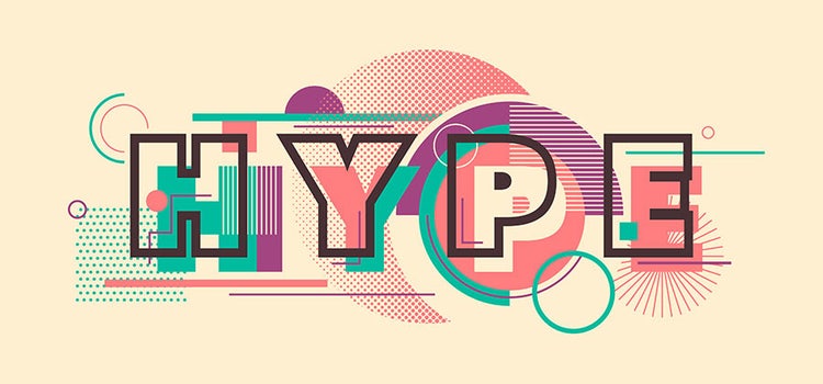
Logo multicolore dit « HYPE »

What is visual identity?

Visual identity is a core component of your overall brand identity. It establishes the visual elements that allow customers to recognise and remember your brand.

Think of visual identity as the visual "face" of your company—the collection of design elements that instantly communicate who you are.

Once you've defined your visual identity, you'll use it to create your graphic charter (or brand guidelines)—a practical document that explains how to use all your visual elements consistently.

Why is visual identity important in branding?

Visual identity is essential to branding because:

  • It's the first impression – Customers see your visuals before they read your words
  • It communicates quickly – A well-designed logo says more than a paragraph
  • It builds recognition – Consistent visuals make your brand instantly identifiable
  • It creates emotional connections – Colours, fonts, and imagery evoke emotions
  • It differentiates you – Strong visual identity sets you apart from competitors
  • It supports consistency – Visual guidelines ensure all communications align with your brand
  • It increases memorability – Strong visual identity stays in customers' minds

In short, visual identity is how customers recognise and remember your brand. So, it’s important to invest in getting it right.

The key elements of visual identity.

For maximum effectiveness, your visual identity should reflect your business field, company values, mission, and story. To create a compelling visual identity branding, you must develop these essential elements:

Your logo is the cornerstone of your visual identity design. It's the most immediate and powerful way to make an impression on customers' minds.

A strong logo should:

  • Encapsulate the complexity of your business at a glance
  • Be clear and immediately recognisable
  • Be visually attractive and memorable
  • Work at any size—from a tiny social media icon to a large billboard
  • Remain timeless and relevant for years to come

Your logo is often the first visual impression customers have of your brand, so it needs to effectively communicate your business, values, and personality.

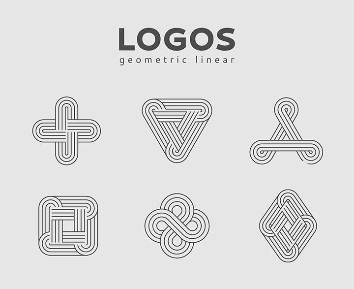
Illustration de logos géométriques

Your brand name.

Your brand name and its typography are how customers first "meet" your brand and learn about your business. Your name is an opportunity for customers to form an opinion about your company and understand your business proposition.

A strong brand name:

  • Is easy to remember and pronounce
  • Reflects your field of business
  • Differentiates you from competitors
  • Works across different markets and languages
  • Evokes the right emotions and associations

Typography and typefaces.

Typography—the style of text and letters you use—is a crucial element of visual identity design. There are five main categories of typefaces:

1. Serif Fonts (with Serifs) These fonts have small lines or "feet" extending from the base of letters. They convey formality, tradition, and authority. Example: Times New Roman

2. Sans Serif Fonts (without Serifs) Clean and modern, these fonts have no extended lines. They're excellent for readability and contemporary designs. Example: Helvetica, Arial

3. Script Fonts These fonts imitate handwriting and often convey elegance and sophistication. They can be difficult to read, so they work best for headings, logos, and signatures. Example: Lucida Handwriting

4. Handwritten/Manuscript Fonts A newer category that mimics contemporary handwriting. These fonts add personality and informality but can be challenging to read in body text.

5. Decorative/Display Fonts Highly stylised and distinctive, these fonts convey personality, humour, and creativity. They're perfect for headlines and logos, but impractical for body text. Example: LEGO's custom typeface

Choosing your typeface strategically:

For maximum readability, keep your font choices simple. Reserve decorative or script fonts for your headlines, brand name, and logo. Many leading brands develop custom typefaces specifically for their visual identity—this adds a unique graphic element and strengthens your brand recognition.
Colour palettes.

Colours are one of the most powerful tools in visual identity design and communication. They can instantly convey emotion, set the tone, and influence how customers perceive your brand.

How to choose your colours:

  • Select 4-5 colours maximum to avoid looking chaotic or unfocused
  • Choose 2 primary colours (these will form your logo and main visual elements)
  • Choose 2-3 secondary or tertiary colours (for supporting materials and accents)
  • Consider colour symbolism carefully—different colours evoke different emotions and associations
  • Ensure your colours work well together and maintain good contrast for readability

Understanding colour psychology:

  • Warm colours (yellows, oranges, reds) – Convey action, energy, warmth, and optimism
  • Cool colours (greens, blues) – Suggest calmness, trust, stability, and professionalism
  • Purple – Contains both warm and cool properties, suggesting creativity and sophistication

Colour is one of the most important elements of your visual identity, so choose strategically based on your brand personality and target audience.

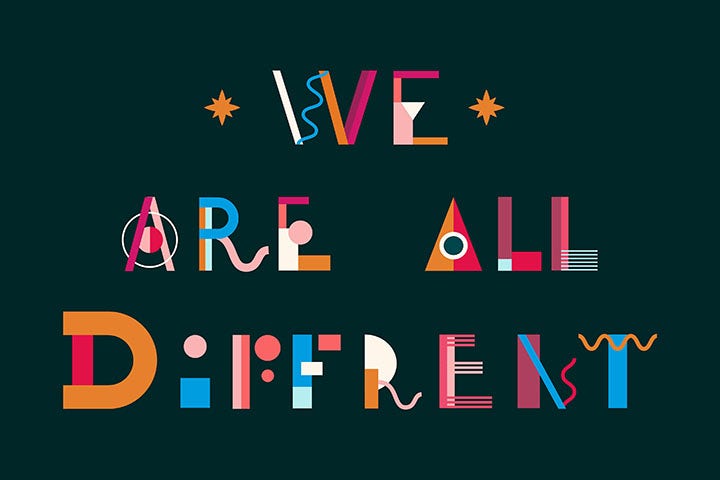
Illustration multicolore sur arrière-plan noir dit « we are all different »

Your brand tagline or slogan.

A powerful brand tagline is a short, memorable phrase that encapsulates your brand's essence, values, and what you offer.

The best taglines:

  • Are short and easy to remember
  • Have a pleasant rhythm and sound
  • Describe your business and values
  • Can eventually standalone without your logo or brand name
  • Use wordplay, rhyme, or other memorable techniques

Think of iconic examples: "Just Do It" (Nike), "I'm Lovin' It" (McDonald's), or "Think Different" (Apple). These taglines have become synonymous with the brands themselves.

How to create your visual identity: Step-by-step.

Creating a visual identity requires a methodical, disciplined approach. Here's how to do it systematically:

Step 1 – Define your brand.

Start by clearly defining what your brand is:

  • What products or services do you offer? – Be specific about your offerings
  • What values underpin your business? – What principles guide your company?
  • What are your ambitions? – Where do you want to take your brand?
  • How do you want to be perceived? – What image do you want in customers' minds?
  • Who is your target audience? – Who are your ideal customers?

By answering these questions with precision, you'll develop a clear understanding of your brand identity, which will guide all your visual identity decisions.

Step 2 – Brainstorm visual concepts.

Now that you understand your brand, it's time to explore visual possibilities:

  • What colours align with your brand personality? – Generate colour combinations that match
  • What does your target audience aspire to? – How can you reflect these aspirations?
  • What sets you apart from competitors? – How can your visuals show this difference?
  • What imagery and style resonate with your values? – Collect visual inspiration for reference
  • What emotional response do you want? – What should customers feel when they see your brand?

Create a mood board or visual inspiration collection. This becomes your foundation for developing a cohesive visual style.

Step 3 – Select your visual elements.

Based on colour symbolism and your brand personality, choose the specific elements that will make up your visual identity design:

  • Colours – Test multiple colour combinations before finalising your palette
  • Fonts and typography – Select 2-3 typefaces that work well together
  • Logo style – Decide on the visual approach (geometric, illustrative, text-based, etc.)
  • Icons and graphics – Choose symbolic elements that represent your brand values
  • Photography and imagery style – Define the aesthetic for photos and illustrations
  • Patterns and textures – Consider adding distinctive patterns or textures (if appropriate)

Don't rush this step. Test these elements together to ensure they work harmoniously and tell a cohesive story about your brand.

Step 4 – Develop your graphic charter.

Ensure your visual identity is cohesive by documenting everything in a comprehensive graphic charter or brand guidelines document.

Your graphic charter should specify:

  • How to use your logo (sizing, spacing, clear space, colour variations)
  • Colour codes for all brand colours (hex, RGB, Pantone, CMYK)
  • Typography rules (which fonts for which uses, sizing, weights)
  • Icon and symbol usage guidelines
  • Photography and imagery guidelines
  • Layout and spacing standards
  • Do's and don'ts for applying your visual identity
  • Real-world examples showing correct application

This document ensures that whether it's your team or external partners creating content, everything maintains visual consistency.

Photo des gens sur ordinateurs dit « branding »

Top tips for effective visual identity design.

Follow these professional tips to create a visual identity that truly works:

Master colour psychology.

Choose your colours based on the mood and message you want to convey:

  • For authority and formality – Blues, deep greys, blacks
  • For warmth and energy – Oranges, reds, warm yellows
  • For trust and stability – Blues, greens
  • For creativity and innovation – Purples, vibrant colours
  • For luxury and elegance – Gold, black, deep jewel tones

Tools to help:

  • Use the Adobe colour wheel to understand colour relationships (complementary, analogous, triadic)
  • Try the Adobe colour wheel to generate harmonious colour palettes
  • Test your colours in different contexts—digital, print, backgrounds, text

Remember: your colour choices should reflect your brand's personality and values. Choose strategically, not randomly.

Select typography that matches your brand personality.

Your fonts communicate personality before anyone reads a single word:

For formal, authoritative brands: Use serif fonts. These convey tradition, respect, and professionalism.

For modern, contemporary brands: Use Sans Serif fonts. These feel clean, simple, and modern. They're highly readable on digital platforms.

For elegant, sophisticated brands: Use script fonts. These convey sophistication and elegance—but it’s advisable to restrict their use to headlines and logos, as they can be difficult to read in body text.

For creative, playful brands: Use handwritten, manuscript, or decorative fonts. These add personality and informality—perfect for headings and logos.

Pro tip: Pair fonts strategically. Use one serif and one sans serif, or combine a decorative font with a clean, readable font. Test different combinations to find what works best for your brand.

Choose icons, shapes, and symbols that represent your brand.

Graphics and symbols should:

  • Align with your brand values and personality
  • Be used consistently across all applications
  • Be either outline-style (line drawings) or solid-style (filled)
  • Complement your other visual elements
  • Be simple enough to recognise at small sizes

Don't underestimate small details—icons and symbols can make a significant difference in how professional and cohesive your visual identity appears.

Understand your target audience's expectations.

Analyse your target audience and their preferences:

  • What visual styles appeal to them?
  • What colours do they respond to?
  • What imagery resonates with them?
  • What emotions should your brand evoke?

Adjust your visual identity to align with these expectations—but be authentic. Don't make promises through your design that you can't deliver through your products or services. Customers can spot inauthentic branding, and it damages trust.

Focus your visual identity strategy.

Don't try to implement every possible visual element. Instead:

  • Identify which visual elements add the most value to your brand
  • Prioritise consistency in your most visible touchpoints
  • Consider which platforms matter most for your business
  • Remember: sometimes less is more

For example, you might focus on perfecting your logo, website design, and social media graphics before creating branded vehicle wraps or custom merchandise. Be strategic and intentional.

Use colour theory and tools effectively.

When building your colour palette:

  • Use the colour wheel as a guide for harmonious combinations
  • Try complementary colours (opposites on the wheel) for high contrast
  • Use analogous colours (next to each other) for harmony
  • Test colours in different contexts—on white backgrounds, dark backgrounds, and on digital screens
  • Ensure sufficient contrast for accessibility and readability

Try the Adobe Colour tool

Illustrations graphiques en orange, jaune et bleu

How to build your visual identity with Adobe.

Adobe's design suite provides everything you need to develop professional visual identity branding:

Build harmonious colour palettes.

Using Adobe Illustrator:

  • Open the Colour Guide panel to explore colour variations infinitely
  • Adjust hues, saturation, and brightness using multiple controls
  • Save your final palettes as colour swatches or swatch groups
  • Export these palettes to use across all Adobe applications

Using Adobe Colour:

  • Visit the Adobe Colour website to experiment with colour combinations
  • Use the colour wheel to create harmonious palettes
  • Generate palettes based on photos or custom inputs
  • Save and sync your palettes across all Adobe apps

Your colour palette becomes your visual signature—make sure it's perfect.

Design your logo and icons with Adobe Illustrator’s tools for logo design:

  • Pen tool – Create custom shapes and paths
  • Image trace – Vectorise images and sketches into scalable graphics
  • Perspective grid – Create realistic perspective in your designs
  • Shape libraries – Access thousands of pre-made shapes to build from

You can create logos from scratch, refine hand-drawn sketches, or combine elements to build something unique.

Master typography.

Using Adobe Illustrator's Text tools:

  • Text tool – Create headings, body copy, and logos
  • Type on a path – Place your text along curves or angles for creative layouts
  • Character panel – Access countless font families, weights, and styles
  • Text formatting options – Control size, spacing, alignment, and more

Experiment with different typefaces to find combinations that match your brand personality.

Manage your visual identity assets on Adobe Creative Cloud.

Once you've created your visual identity elements:

  • Organise all assets in Adobe Cloud libraries
  • Create reusable components and templates
  • Share your visual identity system with team members
  • Sync your colours, fonts, and styles across all Adobe applications
  • Update your assets globally when you need to make changes

This approach ensures consistency across all your visual communications.

Quelqu’un travaille sur ordinateur

Frequently asked questions.