Introduction
It's incredible how in Lightroom on the web, with just a few simple adjustments of light and color, we can transform our pictures.
Hi, I'm Glyn Dewis, and in this video, I'm going to show you how to bring a photo to life using the powerful edit tools in Lightroom on the web to make adjustments to the light and the color.
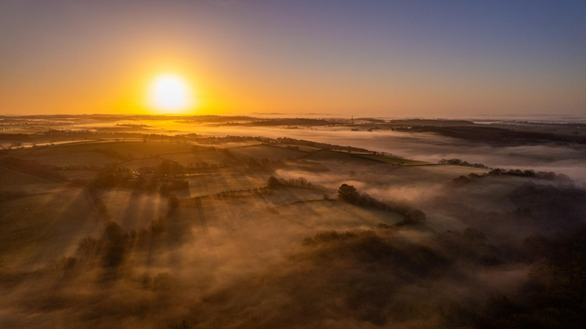
I'm going to work on this image here, which is a raw file that I captured using the camera on my drone.
I'll start off by simply pressing Auto just underneath the Histogram.
Using auto to establish a strong starting point
The Auto button is like your Lightroom personal assistant.
It automatically analyzes your image and applies what it thinks are the best settings for basic exposure, contrast, and tone.
And already with just one click, that has made a big difference.
Fine-tuning exposure and contrast in the light panel
But now let's come down to the Light section where we can see the adjustments that pressing Auto has done.
In the Light section, we have a number of adjustment sliders.
Exposure adjusts the overall brightness of the image and is great for correcting underexposed or overexposed shots.
Contrast increases or decreases the difference between dark and light areas.
Boosting Contrast makes your image pop.
Reducing it gives a softer, more flatter look.
Highlights affect the brightest part of the image, like sky or reflections.
Lowering the Highlights, brings back lost detail in bright areas.
Shadows adjust the darker parts of the image.
Shadows reveal detail in shadowy areas without affecting the rest of the image that much.
The Whites control the brightest points of the image, and Blacks controls the darkest points of the image.
Now I can adjust these settings to fine-tune how I want the image to look.
I'll start by adding a little more Contrast - about here will be good.
I'll also reduce the overall Brightness of the image ever so slightly.
I think the shadow and highlight details are pretty fine.
I don't need to change anything there, but I will take the Whites all the way over to the left to reduce the brightest points in the image.
And that has a great effect on the sun and the sky.
Next, I'll move down to the Color section.
Adjusting color temperature and tint
Using the Temperature slider, I can drag to the left to cool the image down, adding in blue tones, or take it to the right to warm up the image.
I'll just make it a little warmer - to about there.
We can also adjust the Tint of the image.
Clicking and dragging to the left adds a green tint, to the right, a magenta tint, and the further over we drag, the more intense it becomes.
I'll add a little magenta tint which works a treat.
Then we have Vibrance and Saturation.
Both of these we can use to adjust the intensity of color in our image, but they work very differently.
Vibrance is very smart, as it only increases the intensity of the muted or the dull colors in an image.
Whereas Saturation doesn't really care about the original intensity of the colors, it just cranks everything up.
Let me show you what I mean.
Comparing vibrance and saturation for color control
I'll increase Vibrance by dragging to the right, up to around about + 50.
And this is the result, which works really well, naturally warming up the scene.
I'll reset that Vibrance slider back to 0 by double-clicking on the circular Control icon.
Now, I'll increase the Saturation to 50 and look at the difference - that is so overdone, with all the colors now being affected.
So, I'll reset that and only bring up the Vibrance to around about there.
Yes, happy with that.
We've only made a few simple and quick adjustments.
But let's now take a look to remind ourselves what the original looked like when we first started out.
I'll click on the Show Original icon in the upper right of the screen.
Reviewing before and after results
That's before - and after - before - and after.
Such a huge difference, but so easy to do.
There you can see how much of a difference we can make to our images with just a few simple adjustments.
And of course, we don't have to follow them in a set order.
It's no problem to move from one adjustment to another - and back again.
But I love doing this and seeing images just come to life.
It's addictive - so have fun!