Master complementary colours and create harmonious colour schemes.
Choosing the right colour palette is never an easy task, whether you're creating graphics, painting, designing or decorating. Understand the power of complementary colours and why they're essential across visual arts – from Impressionism to modern design today.
What are complementary colours?
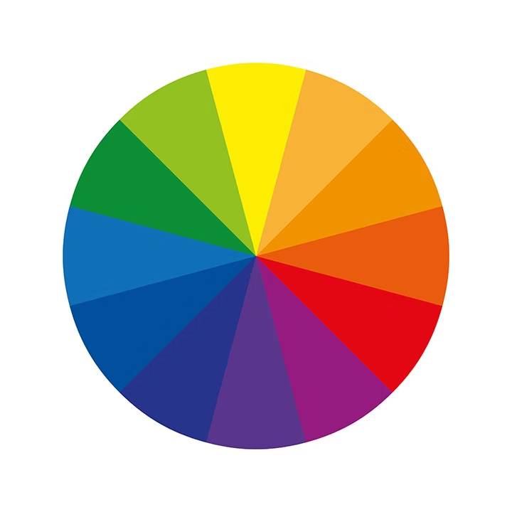
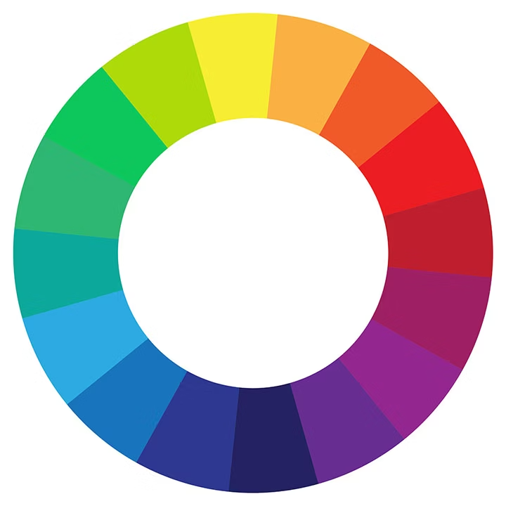
Complementary colours are two colours positioned directly opposite each other on the colour wheel. For example, yellow is complementary to violet, red balances well with green, and blue complements orange.
When placed side by side, complementary colours create strong contrast and enhance each other's vibrancy. When two complementary hues are used together in a design or artwork, the result is typically harmonious and balanced – creating visual interest and impact.
This principle is fundamental to colour theory and is widely used by designers, artists, and creative professionals worldwide.
Why are complementary colours important?
Designers and visual communication professionals rely heavily on the colour wheel and its principles to build palettes and ensure different shades work well together. You'll find complementary colours used extensively in:
Logos. Using complementary colours helps create logos that are recognisable, memorable and impactful.
- Brand guidelines and style guides. Apply this principle to create harmonious brand guidelines and pair colours that work together, ensuring consistency across all visual communication.
- Posters and advertising materials. Pairing opposite colours on the colour wheel creates strong contrast that captures attention – perfect for delivering your message with impact.
- Web design. Using complementary colours in website design produces a professional appearance and improved readability.
- Social media content. By applying complementary colours to your posts and refining your palettes, you increase the chances of creating engaging content that stands out.
- Colour photography. Many photographers use colour complementarity to create striking, compelling images.
The concept of complementary colours is also widely used in interior design, fashion, sportswear, and many other creative fields – always with the goal of creating visually striking and pleasing results.

How to find complementary colours.
To find the complementary colour of any given colour, consult the colour wheel (also called the chromatic circle). Simply draw a line across the wheel – the two colours at each end are complementary colours.
However, there's more to it. When choosing and combining colour shades, it's helpful to understand some fundamental colour theory principles.
Here are essential tips to help you master the basics and pair colours effectively, whether you're designing graphics, decorating interiors, creating outfits or tackling any other creative project.
Colour theory: art and science combined.
Colour theory covers the essentials that help you create, choose, and combine colours that work harmoniously together.
However, there's also a psychological dimension to colour theory. Colours are perceived differently depending on cultural backgrounds and individual colour symbolism. It's also been proven that colours influence our behaviour and mood – which is why colour choices are so important in advertising and packaging design.
Primary colours.
The three primary colours have the unique property of creating all other colours when combined. However, they cannot be created by mixing other colours together. These are:
- Red
- Green
- Blue
We refer to this as "RGB" (Red, Green, Blue).
What's the difference between RGB and CMYK?
RGB (Red, Green, Blue) is the colour mode used for digital work – on screens and light-based sources. This is called additive colour mixing (combining light and colour).
CMYK (Cyan, Magenta, Yellow, Black) is the colour mode used for print. This is called subtractive colour mixing (working with physical materials like pigments and paint).
Secondary colours.
The three secondary colours are created by mixing two primary colours. These are:
- Violet. Made from blue and red.
- Green. Created by mixing yellow and blue.
- Orange. The result of yellow and red.
Tertiary colours.
The six tertiary colours are created by mixing a primary colour with a secondary colour. These are the colours most commonly found in nature:
- Blue-green turquoise (blue + green)
- Indigo (blue + violet)
- Purple (red + violet)
- Red-orange (red + orange)
- Yellow-orange (yellow + orange)
- Light-green (yellow + green)
The colour wheel.
Primary, secondary and tertiary colours are all represented on the colour wheel. This is a visual representation showing the relationships between these colours.
The colour wheel is what allows you to find any colour's complementary colour by drawing a line across it – the two colours where the line intersects are complementary to each other.
Colour temperature.
If you divide the colour wheel in half, you'll get:
Warm colours on one side. Including yellow, orange and red tones.
Cool colours on the other side. Including green, blue and violet tones.
Generally, colours with blue undertones fall into the cool category, while colours with red undertones are considered warm.
The history of complementary colour theory.
The first ideas of complementary colours appeared in the 19th century, particularly in Johann Wolfgang von Goethe's seminal work Zur Farbenlehre (The Theory of Colours).
Complementary colours in Impressionism.
Following Goethe's work, many artists began exploring colour theory. This theory played a crucial role in the rise of Impressionism and other artistic movements.
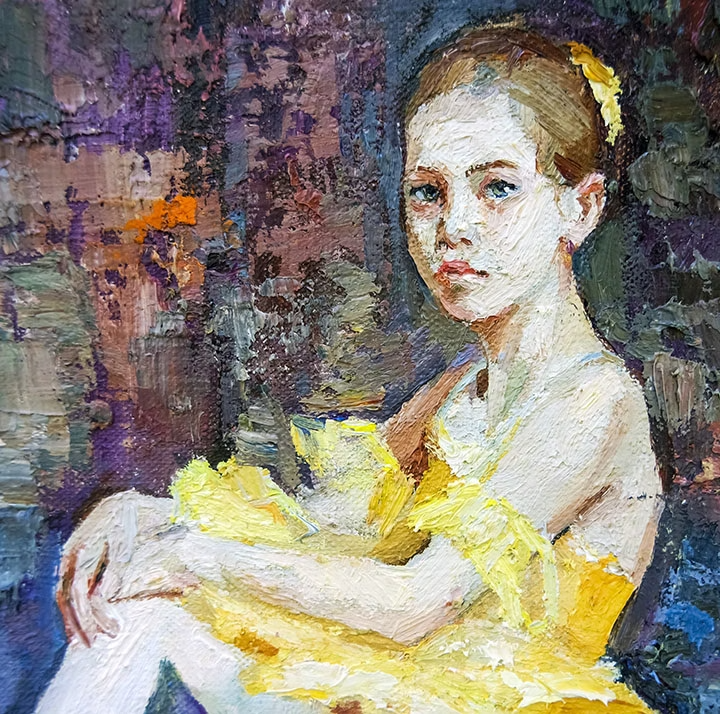
Impressionist artists were among the first to recognise that shadows are not neutral – they're actually coloured. This phenomenon is called simultaneous contrast.
You can see this effect clearly in Claude Monet's paintings, particularly in:
- The Magpie – With its blue shadow on the snow.
- Women in the Garden – With its striking indigo shadowing on the dresses.

Primary and complementary colours in abstract art.
Using primary and complementary colours beyond shadow work also creates striking results, particularly in abstract paintings and artworks. This creates particularly interesting and dynamic contrasts.
Complementary colours in graphic design and marketing.
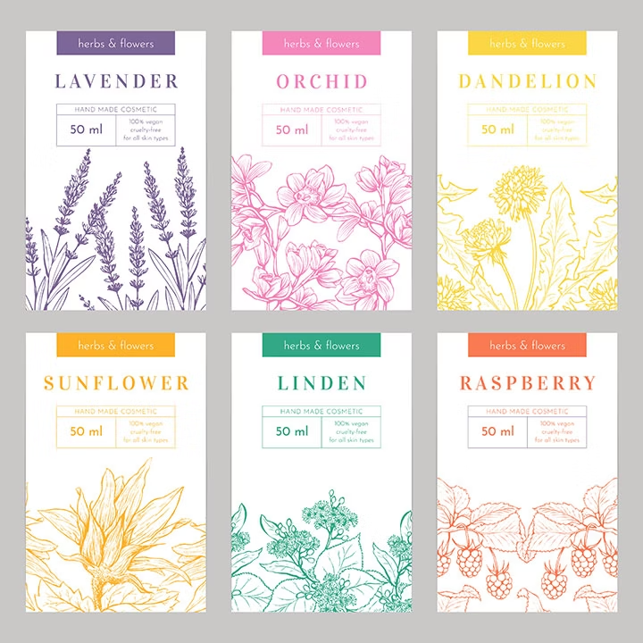
In graphic design and marketing, colour theory and the use of complementary colours are essential pillars. Logos, advertisements, posters, product packaging and more are carefully crafted around these principles to maximise impact and brand recognition.
Complementary colour examples and combinations.
Using the principle of colour complementarity and the colour wheel, you can easily build a harmonious colour palette for your graphic designs and creative projects:
Complementary colour pairings with primary colours.
- Blue and orange. Combining these two colours in your graphics, paintings, photographs or logos ensures contrasting, timeless results.
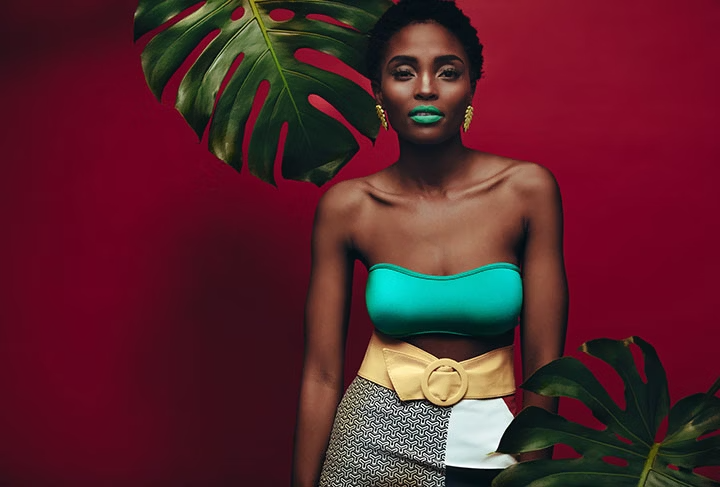
- Red and green. This pairing remains warm despite the presence of green. It's arguably the most common complementary colour combination found in nature.
- Yellow and violet. Ideal for drawing attention and adding energy to your designs. Use varied tones to avoid an overly bold, clashing combination.
Complementary colour pairings with secondary and tertiary colours.
- Burgundy and teal green. For a sophisticated, understated look that conveys elegance.
- Brown and deep turquoise. A combination that inspires serenity and authenticity.
- Fuchsia and mint green. For a bold, dynamic pairing that communicates innovation and originality.
How to pair colours effectively.
Planning a logo design? Creating a product photoshoot? Redecorating a room? You're in luck – there are several options to help you identify the best colour combinations and palettes for your projects.
Pantone colour systems.
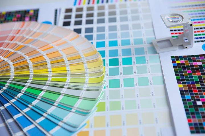
The Pantone system is a universal standard that has named and numbered over 3,000 colours in a colour reference guide. There are many suggested Pantone colour pairings available. Stay aware of current colour trends, draw inspiration from existing colour palettes, and see how these enhance your graphic designs.

Adobe Color – the free colour wheel picker.
Adobe Color is a free, user-friendly online colour palette generator. It helps you create colour palettes based on complementary colours and much more.
You can also explore other combinations, such as monochromatic palettes, triadic colours or analogous colours (explained below). The tool allows you to draw inspiration from current colour trends and style guides relevant to your industry.
Create your colour palettes with Adobe Color and access them directly from Adobe Photoshop, Adobe Illustrator or Adobe InDesign.
Frequently asked questions.
What are complementary colours and why do they matter?
How do I find complementary colours using a colour wheel?
What's the difference between complementary, analogous and triadic colours?
- Complementary colours sit opposite each other on the colour wheel and create maximum contrast.
- Analogous colours sit next to each other on the colour wheel and create harmonious, cohesive palettes.
- Triadic colours are three colours evenly spaced around the colour wheel, creating vibrant yet balanced combinations.
Each serves different design purposes – complementary for impact, analogous for harmony, and triadic for dynamic energy.
Can I mix complementary colours together?
Is 60-30-10 the best colour palette rule?
The 60-30-10 rule is a classic interior design and branding principle. It suggests using 60% of your dominant colour, 30% of a secondary colour, and 10% of an accent colour. This creates visual balance and ensures no single colour overwhelms the others.
You can apply this rule alongside complementary colours – for example, using 60% of a warm neutral, 30% of a complementary colour and 10% of an accent.