#1e1e1e

What is leading? The complete guide to line spacing.

Often overlooked, leading (also called line spacing or line height) is a fundamental page composition element.

Leading delivers optimal readability, while establishing information hierarchy.

Through this guide, we explain what leading is, foundational principles, how to code it, and how to modify it using Adobe tools.

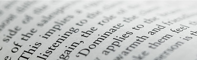
Close up of text in a book

What is leading: definition and purpose.

Leading is the vertical space between two lines of text. More precisely, it’s the interval between two baseline lines that support lowercase characters. The baseline is the invisible line upon which letters rest. For example, descenders in letters like ‘p’ or ‘j’ extend below this line.

Leading can be calculated, increased, or reduced depending on your desired outcome: tightly packed text or more spacious, breathable text.

Close up on an industrial machine

Leading in print design.

In traditional printing, leading referred to a strip of metal separating text lines.

This historical terminology remains essential to modern typography understanding.

Leading vs kerning: understanding the difference.

Leading differs from kerning, which adjusts space between individual letters and characters. Font designers establish spaces between alphabet characters, but these can be adjusted based on font usage.

Kerning is commonly used in logo and headline creation. Leading in typography, conversely, applies to overall publication design. These are complementary tools; both improve text clarity and impact.

Leading and typography selection.

Your leading choice depends fundamentally on your selected typeface, and it’s essential for document readability.

For example, with sans-serif fonts like Helvetica (where letter height is substantial), you’ll need higher leading for optimal readability.

With this typography style, ascending and descending strokes shouldn’t touch between upper and lower lines.

Like font selection itself, leading forms part of a brand’s visual identity.

Typographic colour and leading.

Leading affects text colour perception. Tight leading produces darker text; generous leading produces lighter, airier text. This concept is called typographic colour: the first impression text makes on readers and reading ease.

But leading isn’t the only element determining typographic colour. Character design itself matters; so do spacing quality, kerning precision, and line length (measure). Consider all these elements when creating text colour effects.

Boxing graphic flyer

Types of leading and best practices.

No strict rules govern leading selection. However, certain principles matter during document design.

Consider your reader.

Today, we encounter multiple media formats daily, and our attention depends on creativity and presentation. This applies especially to text layouts. Different typefaces require different leading amounts.

Text size determines leading choice: small characters need more generous line spacing because they demand more reading effort.

Line length also matters – shorter lines need less space; longer lines need more space and greater leading to maintain reading flow.

Remember that leading adds balance and light to your designs. Use it to maximise document readability. Where possible, opt for single line spacing adapted to your text.

What is single line spacing?

Single line spacing is the default leading set at 120% of character size.

Example: For 10-point text, line height would be 12 points.

In most cases, don’t exceed 150% of character size for optimal readability.

Design and leading.

From a graphic design perspective, strategically manipulating leading can attract reader attention and establish reading hierarchy.

Display type leading may differ significantly from body text for visual impact.

Titles and leading.

Titles establish layout hierarchy. You can reduce leading for titles or use negative leading if titles span multiple lines.

In graphic design, white space is as important as characters. It increases readers’ focus on certain areas. Text without line or paragraph spacing (like newspapers) is more fatiguing than well-designed magazines with more intricate layouts attracting reader attention.

Coloured text and backgrounds.

Black text on a white background offers maximum typographic legibility.

When using other colour combinations, increase leading. Do this when placing light text on dark backgrounds too. Also consider using lighter font weights.

A woman reading a book in bed

How to code line spacing in HTML and CSS.

Let’s explore coding line spacing using HTML and CSS languages.

Understanding HTML for line spacing.

HTML stands for HyperText Markup Language, a computer language most web developers use to create pages.

It’s not a programming language but a mark-up language that enables you to structure different page content.

HTML indicates which part of your content is a title, or which part is a paragraph, for example.

To modify line spacing in HTML, you’ll use a complementary language: CSS.

CSS line spacing: the core technique.

CSS line spacing (Cascading Style Sheets) formats content defined by HTML.

CSS modifies styles for pages previously coded in HTML.

HTML and CSS complement each other for coding line spacing.

To create space between lines, use the CSS line-height property, which defines HTML line height.

Apply line-height values using pixels, percentages, or length values.

Calculate web line spacing in pixels.

In web design, line height matters as much as in print. Screen viewing fatigues eyes faster than paper reading.

Line spacing must be precise and relevant for webpage readability. Calculate line spacing in pixels.

Adjust leading in Adobe InDesign.

Leading is considered a character attribute. You can apply different leading values within the same paragraph.

Below is a guide to making leading modifications in Adobe InDesign.

Modify leading in selected text.

To adjust specific text leading:

  1. In an Adobe InDesign project, select the text you wish to modify.
  2. Open the Character panel or Control panel, then select leading from the Leading menu.
  3. Enter a new value, replacing the existing value.
  4. Modify leading in the standard Character Format panel when creating new paragraph styles.

Apply leading to entire paragraphs.

To adjust leading across complete paragraphs:

  1. Select Edit > Preferences > Text (Windows) or InDesign > Preferences > Text (Mac).
  2. Select to apply leading to an entire paragraph, then click OK.

Modify default automatic leading percentages.

To adjust default leading percentages:

  1. Select the paragraphs you wish to modify.
  2. Choose Justification from the Paragraph panel or Control panel menu.
  3. Enter a new default percentage for Automatic Leading. The minimum is 0%; the maximum is 500%.

Learn more about leading in Adobe InDesign

A young woman typing on a computer

Frequently asked questions.

What is normal leading?

Normal leading (default leading) is calculated based on typeface choice, equalling 120% of character size.

Adobe InDesign uses the line’s highest character size when calculating leading values.

What is the difference between leading and kerning?

Leading adjusts vertical space between text lines; kerning adjusts horizontal space between individual letters. Both improve typography but serve different purposes.

How do I change line spacing?

To modify line spacing in Adobe InDesign, select the text needing spacing adjustment, then select leading from the Character or Control panels.

Enter a new value, replacing the existing leading.

When creating new paragraph styles, modify leading options directly in the standard Character Format panel.

What CSS property controls line spacing?

Use the CSS line-height property to define space between lines. This property accepts various values: numbers, pixel lengths, em units, or percentages. The line-height property applies to all HTML tags.

What is double line spacing?

Double line spacing means line height is 200% of font size, or 2x the font height.

Historically used in manuscript submissions, double spacing reduces text density and increases readability.

How does leading affect page layout?

Leading significantly influences how much content fits on a page, reading pace, and visual balance. Tight leading compresses content but may reduce readability; generous leading spreads content and demands more pages but improves readability.

Should I use different leading for headlines?

Yes. Display type leading often differs from body text. Headlines typically use tighter (lower) leading or negative leading, creating visual impact.

Body text needs generous leading for comfortable reading. Manual leading adjustment allows for creative flexibility.

What’s responsive leading for web?

Responsive leading for web design means adjusting line height based on screen size. Mobile screens may need different leading than desktops, for example.

Can I use negative leading?

Yes. Negative leading reduces space below text lines, creating compact, dramatic layouts. It’s commonly used for headlines where letters overlap slightly.

However, negative leading reduces readability, so reserve it for display type, not body text.

How does leading relate to font size?

Leading should scale with font size.

Larger fonts typically need proportionally more leading; smaller fonts need generous leading for comfortable reading.