#1e1e1e

Master tertiary colours to create nuanced designs.

Tertiary colours are essential for building diverse, sophisticated colour palettes. Understanding them opens up a world of nuanced possibilities—from warm terracottas and golds to cool teals and indigos.

Whether you're developing a brand identity, designing illustrations or creating digital interfaces, tertiary colours offer sophistication that simple primary or secondary palettes cannot achieve. In this guide, we’ll explain how to make them, what they mean and how you can use them to catch the eye in your designs.

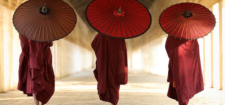
Photo of three figures walking with umbrellas

What are tertiary colours?

On the colour wheel, tertiary colours (also called intermediate colours) are created by mixing equal parts of a primary colour with an adjacent secondary colour.

Warm tertiary colours:

  • Red-orange (vermilion, scarlet, nasturtium)
  • Yellow-orange (ochre, gold, saffron)

Cool tertiary colours:

  • Yellow-green (chartreuse, pistachio, sulphur)
  • Blue-green (turquoise, teal)
  • Blue-violet (indigo, campanula)

Transitional:

  • Red-violet (purple/mauve) bridges warm and cool families

Why tertiary colours matter:

Tertiary colours carry symbolic elements from both component colours. For example, purple combines red's warmth with blue's coolness—which one dominates depends on surrounding colours.

The colour wheel provides methodical classification of twelve basic colours, allowing you to combine shades strategically. It's an invaluable educational tool for understanding colour interactions and selecting palettes based on various criteria: warm/cool, analogous hues, complementary colours and beyond.

How to make tertiary colours

The simple formula: primary colour + secondary colour (adjacent on the colour wheel)

Important: Only mix a primary colour with a secondary colour that sits next to it on the colour wheel. Mixing a primary with an opposite secondary creates muddy greys, browns or blacks—which may be desirable for shading but won't give vibrant tertiary colours.

Recipes for vibrant tertiary colours:

  • Blue + green = turquoise
  • Blue + violet = indigo/campanula
  • Red + violet = purple
  • Red + orange = vermilion/scarlet/nasturtium
  • Yellow + orange = ochre/gold/saffron
  • Yellow + green = chartreuse/pistachio/sulphur

Mixing tips:

In paint, you can mix colours completely for uniform results or partially for richer, varied effects. Partial mixing creates visible colour variation within a single hue—often more visually interesting than fully blended colour.

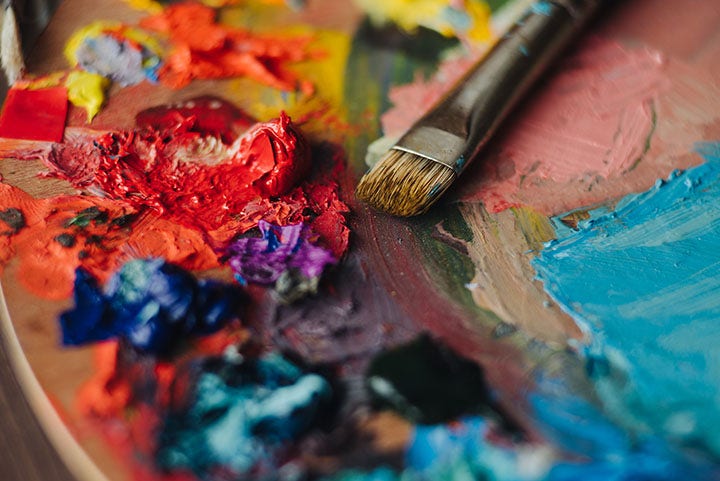
Photo of paints on a palette

Symbolism and meaning of tertiary colours

Each tertiary colour carries distinct emotional and cultural significance. Understanding these associations helps you choose colours strategically.

Vermilion, scarlet and nasturtium

Historically derived from cinnabar (mercury ore), vermilion has been used since the Neolithic period in China, India and Ancient Rome for artistic and cosmetic purposes. Modern vermilion uses synthetic pigments due to cost and toxicity concerns.

Emotional associations:

  • Warmth, passion, sensuality and creativity
  • Talent and opulence in digital design
  • Can suggest danger or negative emotion if overused

Design guidance: Use sparingly to avoid overwhelming designs. Pair with grey or gold for a striking contrast that lets these rich colours shine.

Ochre, gold and saffron

Gold represents material and financial power—conveying luxury, security, comfort and warmth. Ochre creates harmonious, calming atmospheres with authenticity and softness.

Saffron variations attract attention and evoke a sense of purity and solemnity.

Design guidance: These are powerful colours—restrain to strategic accents. Gold pairs beautifully with red, black or brown for opulent effects, but can feel excessive if overused.

Chartreuse, sulphur and pistachio

Signalling elegance and harmony, these gentle colours bring calm and reassurance. Their green tones reference nature, spring and playfulness.

Design guidance: These refreshing, soft hues pair perfectly with white for lightness and optimism. For warmth, combine with browns or wood-effect elements. For playfulness, pair with pink or orange—especially for children's designs.

Turquoise

Turquoise colours invite escapism—representing the sky or crystalline water, lagoons and clear horizons. They convey relaxation, peace and stability.

Design guidance: Powerful despite their calming nature. Lighten intensity with white or wood textures. Effective in moderation or for accent elements. Pair with black/white for Art Deco effects, or soft lavender for delicate results.

Indigo and campanula

Striking intensity and depth characterise indigo hues. They evoke creativity, strength, power, luminosity and brilliance. Their richness suggests mystery and introspection whilst inspiring confidence—trusted values in graphic design.

Design guidance: Indigo's intensity suits varied and surprising combinations. Pair with mustard for remarkable contrast, or orange/vermilion for striking opposition. White or cream accents create less contrast but equally striking results.

Purple

Modern purple evokes boudoirs, theatre and religion—symbolising opulence, power and hierarchy. Its theatrical nature conveys strength, royalty and intimacy.

Purple uniquely combines warm and cool characteristics—you can emphasise either based on surrounding colours.

Design guidance: Perfect for sophisticated, intimate atmospheres. Stunning in jewel-toned intensity. With pink: ultra-feminine style. With dark green: voluptuous effect. With light green: spring aesthetic. Purple stimulates imagination and works beautifully across creative applications.

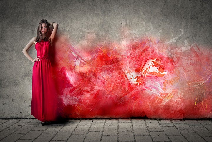
Photo of a woman in a red dress beside a wall with red special effects

Using tertiary colours with Adobe tools

Adobe Colour

Adobe Colour's colour wheel offers ten colour harmony rules, allowing you to:

  • Select tertiary colour families that enhance your project
  • Extract themes and reuse them across Adobe’s tools
  • Test colour combinations before committing

Adobe Illustrator

The Swatches panel of Adobe Illustrator enables precise management of:

  • Hues and gradients
  • Patterns and textures
  • Custom colour palettes via swatch libraries
  • Harmonious tertiary colour variations

Key tools:

  1. Colour Balance Wheel: Redefine tertiary colours harmoniously
  2. Colour Theme Selector: Explore colour combinations
  3. Eyedropper Tool: Select your base colour and generate a complete range of coordinating tertiary shades instantly—test multiple variations with a single click to see effects immediately

These tools transform tertiary colour selection from time-consuming to effortless.

Adobe Photoshop

For photograph-based work, use Photoshop's colour adjustment tools to:

  • Apply tertiary colour overlays
  • Create duotones and tritones using tertiary colours
  • Adjust saturation and hue of tertiary elements
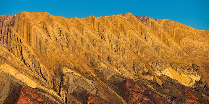
Photo of ochre mountains

Frequently asked questions.

What's the definition of tertiary colours?

Tertiary colours are created by mixing equal proportions of a primary colour with an adjacent secondary colour on the colour wheel. They represent the most complex layer of the colour wheel, offering nuanced alternatives to basic primary and secondary hues.

Why are black, white and grey not considered colours?

According to Newton's theory, black (which absorbs all light) and white (which reflects the entire light spectrum) are optical phenomena rather than true colours. Grey, resulting from mixing black and white, cannot be considered a colour under this framework. This remains philosophically debated across different colour theory schools.

What is a pure colour?

A pure colour (also called saturated colour) contains no white, black or grey mixed in—nor is it diluted or neutralised with its complementary colour. Pure colours are vivid, intense and maintain monochromatism. Purity (similar to saturation) is expressed as a percentage. Reducing purity creates paler, more muted versions.

What are quaternary colours?

Quaternary colours result from the sophisticated mixing of primary, secondary or tertiary colours with added black or white. Examples:

  • Plum: blue + red + black
  • Olive green: yellow + black
  • Sage: blue + yellow + white

Are all tertiary colours equally vibrant?

No. Vibrancy depends on component colours and mixing ratio. Red-orange tends to be more vibrant than yellow-green. You can adjust vibrancy by varying the primary-to-secondary ratio or adding small amounts of white/black for subtle shifts.

How do I choose which tertiary colour to use in my design?

Consider:

  1. Mood: What emotion should your design convey?
  2. Context: What's your industry/audience?
  3. Hierarchy: Should this colour dominate or provide accents?
  4. Balance: How many tertiary colours will you use together?
  5. Testing: Create mock-ups with Adobe Colour to preview combinations

Can tertiary colours work for professional/corporate design?

Absolutely. Indigo, teal and gold tertiary colours convey professionalism and sophistication. Purple works for creative industries. Avoid overly saturated tertiary colours (like bright chartreuse) for traditional corporate contexts unless it aligns with your brand personality.

What's the difference between tertiary and quaternary colours?

Tertiary colours = primary + secondary. Quaternary colours = primary/secondary/tertiary + black/white/grey. Tertiary colours sit at a specific position on the colour wheel; quaternary colours exist between positions, created through additional modification.