Introduction
Creating a Specials Menu from scratch can be tricky.
In this video, I'll show you how to create a simple menu design and keep it updated.
My name is Sydney Michuda, Creative Director of Super Creative.
Let's dive in.
Create a new document
Setting up the menu document and layout guides
and set the artboard to your assigned size, ours will be 8.5 in x 11 in, and make sure the Color Mode is CMYK Color for printing.
Create some simple Guides, so all your margins are consistent.
To turn on the Rulers, go to View, Rulers, Show Rulers.
Click and drag the Guide to one inch on each side and place a Guide in the center as well.
Lock those Guides in place by going to View, Guides, Lock Guides.
To create a textbox for your menu items, select the Type Tool and click near the left Guide to start your text box and drag until you reach the right Guide.
Copy and paste your menu items inside the box.
Select the Type Tool, click above the text box and type your headline Specials Menu.
Scale the headline, so it's larger than the menu items.
We'll refine the layout later.
Next, click the headline, go to the Character window and click the All Caps button.
This will give the heading more impact when selecting fonts.
Place your logo in the document, center-align it to the artboard and move it below your text box.
This restaurant has an eccentric New York City meets Japanese esthetic with a hand-lettered logo.
Let's pick some fonts that complement this style, not compete with it.
Choosing fonts and establishing type hierarchy
To pick the headline font, click the headline, open the Character window and click the Fonts dropdown to browse through fonts.
If you're not finding the right option, click Find More to browse the entire Adobe Fonts library without leaving Illustrator.
I like Manofa, P22 Underground, and IvyMode, but let's go with Manofa since it's eccentric and fresh with a touch of handmade, just like the restaurant.
To pick the menu item font, click the text box and open the Character window dropdown.
Select a more straightforward font with lots of variation, so we can use it for subheads and body text.
I like Courier Std, Adobe Garamond Pro, and DM Sans, but let's use Courier Std.
Now that we have our main font selected, let's clean up the layout.
Make sure the food names, descriptions and prices are on separate lines.
Separating different information like this makes it easy for viewers to identify key details.
Make the food names a thicker weight, so it stands out on the page.
Make the description smaller and thinner than the food name and keep the price the same size as the description, but make it bolder, so it's easily identifiable.
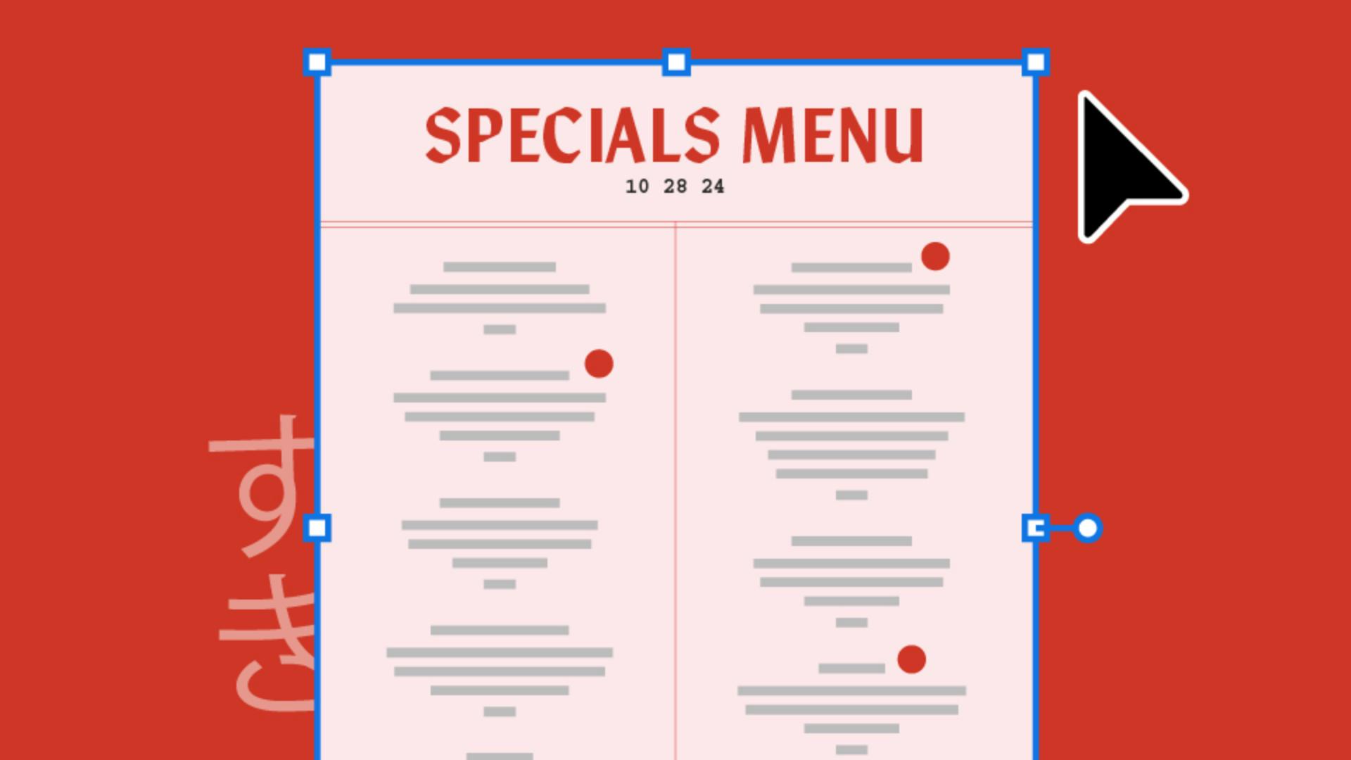
To fill the page, let's adjust the layout and create two columns.
Structuring the menu into columns and visual dividers
Select the text box, go to the Paragraph window and hit Align center to align all the text.
Make the text box narrower, duplicate it and drag it over to the right side of the page.
Remove the text and pull the bottom up above the logo.
To continue the text from one box to another, select the full text box, click the red + icon in the lower right, hover over the second text box near the upper left, and when you see the Link icon, click.
Then your text will flow between boxes seamlessly.
Move the text boxes down always, so we continue to fill the page.
Let's also center the headline, so it matches the text below.
Let's add a thin vertical line to the center of the layout.
Grab the Line Tool, make sure the stroke is filled and create your line.
To see it without Guides, go to View, Guides, Hide Guides.
Let's also add a simple border design to add a touch of elevated organization.
Now let's add some color.
With the Rectangle Tool,
Applying color, accents, and final refinements
click and type the size of the artboard, 8.5 in x 11 in and center it with the artboard.
Go to Object, Arrange and click Send to Back.
If you have brand colors, populate the menu with them.
If you don't, here're a couple of recommendations.
Click the Fill box and find a light color for the background like off-white, mint green or this cheeky pink.
This restaurant has red accents in the space, so let's use that as an accent color throughout the design.
Apply the accent color to the headline and the line accents.
To finish things up, make some final adjustments to the text boxes and check for typos.
Add any dietary labels in the accent color, add a few design elements to the header as well as the date the menu was made, add the address and contact info to the footer near the logo and any other design elements to dress it up.
And there you have it, a Specials Menu that's easy to update and gives your brand a polished look.
Again, my name is Sydney Michuda of Super Creative.
Thanks for watching and happy designing.