60 Couple captions for every photo, milestone, and memory.
Couple caption ideas for texts, posts, and prints.
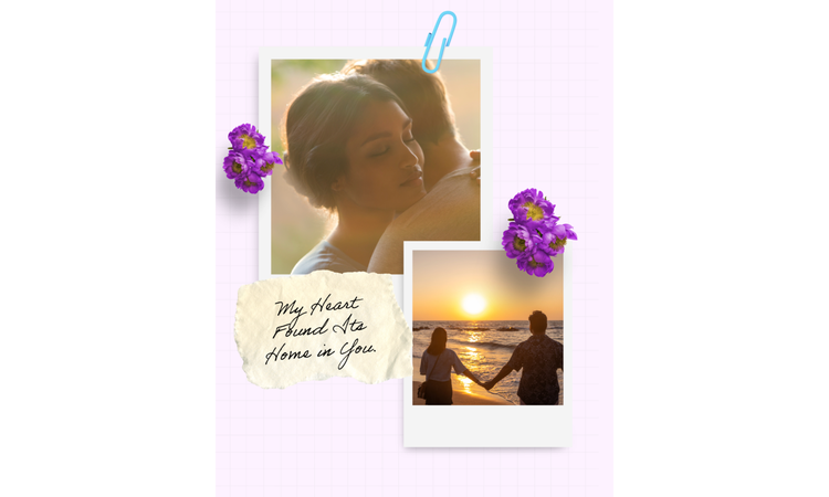




A caption that works in a text thread and on a printed card.
A caption written for a quick text to your partner is short, maybe three words, and that's the whole point of it. Put that same line on a card for your anniversary dinner, and it suddenly looks thin, like you ran out of things to say halfway through. The format also decides the caption. That's the idea behind this list: couple captions, sorted by tone, that can also fit in text threads or the print you're making. Adobe Express is where you'll build it all since it handles the photo and the caption in the same place.
Match your design to your dynamic with these couple captions.
You're staring at a blank canvas with your favorite couple photo, and the caption you type first is something you've seen 50 times on someone else's post. That's just wrong. Your relationship has its own distinct brand. You might be the romantic duo or the foodie lovers who are obsessed with midnight snacks. Match your photo with a caption that describes your kind of love.
To make your couple caption capture your brand, it must feature a specific typography, visual hierarchy, and copy. Pairing a raw, candid snapshot with a polished script font creates a visual mismatch. Instead, visualize how the photo, caption, and design look together. This matters even more for a relationship milestone like a wedding anniversary.
Let the mood of the photo guide the design. Casual snapshots often suit handwritten fonts or layered elements. Engagement or anniversary photos usually look better with a simpler layout that gives the image room to stand out.
If you take these memories offline, use a customizable card creator to build physical keepsakes. You can pull color themes directly from your favorite photos together, instead of traditional romantic pastels. For digital spaces, if you update a shared profile header, create a banner to establish a clear visual identity across the top of your page. Create your brand and pick a distinct style from the list below.
Vertical mobile layouts require movement, so build your post with a Facebook Story creator. Use a multi-frame video grid template to show a quick progression of clips, like walking down a street or a fast time-lapse. Place this caption directly in the center using a clean font inside a solid, semi-transparent color block.
This caption works well on an I Love You Card template with one favorite photo. Keep the font easy to read, then pull one color from the image for a border or small design accents so everything feels connected.
Try a meme generator to lean into this funny couple caption. Use a thick, white, all-caps sans-serif font with a heavy black text outline. Keep the framing tight on the photo or video to emphasize the humor.
Use a love poster design for a clear visual hierarchy. Place your photo in the center, and add a larger font for the opening words. Keep the remaining text smaller so the image stays the focal point.
recipe
Emphasize the quiet moments with these cute couple captions.
You don’t have to wait for anniversaries or staged photoshoots share your relationship online. Most genuine content comes from ordinary moments, like a quick snapshot of you holding hands in the car. When you pair an intimate image with cute couple captions, it’s not forced or cringy, especially if your design choices mirror that same gentle, fun energy.
Use a photo collage to organize your candid snapshots into a visual narrative. Apply thin borders. If bright white feels too sharp, switch to an off-white or light gray to blend the photos. Add cute details like tiny flowers and sparkling hearts.
Turning a cute caption into a printed announcement? A flyer layout is great for an anniversary party or housewarming invite. Move the caption into an open part of the photo. This leaves an empty room in the frame, so your text doesn't crowd your faces or block important background details.
This line reads like an actual declaration, so lean into the wedding certificate's formal border and seal. Set both names in a serif font larger than the caption itself, with the caption running underneath in smaller type like a certificate's fine print.
Playful captions work best when you map your own audio to a simple, stylized character rig using an animation audio tool. Choose a quirky, illustrated pea pair from the asset panel and record a quick, three-second voice note reading this line with a casual, conversational chuckle. Export the final animation as an MP4 so it’s easy to layer directly into a quick video edit or a shared group chat.
Split this one across two shirts too, "you" printed on one with a plus sign after it, "me" printed on the other with an equals sign and "my favorite equation" underneath. Set the plus and equals signs slightly larger than the surrounding text, almost like a math worksheet, and keep the font a plain block sans serif.
recipe
Inject some humor into your layout with these funny couple captions.
Funny relationship posts usually work because they feel real and unedited. If the photo already tells the joke, keep the design simple and avoid adding too many effects that might lose the moment. When you pair your candid photos with funny couple captions, abandon delicate script fonts and formal typography. They clash with the punchline. Choose loud, high-impact elements that match the humor of your text.
For print displays or digital graphics, use a poster maker to immortalize your favorite jokes and create a focal piece for your living room wall. Skip the standard sunset background image. Check your photo album for LOL-worthy shots and use a bold or funky font that's easy to read.
For something different, start with a letter template and turn it into a fake roommate agreement or a witty performance review for your partner. Keep the layout simple with a traditional font and generous margins. The formal look makes the joke land even better.
Open the Adobe Express mug label maker to design a custom set of matching morning coffee cups. Instead of adding a photo, use this funny caption onto the canvas with a pixelated retro font that mimics a computer router setup screen. Keep the design minimal with black text on a solid cream background block to avoid distracting visual clutter.
Browse this couple template collection to find a layout with a bold, contemporary aesthetic. Swap out any delicate script fonts for a thick font, and color the text a vibrant candy pink or electric blue to give it a sharp, sarcastic edge. Position the text overlapping the edge of a casual photo to create a balanced but playful layout.
If you have a blurry or poorly lit photo of your partner sleeping, use a photo editor to lean into the comedy. Rather than trying to fix the lighting with a pretty filter, slap a giant, bright neon yellow arrow graphic pointing directly at their face to emphasize the funny moment.
Create a TikTok video and pair this caption with a quick, five-second vertical clip of your partner staring blankly into a completely empty refrigerator. Place the text near the top of the mobile screen with a clean sans-serif font and a solid black background banner to mimic standard internet commentary styles.
recipe
How to get more from these couple captions.

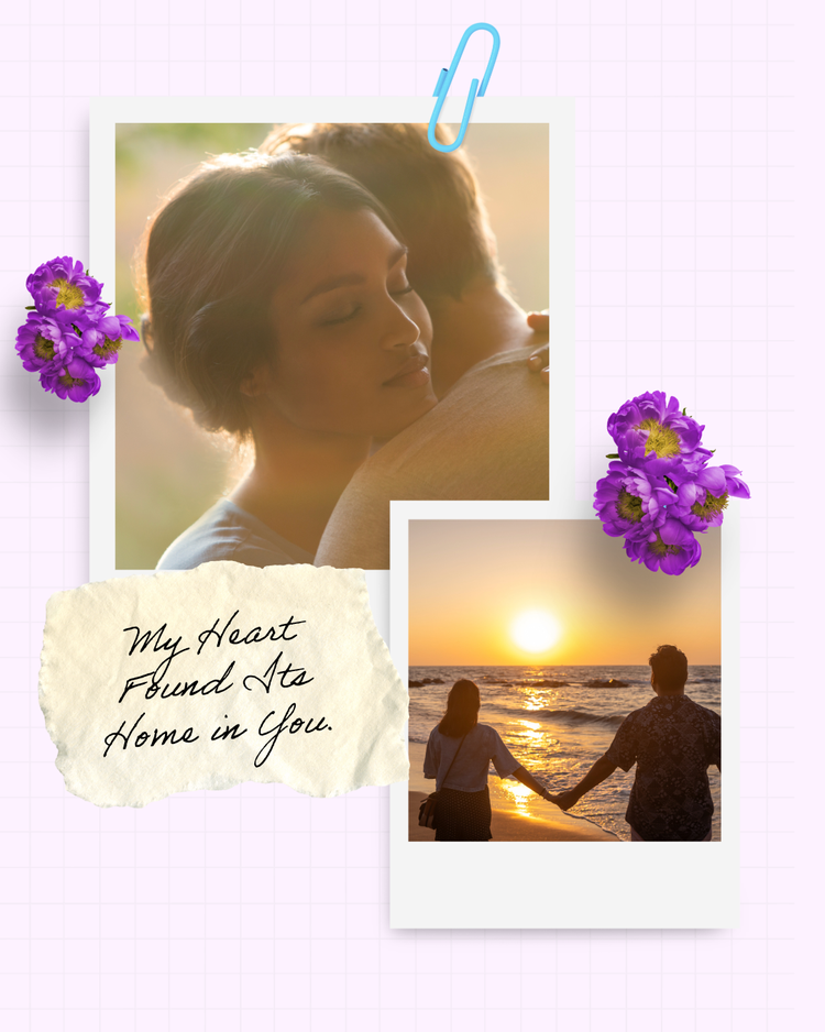
Pick couple captions for Instagram that still work when they shrink to a thumbnail.
Most of these captions play off Instagram's own language back at itself, the feed, the filter, the whole idea of a highlight reel. Picking couple captions for Instagram means thinking about two very different sizes at once. A caption reads one way full-size in someone's scrolling feed. Shrunk down to the tiny square it becomes in your own profile grid, it can read completely differently or not be read at all. A thin script font that looks lovely full-size can vanish entirely at grid size. Test the design at both sizes before locking anything in. Most people only ever check the full-size version.
Instagram Reels leave the bottom third of the screen covered by on-screen icons and captions, so build your text box above that zone from the start. An Instagram Reel maker shows those safe zones directly on the canvas, so you don't find out after posting that the share button cuts off half your caption.
Instagram's profile grid always shows a square crop, so any caption sitting near the edge of a non-square image can get sliced off once it’s posted. Adobe Express's Instagram post templates are already sized to the platform's actual grid ratio, so text placed near an edge doesn't disappear once it goes live.
Use this tongue-in-cheek caption for a multi-photo carousel post where the first image is a polished portrait and the second is a messy candid. Place the text on the second slide only to create a visual punchline that rewards people for swiping through your grid post.
This caption fits naturally in a Reel or short slideshow. Before exporting, preview the entire video to make sure the text isn't covering faces or getting lost as each clip changes.
Lean into the literal meaning of this caption by using a completely unedited, zero-filter snapshot taken in natural light. Keep the text small and position it in the negative space near the bottom of the frame, giving the entire upload a raw, authentic lifestyle magazine aesthetic.
Design matching couple captions so they read as a pair even when split apart.
Matching couple captions are written to complete each other. The timing gap is the tricky design problem here since one message is off without the other. To ensure cohesiveness, keep the font identical across both designs. Match the text's size and placement, too. You can also flip one small, deliberate detail between the two, like aligning his version to the left and hers to the right. You may also invert a light background against a dark one. That single flipped detail is what makes two separate designs read as a set rather than two unrelated posts that happen to reference each other.
A few of these lines are strong enough to carry an actual invite, especially the ones built around choosing someone or finding your person. Split an engagement party announcement into a his side and a her side using two invitation templates. Keep the paper color and border identical across both, and let the photo or the wording be the only thing that changes.
If you're posting these on social media, plan the two posts as neighboring squares in your grid. Build both images at once inside a photo grid and lay them out, side by side during preview so you can see whether the pairing reads the way you want it to.
If you’re sharing this coordinated announcement on family-heavy platforms, use a Facebook Post maker to keep both uploads visually connected. Choose a clean, landscape-oriented template and place your text in a simple block font in the lower right corner of the image.
Design a custom piece of home decor by placing this text on a custom pillow maker. Adobe Express print ordering is available in the US, UK, Australia, and Canada. Use a bold, varsity-style athletic font to lean into the team theme. Stick to a high-contrast charcoal and off-white color scheme to avoid looking like cheap sports merchandise.
Turn a milestone dinner into a keepsake by printing these twin phrases on a custom wine label. Use an elegant serif font for the main text on a matte black background block, and set the word "yes" in a subtle, contrasting cream italic script to represent the proposal moment.
Build a personalized tracking tool for your office by printing this caption into a blank calendar. Use a vertical split layout for the top header image, placing his perspective on the left grid and hers on the right. Use a tiny, spaced-out sans-serif font that matches the clean, minimalist lines of the date squares below.
Look beyond the timeline with these anniversary couple captions.
Anniversary captions can get stiff fast, especially when they only count the years. Real relationships don’t run on a rigid calendar metric. They run on the daily agreement to keep showing up on the same team after a stressful work week or a messy argument. Avoid the sterile date-counting formulas and focus your visual design on the actual choice to stay connected.
Avoid using overly ornate script fonts that make your announcement look like a template from a mass-market card aisle. For your social media greeting, customize a happy anniversary GIF to loop a quick sequence of raw video snippets from the past year. Keep the text overlay minimal and clean.
Partner this with a customized anniversary card you can give in person. Aside from your personalized letter (handwritten is better), add an anniversary couple caption along with your favorite couple shot this year.
Create a travel-inspired aesthetic by uploading a photo of your last trip to a postcard generator. Place this caption across the top margin using wide letterspacing and an elegant font to give the words an editorial feel. Leave the bottom half entirely blank, mimicking a premium print you would find in a boutique shop.
Create an intimate keepsake by typing your message into a love letter template. Set the body text in a clean typewriter font like Courier with textured off-white background block. Place this specific phrase at the very end of the page as a single-sentence sign-off.
Skip the predictable static image upload and turn a quick, three-second live photo of a shared laugh into a looping graphic with a romantic GIF. Place this caption right along the bottom edge of the frame in a bold, low-profile sans-serif font using a neutral color.
Match your couple captions to the canvas where they will live.
Most people choose a caption first and then force it onto a template. But when you reverse that low workflow, you keep your layout from looking cluttered. The physical or digital medium you choose dictates how much space your design needs, which, in turn, affects the readable text space. Deciding the format first, then the caption, will ensure your visual hierarchy and text lengths fit together naturally.
1. Instagram Stories need quick, punchy hooks. Because mobile frames disappear after a few seconds, avoid massive blocks of text that require heavy reading. Stick to a three-word phrase in a bold font, placing it in the negative space near the bottom of the screen so your faces remain the main focal point.
2. Printed cards are great for slower storytelling. Unlike a fast social scroll, a physical greeting layout can easily handle longer, more intimate sentences. You can use the couple caption as the theme or the opening line. Then use your own words to share your feelings and wishes with your partner.
3. Digital headers require minimal text. A wide-profile header is meant to establish a visual identity, so keep the caption as short as possible. Use a clean, uniform block font and center the layout so the text remains readable across desktop and mobile layouts.
4. Photo grids work best with a single anchor phrase. Stamping a different text line on every image in a layout creates visual confusion. Pick one phrase for the entire frame, placing it in a neutral border block at the very bottom to let the collection of snapshots have the greatest impact.
5. Phone wallpapers demand zero visual clutter. A background graphic needs to account for your phone's clock, lock screen widgets, and app rows. Keep your text to a single, tiny line positioned directly in the middle or at the very edge of the frame. Use a low-contrast color so it doesn’t distract from your notification layout.
Customize your next couple caption layout effortlessly with Adobe Express.
You don't need an advanced background in graphic design to build memorable layouts for your relationship milestones. Adobe Express simplifies the entire process. You have direct control over your font choice, color themes, design elements, and spacing without the barriers of traditional design software. Whether you are prepping a quick digital story or printing a physical keepsake for your living room, Adobe Express tools allow you to match your couple caption with a custom design. It takes the guesswork out of visual hierarchy, letting you focus on sharing your story.