CREATIVE CLOUD FOR TEAMS
A picture is worth a thousand words.
Up your social media game with these 7 basic design principles.
With so many videos, photos and illustrations out there on the various social channels, how can marketers ensure their visuals get seen and shared?
As a growing number of brands gain a competitive edge through consistently engaging social content, it’s now more important than ever to carefully choose and customise images that give your social posts maximum impact.
Here are 7 basic design principles to inspire you to select and use better imagery and tips on how to use the world-class design apps within Adobe Creative Cloud for teams to create them.
1.
Use contrasting pairs of fonts.
When your social posts contain words as well as images, you need to make sure the message stands out and works well with the image. An effective way of doing this is to use contrasting pairs of fonts. You can achieve contrast in a number of ways, including through style, size, weight, spacing and colour.
When combining fonts, you want contrast, but not conflict. Just because fonts are different doesn’t mean they will automatically work well together. Generally speaking, typefaces that share a couple of qualities – such as similar proportions or lowercase letters with the same height – will look more harmonious together, even if their overall appearance differs.
You can access a wide selection of Font Packs from Adobe, assembled by the Adobe Fonts team and some special guests.

2.
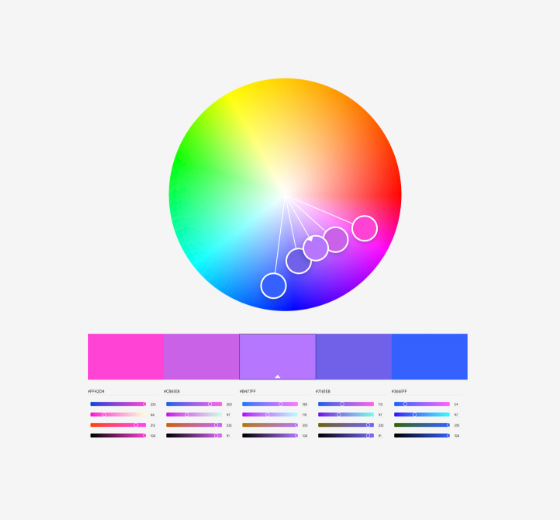
Use a colour wheel to choose colours like a pro.
Have you ever wondered how designers find the perfect colour combination for a project? They use colour theory – a practical combination of art and science used to determine what colours go well together, with the help of a colour wheel.
You can create a variety of colour scheme options by using the Adobe Color tool. Explore different colour combinations and pair them in different ways to build a cohesive colour palette for your images that will engage your audience.
3.
Pay attention to balance.
The art of balance in social media image design is tricky to master, but it’s well worth the effort. A great way to think of balance is to imagine that each element of your design has ‘a weight’ behind it. Put another way – if you placed your image on a balance scale, would it tip to one side?
Symmetrical balance
Symmetrical balance creates a feeling of harmony, which is great for illustrations, drawings, blog graphics, photographs and much more.
Asymmetrical balance
Asymmetrical balance creates tension through contrast and can be visually interesting when done correctly.
Balance is very important when you are choosing images from a stock library like Adobe Stock. Thinking about different ‘weights’ can help you to pick the most effective photos from a large selection.

4.
Create visual hierarchy.
Your social media image is made up of multiple elements, each of which is important to your overall message. The right visual hierarchy will make sure that you get the most important message across first.
Establish the most crucial element as the focal point and then use the other design principles in this article to make it stand out.
Work out what the most important message is and put it in the biggest font. Once that’s in place, you can start to build your second or third pieces of information in without taking away from the overall goal.
5.
Use lines to your advantage.
Our eyes follow the lines and curves in any image or photo – in photography these are known as ‘leading lines’. It’s very useful to think about how the lines in your images draw the eye to key elements, like your product or key messages and headlines.
When adding lines to your image, pay close attention to where they draw the viewer’s eyes. Aim to create a logical path that the viewer can follow along with until they come to the point that you intended them to. One of the most effective ways is to put your main subject at the end of a leading line.
Leading lines are an excellent way to tell a story with your images. By placing them at key points of your composition, you can influence the way people will view your photo or illustration, linking together important elements and guiding viewers through the scene.

6.
Make it easy to read.
You’ve applied all the design principles we’ve covered so far. You selected the perfect balanced image, added hierarchical messaging in contrasting fonts, with just the right colour palette. Unfortunately, the text fades into the background, making it difficult to read. How frustrating!
Make sure all your hard work isn’t undermined by ensuring that the copy is easy to read.
Create enough colour contrast to make the text legible and choose background images with clear space for copy.
Adobe Stock is your friend here. It has a filter option that enables you to ensure your message won’t be lost in the mix.

7.
Consistency is key.
The final principle to apply is to keep things consistent when it comes to fonts, colours, backgrounds and imagery styles. That will make your social feed more impactful and reinforce your branding. Create a set of consistent layouts for your social media posts – to make it easier, Adobe Express has a whole library of social post templates you can customise or use for inspiration.
Choose your Creative Cloud for teams plan.
All plans include the Admin Console for easy licence management, 24/7 tech support, unlimited job postings on Adobe Talent and 1 TB of storage.
Single App
Your choice of one Adobe creative app such as Photoshop, Illustrator, lnDesign or Acrobat Pro.*
BEST VALUE
All Apps
Get 20+ Adobe creative apps including Photoshop, Illustrator, InDesign, Adobe Express, XD and more.
Call 1800-946-197 or Request a consultation
Questions? Let's chat.
Buying for a large organisation? Learn about Creative Cloud for enterprise
* Acrobat Pro, Lightroom and InCopy single apps come with 100 GB storage.