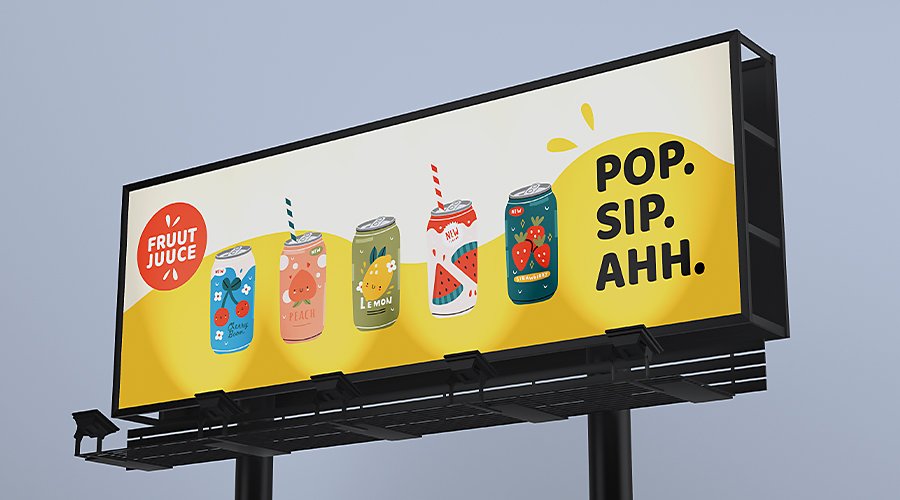
Create billboard designs that demand attention.
Explore how to use these classic advertising spaces to affect a large audience with billboards that send a strong message.

Why billboard ads matter.
If you’ve been in a car or on the bus, you’ve seen a billboard. These large physical ads are seen by millions of commuters every day. Billboards live in high-traffic areas such as highways and large intersections, as well as near businesses that want to attract traffic. Because of their size, they’re hard to miss. More than 70 per cent of people consciously look at billboard advertisements and more than one-third report looking at outdoor advertisements most of the time they pass one.
While digital ads are prevalent due to the increased time people spend with screens, print ad campaigns remain relevant wherever physical customers are present. In the digital world, brands are constantly competing for attention and clicks. On the road, drivers and commuters have fewer distractions.
A busy highway or intersection can garner thousands of impressions every day. Commuters stuck in traffic during rush hour have more time to stare at billboard ads and people travelling along the same roads daily get constant exposure to the same ads. Industries that remain hyper-local and cater to traditional audiences also prefer the tangible and concrete qualities of billboard advertising. Roads are accessible to everyone, even to crowds who don’t frequent the Internet or watch television, so ads that appear there can always make an impact.

Billboards for a new generation.
Digital billboards combine the old and new. Physical, printed billboard ads show only one advertisement for weeks at a time, whereas digital billboards share real estate with multiple advertisers. They quickly cycle through multiple digital billboard designs and are commonly found near slower traffic, where pedestrians or drivers can see a variety of ads in one place.
The frequency and variety of advertisements on digital billboards can also change overnight. Digital signage is flexible to adapt to current events and push sales in specific directions at the click of a button. In addition, digital billboard designs can include videos, countdown timers, live traffic or weather displays and other rotating messages that prompt pedestrians to stop and admire them.
Billboard design tips.
The best billboard designs are creative and attention-grabbing — they get the message across even though they’re only viewed for a moment. The message will vary depending on the billboard advertisement’s placement. People stopped at a red light have more time to read an ad than people speeding past on a highway. Your graphic design should factor in the location and complexity of the message. Keep these things in mind as you design:
Explore contrast and typography.
Help your billboard ad stand out by contrasting the colours of the font, image and background. Because they’re outdoors, billboards also need to stand out from surrounding buildings and nature so they remain visible in different types of weather and lighting.
The typography and specific fonts you use for billboard designs should be large enough to read from any viewing distance and contrast well with the background image. A bold sans serif typeface that reflects your brand identity and maximises contrast is a good choice. Or search in font families that your brand already uses and pick a bold or black variation. Use fonts that you can run large enough so that viewers don’t need to walk or drive closer to make out the details.
When merging all the elements together, opt for a simple design that minimises clutter. A white font on a colourful background, for example, creates a vibrancy that draws in the eye.
For organisations that want to preserve a sophisticated brand identity but are well known for light, thin or cursive fonts, it’s important to prioritise readability. Find a bolder font that works with your brand guidelines, make the logo larger or use background images to capture your brand aesthetic. People should drive away knowing the ad was for your brand, even if the font isn’t the same cursive you use elsewhere.

Use high-quality imagery.
First and foremost, images and photos in billboard designs should be high resolution. Whether you’re working with print or digital billboard designs, you don’t want pixelation to affect the impact you’re trying to make. While many image file formats use raster files that pixelate if you enlarge them beyond their original dimensions, you can use Adobe Illustrator to create large-scale artwork in the vector art format that will look crisp for any billboard ad size.
You can also edit and crop your image or make colour corrections to ensure that it looks good on your billboard canvas. Adobe Fonts and Adobe Stock have a wide variety of premium text and stock image options that you can edit and scale up for billboard campaigns and any type of large signage.
Look sharp from any distance.
Optimise your billboard design for locations high up and far away from pedestrians and drivers. Use the entire height and length of a highway billboard. Place text in creative ways to tell a story with a dramatic image. For a witty and larger-than-life effect, extend photos or graphics beyond the standard billboard rectangle with extra panels. Digital billboard designs don’t need much help to stand out because they receive bright lighting that automatically sets them apart from their surroundings.
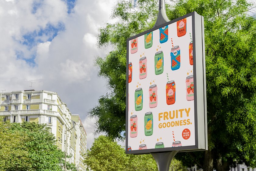
People view large posters at bus stops and they see wraps on the sides of buses and trucks closer up or from an angle, so consider altering your billboard design for different types of outdoor advertising. Using vector art ensures that images and text will appear clearly at any scale and wherever you decide to repurpose your billboard ad.

Writing text for billboard ads.
Like a giant business card or flyer, the copy on a billboard ad should clearly reflect the company or brand identity and include a call to action. Whether it’s to promote a specific product or service, the writing should be concise and memorable.
Here are some tips to keep in mind when you create a billboard ad:
Use a short tagline: Seven words or fewer is all it takes to create a catchy tagline. Avoid adding any fine print that could distract or be unreadable.
Be family friendly: Billboard advertisements are visible to all commuters, so make appropriate content for audiences of all ages.
Include contact information: Add a phone number, website, address or directions to your business on the billboard that potential customers can refer to for more information.
Localise the message: Tailor your advertisement to the specific city, state or area where the billboard is located. Add a personal touch or shoutout to a city to show customers that the brand aligns with what they already love.
Or stand out by breaking the rules. Sometimes going against expectations sticks with an audience more. A billboard that just features a website and logo may drive curiosity with its simplicity.
Whichever creative avenue you take, Adobe Creative Cloud is an option to give your business industry-leading apps that will help you and your team design bold billboards and other marketing materials. Fuel creativity, organise your work, share your assets and build ads that draw the eye.
Choose your Creative Cloud for teams plan.
All plans include the Admin Console for easy licence management, 24/7 tech support, unlimited job postings on Adobe Talent and 1 TB of storage.
Single App
Your choice of one Adobe creative app such as Photoshop, Illustrator, lnDesign or Acrobat Pro.*
20% off the 1st year
All Apps
(excl. SST)
Get 20+ Adobe creative apps including Photoshop, Illustrator, InDesign, Adobe Express, XD and more.
Introducing Creative Cloud for business Pro Edition. All the apps teams love, now with unlimited Adobe Stock. Learn more
Call +65 3157 2191 or request a consultation
Questions? Let’s chat.
Buying for a large organisation? Learn about Creative Cloud for enterprise
* Acrobat Pro, Lightroom and InCopy single apps come with 100 GB storage.