Students and teachers
฿761.84/mo
Save over 60% on 20+ Creative Cloud apps — includes Illustrator. Learn more
Creating a symbol that instantly summarizes a brand can be a daunting task, both in terms of design and technical considerations. Discover insight and advice on how to grow your skill as a logo designer.
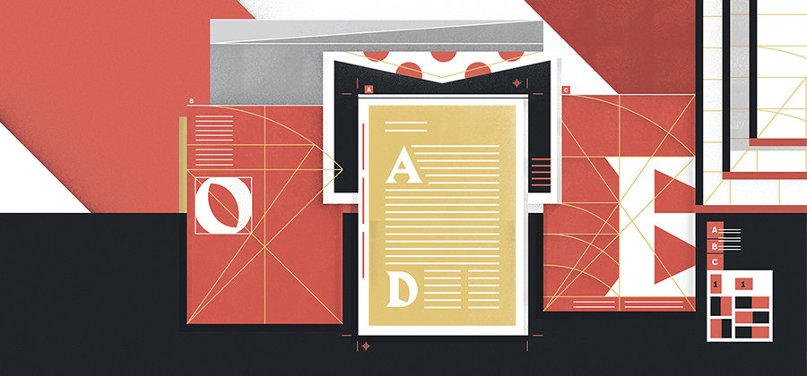
Even a moderately successful logo can tell you a lot about a brand at a glance. Great logos are some of the most recognizable and resonant symbols on the planet.
“With logo design, you’re telling a story in a very small space,” says designer Dylan Todd. “Think about what you’re trying to say and find the best way to boil it down, whether it’s via graphics or type.” Understanding logo design will help you steer clear of bad ideas so you can make a big statement in that small space.
A professional logo needs to reflect a company’s mission, values, and spirit. Asking about these things should be an early part of a designer’s process when creating a custom logo. Getting to know the client or company is the first step toward creating the perfect logo for them.
“I start with a questionnaire I’ve developed to talk about what a client wants to say and who their audience is,” says Todd. Graphic designer Jimmy Presler says, “Ask about the feeling they’re looking to portray and the specific goals they have for the project. The more reference images you can get, the better.” You’ll be better able to hit the mark if you understand a client’s vision and identity before you begin designing the logo. Discover their story, and tell it with a single mark.
“You’re a commercial artist there to serve the demands of commerce,” says Todd. “The person hiring you has the vision you’re trying to execute. Sometimes you can give them something that surprises them, but you don’t want to give them something counter to the story they’re trying to tell.”


When starting a logo, Presler suggests expanding on a single idea. “I’ll see how many different ways and how simply I can draw a rabbit head, for example,” he says. “I’ll keep iterating on the core idea and then identify which of those is more successful.”
Todd does his early sketches digitally. “I open up Adobe Illustrator and start typing things out and chopping letters up and moving things around — it’s more like sculpture than drawing,” he says.
One of his favorite methods for refining a logo concept is to bend, shape, and distort text with curvature tools. With a Bézier curve, designers can make clean arcs based around fixed points. “It opens up a whole new avenue for typefaces and logo design,” he says.

Learn the basics of creating curves.
Find out how to make curves with lines, type, or images using Illustrator’s curvature tools.
Todd also emphasizes that knowing your tools is crucial to creating good logos. He has spent more than a decade honing his Illustrator skills. “Familiarize yourself with your tools like you’re a carpenter,” he says, and suggests that designers take the time to experiment with the full complement of tools in Illustrator.
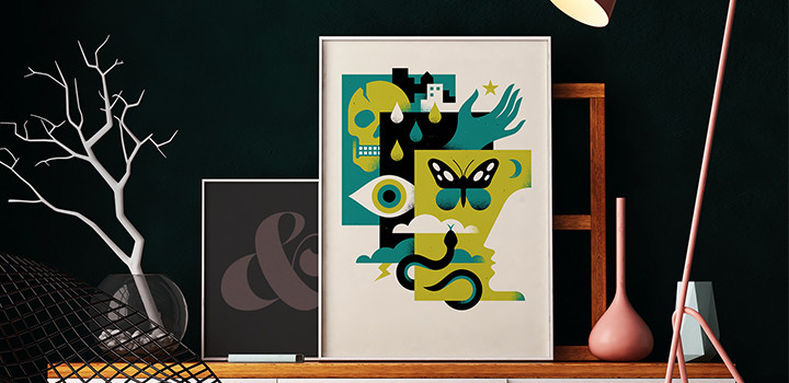
Get started with Illustrator’s tools.
Improve your understanding of Illustrator’s toolset to help you on your logo creation journey.
He also noted that while there are no hard-and-fast rules in design, new designers should take time to learn the ropes. “You need a good base in the fundamentals before you start trying to break rules,” says Todd.
It’s a logo’s job to be recognizable in an instant. Legibility is key, so be wary of overdesigning. “Show it to people who aren’t designers,” Presler says. “Show it to your mom, your dad, or your neighbor. Something might look cool, but if no one can read what it says, you need to rethink your approach.”
“Show it to people who aren’t designers. Show it to your mom, your dad, or your neighbor. Something might look cool, but if no one can read what it says, you need to rethink your approach.”
Logos usually shouldn’t look like coats of arms, government seals, or archaic devices. There’s a good reason why Cadillac’s logo went from looking like an ornate coat of arms to a more stylized striped shield: a crest with a bunch of indecipherable bits makes you squint to find details. A logo where those details have been simplified to their essence more directly conveys a sense of brand identity.
Simplicity is difficult. Alyssa Newman, who is also a digital painter, acknowledges that for artists and designers who thrive on detail, it can be very hard to stick with simple design elements. “I ask, ‘How can I convey this badge or icon or logo effectively through really basic shapes?’” The artistry in beautiful logo creation is found where simplicity and creativity meet.
Logos have to look good when scaled up, scaled down, or reproduced on a variety of surfaces like business cards, letterhead, company cars. They need to work in color, black and white, and gray scale. Vectors are a helpful tool for scaling to meet these different needs.
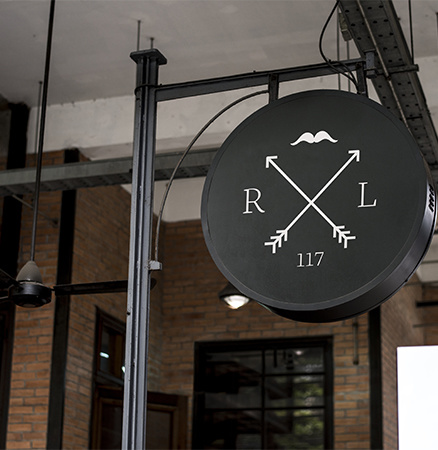
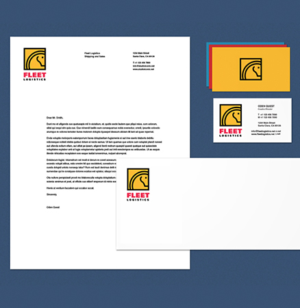
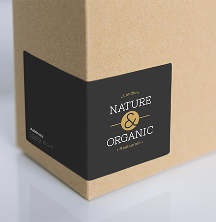
“Instead of a fixed number of pixels, vectors are based on points on a grid,” Todd explains. “This makes them infinitely scalable, and a vector file will look the same whether it’s printed on business cards or a billboard. It’s a great way for logo designers to avoid resolution issues and make a company logo more adaptable.”
Clients usually want eye-catching, unique logos that set them apart from the crowd. To achieve that, Todd advises against simply following logo design trends, and cautions against some fonts that have been overexposed. “Futura, Helvetica, or Gotham are nice fonts, but you see them everywhere,” he says. “The last thing you want is to have a logo that looks like something you’ve already seen.”
To avoid repetition and help a client stand out, don’t be afraid to be unconventional. A creative logo can be just what a client needs. “Everything has been done before,” says Newman. “When it comes down to a minimalist logo or icon, you also want to keep it as authentic as possible. So don’t be afraid to get a little weird with it.”
However, don’t pressure yourself to make the next instantly recognizable brand icon, either. The Nike swoosh, the Apple logo, and the Amazon smile — great examples for logo design inspiration — all evoke a very specific feeling. However, they do so only because they’ve earned their iconic status over the years by being smart design that hasn’t needed to be replaced as styles change.
A logo may or may not become iconic. That’s out of the designer’s control. What is in your control is legibility and usability. To get started on making a great logo, check out Adobe’s logo design tool.
Create logos, icons, charts, typography, handlettering, and other vector art.
Picking the right font: Serif vs. sans serif.
Choosing between serif or sans serif fonts means considering user experience, attitude, and history.
Learn about the versatility of this file format and discover how to use it in your design work.
Deciphering the art of ambigrams.
Explore ambigrams, a word or design that retains meaning when viewed from another direction.
Learn about kerning and how to use it to improve your typography.
Adobe Illustrator Single App
Get Illustrator as part of Creative Cloud for just ฿876.33/mo.
Creative Cloud All Apps
Get Illustrator and the entire collection of creative apps for just ฿2,211.69/mo.
Learn more ›
฿761.84/mo
Save over 60% on 20+ Creative Cloud apps — includes Illustrator. Learn more
฿1,468.04/mo
Get Illustrator and 20+ Creative Cloud apps plus exclusive business features.
See what's included | Learn more