Explore design tips and innovative examples to inspire engaging annual report designs.
Annual reviews can inform and inspire.
An annual report offers a comprehensive overview of a year’s worth of company business. It can be a challenge to design a business report people enjoy reading, but a good annual report can inspire trust and generate excitement both inside and outside an organisation. With concise storytelling, strategic data visualisation and eye-catching design, you can create a report that delivers motivation, inspiration and thorough information.
Start with a story.
Describe the company and its mission in a brief introduction. This might come in the form of a letter from the CEO or chairperson of the board of directors. Outline strengths and weaknesses, triumphs and challenges of the previous year and present key goals for the coming years. What does the company want to achieve and how will it measure success? If it serves the story, you might dig deeper into the company’s history or founding.
Determine the best way to present that story.
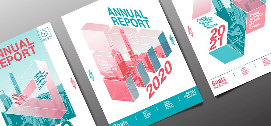
Most annual reports are printed as books or offered online as PDFs, but there’s plenty of room to explore. Because people do judge books by their covers, the report cover design is important. Through photography or graphic design elements, the cover page should establish the themes, typography and colour palette that carry through the whole report.
Even the shape of the cover can offer room for creativity. The Pirelli Tyre Company produced an annual report for 2013 that was both book and sculpture. The spine of the case that held the report was cut so the book could rest at an angle, giving it the appearance of being perpetually in motion.
Sometimes less is more. The cover design for this 2019 annual report for Neurama, a company focused on ageing, includes several brightly coloured circles on a light background with no text. The circle theme continues inside, coupled with vivid portrait photography.
To see a truly creative approach, check out the annual report for Ablynx, a biopharmaceutical company. The creative agency Soon developed customised 3D-printed infographics for the report, complete with miniature figures and then photographed the tiny scenes to illustrate data.
Make data meaningful with graphic design.

You don’t have to go as far as 3D-printed graphs, but it’s important to present data in a clear and compelling way. This is especially true for negative findings. Be clear about the facts and then pivot to solutions. Clean iconography, strategic use of colour and clear labelling can bolster your argument.
To avoid overwhelming the reader with graphs, create infographics to show data in the most reader-friendly way — which you can make in an app like Adobe Illustrator. Begin by sketching out different ways you might visualise the data. Develop a visual hierarchy, so the most important information stands out and arrange the information in a way that guides the reader’s eye through the story you’re telling.
Design for clarity.
Never forget that the primary purpose of every annual report is to convey important information. An app like Adobe InDesign is one way you can create the page layout you want from scratch. You can also use an annual report design template from a resource like Adobe Stock. As you’re designing the pages of the annual report, keep in mind these basic design principles.
- Begin with a summary page that sets up the information to come.
- Use visuals to capture the attention of your audience and clearly separate different sections.
- Choose typography that makes the report easy to read and understand. Simple fonts are best.
- Use white space to add clarity and emphasize the most important points.
- Make sure every photo or graphic adds something new to the content.
- Edit copy down to its essential core. Where possible, use a graph or chart in place of a paragraph of information.
- If you’re going to use one colour, stick to it. If you choose multiple colours, use no more than three.

Annual report design inspiration.
No matter what type of annual report you’re making, you can find inspiration and discover design trends in these annual report examples from Behance.
Corporate report
This Associated British Foods print design by Beth Sicheneder gets right to the heart of the matter by balancing photographs and text with clear iconography and data visualisation. Note that the first page offers a succinct company profile and mission statement.
Nonprofit report
This annual report design concept for the Toronto Symphony Orchestra inspires as it informs. Expressionist brushstrokes throughout the report represent the dynamic music of the orchestra. Designer Eunice Joaquin explains, “The concept connotes passion, fluidity, movement and freedom.”
Creative design
When Global Fund for Children rebranded, the company asked the design team to include an annual report in the rebrand. Graphic designers refreshed the visual identity and incorporated new iconography and bright colours into a visually stunning presentation.
Creative packaging or formatting
JurongHealth Campus tasked Darling Communications with creating an annual report that celebrated the organisation’s eight-year journey. The result, Our Jotter Book, uses a three-ring binder to combine full-length images, hand-written notes and sketches to tell the story of the hospital.
You don’t have to spend a fortune printing and binding your next annual report. Check out this design for Amnesty International Hong Kong in 2011. Constructed as a newspaper to highlight the 50th anniversary of the organisation, the report begs to be picked up and scanned like the day’s news. Bright yellow highlights draw the eye to the most important details and numbers.
Online and interactive reports
Online reports are greener than printed reports and companies can measure how often people view them. They also allow for more creativity in design and presentation. This 2014 annual report for Microsoft IT prioritised a responsive user experience across devices. Readers engage with the company’s success stories through animated stats, interactive graphics, illustrations and original photography. This 2012 report for the Holland Board of Public Works includes animation and a water usage quiz.
Team up for success.
Design apps, like those available in Adobe Creative Cloud for teams, can help you to create icons, charts and graphs to make your case. And a programme like InDesign, with in-app tutorials, can help with the layout of your report.
To make use of your annual report’s creative assets in other design projects, store them in a shared resource. Creative Cloud Libraries is one option for this, ensuring assets are quickly and easily accessible to your whole team.

More topics you might be interested in…
Find creative ways to grow your business.
CUSTOMER STORIES
See how Adobe customers are building great experiences with Creative Cloud for teams.
BEST PRACTICES
Browse the latest guidelines in effective design, marketing and more.
TUTORIALS
Take your creativity to the next level with step-by-step tutorials.
Choose your Creative Cloud for teams plan.
All plans include the Admin Console for easy licence management, 24/7 tech support, unlimited job postings on Adobe Talent and 1 TB of storage.
Single App
Your choice of one Adobe creative app such as Photoshop, Illustrator, lnDesign or Acrobat Pro.*
BEST VALUE
All Apps
Get 20+ Adobe creative apps including Photoshop, Illustrator, InDesign, Adobe Express, XD and more.
Introducing Creative Cloud for business Pro Edition. All the apps teams love, now with unlimited Adobe Stock. Learn more
Call +44 203 0277 764 or request a consultation
Questions? Let’s chat.
Buying for a large organisation? Learn about Creative Cloud for enterprise
* Acrobat Pro, Lightroom and InCopy single apps come with 100 GB storage.