A guide to color meaning.
Learn how to use color psychology to complement and amplify your message. Once you understand the meanings of colors, you’ll be well on your way to creating impactful designs that evoke the right emotion.
Everything you need to pick a winning color scheme.
One fascinating aspect of color theory is the psychology of color, which explains how people interpret colors and ascribe meaning to them. Color influences how you feel about a product, how you make decisions, and how you interpret messages.
Because color is such a powerful tool for artists and designers, learning how to harness it is a surefire way to set yourself up for success. Whether you want to create a new logo design or mock up a website homepage, knowing the meaning of colors and their associations will help you pick the best colors to tell your story.
Create with all the colors of the rainbow.
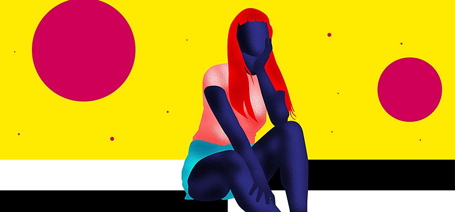
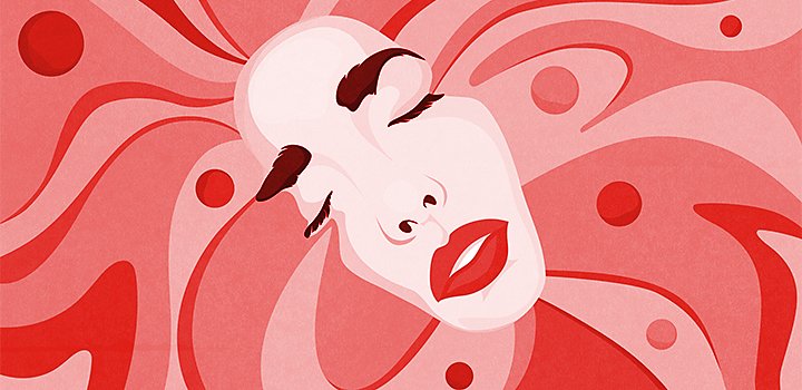
Red
Red is a very strong color with associations both positive and negative. On the positive side, red symbolizes strength, passion, and confidence. But it can also be aggressive, symbolizing anger, alerts, or danger. This doesn’t mean you should steer clear of the color altogether; you can use both sides of the color red and its strong connotations to your advantage.
“If you’re designing a UI or UX interaction, for example, don’t use blue on your Delete button,” says UI and UX designer Aliza Ackerman. “You want a color that acts like a warning and says, ‘You’re about to delete this. Are you sure you want to do that?’”
Red can help push people to make decisions faster. Almost every fast food brand has red in its color palette, because red elicits a physical response; it makes people hungrier and stimulates the appetite. Similarly, companies often choose red to announce a sale because it brings urgency to the message.
Orange is bright and full of energy. Happy, playful, fun, powerful, and attention-grabbing are all attributes that you can infuse into your brand or message with the color orange. A lot of tech brands use orange, possibly because it channels the optimism and youthful energy a tech startup might want to convey.
Yellow connotes cheerfulness and adds a pop of refreshment to your palette. “It’s a very strong color and really draws the eye, so I use it sparingly as an accent color most of the time,” says Ackerman. Like red, it can also act as a siren for alerts and bold, informational messages.

Green
Green is one of the most versatile colors in the color wheel, thanks to its widespread use in everyday life. Money, trees, food, and traffic lights all use green, and the shade of green you choose can convey vastly different messages. Its ties to nature can lend your natural food brand or yoga studio an organic, healthy feel, while a brighter hue is often used in financial applications. “Toned down, it can be really soothing and relaxing, but if it’s a super-vibrant green, it’s more refreshing and energetic,” adds Ackerman.
Blue is calming, soothing, and friendly. It’s often a fail-safe, neutral choice and can take on a professional or friendly tone, depending on how you use it. Blue is a trustworthy color, and scores of brands in all industries capitalize on this color to build a positive image for themselves.
Alternatively, blue can evoke sadness, evidenced in common phrases such as “feeling blue,” or “having the blues.” This is partially because blue is on the cold end of the color spectrum, as opposed to warm colors like red and orange. But again, different shades of blue evoke different emotions; keep this in mind when you choose a palette.
“Purple is a very elegant color. It signifies loyalty, so any time you want to build trust, the color purple is a great option,” says Ackerman. In addition to trust, purple is often seen as mysterious. This rich color is traditionally feminine and also has ancient ties to royalty and luxury.
A color’s historical implications should by no means dictate how you use it, but you should be aware of how deeply ingrained or even subconscious associations like these can unintentionally alter your message.

Pink
“A lot of brands that are geared toward feminine audiences use pink,” says Ackerman. By turns nurturing and playful, pink is a powerful color that often makes people think of passion, love, and youth. An intense hot pink packs more urgency, while a minimal, dusty pink is more calming and neutral.
Pink is a great example of how color meaning can change with society over time. Once thought of as a “boy” color, pink is now largely associated with femininity.
White often symbolizes simplicity, purity, and cleanliness. Often used to give contrast to your designs, white provides a clean, neutral slate that keeps you from crowding your design too much. “It’s there to give breathing room to other elements and to be a background to showcase something you want to bring more attention to,” says Ackerman.
Neutral and natural, brown “has some warmth to it and a feeling of security,” says Ackerman. It’s a very earthy color that will effortlessly evoke elements from the natural world. If you’re going for an organic, wholesome feel, brown is an excellent color to include in your palette.
A true neutral shade, gray is almost always used as a secondary color or accent. It can be used to temper or complement any color, or to serve as a quiet background. Try not to block out your design in all gray, as that can tip the balance from neutral to dreary and boring.

Black
Black is a power color that adds gravity and strength to your message. Used sparingly, black can help your design look polished and minimal. Black backgrounds are an increasingly popular color choice in web design, but be careful that it doesn’t make your interface too dark and heavy.
There are certainly occasions where a bold splash of black tells your story like no other can. If you need to add an edge to your design, or a sophisticated and serious tone, black is a classic that can’t be beat.
Tips to hone your color-selection skills.
Different cultures ascribe different meanings to colors.
We like to think of color as a universal language, but this isn’t always the case. Colors don’t always translate the same across different cultures and countries. “Culturally, in America the color white symbolizes purity, innocence, and simplicity. But in China, white is associated with death, and people wear white to funerals,” points out Ackerman. If you design for a global audience, look into how other cultures perceive colors to avoid accidentally sending the wrong message.
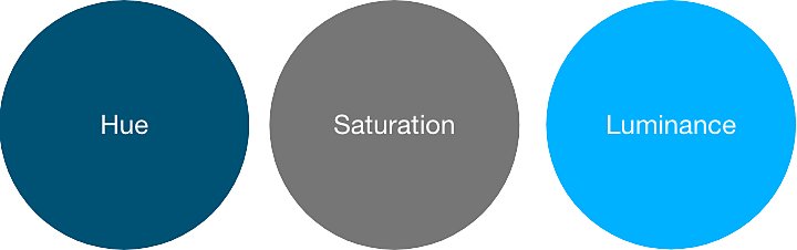
Shade matters just as much as color.
There are three elements to color: Hue, saturation, and luminance. When you make a color palette, the shade and tone of your color matters just as much as the color you choose. A dark blue navy is bold, strong, and more masculine, while a light blue or baby blue is airy, bright, and youthful. When you pick a color, think of the many different shades it encapsulates and the different moods they create.
Speaking from a UX perspective, Ackerman often opts for softer shades, especially when it comes to black and white. “I go a couple brightness notches down from pure black or white. I always try to use a soft gray or a slightly off-white, because it’s easier on people’s eyes, especially on screens.”
Experiment with color combinations.
Colors can take on new significance when paired together. Color combinations can boost your message, detract from it, or make a new meaning entirely; the best way to get better at selecting the right palette for the job is to experiment. Try the color palette generator from Adobe to make your own color scheme and learn about the relationship between different color combinations.
High-quality designs start with smart color theory. Now that you know the psychology behind colors, you’re ready to put the color wheel to work on some of your own designs.
Contributor
You might also be interested in…

Understanding black and white as colors.
Investigate the science of colors and see what sets black and white apart.

Learn how to colorize black-and-white photos.
Colorizing photos can bring the past to life. Explore how to get started in this introduction.

Create professional-quality backgrounds for any kind of media.
Discover how to craft professional-quality backgrounds for presentations, desktops, and other projects.

How to become a professional illustrator.
Get tips on portfolio creation and art presentation to help you kick off a new career.

Creativity for all.
Photography. Video. Design. UX. 3D and AR. Creative Cloud has everything you need, wherever your imagination takes you.