Welcome to this two part Typography in Illustrator tutorial.
Hi, I'm Nigel French.
In part one I'll guide you through designing a logo for a community theater group.
We'll look at choosing the right font, adjusting the space between the letters, the space between the lines and the alignment of type.
And we'll also pick up some handy tips and tricks along the way.
Let's get started.
Setting up the typography workspace and initial logo concepts
To have the panels I need close to hand, I'm using the Typography workspace.
And to reduce clutter, I've collapsed the panels.
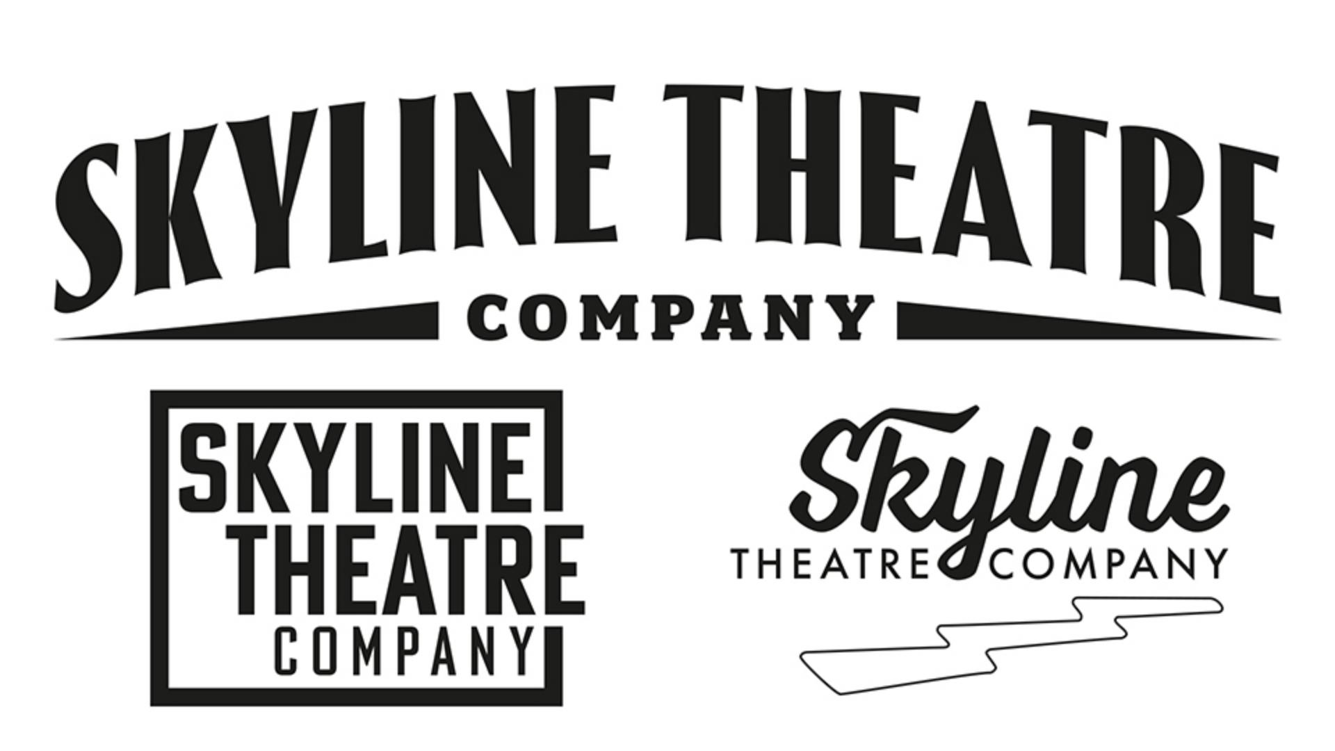
Here are some different approaches to creating the logo.
Adjusting leading, alignment, and type hierarchy
In the first example for a solid type block, I have the letters in uppercase and I'm using a condensed Bold sans serif.
To bring the lines closer together, let's adjust the leading on line spacing.
This is currently set as Auto, which by default is 120% of the type size.
On the Paragraph panel, choose Justification... and reduce that to 80%.
I'll convert the type object from point type to area type.
Now I can Justify all lines across the width of the type area.
Select the word Company and on the Character panel halve its size.
For contrast, use a Light weight.
To make the line spacing optically even, hold Option or Alt and press the down arrow a couple of times to increase the leading just for that line.
Building staggered layouts with guides and pathfinder
On my next artboard, I have a variant with a staggered alignment.
Here I'm using three separate pieces of point type for flexibility.
I'm using guides to align the different pieces of type.
The vertical stand of the K is aligned with that of the T, the left edge of the C with the left edge of the H and the Y of Company with the right edge of the R and the E.
When designing logos, I like to draw colored rectangles on a separate layer to ensure consistent spacing between the elements.
And when the spacing is how I want it, I hide these shapes.
Using these shapes as guides, I've added a box around the type.
Now I don't want this box to fully enclose the type.
So, what I'm going to do is first of all select it and then come to the Object menu and to Path and choose Outline Stroke.
That now gives me a filled rather than stroked shape.
And I will now draw a separate rectangle over that, holding down the Shift key, switching to my Selection Tool, I'll select both and then I can come to the Pathfinder options on the Properties panel and subtract the topmost shape.
Let's now take a look at a different approach, this one using a script typeface.
Exploring script fonts, kerning, and glyphs
When working with scripts, it's important to use metrics automatic kerning, so that the letters fit together in the way they were intended.
I'm combining this script with a classic geometric sans, Futura.
To fit the words either side of the Y, I'm going to replace the word space with an Em Space.
A font includes multiple spacing widths, and the Em is the widest.
To add personality, I'm going to take advantage of contextual alternates.
Voltage is a typeface that comes with an ornament set.
I'm going to duplicate that piece of the type, holding down Option or Alt while I drag away from it.
I'll then select it and replace that with a single character and then select that character.
Now come to the Glyphs panel.
It's here though I can access all of the characters available for a specific font.
On the Show menu, I'll change that to Ornaments.
I'll increase my view size, so I can see what I'm getting, and then double-click on this glyph to replace my currently selected character.
To make it easier to scale and move this, I'm going to convert it to outlines.
Creating an art deco logo with tracking and envelope distortion
For my last version, I'm going to use an Art Deco inspired font.
It's called Thrillers and it's available on Adobe Fonts.
For a more spacious look, I'm going to add some positive tracking.
And then to add some flair, I'm going to add an Envelope Distortion.
To keep the letters upright, I'll choose Arch rather than Arc.
And for a more gentle arch, I'm going to reduce the amount of Bend to 15%.
Let's now move that down a bit.
And on the Layers panel I have a couple of triangles I've added either side just to balance the composition.
Now when everything is the way I want it, I'll drag a marquee over everything to select it and then choose Group, so that I can in the future move and scale this as one unit.
Good work.
Now that we have the logo ready, in part two we'll incorporate it into a promotional flyer.
What you’ll learn
Choose fonts and refine spacing
The right typeface defines your logo’s personality. Choose one that’s bold, classic, or distinct, like an Art Deco style. Then fine-tune letter and line spacing with precise numerical adjustments and visual refinements to create a balanced, polished look.
Arrange and align text
Text arrangement shapes the logo’s impact. Stack words for boldness, stagger text for movement, or center everything for structure. Adjust justification and alignment to create dynamic, well-balanced logo lockups.
Add stylish details
Typography is more than just letters — it’s an art form! Use ornaments as graphic elements, frame the design, or experiment with decorative styles like arched text or Art Deco details to bring each variation to life.
You can control how Adobe websites use cookies and similar technologies by making choices below. But note that if you disable cookies and similar technologies entirely, Adobe websites may not function properly.
Cookies are small text files stored by your web browser when you use websites. There are also other technologies that can be used for similar purposes like HTML5 Local Storage and local shared objects, web beacons, and embedded scripts. These technologies help us do things like remembering you and your preferences when you return to our sites, measure how you use the website, conduct market research, and gather information about the ads you see and interact with.
You can make choices in the menu below about what cookies and other technologies you want us to use on Adobe sites when you visit them from this browser. You can always change those choices later by clicking on the Cookie Preferences link at the bottom of the page.
If enabled:
We can improve your experience by tailoring the site and the content to things we think might be of interest
We can better keep track of your preferences — like what language you prefer to use
We will better understand your likely interests so we can provide you more relevant Adobe ads and content on non-Adobe websites and in non-Adobe apps
It will help us improve the performance of our website and those of our partners who use the Adobe Experience Cloud
If disabled:
We won’t be able to remember you from session to session so the experience may not be tailored to your interests
You’ll still have access to the content of the site but certain features that depend on cookies may not function
You’ll still see ads, they just may not be as relevant to you
General information
You can control how Adobe websites use cookies and similar technologies by making choices below. But note that if you disable cookies and similar technologies entirely, Adobe websites may not function properly.
Cookies are small text files stored by your web browser when you use websites. There are also other technologies that can be used for similar purposes like HTML5 Local Storage, web beacons, and embedded scripts. These technologies help us do things like remembering you and your preferences when you return to our sites, measure how you use the website, conduct market research, and gather information about the ads you see and interact with.
You can make choices in the menu below about what cookies and other technologies you want us to use on Adobe sites when you visit them from this browser. You can always change those choices later by clicking on the Cookie Preferences link at the bottom of the page.
If enabled:
We can improve your experience by tailoring the site and the content to things we think might be of interest
We can better keep track of your preferences — like what language you prefer to use
We will better understand your likely interests so we can provide you more relevant Adobe ads and content on non-Adobe websites and in non-Adobe apps
It will help us improve the performance of our website and those of our partners who use the Adobe Experience Cloud
If disabled:
We won’t be able to remember you from session to session so the experience may not be tailored to your interests
We’ll still count your use of our site and services
You’ll still have access to the content of the site but certain features that depend on cookies may not function
You’ll still see ads, they just may not be as relevant to you
Operate the site and core servicesOperate site and measure engagement
Always active
These cookies are required, and they are used to enable the site and related services core functionality. Without them the site could not operate, so they cannot be disabled.
These cookies enable the site and related services’ core functionality and collect statistics about user engagement, such as counting active use to help us understand trends. These cookies cannot be disabled.
Measure performance
These cookies are used to analyze site usage to measure and improve performance. Without them Adobe cannot know what content is most valued and how often unique visitors return to the site, making it hard to improve information we offer to you.
These cookies are used to analyze site usage to measure and improve performance. Without them Adobe cannot know what content is most valued, making it hard to improve information we offer to you.
Extend functionality
These cookies are used to enhance the functionality of Adobe sites such as remembering your settings and preferences to deliver a personalized experience; for example, your username, your repeated visits, preferred language, your country, or any other saved preference.
Personalize advertising
These cookies are used to enable Adobe and our partners to serve ads more relevant to your interests. Without them you will still see ads, but they might not be as relevant to you.
Personalize advertising
These cookies are used to enable Adobe and our partners to serve ads more relevant to your interests. Without them you will still see ads, but they might not be as relevant to you.