Looking to make a scroll-stopping digital ad that's simple but effective?
My name is Sydney Michuda, Creative Director of Super Creative.
In this video, I'll walk you through a quick, easy process to make ads that stand out and drive action.
Setting up the digital ad document
Create a new document and set the artboard to your ad size.
Let's use a vertical 250 px x 360 px and make sure the Color Mode is RGB Color for digital.
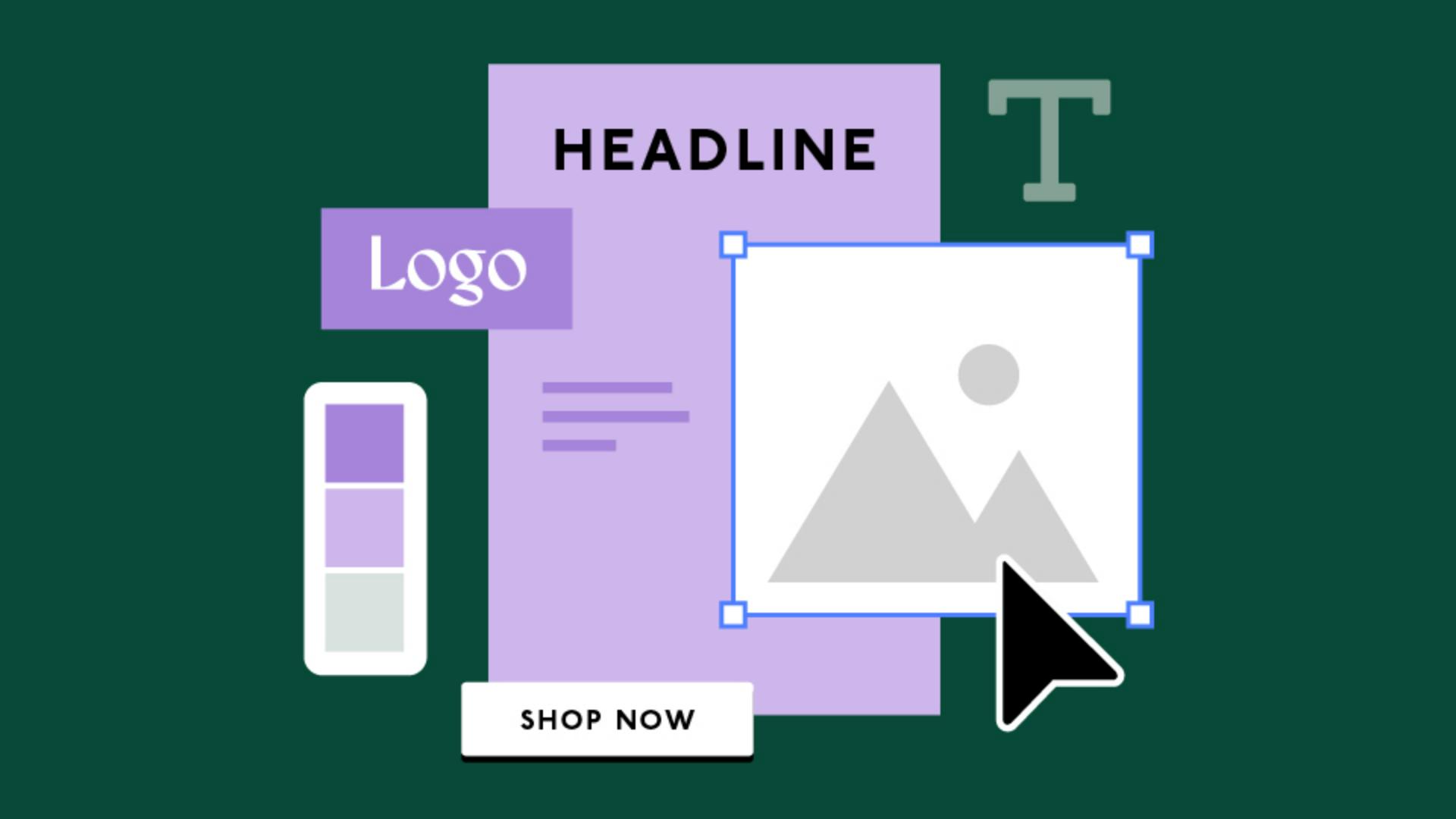
Your ad should contain the brand's logo, a headline, some descriptor body copy, and a call-to-action button.
Paste this info into your document.
Let's create a layout
Creating the layout with product imagery and background
where the product photo is cropped out of its environment and placed onto a solid color background.
This will help with text legibility.
Decide on the product photo you'd like to use in the ad, then in Photoshop or Illustrator, clip the product out of the photo, leaving the shadow intact and keep the background transparent.
Place the photo into your Illustrator document.
If you have brand colors, place them into your document.
With the Rectangle Tool, click and type 250 px x 360 px, then move the shape to the center of your artboard.
Move the shape to the back by going to Object, Arrange, Send to Back.
Let's use a bright lighter color for the background and apply one of the darker colors to your type.
If you have brand fonts, apply them to the copy.
Applying brand fonts and text hierarchy
If you don't, find an impactful headline font that matches your brand's attitude and a clean, legible font for body copy.
Place a simple version of your logo at the top of the ad and center it with the Align Tool.
I'm also going to place a colored shape behind the logo for a tiny bit more impact.
With the Paragraph window, center-align the headline and increase the size.
Then place it near the top of the ad below the logo.
The size and placement near the top of the layout gives the headline clear priority, and nice visual flow from top to bottom.
If possible, arrange your product photo, so some of the product overlaps parts of the headline.
This makes the ad engaging and more interesting.
When sizing the photo, make sure to leave room near the bottom for the copy and button.
Keep the body copy smaller, but still big enough to read quickly.
Center the type inside the text box, center it in the artboard and place it near the bottom of the page.
Designing an effective call-to-action button
Lastly, let's add the call-to-action button.
Use the Rectangle Tool to create a shape around the call-to-action copy.
Select the copy and bring it to the front with Object, Arrange, Bring to Front.
Then make sure the copy is centered inside the shape with the Align Tool.
Let's make the button white, so it stands out from the dark text color.
Move the button to the bottom of the ad below the body copy.
Make sure the button is large enough to identify and read quickly, but not so big that it fights with the headline.
To really spice things up, test out incorporating other cropped photos to the edges of the layout.
This will draw the eye in further and make the layout even more compelling.
Exporting the ad for web use
Finally, save your editable document as an .ai file.
Then, to export your ad for the web, go to File, Export, Export As..., select JPEG, click Use Artboards, click Export, select Screen (72 ppi) resolution and hit OK.
Now you're all set to create simple digital ads that stand out and break through the noise.
Try it out and make an ad that leaves an impression.
Again, my name is Sydney Michuda of Super Creative.
Thanks for watching.
Note: Stock assets provided are for practice purposes only. See terms.
What you’ll learn
Set up the document for digital work
Create a new document with the correct size, color space, and resolution to ensure your ad looks sharp on screens.
Arrange the text and visual elements
Gather ad copy, artwork, and brand colors on the artboard. Choose an impactful headline font and clean, legible fonts for the rest of the text. Learn to arrange elements to create a standout ad that guides your viewer to the call-to-action.
Save artwork and export a final copy
Save the original design in Illustrator's format for easy edits later. Then, export the digital ad optimized for screen viewing.
You can control how Adobe websites use cookies and similar technologies by making choices below. But note that if you disable cookies and similar technologies entirely, Adobe websites may not function properly.
Cookies are small text files stored by your web browser when you use websites. There are also other technologies that can be used for similar purposes like HTML5 Local Storage and local shared objects, web beacons, and embedded scripts. These technologies help us do things like remembering you and your preferences when you return to our sites, measure how you use the website, conduct market research, and gather information about the ads you see and interact with.
You can make choices in the menu below about what cookies and other technologies you want us to use on Adobe sites when you visit them from this browser. You can always change those choices later by clicking on the Cookie Preferences link at the bottom of the page.
If enabled:
We can improve your experience by tailoring the site and the content to things we think might be of interest
We can better keep track of your preferences — like what language you prefer to use
We will better understand your likely interests so we can provide you more relevant Adobe ads and content on non-Adobe websites and in non-Adobe apps
It will help us improve the performance of our website and those of our partners who use the Adobe Experience Cloud
If disabled:
We won’t be able to remember you from session to session so the experience may not be tailored to your interests
You’ll still have access to the content of the site but certain features that depend on cookies may not function
You’ll still see ads, they just may not be as relevant to you
General information
You can control how Adobe websites use cookies and similar technologies by making choices below. But note that if you disable cookies and similar technologies entirely, Adobe websites may not function properly.
Cookies are small text files stored by your web browser when you use websites. There are also other technologies that can be used for similar purposes like HTML5 Local Storage, web beacons, and embedded scripts. These technologies help us do things like remembering you and your preferences when you return to our sites, measure how you use the website, conduct market research, and gather information about the ads you see and interact with.
You can make choices in the menu below about what cookies and other technologies you want us to use on Adobe sites when you visit them from this browser. You can always change those choices later by clicking on the Cookie Preferences link at the bottom of the page.
If enabled:
We can improve your experience by tailoring the site and the content to things we think might be of interest
We can better keep track of your preferences — like what language you prefer to use
We will better understand your likely interests so we can provide you more relevant Adobe ads and content on non-Adobe websites and in non-Adobe apps
It will help us improve the performance of our website and those of our partners who use the Adobe Experience Cloud
If disabled:
We won’t be able to remember you from session to session so the experience may not be tailored to your interests
We’ll still count your use of our site and services
You’ll still have access to the content of the site but certain features that depend on cookies may not function
You’ll still see ads, they just may not be as relevant to you
Operate the site and core servicesOperate site and measure engagement
Always active
These cookies are required, and they are used to enable the site and related services core functionality. Without them the site could not operate, so they cannot be disabled.
These cookies enable the site and related services’ core functionality and collect statistics about user engagement, such as counting active use to help us understand trends. These cookies cannot be disabled.
Measure performance
These cookies are used to analyze site usage to measure and improve performance. Without them Adobe cannot know what content is most valued and how often unique visitors return to the site, making it hard to improve information we offer to you.
These cookies are used to analyze site usage to measure and improve performance. Without them Adobe cannot know what content is most valued, making it hard to improve information we offer to you.
Extend functionality
These cookies are used to enhance the functionality of Adobe sites such as remembering your settings and preferences to deliver a personalized experience; for example, your username, your repeated visits, preferred language, your country, or any other saved preference.
Personalize advertising
These cookies are used to enable Adobe and our partners to serve ads more relevant to your interests. Without them you will still see ads, but they might not be as relevant to you.
Personalize advertising
These cookies are used to enable Adobe and our partners to serve ads more relevant to your interests. Without them you will still see ads, but they might not be as relevant to you.