Hello, my name is Natasha Polozenko, also known as Nataszko all over the web.
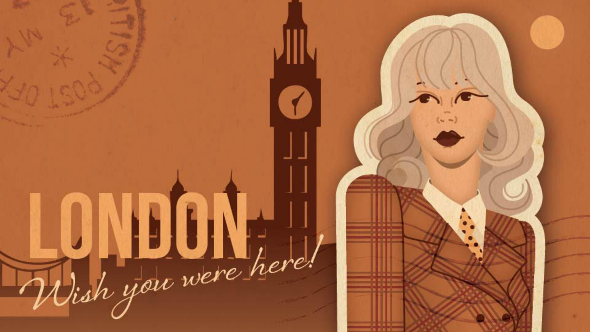
And today, I'm going to walk you through the process of creating this vintage postcard in Adobe Illustrator.
And as an added bonus, I'm going to demonstrate some of my favorite new performance updates that are going to make your workflows so much quicker and more seamless.
Let's rewind and start from the beginning.
These are the images that I'm going to be using as my inspiration, and I've also pulled a bunch of graphic elements from Adobe Stock that I think will work really nicely in my composition and help me save a bunch of time.
For those of you who use links a lot in your work, you are going to be blown away by the improvements here.
As you can see, I have a few files here, some of which are quite large, and in the past, these would have taken a few seconds to load but now bringing images into Illustrator - either by dragging, dropping or using the place command - is super quick.
And if you ever need to convert linked images into embedded ones, that's also much, much faster.
As part of the next step in my process, I want to take this inspiration photo that I have and create my own illustrated character.
And just as we did before, I'm going to quickly drop that sketch as a linked image into my composition.
And now I can use that as my base for my vector illustration.
So now, essentially what I'm going to do is pull this sketch image onto its own layer, I'm going to turn down the Opacity and switch the blending mode to Multiply.
Now I'm going to lock this layer and create a new one underneath where I'm going to use the Pen Tool to start building out all of my base shapes.
Now, when it comes to drawing lines in our artwork, I have a really exciting update.
If you use the Pencil Tool, you're probably used to seeing a preview like this when you draw your lines.
But now there is a better way.
If you click into your Pencil settings and select Live Feedback, now you will see your stroke drawn in real-time instead.
This is so helpful, especially if you like using thick strokes like I do.
You may have also noticed in our settings that Live Curve Fitting was also activated, which will also allow you to see what your smoothing looks like in real-time.
So, once you're done, you'll have something like this, which is looking great so far.
But now, it's time to add some effects to this illustrated character.
I personally like using the Iner Glow effect just to add a touch of dimension to my shapes.
I also use Offset Path to give my character this sticker-like effect, and I've just applied a subtle Drop Shadow to that shape to help my character just pop off the page a little too.
If you're like me and you'd like to stack multiple effects in your work, you may have noticed that sometimes your work gets a little bogged down and laggy when you try to move or resize it.
But as you can see, that is no longer the case.
Working with effects is now a lot more responsive and smooth.
Now it's time to add in our surrounding elements.
First, I'm going to create my background shape - and, side note, a really cool update in Illustrator is that now if you open your Color Picker, you can now type in shortcuts for hex codes.
For example, F is the shortcut for FFFFFF, which is just white.
You can also type in the color you want.
So, if I type in orange, it gives me this.
And I'm actually going to make my orange slightly darker and a little bit more desaturated for this composition.
But I think this is a really great time-saving feature to keep in mind.
I've also added in a bunch of other elements into my composition, including the skyline, a sun, some old postal graphics, and this vintage worn texture that I've applied a Multiply blending mode to.
Now for the finishing touch, I'm going to apply some text inspired by what we see here in this vintage postcard that I found.
I want to use a somewhat similar font, so I'm going to select my image, navigate up to Type, select Retype, and then here I can see the closest version of that font available.
And if I like, I can favorite any of these.
That way I can easily test out what they will look like in my own composition.
It's also worth mentioning that browsing fonts has never been more quick.
When you open the Font menu, the previews load super fast, and when you hover over the different fonts, you're going to be able to review them with almost no lag at all.
In fact, menu dropdowns are just way faster across the board now, which is also super exciting.
And there we have it, a vintage style postcard that I'm going to get printed when I'm in London and send it off to my loved ones.
I hope you enjoyed this Adobe Illustrator tutorial.
It's been a pleasure giving you a taste of some of the exciting performance enhancements that the Illustrator team has been working on.
At the end of the day, all of this makes for a way quicker and smoother workflow.
And who wouldn't love that?
Until next time.


