Welcome to part two of Typography in Illustrator.
I'm Nigel French.
In this tutorial, we'll take the logo that you created in part one and incorporate it into a promotional flyer.
You'll learn some essential layout skills as well as some handy tips and tricks.
Let's dive in!
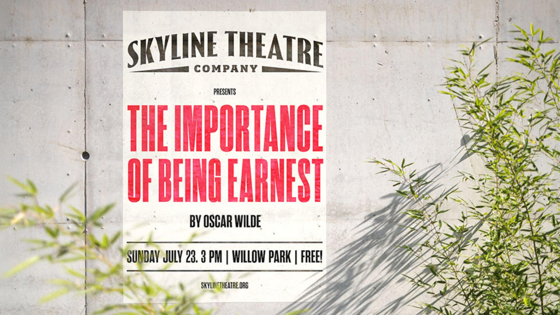
Here's the finished version on a separate artboard.
I'll switch now to artboard number one, and to help me with the placement of the elements on the page, I will turn on a grid.
If I need to change the increment of the grid.
I can do that in Settings, Guides & Grid...
I'll leave it as is with a Gridline every 0.5 in.
I'll scale the logo.
First of all, let's move it over to the left and to scale it proportionally, I'm holding down the Shift key.
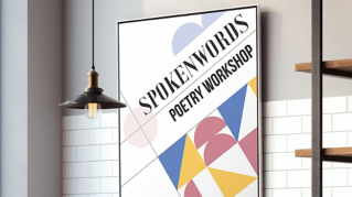
Now I'll move over onto my pasteboard where I have this screenshot of a Victorian poster.
I'm using this as inspiration, and I want Retype to find a similar font.
Retype is available as part of the Typography workspace, but we can also access it under the Window menu.
I'll select the image and choose Match Font.
It's finding similar fonts that are available on Adobe Fonts and on my device.
If the font I want isn't currently active, I can click here to activate it, but the one that I want to use is Rama Gothic.
This is currently active, but I'm just going to switch over to Adobe Fonts to make sure that the whole font family is active.
And if it weren't, I could click right here to activate the whole family.
I'll now exit Retype, select the play title, come to my Character panel and we can apply that font to the selection, Rama Gothic C Heavy.
To make a solid block of type, I'm going to convert to All caps and for a bit more space between the letters, I'll add some positive tracking.
I'll come and double-click this widget to convert the point type to area type.
With area type, I can adjust the size of the type area and make the type fill that space.
I'll come to the Paragraph panel and Justify all lines.
To make the type as dense as possible, in the Justification options, I'm going to reduce the Word Spacing to 60% and the Auto Leading to 75%.
Things will look a little bit strange for a moment, but now I'll hold Command and Shift or Control and Shift and the > key to scale the type.
When the second line becomes overset, I'll just back up one step, and then I'll select the first line and just increase the size of that as much as possible.
So that the text fills the height of the type area, I'm going to come to the Area Type Options, and I'll set the First Baseline to Cap Height.
Watch, as I do so, the type will move up to the top of the type area.
In the Align option, I'll change that to Justify.
And now I'll grab the bottom of that type area and pull it up ever so slightly.
For the supporting text, I've created a paragraph style, so that I can apply the formats quickly and consistently.
I'll make another paragraph style based on this to apply to the lower level of hierarchy.
And here I will just halve its size and then apply it to those two pieces of selected text.
I'll select the date and location text; I also want this to be area type.
I can double-click on the widget or choose Convert to Area Type under the Type menu.
Now I can span it the width of my type area and come to my Justify all lines option.
I'll also change its Area Type Options, so that it is aligned to the Cap Height and to the Center of that type area.
I've done that, so I could add lines above and below the text and be sure that the type will be perfectly centered between them.
I'll draw one line, change its stroke weight, duplicate it, holding Option or Alt and the Shift key to constrain the movement.
With all three elements selected, I'll use the Align panel and Distribute Spacing.
Then I'll group the elements together.
And to refine the spacing of all the elements, I'll come to Select, All on Active Artboard.
And once more with the Align panel, Align to Selection, Distribute Spacing.
Let's turn off the grid, Command or Control '.
To print this as cheaply as possible, I would go no further, just leave it as black and white.
But of course, we could add a colored background, and I could also add color to the text.
So, this will now serve as a template for future productions, and I can save it as an actual template, or I can just choose Save As... before beginning work on the next version.
Well done.
You've created an eye-catching flyer, and now have a much better understanding of what's possible typographically in Illustrator.
Thanks for joining me.