Create an attractive sidebar in no time at all
Set off important information in a flexible sidebar using simple text frame tools in Adobe InDesign.
Published
Introduction
I'd like to add a sidebar frame to this document.
Creating and styling a sidebar text frame
So, I'll just go to the Tools panel, select my Type tool and then click and drag to create a text frame.
I'll switch to the black arrow and then up here in the Control panel.
I can click my Fill pull down, scroll down and choose this nice dark blue.
I'll leave the Stroke set to none. - for now.
I'm going to go to the Tools panel, get my Zoom tool and then click and drag around this frame, so that I get a closer look.
Now I'll switch to the Type tool, click inside the frame and type my text.
InDesign CC also allows you to import text whether that's plain text, RTF, which stands for rich text format, or Word files. and you can also copy and paste from a text document.
Now it's kind of hard to see the text on this dark background.
Formatting text and improving readability
So, I'll click and drag across all of the text, go up to the Control panel, click my Fill pull down and choose (Paper) to make the text white.
Now, it's time to format the text.
I'll triple click in the first line, that's going to be my headline and up in the Control panel I'll highlight the current font name and type the first few letters of the font I'd like to use, "Warnock Pro Bold".
I'll triple click the second line and again go up to the Control panel, type the first few letters - this time I'll choose "Warnock Pro Regular".
By the way "Warnock Pro" is available from Typekit, which is part of your Creative Cloud membership.
I'll also click in my heading and set it to a center alignment by going up here to my Control panel and choosing the Align Center icon.
Now, I'll switch back to the black arrow, so that I can work on the frame.
If you've ever wondered what this little yellow square does,
Customizing frame corners and appearance
let me show you.
Click on it and four little yellow diamonds appear - one on each corner of the frame.
And that's your hint that they're corner controls.
Grab one and drag it and you instantly have rounded corners.
If you press Option on a Mac or Alt on Windows and click on one of your corner controls and keep clicking you can cycle through the different corner styles.
You can also choose a corner style up here in your Control panel.
Now if you'd like numerical precision, hold down Option or Alt and click on the Corner Options icon in your Control Panel and that will bring up the Corner Options dialogue.
You can see that you can pick a radius and you can also choose a Corner Style here.
If you'd like to affect one corner an easy way to do that is to hold down your Shift key and then just drag that corner to change its radius.
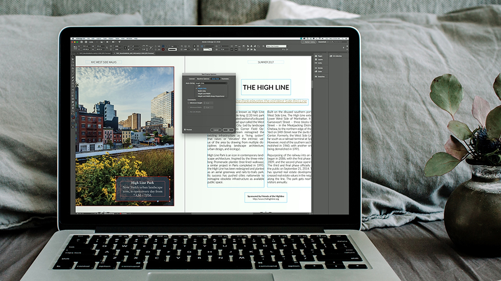
Adjusting text frame spacing and auto sizing
Now the text is pressing up against the walls of the frame and I'd really like to change that.
That's really easy to do.
I'll just go up to Object and choose Text Frame Options...
And I can change the Inset value right here in the center.
I know the value I want to use.
So, to quickly do this, I click on the field label - the word "Inset", type the value "16 pt." and then I'll hit Tab to commit to that value, but stay in the Dialog box.
I'm also going to use the Auto Size feature.
And this lets the text frame change size if I add or delete text.
I'll click the pull down and choose Height Only.
And I'm going to pin down the bottom edge of the frame.
So, if I add text that frame will grow vertically, but the bottom will stay where it is.
I'll click OK.
Now, I'd like to add some more text.
So, I'll click on the frame and then double click and that switches me to the Type tool.
You see how the frame adjusted to the additional text?
That's that Auto Size feature.
By the way, when you're separating spans of time, as you see here rather than a hyphen you should use an en dash.
So, I'll highlight the hyphen, right click, choose Insert Special Character, Hyphens and Dashes and choose En Dash.
There, that's much more elegant.
I'd like to see the image
Applying transparency and final design touches
show through the background of this text frame a little bit.
And that's really easy to do.
I'll switch back to the black arrow, so that I'm talking to the frame and then up in the Control panel I'll click this little fx icon and choose Transparency...
I don't want the text to fade out, I just want the background of the frame to fade out.
So, where it says, "Settings for."
I'll click that pull down and choose just Fill.
And then I'll reduce the Opacity, so that the text is still readable, but I can see that background show through.
That's a really nice effect.
And then I'll click OK.
Finally, I think I might want to add a stroke to this frame.
So, up in the Control panel, I'll click the Stroke pull down, scroll down and choose maroon.
And that echoes that red brick building in the image.
Now let's see what this is going to look like, when it prints.
Up in View, I can choose Screen Mode, Preview and back in View I'll choose Fit Spread in Window.
I'll deselect my frame.
Now, that you've seen how much you can do starting with just a really simple text frame you should try it yourself.
Experiment, create a blog quote or a caption for the image, or apply these techniques to a project you're working on and refine your design.
Contributor