Introduction
Have you ever wanted to make subtle changes to color in an image, so you could accentuate the difference between similar hues, or modify a specific color so it blends better with the rest of the subject?
Hi, I'm Seán Duggan from Adobe Learn.
In this tutorial, I'll show you how to use the Color Variance control in Lightroom to enhance and modify specific colors in your photos.
Select a specific color with the Point Color eyedropper
I've already applied an Auto Adjustment to this photo, but there's some additional fine-tuning I want to apply to the color of the grass.
Color Variance is a new slider that has been added to the Point Color controls.
I'll open the Color panel on the right and then I'll click on Point Color.
At the moment everything is grayed out because I have not selected a color.
The first step in using Point Color is to enable the Eyedropper Tool.
When you use the Eyedropper to select a specific color in a scene, the Variance slider will affect a range of colors that are similar to the color that you chose.
You can make the variance or the difference between those colors more noticeable, or you can adjust that range of colors to make them more alike.
If I move the Eyedropper over the grasses, we can see that there are some very dark yellowish browns, as well as some much lighter variants of that color.
The objective with this tool is to select an area that's in the middle between the darkest and the lightest variant of that color.
This area looks good, so I'll click to select it.
Over in the Point Color panel, you can see the color that I chose is indicated in the color field.
This panel provides several ways you can modify color: you can shift the Hue, the Saturation, and the Luminance or the Brightness.
And once you've made an adjustment, you can even fine-tune the exact range of colors that are being affected.
Adjust Variance to decrease or increase the difference in a range of similar colors
For this tutorial, we're going to focus mainly on the Variance slider.
If I move the Variance slider to the left, the colors in the grasses become more alike.
And since there's a similar range of colors in the trees, they're affected as well.
If I move the slider to the right, this increases the contrast between the selected range of color, and the differences between the colors become more noticeable.
Use Variance with a mask for more precise control
If you liked the effect on the grasses, but felt that it was a bit too much on the trees, the way to handle that would be to apply Color Variance using a mask.
And this is how I like to use it, because it gives me much more control over what parts of the scene are affected.
Let's check that out.
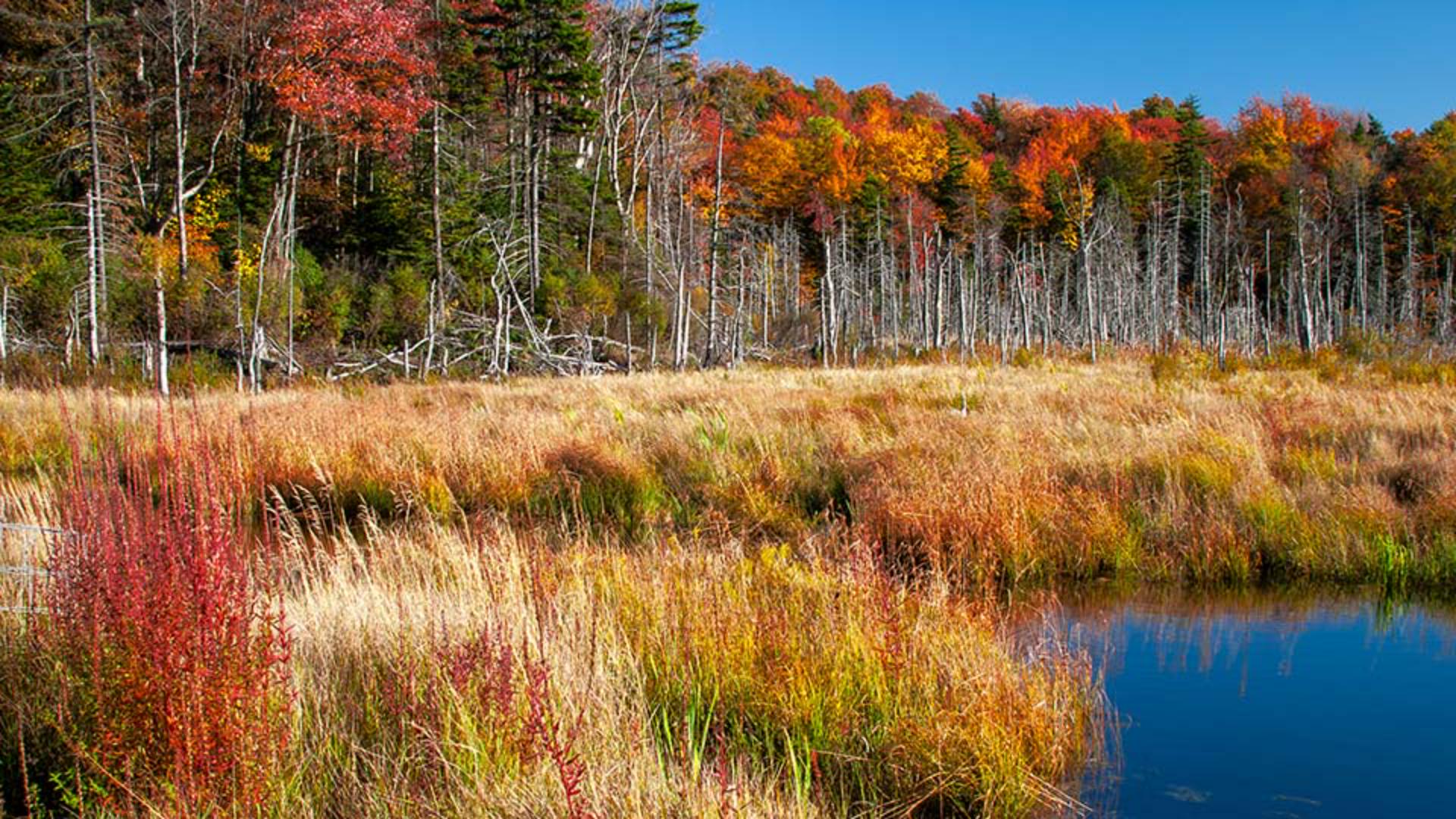
Fix uneven sky color in landscape photos
In some landscape photos, especially if you've used a Polarizing filter, there may be an uneven quality to the blue color in the sky.
And we can see that in this view of Mount Washington that I photographed in Oregon's Cascade Range.
This can also be caused by the position of the sun in relation to how you frame the scene.
But whatever the cause, if you want to even out the blue in the sky, the Variance slider in Point Color can help with that.
I'll click the Masking icon on the right and choose Sky to have Lightroom create an AI-generated mask for just the sky.
I'll go down to the Point Color panel, grab the Eyedropper, and again, I want to choose a color that's roughly midway between the darkest and the lightest blue in the sky.
Something like that.
Since my goal is to even out the blue in the sky, I don't want to move the slider to the right because that will increase the color contrast.
But if I move it to the left, then the blue color is harmonized, and the result is a smoother and more even color in the sky.
And for this scene, I might move the Luminance slider to the left to slightly darken the sky and maybe increase the Saturation a bit.
I'll click and hold the Eye icon at the top of the Masking panel to see the before view.
And here it is after that adjustment.
Much better.
Minimize redness and create natural, even skin tones in a portrait
Let's shift gears now and explore how you can use the Variance slider to even out the skin tones in a portrait.
In this photo, the man has an obvious sunburn.
It's especially apparent on his nose, his cheeks under his eyes, and on his head.
I'll go to the Masking icon on the right and down in the People section, I'll click on the thumbnail for the man.
Lightroom uses AI to identify different areas that can be masked.
I'll select Facial Skin and then click Create.
Once again, I'll go to Point Color, get the Eyedropper Tool, and select a color on his face that I feel is midway between the darkest, reddest color of his skin, which is on his nose, and the lightest area, which is probably some of the highlights on his forehead.
I think this area down by his mustache is pretty good.
With this example, you can really see that moving the Variance slider to the right is definitely not what we want to do.
So, let's move it back to the left and we'll see that sunburn fade away.
If you go too far to the left, the skin tone can become too uniform and look unnatural.
To fix that, we'll just back it off a bit, maybe to about -50.
That removes the bad sunburn, but there's still some variation in his skin tone which looks more natural.
As a final touch, I'll increase the Luminance to lighten his face a bit and maybe reduce the Saturation by a few points.
Here's the before version, and here's how it looks now after the Variance slider has removed the bad sunburn.
With these examples, we saw how you can use color variants on both landscape and portrait images, but it can be useful for any type of photo where you need to make subtle adjustments to a specific range of colors.
So, give it a try on some of your own images.
