Match color in a composite
Learn how to create a unifying color treatment for a composite.
Published
Introduction
Making multiple image composites is all about bringing different photos together to create a new image.
Sometimes the photos may have obvious color differences.
Knowing how to fix this is an essential skill for your compositing toolkit.
Hi, I'm Seán Duggan from the Adobe Learn team.
In this tutorial, we'll explore some ways in Adobe Photoshop to match the color across the different elements in a composite so that everything looks like it's part of the same scene.
Let's get started!
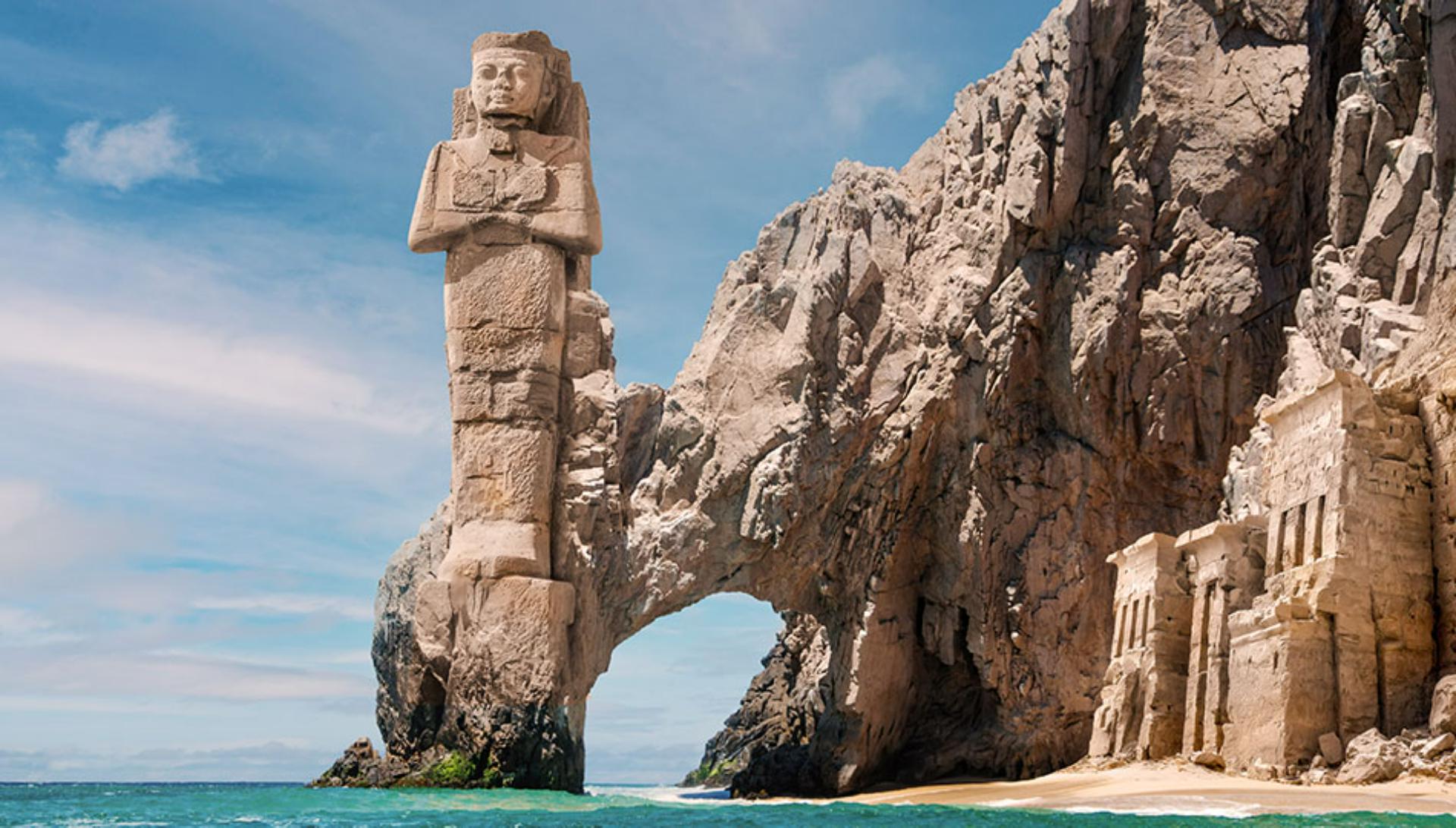
For this project will be working with a composite
Identifying color mismatches in a composite
that contains elements from two photos, as well as an AI generated image from Adobe Firefly.
Both the statue, as well as the temple ruins on the right, have a much warmer and more yellow red color balance than the rocky cliffs.
Part of the story that this composite tells is that the statue and the temple have been carved from the cliffs, but that very noticeable color difference doesn't support that.
Let's create an adjustment that will solve this.
Sampling colors and applying a Hue/Saturation adjustment
From the Tools panel on the left, I'll choose the Eyedropper Tool.
Then I'll use this to sample color from the rocky arch.
Each time I click in a different area, the sampled color is placed in the foreground color swatch.
I'm just looking for what I feel is a color that is representative of the rocky cliffs.
There, that looks about right.
We can always adjust it later if we need to.
The first thing I need is a selection of the statue so I can protect the sky around it when I start applying the color.
I'll use a shortcut for this that works when you have a layer that includes transparent areas.
I'll hold down the Command key on Mac or the Control key on Windows and click the layer thumbnail for the statue.
This will load a selection of the nontransparent areas on this layer.
Next, I'll click the Add Adjustment Layer icon at the bottom of the Layers panel, and I'll choose Hue/Saturation...
Notice that the statue's selection has been turned into a layer mask on the Hue/Saturation layer.
In the Properties panel, I'll click the checkbox for Colorize.
This colorizes the statue with the rock color that I sampled with the Eyedropper Tool.
I'll experiment with adjusting the Saturation a bit to get it to match the rock better.
In the natural world
Refining color match with mask painting
rock and carved stone are rarely a single color, so I'm going to modify the layer mask to add some irregularity into the color.
To do this, I'll select the Brush Tool over in the Tools panel.
In the Options bar, I'll click on the Brush Picker and make sure that I have the Soft Round brush selected.
I'll set the Opacity to about 30% and down at the bottom of the Tools panel, I'll make sure that black is set as the foreground color.
If black is in the background swatch, as is the case here, just tap X on the keyboard to exchange the colors.
Painting with black on a layer mask will hide whatever that layer does.
I'll tap the left bracket key on the keyboard a couple of times to make my brush size a bit smaller.
Then I'll add some short brush strokes in different areas of the statue to bring back a little bit more of the original warm color.
Next, I'll tap X to exchange the colors and make white the foreground color.
I'll tap the right bracket key a few times to make the brush size bigger and now I'll begin painting over the temple ruins on the right side.
Painting with white on the Hue/Saturation layer mask is revealing some of the colorize adjustment created by that layer.
My aim here is not to create a uniform color for the temple, but to break up the original color and make it look more like the surrounding rock.
And I might add some of that color to different areas on the rest of the cliff as well.
There, that's looking better.
If I turn the visibility of the Hue/Saturation layer off and on, you can really see the difference.
Let's add one more adjustment layer
Applying a global color adjustment with Photo Filter
for an overall adjustment to the entire scene.
Last time I used the Adjustment Layer icon shortcut at the bottom of the Layers panel.
This time I'll use the Adjustments panel.
I'll close the Adjustment presets and down in the Single adjustment section, I'll choose Photo Filter.
I'll use the Warming Filter (85), and I'll set the Density to about 30%.
This adds a warming effect to the whole image and makes the sky and water work better with the cliff and the ancient ruins.
Now our fictional archeological site is looking much better.
I'll turn off the visibility for the two adjustment layers so that we can see how each one is affecting the scene.
Here's what the image looked like before the adjustments,
Reviewing before-and-after results
and here it is with the Hue/Saturation layer that adds in a regular coloring to the statue and the cliffside ruins.
And finally, here is the Photo Filter adjustment that adds a warming effect to the entire image.
Creating a final color treatment for a composite project can really tie everything together, so that all the elements work as a unified image.
It's like a final dash of image seasoning, that's an essential part of creating successful composites from multiple photos.
Note: Stock assets provided are for practice purposes only. See terms.
What you'll learn
Apply adjustments to unify the color in a composite
Bring everything together in a composite with adjustments to harmonize the color across the different images.
Instruction by