Build cinematic posters from Firefly art in Photoshop
Part 2 of 2: Jesús Ramirez turns Firefly generations into a modular, client-ready poster concept in Photoshop.
Published
Introduction and meet Jesús Ramirez
[Jesús Ramirez]: Firefly delivers the raw material, Photoshop turns it into a composite that survives every client revision.
My name is Jesús Ramirez, and I create TV and movie posters professionally.
In this video, you'll learn how to take three Firefly generations and build them into a fully editable poster composite in Photoshop.
Every layer stays modular, so when your client asks for changes, you can deliver them in minutes.
This will be my working document.
It's a template that lets me preview the final composite against the full delivery image.
In my line of work you don't just deliver a poster, you deliver a larger image that the client can crop for posters, social media graphics, vertical banners, horizontal banners, and more.
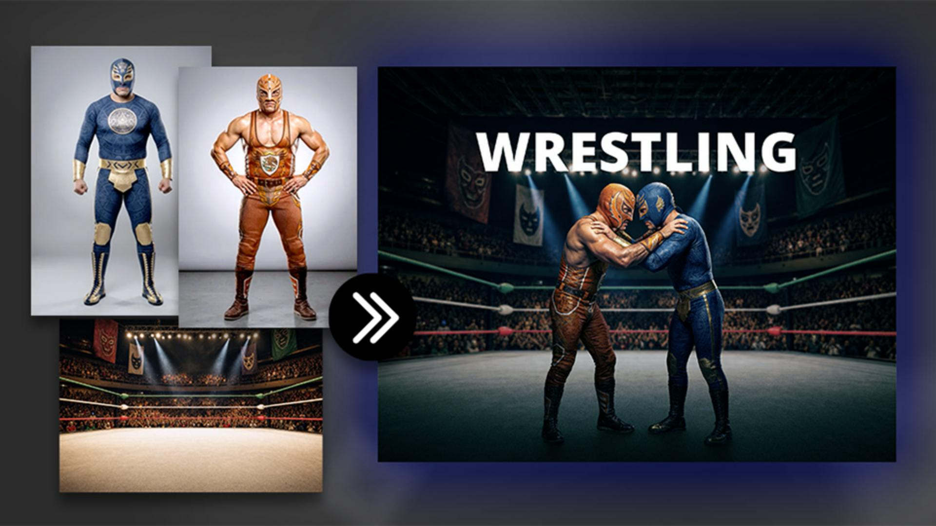
Load Firefly generations as modular layers
To start, we'll bring in all three Firefly generations into a single Photoshop document.
To do so, go into File, Scripts, and choose Load Files into Stack...
From here, choose Folder from the dropdown, then click on Browse, and navigate to the folder that contains all your assets.
Then click OK.
Once you see the three files listed on this preview window, you can press OK.
Photoshop will then load your Firefly generated images into one document as separate layers.
Double-click the Hand Tool to fit the image to screen.
And here we have our three layers the wrestlers, the roadmap reference image, and the ring background.
Notice that the background is smaller than the other two images.
That's because the model used to generate it doesn't output the same resolution as Gemini, but that's not a problem here since we'll blur the background anyway.
The lower resolution won't be visible in the final result.
Now let's prepare each asset before bringing it into the poster template file.
We'll start with the ring.
Select the background layer and rename it to Ring.
Then right-click on the layer and choose Convert to Smart Object to keep our adjustments editable.
Then press the V key to enable the Move Tool.
Drag the Ring layer onto the tab of the poster template.
When it switches over, move to the center and release.
Then from the Layers panel, place the Ring layer below the Poster View layer.
Next, let's prepare the wrestlers layer.
Go back into the document with your generated assets, enable the wrestlers layer, and rename it to Wrestlers.
Then right-click on it and convert it into a Smart Object.
Now open the Smart Object by double-clicking on the layer thumbnail.
Then from the Contextual Task Bar, click on Remove background.
Now save the Smart Object by pressing Ctrl S on Windows - that's Cmd S on the Mac.
And now we can close it by pressing Ctrl W - that's Cmd W on the Mac.
At this point, we can take this document into our working document.
Press the V key on the keyboard to enable the Move Tool and drag the wrestlers onto your working document.
Next, go back to the document with your assets and disable all the layers except the generated poster.
This will be our roadmap.
We don't have to follow this image exactly, but it gives us direction and we can always deviate when needed.
Scale and extend the scene for every crop and format
Let's now replicate the poster in our composite.
Start by analyzing the image.
Notice the scale and how the layers relate to each other.
We can only see parts of the wrestlers' legs, and their backs are visible.
Also notice that the green rope is right around mouth level.
Let's try to recreate this.
Go into your working document, disable the wrestlers layer, and scale the ring layer.
Then enable the wrestlers layer and adjust it accordingly to make it look as close to the sample poster as possible.
In this case, it looks like I need to bring the background down so that the green rope is at about mouth level.
And this is very close to our sample image.
It looks fantastic as a poster, but look at how this becomes a problem in the full image view.
The background placement is making the wrestlers look tiny.
The reference poster was cropped tighter so the perspective worked.
In our full composite, you can see the wrestlers' feet and the surrounding environment, which means the perspective has to make sense.
If you drag the background up too far, the wrestlers look tiny.
If you drag it down too far, they look gigantic.
You want to find the position where the perspective reads as natural.
In this case, having the green rope around the rib cage makes sense.
Remember, you don't have to follow the sample poster exactly; it's simply a guide and not a rule to follow.
Repositioning the ring layer leaves a gap at the top of the frame.
You can see the checkerboard pattern, which is transparency.
We'll fix that with Generative Fill.
Enable the Rectangular Marquee Tool from the Toolbar and make a selection across the top of the arena.
Then click on Generative Fill from the Contextual Task Bar, make sure you're using the Firefly Fill & Expand model, since it does the best job extending photographic environments.
In the Prompt box, type the prompt, 'wrestling, arena ceiling,' then click Generate.
You could leave the prompt blank; it sometimes works great.
Other times a short focus prompt gives you better results.
Here are my three Variations.
The second one works best in this composite, so that's the one we'll keep.
Now select the ceiling layer, hold Shift, and click on the Ring layer.
Then right-click and convert these layers into a Smart Object so we can work on them as a single editable layer.
Refine the scene for a cinematic finish
At this point, the poster is modularized and completely editable.
All we need to do now is match the color grading to the sample poster.
With the background Smart Object selected, go to Filter and choose Camera Raw Filter...
From the Light panel, use the sliders to create a darker background to match the sample poster as best as possible.
Now, open the Color Grading panel and click on the Shadows wheel.
Drag towards the blues to add the blue tint.
Then adjust the Blending slider to control how much of the image picks up that tint.
The further left you drag, the more of the blue spreads into the midtones.
Now go to the Color panel and reduce Saturation.
The image was a bit too saturated for the look we're after.
Then make the bottom half darker.
Open the Masking panel and create a linear gradient mask.
Drag from the bottom of the image towards the top.
Then reduce the Exposure inside that mask to darken just the bottom half.
You can then repeat this masking process on the top part of the image.
When you're done, click OK.
And now we can compare our result to the poster reference.
Everything is looking fantastic.
Now we need to blur the background layer.
There are several ways to do this in Photoshop.
The easiest in this case is Tilt-Shift.
Go to Filter, Blur Gallery, and choose Tilt-Shift.
The two solid lines mark the area that stays in focus.
Everything between a solid line and a dashed line falls off gradually.
Everything past the dashed line is fully out of focus.
The Blur slider on the right controls the intensity.
Drag the two solid lines down where the wrestlers are standing.
That's where the focus needs to stay.
Then drag the dashed slider down to adjust the fall-off.
Now you can adjust the Blur slider to control the blurriness of the background.
In this case, we'll go to 10 pixels.
When you're done, click OK.
Now we need to apply the same effect to the wrestlers.
The easiest way of doing that is by holding Alt on Windows, Option on the Mac, and dragging the Camera Raw Filter onto the Wrestlers smart object to copy it and apply a duplicate.
Applying the same effect to the wrestlers is a bit too strong, but you can always make adjustments by double-clicking on the Smart Filter label.
Then simply double-click on the Highlights slider to remove the darkening effect from the highlights.
Now go into the Color Grading panel and drag the Blending slider to the left to try to remove some of the blue from the skin tones, and drag the Balance slider to the right to try to achieve the same goal.
Then you can press OK, and the result is looking much, much better.
The only issue now is that we don't have any shadows under their feet, but we can easily fix this by clicking on the Harmonize button.
Harmonize generates an image that matches the shadow, lighting, and reflections of the subject to the environment.
First, pick the variation with the best shadows for your wrestlers.
In this case, I like the shadow in Variation 2 the best.
One thing to keep in mind is that the Harmonized layer will not be my main working layer.
I will only use it for the shadows because I want to keep the color grading editable through Camera Raw.
To do so, simply drag the Harmonized layer below your Wrestlers layer.
Now everything is modularized and in its own layer.
This file can now be used as a poster, horizontal or vertical banners, including adding text between the background and foreground.
Now everything is modularized and on its own layer.
This file could now be cropped into a poster, horizontal or vertical banners, and you can even add text between the background and foreground.
Now that you know how to build a fully editable composite from your Firefly generations, try it in your next project.
Again, my name is Jesús Ramirez.
Thank you for watching.
What you’ll learn
Load Firefly generations as modular layers
Bring all your Firefly assets into one document, convert them to Smart Objects, and remove backgrounds to keep every element editable.
Scale and extend the scene for every crop and format
Compose the scene, then extend it with Generative Fill.
Refine the scene for a cinematic finish
Apply Camera Raw adjustments, add a Tilt-Shift blur to the background, and use Harmonize to ground the subjects with realistic shadows.
Instruction and design by