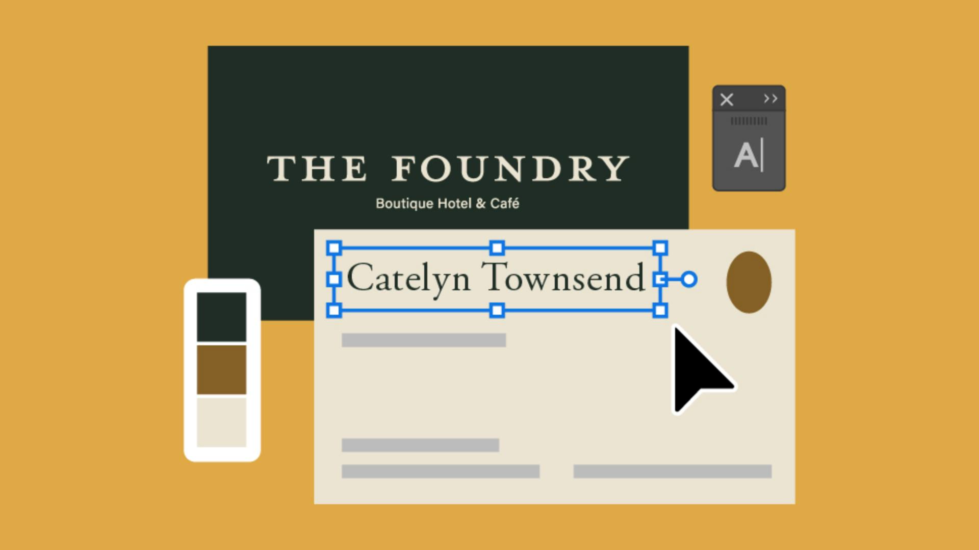
Do you need business card designs, but not sure where to start?
Some brands only have a logo without fonts systems or colors to back them up.
In this tutorial, I'll show you how to choose fonts and colors to match your brand while designing a business card template.
My name is Sydney Michuda, Creative Director of Super Creative.
Let's jump in.
Create a new document and set the artboard size of 3.5 in x 2 in.
Increase the Artboards to 2 for both sides of the cards and the Color Mode to CMYK Color for printing.
Place the primary logo on the front of the card for brand awareness.
With the Rectangle Tool, create a shape to fill the background color.
Go to Object, Arrange, and Send to Back.
Then change the color of the background.
Use a darker color, so it feels impactful like a book cover, and change the logo to a lighter color.
We'll refine these later.
For the back, use a lighter color for the background, so it's easy to read the text.
The back of the card will hold all the personal information.
Include a first and last name, their job title, and some contact info like their email, phone number, the hotel's website, and since this brand has a physical location, the address.
Typically, the name should be the largest text on the back, like a headline.
So, let's make the name a little larger while we choose fonts, and let's move the job title a little closer to the name, since it acts as a label for that person.
Now to pick some fonts, select the name, go to the Character window, select the Fonts dropdown and add some Filters.
Since the hotel is boutique and sophisticated, use a classic serif font to match that elevated esthetic.
Let's go with Adobe Garamond Pro Regular.
For the job title and contact info, choose a clean, understated sans serif font that's easy to read, like Acumin Pro, make the job title font a slightly thicker weight, so it feels like a subhead.
Let's also make the name a bit larger, so it has clear priority in the layout.
Make the title and info a little smaller, then move the info away from the name and title since it's a different kind of content.
Try different layouts until you find one that fits your needs.
To choose a color palette, pick a refined darker color like a navy or evergreen.
Then pick an accent color you might see in the space.
This hotel has brass finishes, so we'll go with a brown hue, then a neutral warm off-white.
Apply the dark color to the front background and the back text and apply the off-white to the front logo and the back background.
Apply the accent color to any design elements on the back.
This hotel has a custom room illustration, so we'll add that to the front for a bit of interest and texture.
To save as a template, lock the front and the back backgrounds, so future editors don't adjust the core elements.
Lastly, go to File, Save As..., name your file, select Illustrator Template and hit Save.
Creating business cards for your brand doesn't have to be a hassle, place the logo, add your information, select fonts and colors, save as a template, and voilà!
Again, my name is Sydney Michuda of Super Creative.
Give it a try yourself and share your results.


