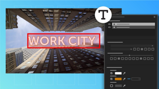
Adobe Premiere Pro CC allows you to use the Type Tools – Pen, Rectangle, and Ellipse tools to create titles and shapes on multiple layers by clicking directly in the Program monitor.
Once the title is created use the Essential Graphics panel to fine tune its appearance.
To follow along download the sample files that accompany this tutorial.
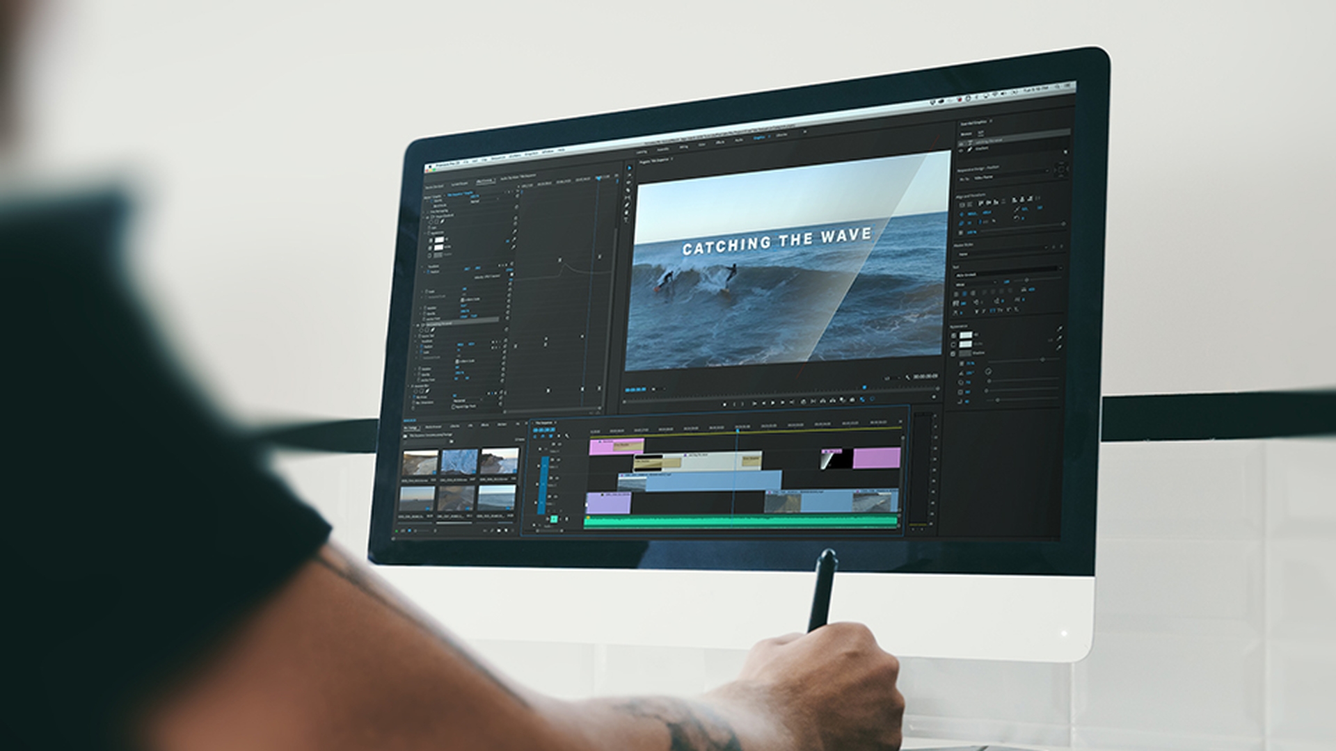
Right now, I'm in the Editing workspace.
I'm going to switch to the Graphics workspace to make it a little more convenient to create and edit titles.
I have a sequence open that already contains two titles.
I'm going to mute the music track as we're working on the visuals only for now.
I'm going to select the first title and then I'm going to select the Edit tab in the Essential Graphics panel.
Right at the top I can see the three layers in this graphic, the company name, the word ‘Presents’ and a shape with a Gradient applied that animates across the screen.
Notice there's a cross-fade applied to the title too.
So, we have a fade up and down at the start and finish.
Once a layer is selected you can use the Settings displayed in Essential Graphics panel to change its properties.
You can select a layer in the Essential Graphics panel or use the Selection tool to click in the Program monitor.
There are some options that will probably be familiar to you like the Font choice, whether the Text is in Bold or Italic and so on.
Some less familiar options might be in the Align and Transform controls.
Every setting can be adjusted for each individual element or you can select multiple layers and apply changes to them all.
You can delete a layer by selecting it and pressing Backspace or Delete I'll just Undo that with Ctrl Z or Command Z.
You can create titles with any duration but there's a default for all still image media which is set in the Premiere Pro CC Preferences.
Here in Windows under Edit, Preferences, Timeline... and in the Premiere Pro CC Application Menu, Preferences, Timeline... on Mac OS.
Here it is, the Still Image Default Duration.
I will just cancel out of this.
Let's make a new title.
I could copy and paste these two but let's build one from the start.
I'm going to line up my playhead over this shot which I'll use as my background.
I'm going to select the Type Tool and notice if I click and hold I can choose a Vertical Type Tool.
I'm going to click into the image and I'm going to type TWO SURFERS, all in caps to match the other titles.
Now, I use my Selection Tool to position this somewhere near the bottom left corner.
Now let's take a look at the settings in the Essential Graphics panel.
Before I do, I want to mention, you can also drag with the Type Tool to create a text box which has boundaries that will constrain the text you type.
We're not going to use that approach for this title, but it's a great way to manage larger amounts of text you’ll copy and paste into a new title.
I'll just select and delete that layer in the Essential Graphics panel and I'll select this TWO SURFERS item.
In the Align and Transform section, I have a number of options to set the Position, Rotation, and so on for the item I've selected.
And if you're not sure what a control does, hover the mouse cursor over the icon and a tool-tip will tell you, you also use these icons to enable key-framing for these controls.
Notice I have a Scale option here which is separate to the Font Size lower down in the Text settings.
We will come to Master Styles in a moment.
For now, let's choose our Text settings.
I'm using the font Aktiv Grotesk which is part of Adobe Typekit and included with your Creative Cloud subscription.
If you want to add fonts using Typekit click the button right here in the Font menu.
I'll set my Font Size large, something around a 100 point.
That'll do.
And you can see there are all the usual options for justification and leading and so on.
The best way to learn the impact of these controls is to make dramatic adjustments with them and just see the impact on your title.
Here is the Tracking, for example.
I'll just undo that with Ctrl Z or Command Z.
Further down we have Color options for the Fill color, the Stroke, that's the edge of the text or the shape and a Shadow.
You can use the Eyedropper to select a color in the Program monitor or click the color swatch to view the Color Picker and here for example, I might choose another color.
I'm not sure that works too well against this background.
In fact, I like the look of the text in the previous title.
So, I'm going to use that to create a Master Style I can use in new titles in the future.
I'm going to select the top layer of text in that title.
I'm going to go to the Master Styles menu and I'm going to choose Create Master Text Style.
I'll save this as Larger Text.
Now I'm going to choose the smaller text and create a Master Style called Smaller Text.
Notice these have both appeared in the Project panel.
They will be available from now on when setting up any titles.
So, let's apply these to the title we're working on.
I am selecting the title, I'm choosing the first layer of text and in my Master Styles menu, I'm choosing Larger Text.
Now I'm going to add a line with the Type Tool and I'll type in some words, OUT AT SEA You'll notice that this style includes the All Caps setting, so it doesn't really matter if I put all caps in as I'm typing or not.
Now I'll make sure I've got that layer selected.
Go to my Master Styles and choose Smaller Text and I'm going to place that down underneath the other text.
Now I'm going to use the Rectangle Tool to create a background shape.
You can use the Pen Tool to create custom shapes but if you click and hold on the Pen Tool icon you have access to the Ellipse Tool and the Rectangle Tool.
I'm going to set the Program monitor Zoom to 10% so I can see around the image.
Then drag to create the shape I want, and I'll just set the Zoom back to Fit.
You can see the newly created Shape layer in the Essential Graphics panel and it's at the top of the list which means it's in front.
Let's pull that down to the bottom of the list, so it's in the background.
When you're working with shapes you don't have to just have a solid color for the shape.
You can also have a gradient.
So, let's do this now.
I'm going to click on the color swatch for this rectangle.
I'm going to start off with pure black for the color.
And I'm going to choose this menu at the top left corner, you only get this when you're working with shapes not with fonts.
I'm going to choose Linear Gradient.
I’m pretty comfortable with the default settings here in the Gradient because I'm going to modify them right inside the Program monitor.
So, I’ll click OK and you can begin to see the edge of that Gradient beginning to take effect on the left in the image.
I am going to zoom out again and go to my Selection Tool and now with the Selection Tool we can see the controls for the Gradient are visible and editable in position and change the midpoint for that Gradient and just how long it is in the display.
Now I'll go back to Fit, and we can see that Gradient taking effect in a I think a more interesting way.
I'm also going to use these Alignment and Transform controls to add the angle that we want here, might be about 30 degrees, something like that and using the Selection Tool, I am going to reposition this so that it covers our text in a pleasing way.
All that remains is to add some animation to the different layers in the title.
If I go back to our earlier title, you can see that the text is moving, we have a blur effect there as it comes on and we have this animation as the rectangle moves across the screen.
We can achieve the same result using regular animation controls in the Effect Controls panel or by enabling animation in the Essential Graphics panel.
Here, for example, I can enable animation for Position and now the changes that I make in the Program monitor will create keyframes that’ll animate the position of the rectangle, but I've left my playhead in the middle of the clip which means I'll have added a keyframe right in the middle of the clip.
If I go to my Effect Controls panel I can see all of the layers in this Graphic displayed now that the clips segment is selected.
There is my Shape layer and here's the keyframe that I added.
I'm going to remove that keyframe, position my playhead at the end of the clip and have that rectangle move down a little bit, there is the keyframe I just added.
I'm going to right click on this keyframe and I'm going to choose Bezier for the Temporal Interpolation so it's nice and smooth.
Move my playhead back, add another keyframe, make sure it's selected and reposition.
So, now I've got some smooth animation.
And I could apply a similar effect to the text but for now I'm going to right click on the start of the clip and Apply Default Transitions and on the end and now I have this nice fade up with my gradient moving across with the water and a fade out again.
Now that I'm happy with the title I can save the whole thing as a Motion Graphics Template by selecting it and going to Graphics and Export As Motion Graphics Template...
I'll give this a Name.
Choose the Destination.
Remember you can always use Libraries to store these Motion Graphics Templates.
I'll go for the Local Templates Folder and I'll click OK.
Now if I go to the Browse tab of the Essential Graphics panel and choose to view my Local Templates Folder, I can scroll down and there's my Surfing Title, Motion Graphics Template.
I can also search in the Browser for the template, I can drag this into my Sequence, adding it to my project and modify it as I wish.