Introduction
Substance Designer 14.0 just came out with a batch of new nodes, including a new quantize color node and the long awaited Kuwahara filter.
Let’s check that out together!
Ok so you probably know about the quantize grayscale already, it’s a node that lets
Using the quantize color node and understanding outputs
you reduce the amount of greyscale values in an image, creating this nice stepping effect.
Up until now this node also had a color version but it was a bit hard to use because you had to adjust each channel separately and the visual result wasn’t that easy to control.
With this major release we get a new Quantize color node that is both more powerful and more intuitive.
And the first thing that changes is that we now have one slider to control the image as a whole, which makes it much easier to interact with.
You can smooth the outlines… add some dithering… and that’s pretty much it!
Now you might be wondering why this node has so many outputs, and the reason is that it not only outputs the final image, which is at the top here, but it also outputs a palette and an ID map.
If you double click the palette you will get this weird line preview, but if you zoom in to the left you will see all the colors stored here.. see, when I increase the amount?
Now because colors are three dimensional objects, it’s actually quite tricky to order them on one dimension like this.
So you can choose between three sorting methods: by default it’s set to Z ordering, which tries to preserve the colors closeness and gives that nice continuum with minimal hue and brightness jumps.
But you can also decide to sort them by hue.. or by representativity, which distributes by the amount of pixels that they occupy, and so the color that takes up the most pixels will come first, and so on and so forth.
Editing and replacing colors with palette tools
Alright so what can you do with this palette?
Well, let’s say you like this quantized result, but you want to change one color in particular. (for instance I think that this red is a bit too dull) You can do this using the Modify palette node.
Connect the palette and the ID to it, … and then you can select a color either with this anchor here, or with this index slider, in which case it will follow the order that I just mentioned.
Once you’ve picked your color you can then replace it with a new color… or change its HSL properties. (go back to color replace).
The “Color spread” slider lets you take in neighboring colors as well… and you can refine the result by playing with the contrast… and the opacity.
Ok this is all very well, but what if you want to change the whole palette and replace every color?
This is where the Create color palette comes into play.
With this node you can create your own palette, picking up to 16 colors using the eye dropper or the gradient as usual.
If you need more colors you can also chain your palettes up like so.. and the colors will just add up.
Alright so let’s say I want to recolor this nice flower pattern that I have: I need two things: a new palette, and a way to apply it.
So I will need both a create palette node, and an Apply palette node.
Let’s plug our base to the apply first so that we can preview the result, taking only the ID in this case, and combining it with our new palette.
Nothing to tweak in this node, it will just replace the colors from our image with the new colors that we’re going to pick here.
Recoloring images using custom palettes
Like I said the create palette comes with 16 hues by default but we don’t need as many…we need only… eight!
… alright!
Now all I need to do is pick the colors I want… and to guide me, I’m actually going to pin my original palette next to my 2D view… and dock it like so.
This way I can easily modify each color while keeping an eye on the original distribution… I’m going to keep the original black.. make those greens a little bit colder… turn the reds purple… and here we go, we have a completely recolorized image!
What I like about this method is how compact it is, I can expose and modify the whole color map in one node, instead of – you know - having to use several blends with masks, uniform colors etc… Speaking of masks, if you want to extract masks from your palette, you can do so using the ID to mask greyscale … Here I’m just going to use it to mask out the black background… perfect.
So this is how you can use the new quantize color, alongside the palette nodes.
Now the example I just showed you works well when you just want to process base color information but what about the other maps?
Well, you can quantize pretty much any color input so let’s try to use it to stylize a whole material.
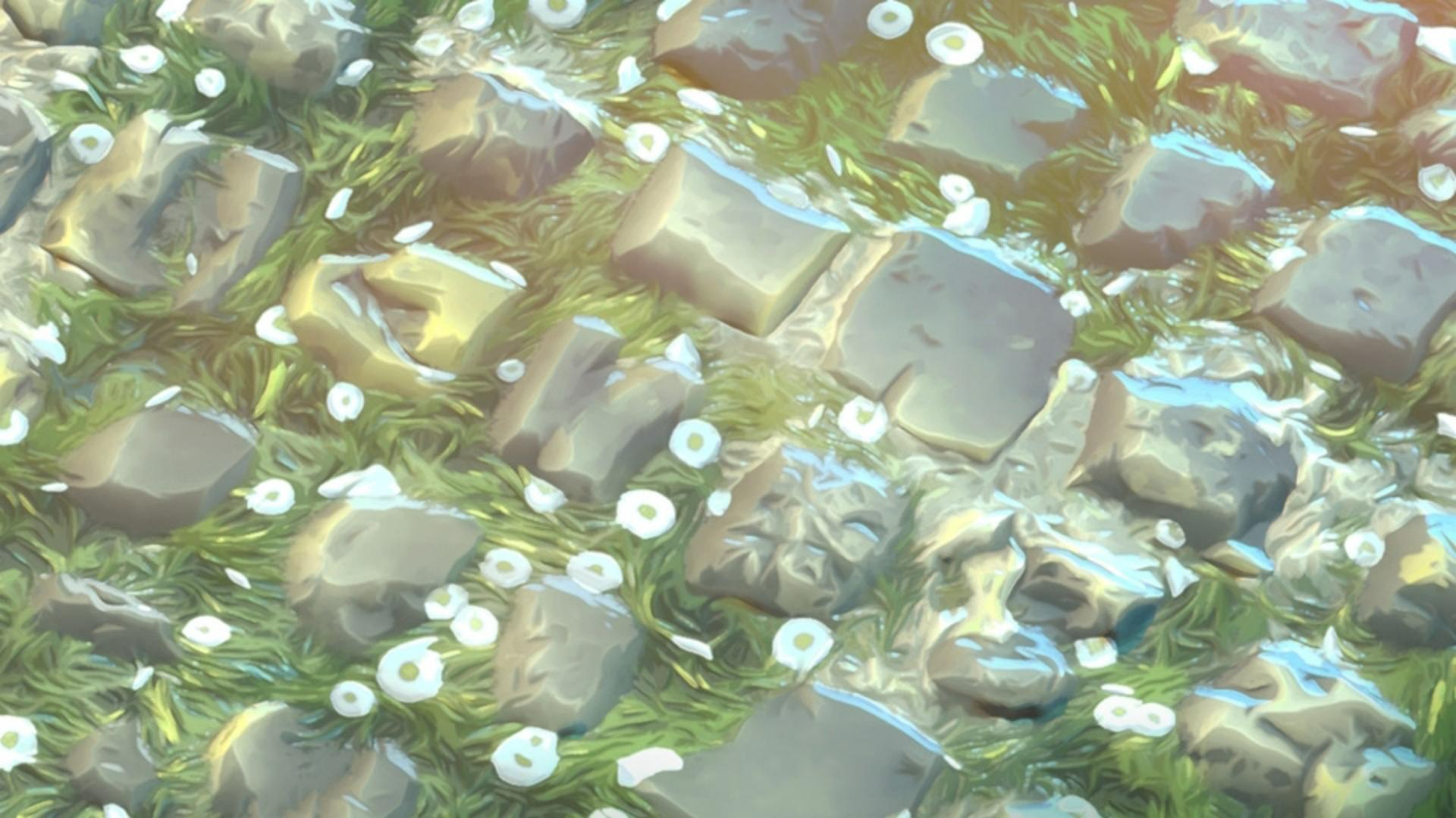
I have this nice grassy cobblestone material here, I made it in Substance Sampler simply by combining two materials from the assets library.
It is quite detailed and realistic and I would like to stylize it.
I imported the sbsar in my Designer graph
Applying quantization to full materials and normal maps
and now let’s see how we can use our new quantize color.
Let’s deal with the base color first.
I think the default 32 colors is fine but I need to smooth it to get this nice blocky look.
Alright I’m pretty happy with it, but I’m not sure I like these patches of dark green, I’d like to replace them with something lighter and more vibrant.
I can just take a modify palette node to do that… placing the target on the color I want to replace… then simply picking a nice bluish hue….
Like so… maybe tone down the opacity a little… alright.
Let’s connect this… ok.
So far, nothing very different from what we’ve already covered, but we’re obviously missing something, it looks a bit off, right?
and that’s because the normal map is still pretty noisy and realistic.
The good news is that we can also process it through a quantize color!
I’m going to go with even fewer colors here to really enhance the faceted look… then smoothing… Now you need to pay attention to one setting in particular when dealing with normal information.
In the quantize properties, you have this “distance color space” option, so far we’ve only worked in “lab” mode, which is the closest to what the human eye perceives and for this reason it works really well for the base color.
But when dealing with data like normal information it’s best to switch to RGB.
Ok let’s see how it looks… very nice!
I really like this chunky look, the sharp angles… I would say it maybe lacks a bit of painterliness, something softer and more organic… And I feel like this is the perfect opportunity to introduce the Kuwahara filter.
You may already have heard about this filter, it was originally designed as a denoiser, but it turns out it also creates a very nice hand painted look.
You will find two Kuwahara nodes in the current release: a greyscale one, and color one.
Let’s take a Kuwahara color, connect our normal to it and see what it does.
If I increase the radius… see what it’s doing?
Again, this is without… and this is with….
What’s happening is that the Kuwahara is trying to smooth the edges, to remove that noisy jaggedness that you see here… while retaining the shapes. and so it’s not uniformly smoothing in every direction, but it’s actually adapting to the flow of the image.
You can really see it on the grass, where it’s able to retain the direction of the clumps..
And this is why it is called Anisotropic Kuwahara.
If I were to turn the anisotropy off, it would just blur everything out.
So depending on the look you’re trying to achieve, you can balance these parameters to get something very specific.
Alright let’s connect this… nice.
You’ll notice that we also have an input and output for a direction map.
This is useful if you want to reuse your anisotropy and slope maps throughout several Kuwaharas and keep things consistent.
In this case for instance I’d like to apply a Kuwahara to my base color as well, so let’s do it… Keeping roughly the same values… maybe sharpening a little… alright.. then, to make sure it stays synchronized with my normal map, I’m going to enable the direction map input… and simply connect them like so.
And now if I decide to change the anisotropy angle here… it will also update here.. giving me a completely different look!
Perfect.
I also like how this combination of quantize and Kuwahara gives me this awesome curvature map that I can use to highlight the edges like that… really nice.
So this is how you can leverage these new nodes to experiment with stylized workflows!
I hope you found this tutorial helpful and that it inspired you to try these nodes for yourself, and of course, like always you can download the project files to have a closer look.
Have fun playing with them!


