You don't build a global business from one moment or a viral marketing campaign.
You build it from hundreds of tiny ones.
The unsexy, often overlooked decisions that most people would skip.
That's where the magic happens.
I'm Olivia Mae Hanlon, the founder of Girls in Marketing, an innovative learning provider and community worldwide.
And I'm also the co-founder of Passata, an AI productivity start-up.
In 2024, I was named in the Forbes 30 Under 30 for marketing and advertising.
But honestly, the achievements I'm most proud of didn't come from flashy moments; they came from sweating the small stuff.
When I started posting on LinkedIn, I thought one strong opening line was enough.
Turns out it's not.
People's attention drifts unless you keep earning it.
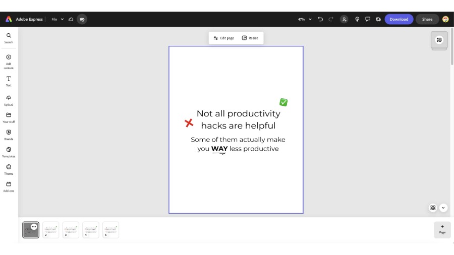
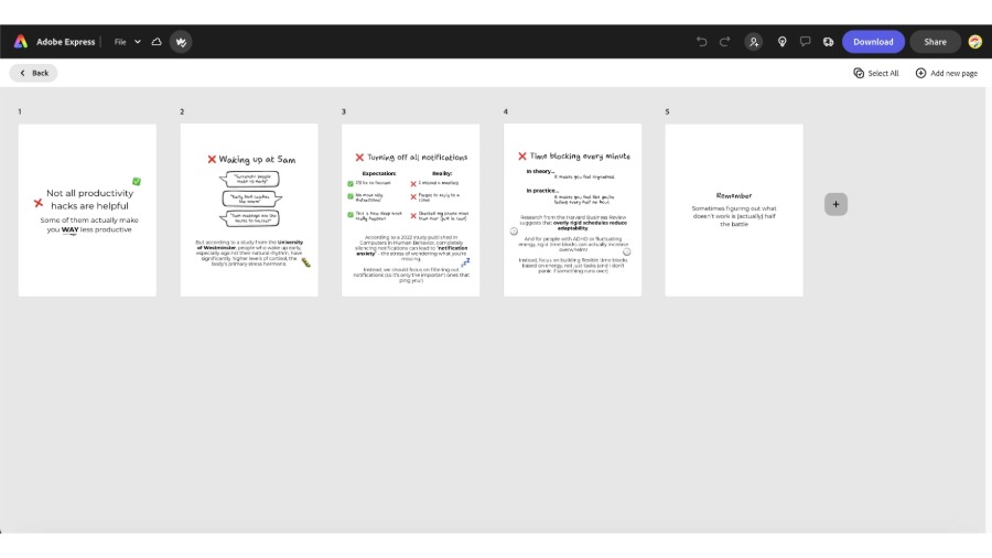
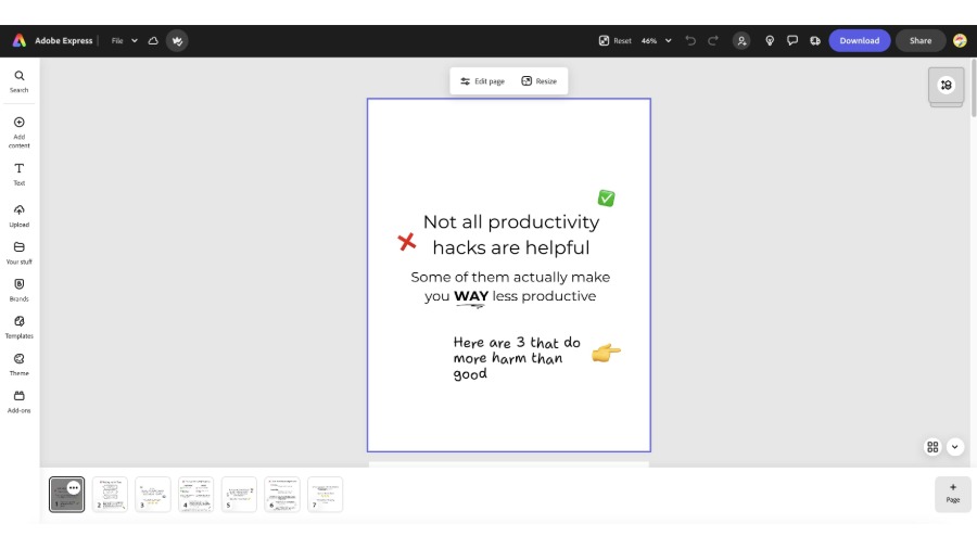
So, I've rebuilt how I write: hook story, hook, pay-off, CTA.
Every post has become a thread of many moments that pull people in forward with each line.
That small shift has doubled my engagement and the shares.
Attention isn't something that we give once; it's often won over and over again.
Earning attention is half the job; the other half is actually making that one sentence, make the whole thing click.
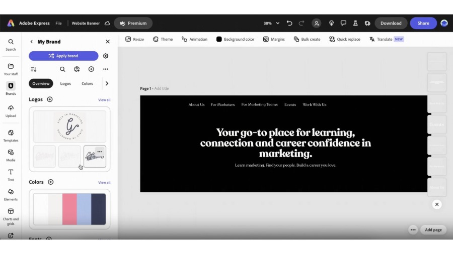
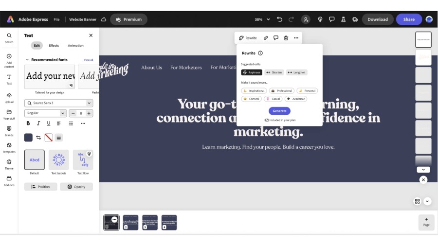
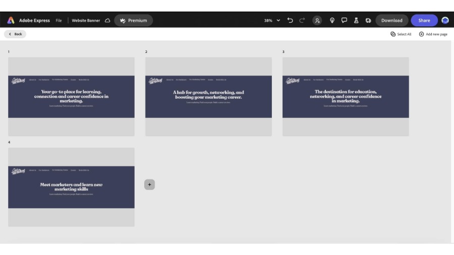
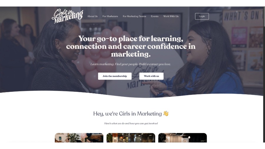
One sentence on the Girls in Marketing homepage changed our whole business - just one line.
Before it was a learning provider and community for marketers.
Now it says: Your go-to place for learning, connection and career confidence in marketing.
With that change, we were getting so many more leads and sales, but more importantly, we were getting the right sort of leads and sales.
And in a world where products look the same, the difference is often a single headline or a single phrase.
That's why I'll always spend as much time on one line as I do on a whole campaign.
That one line pulls the right people in.
Next, we need to stop hiding the message behind heavy design, because if it looks like marketing, people will probably ignore it, right?
When was the last time you replied to a marketing email?
Exactly.
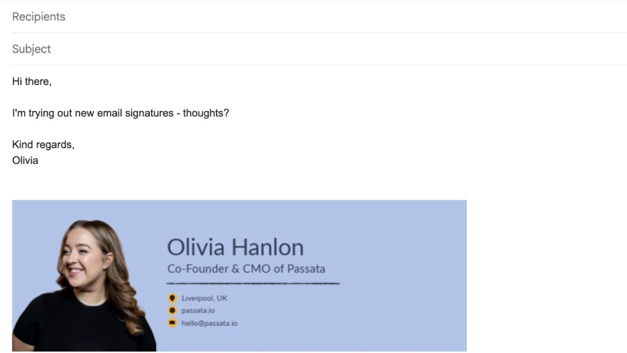
But at Passata, all of our emails are plain text, no graphic design, just clear messages from me, like I've written it to a friend.
And it works.
We have 65% open rates and tons of replies from people who wouldn't usually hit reply, and that is through a lot of trial and error.
We realized the more polished something looks, the more people scroll past.
Because ultimately simplicity and clarity stand out.
Here's my version of One Better: Your biggest wins have to come from making small, seemingly unsexy decisions that compound: weekly content, consistent design, thoughtful frameworks.
Going One Better for you is consistency and making sure that every asset, every post, every process earns its keep.
I've been in business for over six years now, and a key thing for me has been failure.
I'm a failure in so many ways, but I learn from it every time.
One Better isn't about doing more; it's about doing small things well - over and over again.