In this tutorial, we will take a look at the power and versatility of Smart Materials, and how these qualities rely on a strong understanding of what we want to achieve. As a case study, we will break down the flannel Smart Material available to all users in Substance 3D Painter.
Please note this tutorial relies on a basic understanding of the Substance 3D Painter interface and workflow.
SMART MATERIAL PRINCIPLES
Smart Materials in Substance 3D Painter are a very powerful asset for getting started with texturing work on any model, by providing a credible implementation of a material which adapts to the specific mesh it is applied to.
An important part of what makes such a material ‘smart’ is its awareness of the mesh features, which are read from mesh maps supplied by the user. For instance, a curvature map can make a Smart Material display more scratches and wear on specific parts of the model.
A good Smart Material has a simple, sensible Layer structure. It makes variations easy by clearly breaking down its components so any aspect of it can be identified, tweaked and/or disabled if required. This means it offers quick iteration
from the base it provides. More details about Smart Materials can be found in the dedicatedSubstance 3D Painter documentation page .
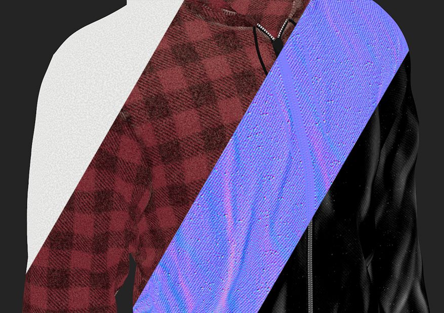
Take a look at how a complete material is applied and adapts itself to fit any mesh with a single drag and drop:
That being said, the foundation for any material work relies on a strong understanding of the real-world elements we want to draw from, as well as the functionality we need from the material. As an introduction for this project, let us take a look at both these aspects
BUILDING A REFERENCE BOARD
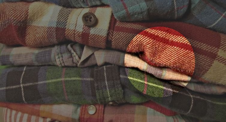
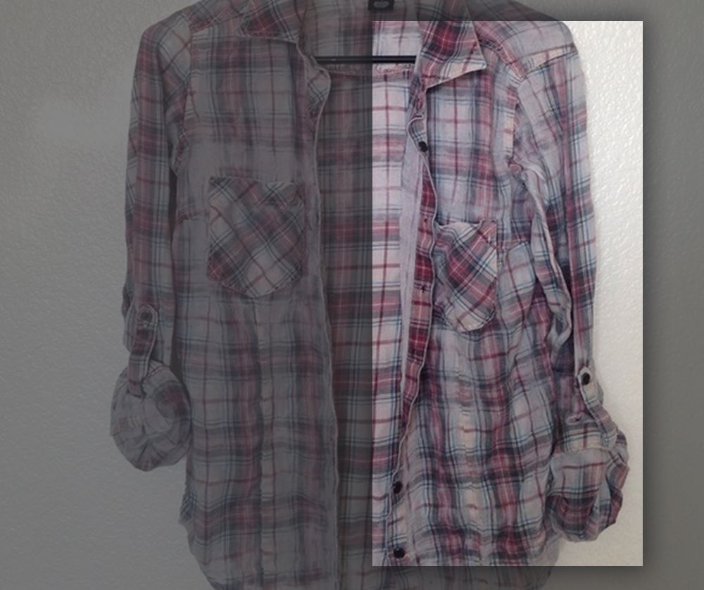
Flannel is a woven fabric
which can look and feel to the touch in many different ways, as the wool and yarn of yore are now dwarfed by the use of cotton and synthetic fiber. The soft wooly feel is often emulated by brushing the fabric, which disrupts the very fine threading and makes the surface look fuzzier and feel softer. This very soft, fuzzy feeling is what we are going for in this project.
Nothing beats having access to the real-life experience of any subject. Being able to touch and finely observe
the flannel, see how it reflects light and creases when being manipulated, is pretty much the best you could hope for in terms of gaining a thorough insight into the material. Do not forget to document your investigation with photographs and notes!
Having this kind of access can often be challenging though, and that is where the near-limitless library of the internet comes in. For seamless and efficient gathering of digital reference, We cannot recommendPureRef enough. It makes building reference boards and using them while working a breeze.
While gathering reference, we must make sure to cover the relevant aspects of what makes soft flannel recognisable and accurate
, from the overall thread structure and commonly used patterns, to the way the threading gets loose and discoloured as the cloth gets worn out. As we progress through the project, we will take a closer look at some pieces of reference when they are relevant to the step at hand.
0 - PROJECT SETUP
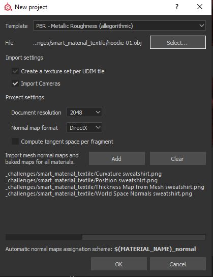
Now we have a usable library of reference, but we are not quite ready to dive in yet. Our Smart Material work will only be as efficient as the base project it is being built upon. When creating a new project in Substance 3D Painter, we are prompted to select a few important items and options, and there is already some important decision-making at play here.
First, we will work using the widely used
PBR (or Physically Based Rendering) Metallic/Roughness shading model, and will therefore select the ‘PBR - Metallic Roughness’ template so the proper shader and texturing channels are set up.
Note: the flannel Smart Material in Substance 3D Painter is also compatible with the PBR - Specular Glossiness shading model, however this implementation will not be covered in detail in this tutorial. Thus, although you will sometimes notice some channels like Diffuse and Glossiness being used in the supporting pictures, these will not be commented on. To know more about how these shading models differ, and about PBR in general, we strongly recommend taking a look at the outstandingPBR Guide by our own Wes McDermott. Keep this document handy at all times!
We want to iterate on our parameters and Layers quickly enough so we have a smooth workflow, so let us use a 2048 document resolution as a good compromise between quality and performance. This setting can be scaled up down the line if we want to polish details further and have more definition.
0.1 - MESH AND MAPS
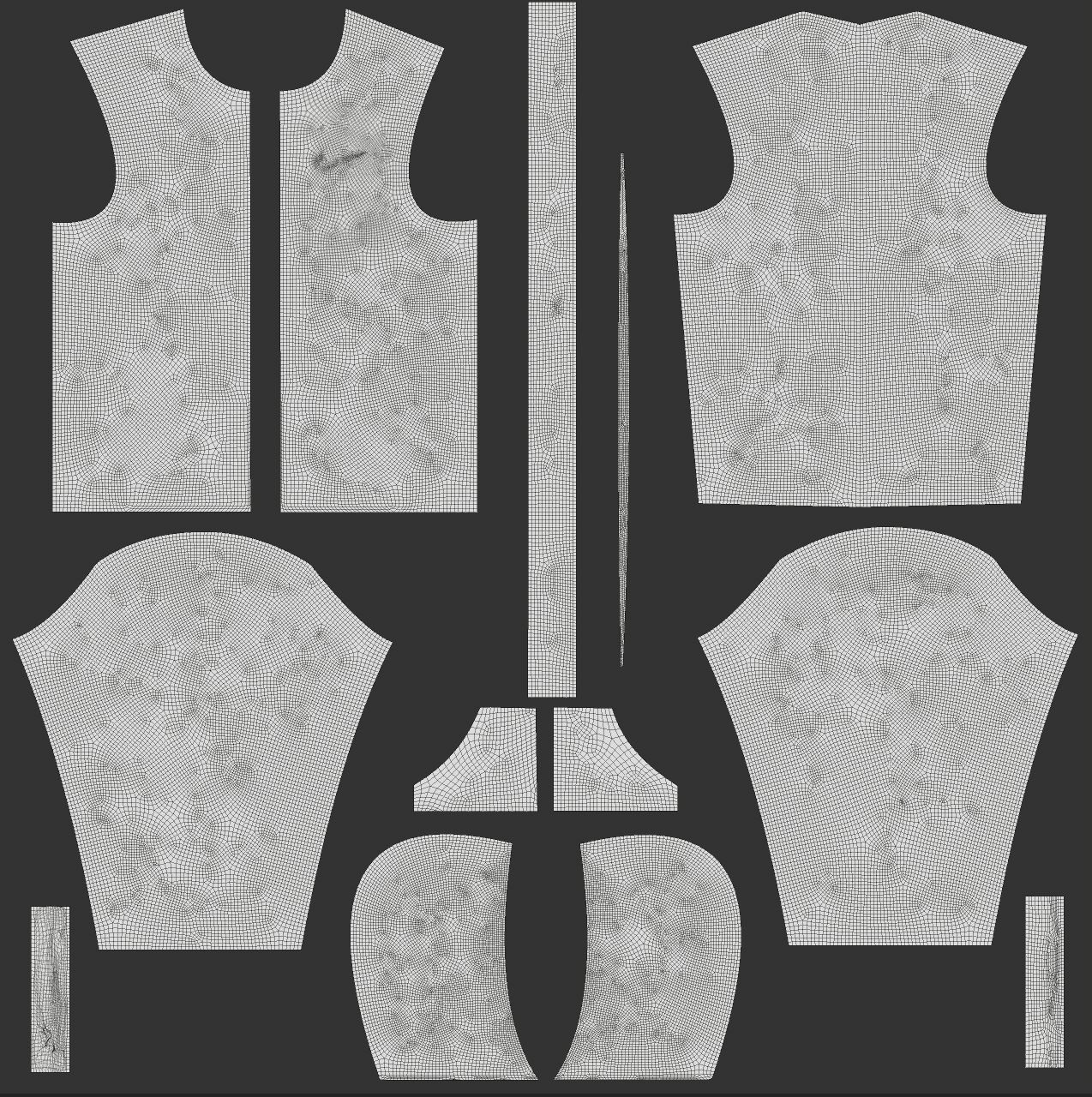
We then need to select a mesh to apply our material to. Because we will be working on fabric which is most commonly used for clothing, let us select some clothing
mesh for this project. We have a great looking hoodie model handy, so we will go with that. That being said, feel free to use whatever makes the most sense for you and you find appealing. The resulting Smart Material, by its very nature, will fit basically any mesh we will throw it on !
Lastly, we will import and use mesh maps which will provide information on several aspects of our mesh, which will be crucial for masking purposes. If you do not have these maps yet, you can generate them inside Substance 3D Painter using a process called ‘baking’. You can get started with baking in Substance 3D Painter by watching theFundamentals of Baking Textures course, right here in Substance Academy!
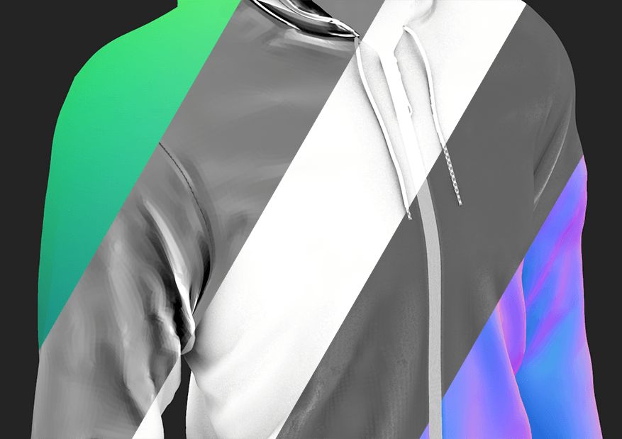
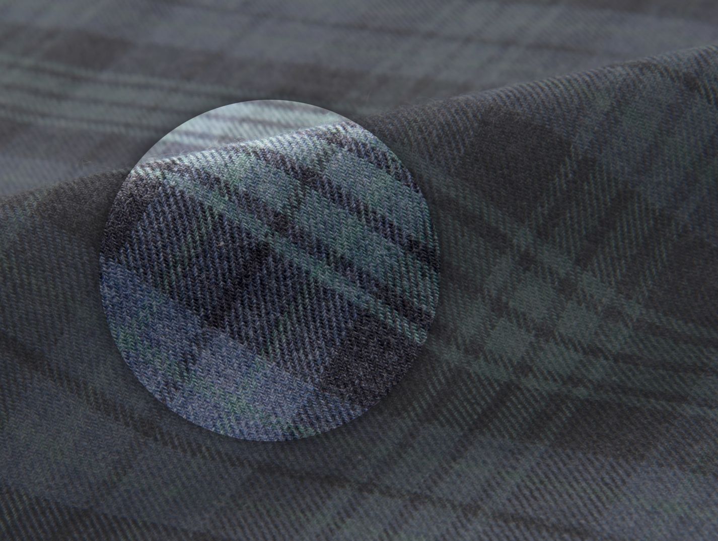
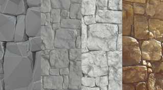
Below, you can see a simple breakdown of some of the maps we can use. In order of appearance: position, thickness, ambient occlusion, curvature and world space normals. During the course of the tutorial, you will be able to appreciate the importance of these maps.
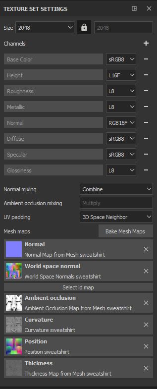
You can check that your resolution, texturing channels and mesh maps are all set up correctly in the ‘ Texture Set Settings ’ windows, as shown below. If anything is missing or incorrect, you can do any adjustments and additions in this panel.
0.2 - BASE LAYER AND FOLDER
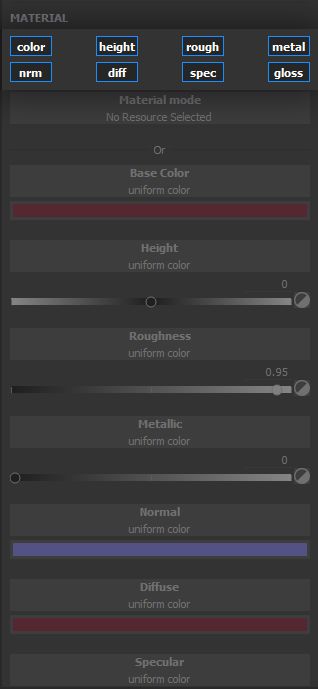
Because we used a template to get started with this project, we already have a new Layer ready to go in the Layers panel. However, we need a slightly different starting block here.
When working with Smart Materials, it is important to be able to predict the outcome of having the Smart Material applied on a model. Because of this requirement, we must make sure that no part of the Smart Material is missing information on any of its channels.
If we neglect to do that, our Smart Material can blend with the Layers below it in unexpected ways, which can lead to poor results and a frustrating experience for the end user. This does not mean the material must be entirely opaque, but that what is opaque has actual information. Keep in mind that a good Smart Material should be drag and drop and provide great results, with no additional fuss.
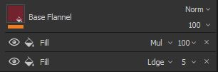
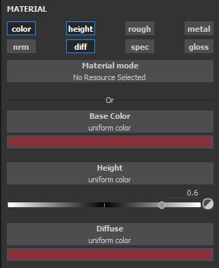
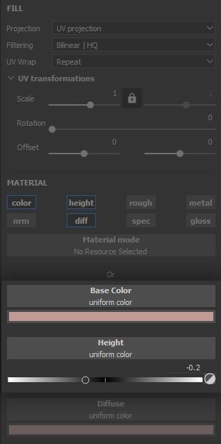
For these reasons, we will go ahead and create a Fill Layer, enable all material channels, and delete the previous Layer added by the template. Now we can work with some peace of mind knowing that all channels will have information to be passed, regardless of any work we will do on top of this base Layer. This Layer will be used as the foundation for our flannel work, which is detailed further in chapter 1: Base Fabric.
Then, we create a folder bearing the name of our Smart Material, and place this base Layer inside of it. This folder will contain * all* of the information required to apply the Smart Material, and will be the means to create it. All the subsequent Layers will be placed on top of the base Layer inside the folder.
Lastly, an important note on the mesh we are using for building our Smart Material: let us talk about UVs.
0.3 - UV LAYOUT
UV coordinates provide a map for our texturing work, letting us put the right information in the right place on our model. They can be automatically generated, however great rewards await those who take the time to lay out their UVs, for it is said in legend the wise artist lays out its UVs with specific goals in mind. For instance, in order to make the most of our hoodie shirt, we can consider the following:
laying out the UVs for the sleeves and tank either vertically or horizontally makes distribution of
linear patterns much more efficient;
cutting our UVs at the same place one would expect sewing seams to be placed will make the inevitable breaks in texture continuity much more acceptable, and even useful - more on that later.
There are more general rules of thumb when it comes to UVs: it is generally good practice to place UV cuts in less visible places, and UVs generally cannot be stacked when baking (they can be stacked later or offset by one coordinate unit). TheUnderstanding UVs and texel density course will help further your understanding of mesh UVs.
We are now all set up and ready to start working on the material! What should stick on your mind in this introduction is the careful thinking ahead and planning required to make the most of what Smart Materials have to offer, as with any project.
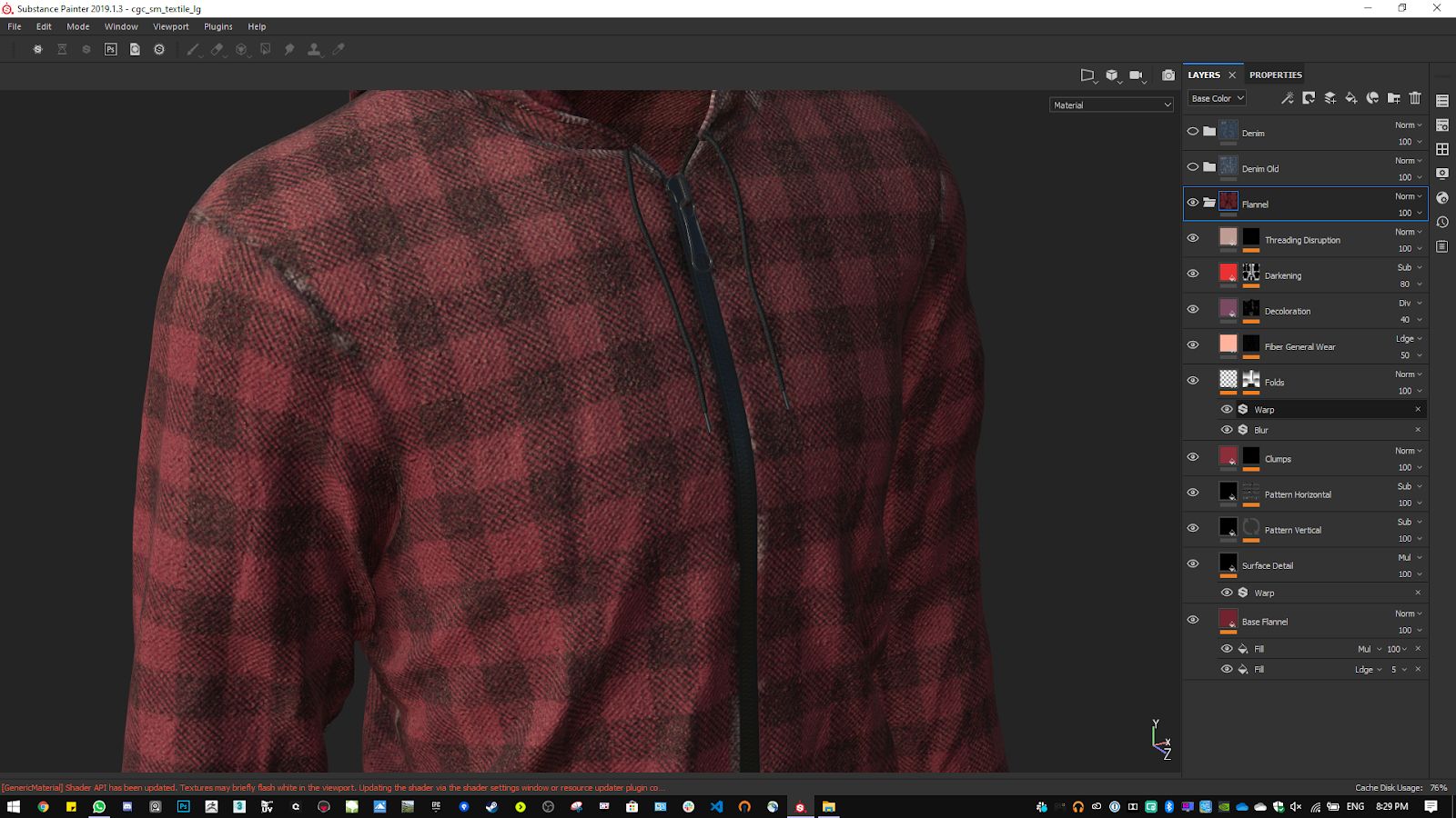
1 - BASE FABRIC
1.1 - MAIN COLOUR
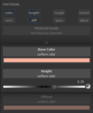
As a foundation for the material, and our base Layer, we need to block in some very basic information
about our fabric: how does it look from afar? How does it generally reflect light?
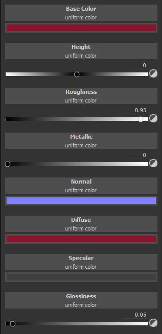
For the general look, we build from the base Layer parameters, which were set as a bordeaux colour with a roughness value of 0.95. Our flannel will be very soft and fuzzy, with heavy scattering and disruption of the light making it quite rough.
We can already convey some impression of fabric through the colour, by breaking it up in a way which suggests some height variation and gaps in the structure. Let us tackle these in order.
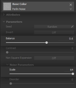
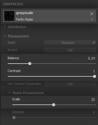
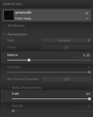
First, we subtly brighten up the surface in little spots with a simple Perlin Noise in a * Fill* Effect set to the Linear Dodge (Add) blending mode, in order to bring the RGB values up.
We make this noise quite dense with a high scale value.
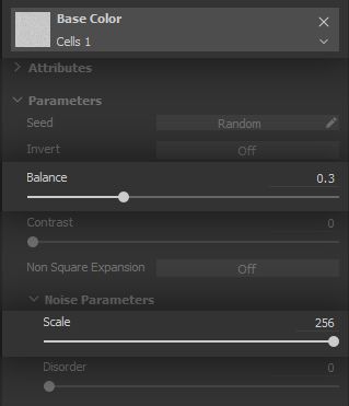
Now we want to fake tiny gaps in between the threading structure, which are effectively very dense and nearly always visible ambient occlusion shadows. The Cells 1 noise and the gradients it provides on its cells is useful to give this shadow feel for faking the gaps. We set one up in a Fill Effect, again with high scale to match the fabric density. You can control the shadow range using the ‘Balance’ parameter.
This should give us a general idea of the colour and fuzziness we are targeting.
1.2 - THREAD STRUCTURE
Next, we need to implement the basic threading structure of the flannel, and its volume.
Note that this is going to be faked through shading using a normals map. To create this normal information, we are going to rely on the automatic conversion of height to normal done by Substance 3D Painter, as working in grayscale for height is often far more intuitive and comfortable than having to deal with normal colours which rely on a specific tangent basis. This means we will use the * Height* channel
to drive the volume shading on the surface of the model.
Also, although this effect could easily be done in the base Layer as well, for the clarity of the material structure we prefer to implement it on a different Layer.
In order to understand the shading we want to achieve, we go back to our reference - which should remain displayed on your screen or on your wall at all times during the course of the project!
Although the threading structure is quite a simple and rigid grid, we observe a general fuzziness to how the surface effectively looks. This will be a strong keyword all through the project. It makes sense to build this effect, and the following, in a way which matches the story
of the material. This makes the creation process more logical and grounded.
Thus, we will first implement a clean threading structure, then break it up and make it more ‘fuzzy’ as the material is naturally disrupted and worn out.
We start by creating a * Fill* Layer with only its Height channel enabled, as we will solely work on volume. This Layer’s blending mode is set as Subtract on its height, as we want to carve out
the empty space in the lower parts of the threading, which will bring the height values down.
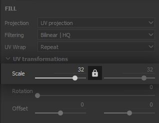
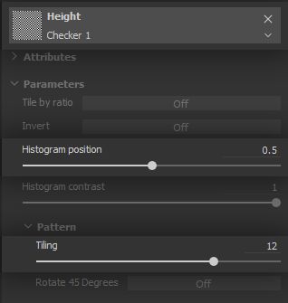
We are going to use several little tricks over the course of this project, starting now: we can make a convincing impression of a criss-crossing thread structure using texture Filtering to our advantage. We set up a Checker pattern in the Layer height, with high scale and tiling values to make it very dense.
The result will not really look like a checker because the 2048 resolution is not enough to display a checker pattern this dense. As the texture gets Filtered, it looks like criss-crossing. Pretty neat! This trick will come back later in this tutorial, so keep it in mind!
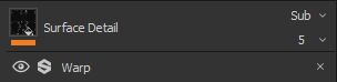
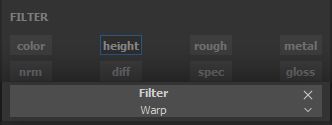
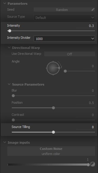
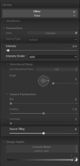
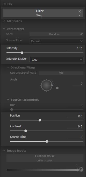
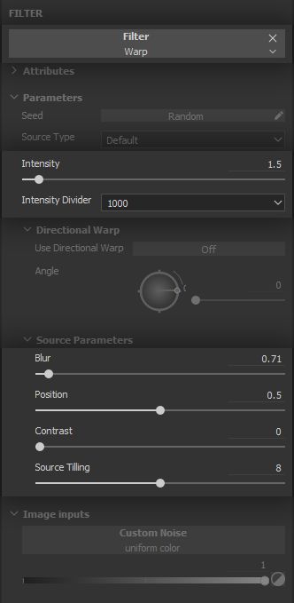
The criss-crossing pattern is still too uniform and rigid. It is time to break it up and bring that lovely fuzzy feeling. A simple * Warp* Filter Effect will do the trick.
Warps are more often than not a game of finding the right balance of tiling of the driving noise and intensity of the warping effect. We keep the warping under control with values lower than 1.0.
We now have a usable foundation for our fabric. Let us get to a very fun and creative part!
2 - BUILDING THE COLOUR PATTERNS
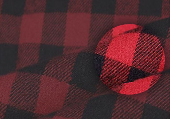
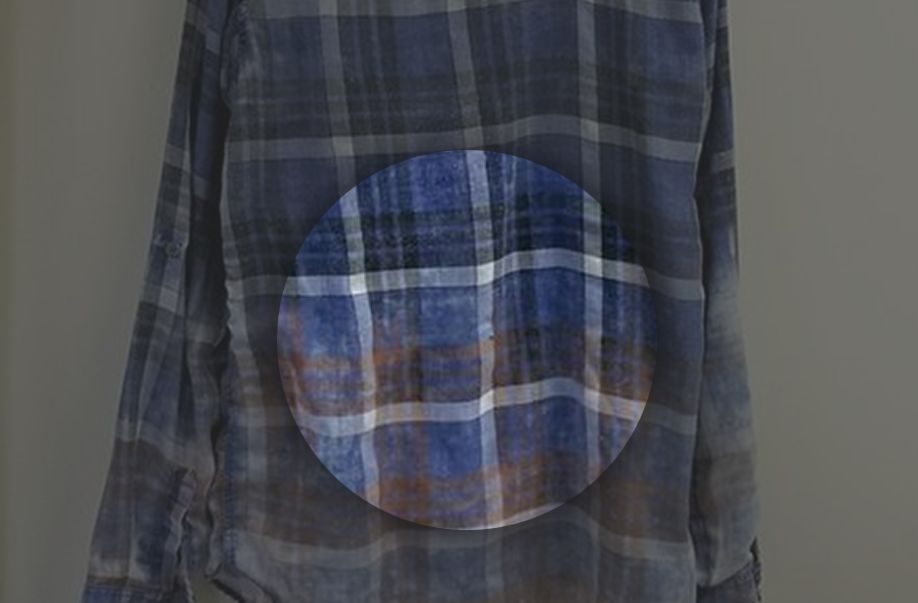
Flannel comes in all shapes and sizes, yet historically a staple of its look is the tartan pattern family. For centuries, this has been a way to identify families and clans, especially in what is and has been for long known as Scotland. We would be remiss not to honour this noble tradition!
Back to the reference again, and a few key points appear quite clearly.
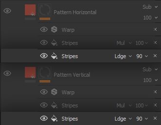
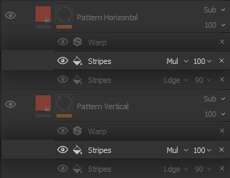
There is a noticeable hierarchy to the stripes, which are separated by colour, continuity, thickness, density and any combination of those characteristics. Identifying these characteristics is an important step of the project, as it will inform our choices in the structure of the Smart Material to promote flexibility. In this case, we understand it is appropriate to separate these stripes into different Layers, and have the hierarchy built directly into the structure of our Filters and Generators. Therefore, we create different * Fill* Layers for separate sets of stripes - the name and number of sets is completely arbitrary.
Furthermore, we also have to think about how the pattern is going to interact with the base fabric. We might want to have the pattern colours react to changes in the colours of the base fabric, so as to make overall hue changes seamless, for instance. For this reason, we fill the Layer with a colour, and set the colour blending mode to Subtract, so we can have the pattern colour be a tinted shade of the base fabric.
Now, it is time to build the stripes of the pattern, with an eye to establishing the hierarchy discussed above.
2.1 - MAIN STRIPES
A way to establish hierarchy is to separate clearly and easily the building of the stripe itself, and its subdivision into secondary stripes. We will do the former in this step.
After creating the Layers for the stripes, the entirety of the model should be darkened. To control which parts should be affected by the Layers, we create a
black mask and start building the stripes as white parts of said mask. Using a mask helps separate the effect of the pattern from its shape, for greater versatility.
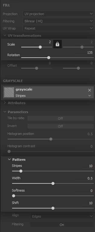
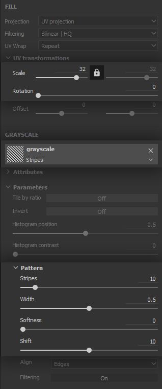
For building the first level of stripes, we will use a * Fill* Effect with a Stripes pattern - duh! This Effect is set with a Linear Dodge (Add) blending mode, in order to add visible portions to the mask (i.e. white).
The Stripes pattern provides very useful options for controlling the number and width of the stripes, as well as their softness. These options can be combined with the rotation and scale parameters of the Layer for further control.
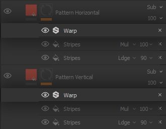
2.2 - SECONDARY STRIPES
Now our main stripes are implemented, let us build some controls for breaking them down into smaller stripes.
The set up is nearly identical to the main stripes, however this time we want to remove parts from the mask we built, thus we set the blending mode to Multiply or Subtract depending on which set of alternating stripes you want to remove. The reason for that is the following:
This very straightforward blending-modes-as-simple-maths approach is applicable for the Linear Dodge (Add) and Divide modes as well, as we will see down the line! The controls for these stripes are the same as before, as shown below. The main difference is in the number and scale
of the stripes, since we need a far greater number of thinner stripes.
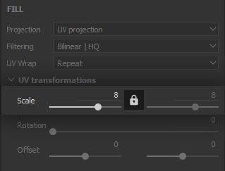
Note: Notice how the stripes fit and follow the shape of the parts of the model, especially the tank and sleeves. We have our careful planning and laying out of our UVs to thank for that. That is why we have let the Projection option of our fill Layers set to ‘UV projection’ up to this point. Build your assets in a way which let them do all of the heavy lifting for you !
2.3 - BLENDING IT IN
The stripes are in, and you are free to go crazy with the pattern combinations ! However, it still looks too clean. As with the threading structure, we need to implement the fuzziness and disrupt the stripes a tad.
Our reference shows the fuzziness can occasionally create some slight discontinuity and colour bleed between the base fabrics and patterns, which can be emulated with simple Warp Filter Effects.
The fuzziness being very fine, we use high intensity divider and tiling for the warp Filter, with a low overall intensity value.
To add more stripes, you can basically duplicate the whole Layer, and start tweaking parameters. Again, we thank ourselves and our diligent thinking ahead
for making this so easy on us now. It is a bit more work up front, but pays large dividends down the line!
3- LAYERING IN THE WEAR EFFECTS
We are now more comfortable with the process, and have a strong look for our flannel. It is time to step up our game and make this material actually ‘smart’.
Up to this point, aside from our UV layout none of our Layers and effects leveraged information which was specific to the mesh. However, the way out flannel wears out is not uniform and will more often than not vary depending on the type of wear. Let us investigate how, and for the usability and versatility of our Smart Material, let us
break down the wear effects by type in separate Layers.
While the order of some types of wear is interchangeable, some others need to be laid out in a specific order in order to make sense. This is another way a strong understanding of the source material through reference and research is yet again leveraged, for a high quality result.
We start the fabric wear effects with a simple one.
3.1 - CLUMPS
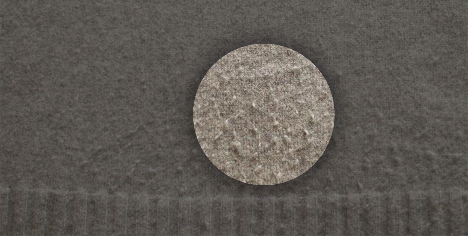
We are going for a brushed flannel, which makes it behave more like yarn or wool. When rubbed against a rough surface, the fine disrupted surface threading will clump together
, as shown below. Implementing this will go a long way towards making our flannel feel more fuzzy and soft.
In our specific case, we have to consider two consequences of the clumping:
It will create a protrusion from the surface of the fabric adding to the height, hence the Linear Dodge (Add) blending mode;
It will possibly cover the fabric below the clump, replacing the colour which is done using a Normal blending mode.
Therefore we create a ‘Fill’ Layer with colour and height channels enabled, and we replicate here the colour of the base fabric. Admittedly, the clumps could also have the same colour as the patterns, but we go for a simple setup as it will drive the impression quite efficiently regardless. Surprisingly often, texturing artists aim for verisimilitude rather than straight realism, as the former can be more interesting than the latter while remaining quite believable
for the audience. The placement of the clumps will be driven by a mask, so we start with a black mask and will build visibility from there, as we did for the stripes.
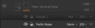
The distribution of the clumps requires a good feeling of randomness, so let us add a ‘Fill’ Effect on our mask, running a Perlin Noise.
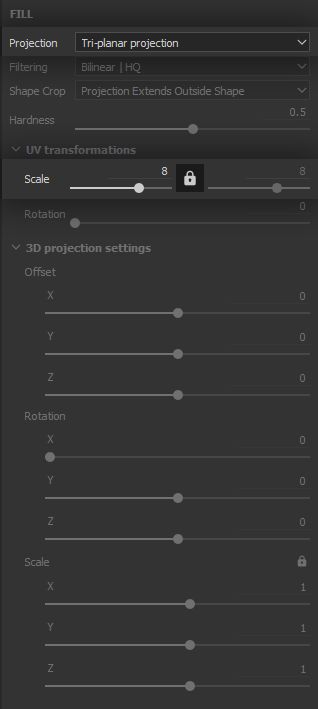
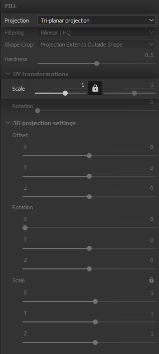
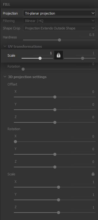
This time we will switch the ‘Projection’ parameter to Tri-planar projection in order to break up the noise tiling as much as possible. Tri-planar projection, as the name implies, projects the texture on the X, Y and Z axes and blends the projections together to minimise stretching of the texture. We need the clumps to be quite small so we bring the texture scale way up.
The noise needs to let only a few areas appear, and these need to be well defined, so the clumps appear both solid and varied. The balance will therefore go down and the contrast
is pushed to its maximum - again, we will let texture filtering provide the blurriness required for smooth height variation.
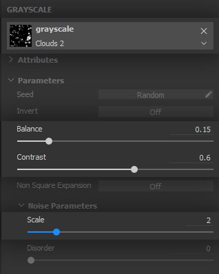
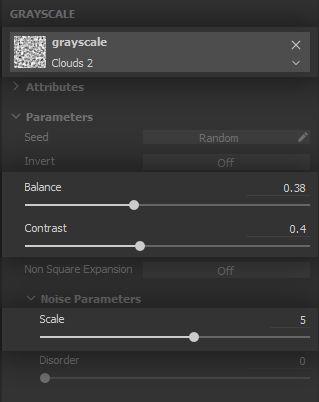
Now, the noise alone will clearly not work, as its tiling is all too visible and the clumps coverage will be far too high. We are going to mitigate and control the coverage with a secondary noise in a separate ‘Fill’ Effect.
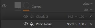
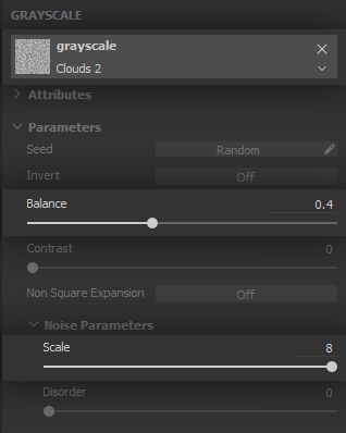
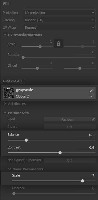
The Clouds 2 noise is very versatile for its good low-frequency separation and mid-frequency graininess without much high-frequency noise, it will therefore be used multiple times throughout the project. The noise is set to a Multiply blending mode, since we will use it to remove large portions of the clumps visibility.
This control noise being set to Tri-planar projection as well is what is going to sell the randomness of the clumping effect. Both projections will play off of one another and result in a believable clumping coverage for our flannel.
Be careful to tweak this effect in a way that supports and sells the base fabric, not distract from it. Going down the wear effects, you will sometimes notice a lot of work is required for something barely noticeable, yet incredibly important in the overall believability of the material.
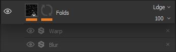
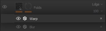
3.2 - FOLDS
On a macro level, the overall surface of the fabric is still very smooth, so let us add some folding creases
to drive home this has been manipulated and worn several times already.
A very satisfying aspect of using reference is realising something you already had a sense of, but now you have a chance to examine it more closely and break it down, gaining a greater insight of how the world works. The picture below demonstrates two phenomena, which will together give us a good indication of which implementation of folding creases makes the most sense. We can notice the lower portion of the shirt is much more creased than the upper part. There are two main reasons for this:
When wet, the weight of the lower portion will pull and stretch the upper part, making the latter smoother while the lower portion remains creased;
When worn, the lower portion of the shirt will fold much more often when the wearer bends or sits. Additionally, this part often has some give to it compared to the upper portion which is more firmly laid out on the shoulders because of gravity;
Finally, the area between the arm and torso is often subject to friction, which will add more creasing.
From these observations, we can extrapolate that the folding creases should be more visible in the lower hanging parts
of our hoodie. This will not always hold true, depending on your specific model and use case.
Folds only affect volume so we create a new * Fill* Layer with only the Height channel enabled.
For our creases, we want a general direction which is vertical, to put the emphasis on the weight of our brushed soft flannel. The fabric will be pulled - and therefore will stretch and fold - downward. Regarding functionality, we need to be able to control the folds and their visibility separately. To achieve that, we will implement the
folds in the Layer itself, and drive its visibility with the mask, which sounds obvious but differs slightly from how we approached our implementation up to this point.
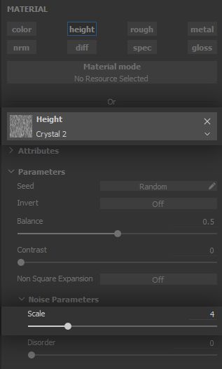
From our reference, we gather that folds have varying lengths, slight changes in direction and can occasionally cross one another. The Crystal 2 noise will do that for us beautifully! Let us set one up in a * Fill* Effect. Folds should be as smooth and subtle as possible so you can bring the Contrast parameter way down. If you want more hierarchy in the folds, feel free to add a new
Fill Effect with another Crystal 2 noise set to a different tiling value.
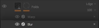
The folds are now a bit too defined and straight. Let us address both of these issues in order.
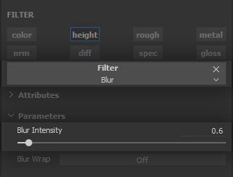
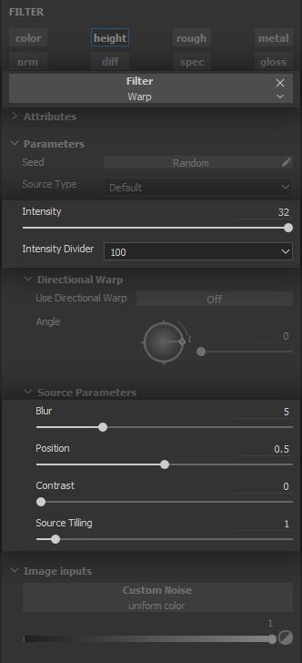
A simple * Blur* Filter Effect will take care of the definition and will blend the folds into the general curviness of the fabric just fine.
On top of this, a low-density, low-definition * Warp* Filter Effect will curve the folds just that much which is needed to make them more chaotic and thus believable.
We are done with creating the folds, and can move on to controlling where they appear. As discussed in our analysis of the reference, we want the folding to be distributed from the bottom upward
, in order to give priority to the lower portions of the model. We also want this distribution to be easily tweakable.
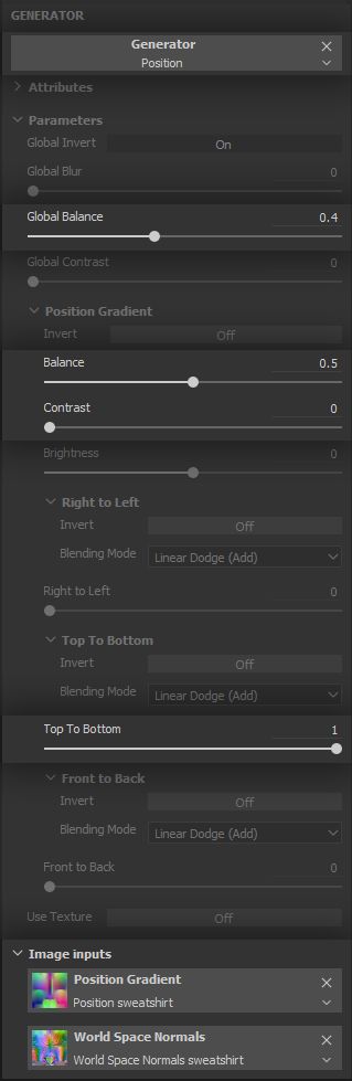
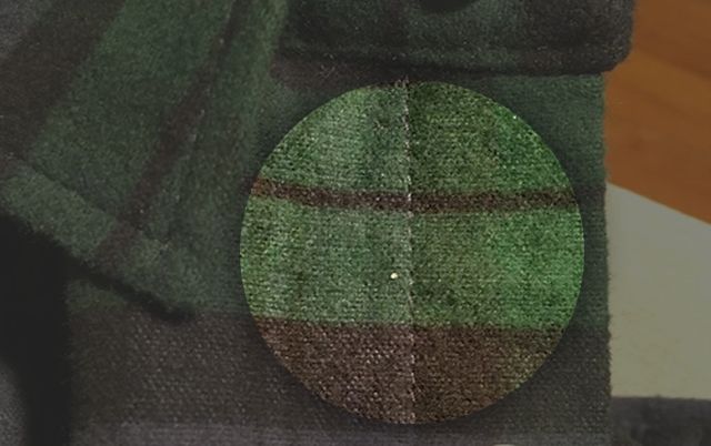
In order to easily isolate which portions of our model are lower than the others, it is now finally time to introduce our first use of mesh maps. The Position map provides gradients from one side of the mesh to the other, mapped on RGB for the XYZ directions respectively. This means the green channel hosts a gradient along the Y direction, which is the vertical direction in our model. Hey, that is quite handy!
To use this mesh map, we add a Generator Effect to the mask and set it to Position. Notice the mesh maps inputs at the bottom of the parameters panel. The most important thing to do here is setting the Top to Bottom direction range to 1 and leaving all other direction ranges at 0, so as to isolate the vertical gradient. From there the couple of Balance parameters, in combination with Contrast should provide all the control we need on the maximum height the folds should appear. Of course, you can break this up further by subtracting a noise in a * Fill* Effect on top of the vertical gradient.
We can now enjoy our lovely folds with straightforward controls. We definitely could not let such a lovely piece of flannel neatly hanging in some store, this was made to see the world and get a bit messy!
3.3 - FIBER WEAR
Speaking of messy, during its adventures our flannel is bound to get rubbed against a number of things, which will displace and sometimes rip on the very fine fuzzy brushed threading. This will expose the support threading structure and discolour the fabric. Depending on the thread material and support threading, the flannel can pick up a spotty, noisy, warmish tint.
We are interested in having some of that in order to provide a sense of age and decay to the integrity of the fabric. Let us get started with a ‘*Fill*’ Layer affecting colour and height to cover both impacts of this decay. Both colour and height are set to the ‘Linear Dodge (Add)’ blending mode for different reasons.
Colour will get a
bit brighter and warmer so we need to add to its current red and green values, with a colour that will impact these colour channels more than blue. Height needs to be subtly increased to reflect the subtle pulling and ripping on the fine surface threading.
We assume all threads are made from the same base fabric material, and as such will discolour in the same fashion. Therefore, the Layer will have a uniform value across its surface and we will only work on masking to implement the effect.
Note that you can have the patterns be impacted differently - per instance, with a different colour - by this effect. To do this, we can reuse the mask we built for the patterns by using Anchor Points. Learn more on anchor points by taking a look at the correspondingdocumentation page . Additionally,this course makes use of this technique if you wish to see anchor points in action. Test your skills by trying to have the patterns be affected differently by the fiber wear!
This type of wear is very fine and thus needs a very simple yet dense noise. It also is very chaotic by nature since it is caused by friction over time and use. A high contrast, very high scale Perlin Noise Fill Effect on our mask Layer stack will do the trick.
Such a dense noise can quickly become an opaque membrane that covers all the model, even at high contrast values. To mitigate that and ensure we get the small dots we need, we bring the Balance value down a notch.
As we have done several times by now, we need to break up the effect and make it a bit more sparse, varied and subtle. Let us bring it back under control with a * Clouds 2* Fill Effect set to the Multiply blending mode.
We use Multiply here instead of Subtract, because although we need the effect to be less intense, we still need to have it applied
nearly everywhere on the model. Multiply, by its mathematical nature, will only modulate the first effect, like a potentiometer. With Subtract, we risk bringing a lot of values at or under 0, resulting in the effect being nullified on sizable portions of our model.
As we have done for the clumping, we set the ‘Clouds 2’ Fill Effect to the ‘Tri-planar’ projection mode, in order to break up symmetry and tiling, and further support the chaotic aspect of this type of wear.
Set the balance and scale to your heart’s content, depending on how homogeneous or patchy
you want the wear to look.
Notice how there is a pattern - ha - to the way we set up a lot of the Layer stacks. We first create the overall look of the effect in a Layer, then control its visibility and intensity separately, whether it is with a Layer, a Mask, and Effect or simply using the Opacity parameter in the Layer stack.
This is a key workflow because it is non-destructive, and it allows easy control
of the important aspects of our texturing process. For instance, we can break up the visibility of our patterns without touching the way they were built. These can be easily reused and tweaked across a number of iterations and projects. Get comfortable with the thinking process of assessing the efficiency of your work and making it reusable. There is no need to reinvent the quilt each time!
3.4 - DISCOLORATION
This effect is entirely optional as it can sometimes appear to not make much sense, yet it is still a fun one and another interesting use of the mesh maps. We want to add further variation on the colour of the fabric to bring down the saturation, which can cause visual fatigue, while
supporting the sense of being worn out. It needs to be subtle so as to not be distracting.
Discolouring the mesh on some parts can do that for us, and applying this effect on the parts of the model which are facing up - i.e. the sky - can tell the story of the fabric having been bleached out by the sun. This is the part which can not make much sense depending on the fabric. Also, we see on the reference how the lower parts are more bleached out. Feel free to more closely match this in your own implementation.
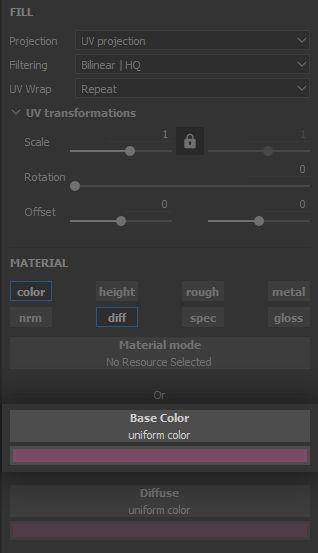
The set up this time is a bit more convoluted: we create a new * Fill* Layer affecting only colour, and set it to the Divide blending mode.
We want to use the discolouration to add variation, but in a way that makes the fabric richer, not more bland. This is comparable to the way some artists paint shadows: they take a darker shade of the same hue, which results in dull and flat shadowing because that is not how light works. Similarly, we would like to bring our colour a bit closer to the colour of the support threading we discussed in the Fiber Wear chapter, but - and this is the catch -
without losing too much contrast on the patterns. This is where the Divide blending mode comes in.
If we were to use the Linear Dodge (Add) mode, we would indiscriminately bring up the values of all parts of the fabric in the exact same way, and lose contrast. Division will bring the values up more in the bright parts of the fabric than the darker parts - i.e. the patterns.
Let us put it in a different way: addition preserves the absolute difference between the two values. Division will let us preserve their ratios. (Value 2) is still double (Value 1) after division, which is interesting to us since the doubling function exacerbates the differences between two values as they go up
. This means the bright parts of our fabric will go bright far quicker than the patterns. This is, quite fittingly, the** reverse effect of the *Multiply*** blending mode where darker parts go darker more quickly than brighter parts.
A side effect of this is that we must pay attention to set this Layer colour to one which is close to the inverse colour of the one we want to achieve, because of the effect of division across the RGB values :
The second example is the reason we go for a dull purple as the colour the fabric will be divided by.
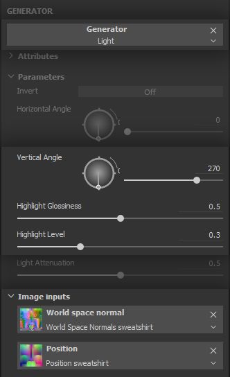
This was a bit of a heavy explanation for such a small step, let us lighten up things - ha! We will use the * Light* Generator Effect to isolate the parts of the model which would be affected by a light source from a given direction - in our case, the sun. We create a black mask a set the generator as the first item in its stack.
This will be adding to the visible portions of the mask, so we set it to the*** Linear Dodge (Add)*** blending mode. The controls are quite intuitive: set a horizontal and vertical direction for the light source, adjust it
highlight propagation and we are done. Again, notice the mesh maps being leveraged in this generator, at the bottom of the parameters panel.
This generator by itself will provide a very smooth propagation of light. We will break it up a tad, to account for the somewhat rough surface of our fuzzy brushed flannel.
The ever-so-useful *
Warp* Filter Effect will lend us a hand again here. Let us make it dense to match the general threading structure and fuzziness of the fabric.
The Light Generator Effect is very fun to use and is a great tool in cases where you need to fake some lighting in the textures. Projects going for a hand-painted aesthetic are a common example. It can also be user to place weathering effects on parts of a model which should be more exposed to the environment, such as moss on rocks. We now have fabric which is a bit more interesting to look at. As always, use the Opacity parameter of Layers and Effects to adjust the
overall visibility of each aspect of the effect.
The overall surface is now done! We only need to add some details and flourishes to make the final result seamless - quite literally.
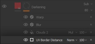
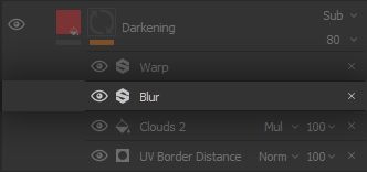
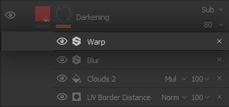
3.5 - DARKENING
The Smart Material looks pretty good already, but we still need to do something about those nasty UV seams. Guess what: we planned ahead! By placing our UV cuts where actual sewing seams would more or less be, we can add in some effects which will at the same time make sense and hide those cuts. We start with a darkening effect on the seams, as fabric will be thicker thus preserve more moisture in addition to creating
lots of small crevices in the sewing folds for dust and dirt to settle into. This can darken the fabric over time.
Darkening will only affect colour, we will therefore set up a new * Fill* Layer active on that channel only and with a ‘Subtract’ blending mode, to bring those RGB values down. Similarly to the discolouration, we want our darkening to have some life into it, and not be a straight shade of the same fabric colour. For this reason, we set a colour on the Layer somewhat matching the fabric but leaving a small range of difference
for the colour to modulate into. In our case, we end up with a colder shade.
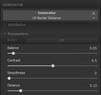
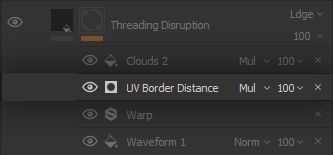
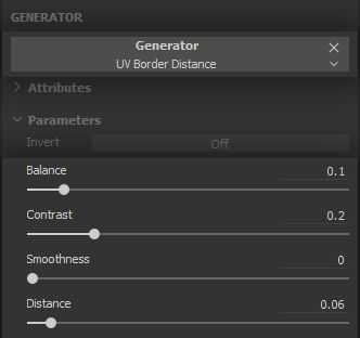
We create a black mask and get to work on placing this darkening in the proper areas, starting with the powerful * UV Border Distance* Generator Effect to leverage those clever UVs we laid out. The generator does pretty much what it says: it creates a white outline on the UV borders, with a tweakable distance and fade.
We are only interested in the moisture and dust accumulating at the thicker folds at the seams, so we go for a low distance and a faint balance, while keeping the contrast high enough to have some definition.
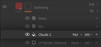
Of course, not all of the fabric will be impacted in the same way along the seams, so we break it up by multiplying a * Clouds 2* Fill Effect Layer set to a Tri-planar projection to alleviate symmetry and tiling.
This should look random enough for our purposes. We do not want the distribution to vary too much as to become distracting, so we keep the noise at moderate scale so it applies smoothly.
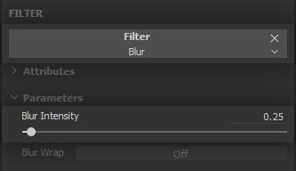
We can mitigate the noisy graininess of ‘Clouds 2’ a bit with a low-intensity Blur Filter Effect.
We use low values for the intensity for our blur. The change of scale in image frequencies that occur with heavy blurring is most of the time similar to using the same original noise at a lower scale, which is often preferable in order to keep some definition and texture.
Replicating the thought process we used for breaking up the Light
Generator Effect, we want to adapt the effect a bit to the threading structure and fuzziness of the fabric, by applying a * Warp* Filter Effect on it.
We keep it dense to match the scale of the threading structure, and go for a higher intensity value to try to create more separation between thread strands.
The strength of the set up we went for is the range of control we have on the colour, intensity, range and variation of the darkening effect. As we move to higher frequencies and more localised fine detail, more steps might be required to keep this degree of control and range of possible variations.
We are down to the last step in our Smart Material, and it is an exciting one because we are going to combine different things in creative ways ! Look forward to reaching the point where you feel comfortable enough with the tools you can sense these combinations, for it is incredibly satisfying.
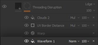
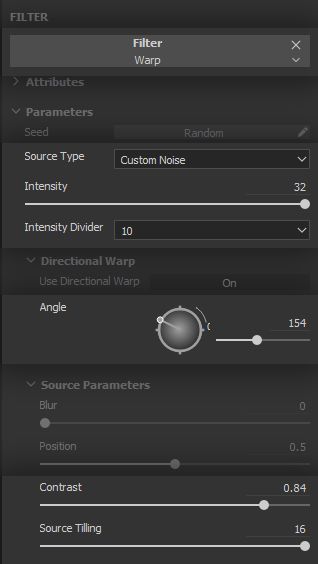
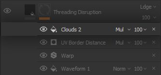
3.6 - THREADING DISRUPTION
As the fabric is subject to yet more friction, the parts of the threading which has the most tension and is most exposed to the environment will slowly thin out and tear, getting discoloured in the process and leaving the support threading exposed.
To place this effect, we will use the exact same approach as the darkening. Indeed, the most exposed and tense parts are often the borders of the fabric, where it curls into itself as the stitching is applied. It therefore makes sense to apply the effect on the seams, which are functionally our UV borders here. More on that later.
This threading disruption effectively removes threads, leaving gaps in the surface of the fabric. It also leaves the support structure exposed, so we need to replace information on both Height and Colour channels. This replacement is done using the Normal blending mode, and we will input hard values for height and colour with what matches the support structure present underneath the surface of the fabric.
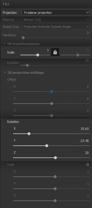
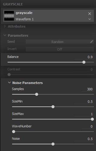
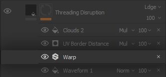
Now let us get our hands dirty on the mask, for this is where the trick happens! We need to create an * impression* of threading coming loose in chaotic fashion, sometimes keeping the criss-crossing in and sometimes not. Meet the Waveform 1 pattern. The way the waveform is implemented relies on repeating fading lines with varying lengths. This is the functionality we need to start building the loose threading. Let us set this pattern up in a * Fill* Effect to start our work on the mask.
A way to create some nice amount of criss-crossing from the get-go is to use a * Tri-planar* projection for the waveform, with a good amount or rotation in the projection so each of the projections on X, Y and Z overlap into each other at different rotations. Set the Hardness parameter at 0 so you can get the maximum amount of blending and overlapping, and keep the scale low for now.
In the parameters of the waveform proper, there are a few important things to consider. The threads need to be fine enough to blend in with the rest of the fabric, so we want a very high number of samples. We want them to be as long as possible while keeping some variation, so the size range is 0.5 to 1.0 with a length noise (i.e. variation) of 0.5. Finally, we do not want any waves. That might sound strange, but waveform works by modulating a high frequency of lines into bigger low frequency waves. However, we want to promote the best coverage of the model we can, and setting the number of waves to 0 effectively impedes our ‘waves’ of ever going down. Try changing any of these values to have a better feel for how it all works.
But there is still far from enough criss-crossing going on, there is not yet any real sense of a threading pattern to any of it. So we need to get even more creative. We can take inspiration from how sewing actually works, and take a shot at offsetting our waveform lines so they criss-cross into each other, but in alternating steps. Let us examine that in more detail.
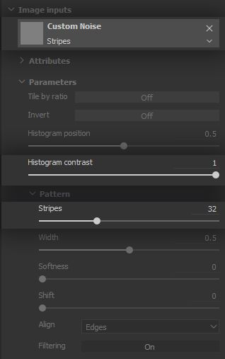
We use a * Warp* Filter Effect but this time, we do not limit ourselves to the default settings, we use a custom noise to drive the warping effect in a specific way.
To emulate the back and forth of the sewing process, we need a mask which features a back and forth between black and white. Fortunately, we have toyed around with such a tool for a while in this project: it is good to see you again, Stripes ! By using a ‘Stripes’ pattern with a very high amount of tiling, a high contrast to keep a good definition, and any random angle
value, we use the warp in a way which displaces the lines back and forth. The result combines with the tri-planar projection and criss-crosses the lines into themselves, we quickly created our threading structure in a way not too different from actual sewing!
The effect is not perfect by any stretch, but it will work great to create an * impression* of disrupted threading at the seams. Add a second high density, low intensity ‘Warp’ Filter Effect to make the thread more wavy and loose.
The placement of the effect on the seams is similar to what was done for the darkening effect, so we will go over in more broader terms. Feel free to go back to the previous chapter to refresh your memory.
We use the * UV Border Distance* Generator Effect to isolate the borders where our seams are…
...and use a Clouds 2 noise in a Fill Effect to make the the disruption more sparse and subtle. Again, go ahead and tweak any parameters to match what suits your project better.
The tri-planar waveform and striped warp trick was fun to pull off, wasn’t it?
This way of approaching the threading disruption effect grants us a surprising amount of control over the distribution of criss-crossing and the direction of the disrupted threads. Pay attention to the balance of this and the darkening effects, it is quick and easy to go overboard. Having reference handy at all times is an important safeguard when it comes to apply restraint.
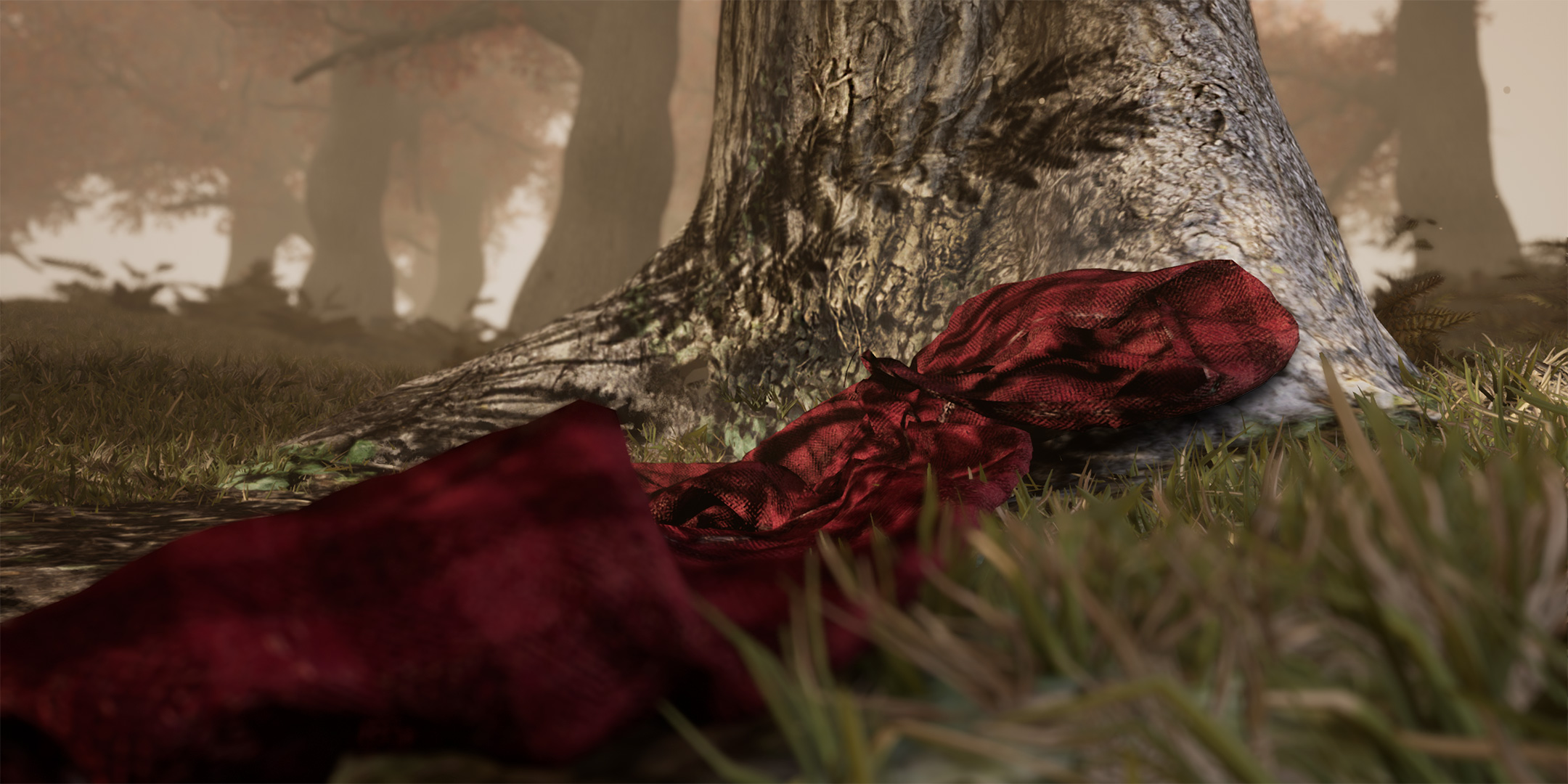
4 - FINAL RESULTS AND IMPLEMENTATION
Such lovely flannel
!
First, let us congratulate you for going through all of this lengthy process, and thank you for sticking with us all the way! There was a lot to cover here and we hope you feel it paid off. We now have a complete Smart Material, which can be added to the Shelf by right-clicking on the main folder which contains all of our Layers, and selecting the Create Smart Material option. A Smart Material bearing the name of the folder is then added to the Shelf, ready to be used in any project or exported to share it with third parties.
Now what?
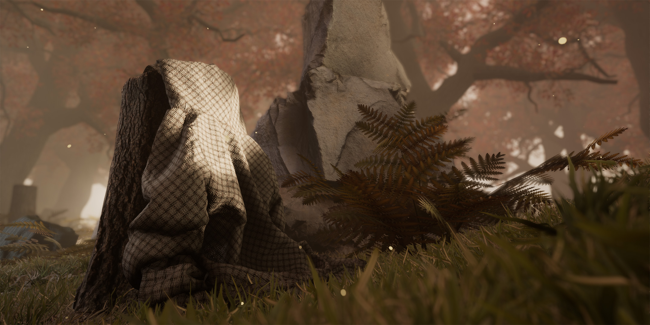
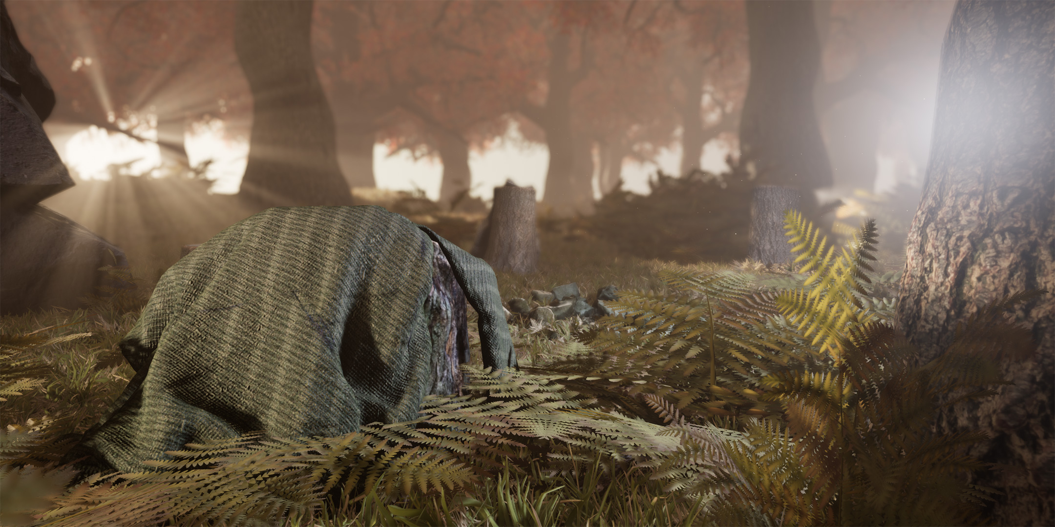
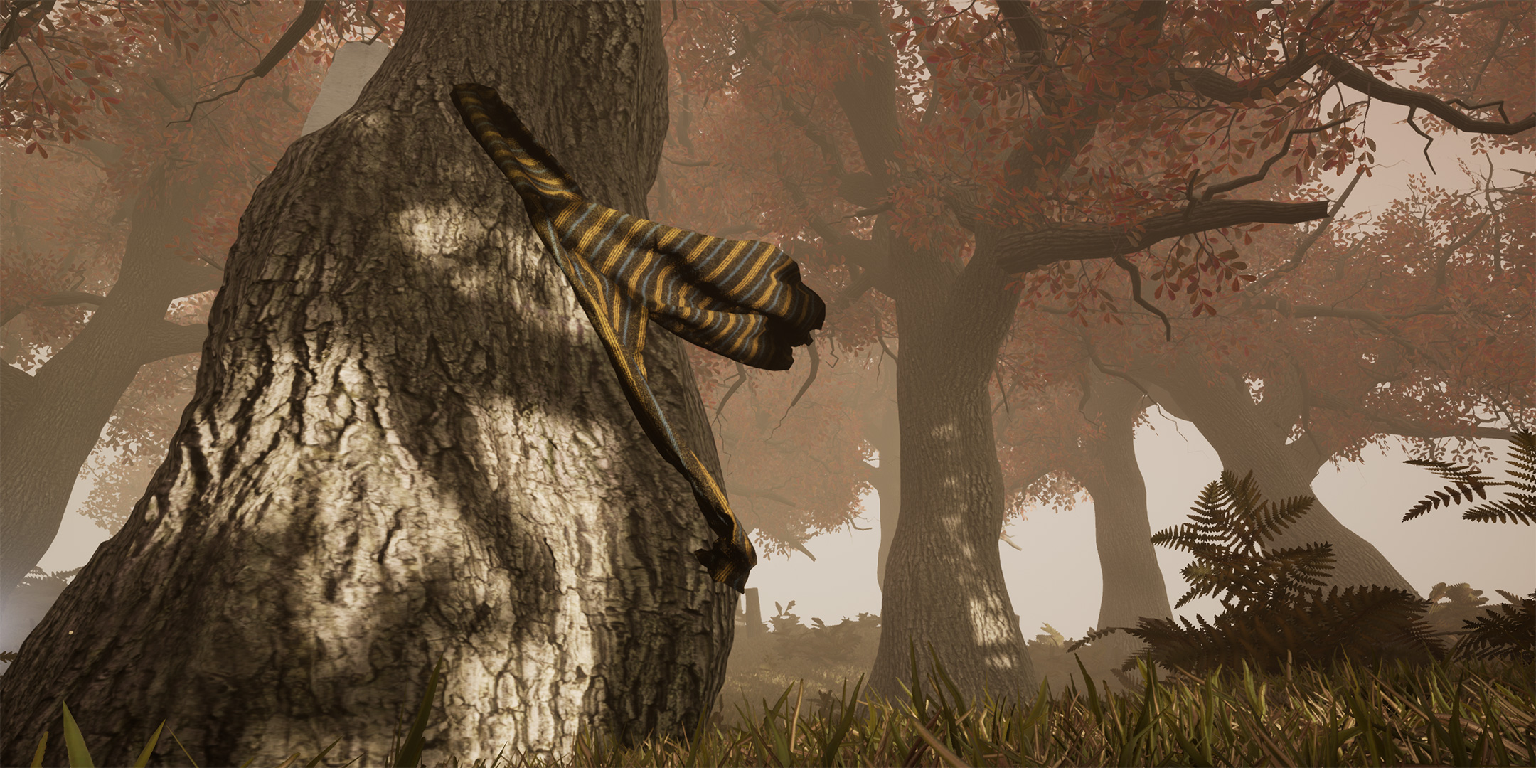
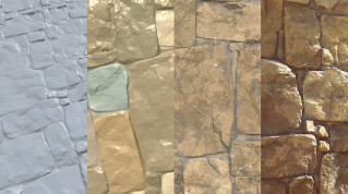
A Smart Material is as useful as how efficiently it adjusts to the mesh, as well as the quick iterations and adjustments it allows users to make. These are the areas where the work we did upfront on the Smart Material pays back great dividends. Let us demonstrate that with a few examples of what can be achieved with what we built. Each one of these versions took around 5 minutes to make!
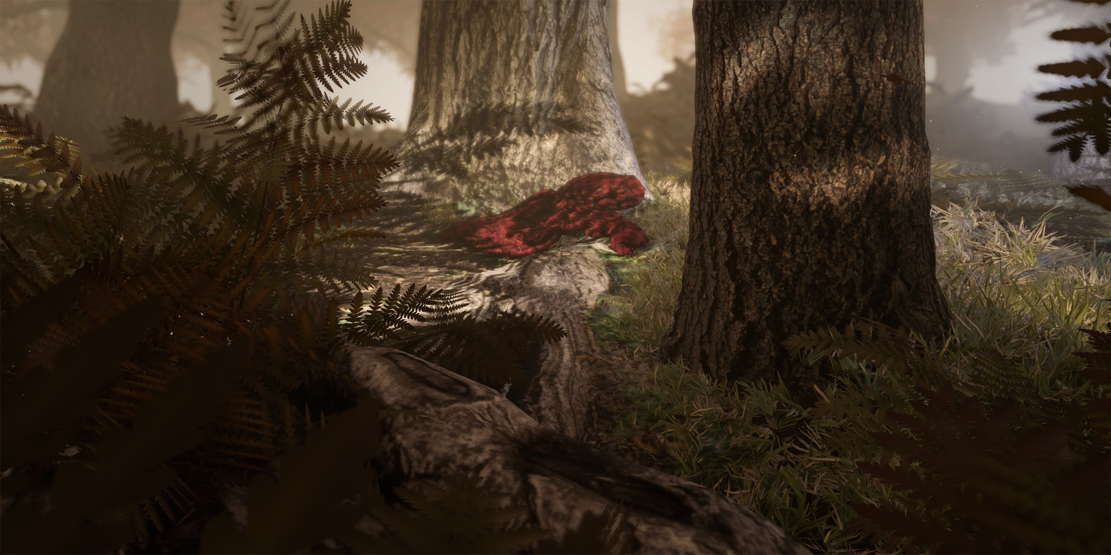
The value of these quick iterations times is best demonstrated in applied use cases, such as this scene made in Unreal Engine 4. For each hoodie mesh we had ready to be textured, the entirety of the workflow from changing values in our Smart Material to exporting to Unreal Engine 4 and placing the model in the scene was accomplished in under 10 minutes.
Someone was very absent-minded when leaving these around… or do these have a mind of their own?
FINAL WORDS
To wrap things up, we would like to highlight how important the preparation of the project is to make the most of what Smart Materials have to offer. More than any kind of proficiency with the software itself, it is a strong understanding of what we wanted to achieve that paved the way to a smooth and fun experience when building our Smart Material: from building our reference boards, to laying out our UVs and defining the functionality we needed.
You should now have a better understanding of Smart Materials, using noises,
Filters and Generators, as well as combining them efficiently using blending modes.
We had a great time sharing all of this with you, and hope this pleasure was carried across! If you wish to discuss Smart Materials, or any other aspect of the Substance tools, come say hello in ourforum ! You will find a vibrant, passionate community and Substance staff. We are always happy to help!
Feel free to let us know inthis page of the Substance Academy forum whether this tutorial was helpful in any way, give feedback on what could be improved and ask questions.
You can control how Adobe websites use cookies and similar technologies by making choices below. But note that if you disable cookies and similar technologies entirely, Adobe websites may not function properly.
Cookies are small text files stored by your web browser when you use websites. There are also other technologies that can be used for similar purposes like HTML5 Local Storage and local shared objects, web beacons, and embedded scripts. These technologies help us do things like remembering you and your preferences when you return to our sites, measure how you use the website, conduct market research, and gather information about the ads you see and interact with.
You can make choices in the menu below about what cookies and other technologies you want us to use on Adobe sites when you visit them from this browser. You can always change those choices later by clicking on the Cookie Preferences link at the bottom of the page.
If enabled:
We can improve your experience by tailoring the site and the content to things we think might be of interest
We can better keep track of your preferences — like what language you prefer to use
We will better understand your likely interests so we can provide you more relevant Adobe ads and content on non-Adobe websites and in non-Adobe apps
It will help us improve the performance of our website and those of our partners who use the Adobe Experience Cloud
If disabled:
We won’t be able to remember you from session to session so the experience may not be tailored to your interests
You’ll still have access to the content of the site but certain features that depend on cookies may not function
You’ll still see ads, they just may not be as relevant to you
General information
You can control how Adobe websites use cookies and similar technologies by making choices below. But note that if you disable cookies and similar technologies entirely, Adobe websites may not function properly.
Cookies are small text files stored by your web browser when you use websites. There are also other technologies that can be used for similar purposes like HTML5 Local Storage, web beacons, and embedded scripts. These technologies help us do things like remembering you and your preferences when you return to our sites, measure how you use the website, conduct market research, and gather information about the ads you see and interact with.
You can make choices in the menu below about what cookies and other technologies you want us to use on Adobe sites when you visit them from this browser. You can always change those choices later by clicking on the Cookie Preferences link at the bottom of the page.
If enabled:
We can improve your experience by tailoring the site and the content to things we think might be of interest
We can better keep track of your preferences — like what language you prefer to use
We will better understand your likely interests so we can provide you more relevant Adobe ads and content on non-Adobe websites and in non-Adobe apps
It will help us improve the performance of our website and those of our partners who use the Adobe Experience Cloud
If disabled:
We won’t be able to remember you from session to session so the experience may not be tailored to your interests
We’ll still count your use of our site and services
You’ll still have access to the content of the site but certain features that depend on cookies may not function
You’ll still see ads, they just may not be as relevant to you
Operate the site and core servicesOperate site and measure engagement
Always active
These cookies are required, and they are used to enable the site and related services core functionality. Without them the site could not operate, so they cannot be disabled.
These cookies enable the site and related services’ core functionality and collect statistics about user engagement, such as counting active use to help us understand trends. These cookies cannot be disabled.
Measure performance
These cookies are used to analyze site usage to measure and improve performance. Without them Adobe cannot know what content is most valued and how often unique visitors return to the site, making it hard to improve information we offer to you.
These cookies are used to analyze site usage to measure and improve performance. Without them Adobe cannot know what content is most valued, making it hard to improve information we offer to you.
Extend functionality
These cookies are used to enhance the functionality of Adobe sites such as remembering your settings and preferences to deliver a personalized experience; for example, your username, your repeated visits, preferred language, your country, or any other saved preference.
Personalize advertising
These cookies are used to enable Adobe and our partners to serve ads more relevant to your interests. Without them you will still see ads, but they might not be as relevant to you.
Personalize advertising
These cookies are used to enable Adobe and our partners to serve ads more relevant to your interests. Without them you will still see ads, but they might not be as relevant to you.