How Iconic Brands Use Color to Connect with Customers

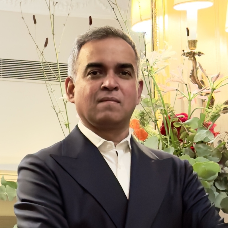
[Music] [R. John Fidelino] Welcome. Thank you for doing this with us today. [Bibhu Mohapatra] Thank you. It's been a busy week for you, hasn't it? I mean, you had a show, you had a sales event yesterday. It was a big to-do. Congratulations a little bit. Thank you very much. Thank you very much. We are here today to talk a little bit about that show and also the collaboration that you did with Pantone and Janavi, who is also your partner in the creation of some shawls last year. Yes. Can you tell us a little bit about your show? Sure. Thank you for being here. And yes, it has been an intense week, but many exciting things. We just presented our spring 2025 collection, which was always inspired by Patti Smith and her aura, her spirit. But the mood board was up months ago. And it had many layers, many aspects. It was the whole package. But then in July, I made a personal pilgrimage to do some rituals with my parents and my brother's ashes, and I went to three different holy spots, over 10 days. And that shifted some things in my mind and within my core. And so when I came back, the same mood board looked very different. I wanted to strip away all the other layers. Lot of the things came alive in me, memories and as I was doing the rituals. We all get numb to our griefs, things that we grief about, but they also come alive. They never go away. They're there. And so for me, I wanted to find light within that and I realized that it's all about because of the bond of love we had. And my collaboration conversation with Pantone, Pantone Dualities was in full swing. So that also affected a lot of it. The colors changed. The colors became a bit more vibrant, a bit more optimistic, a bit more-- It's a restrained color palette, but there are pinks and blues and beautiful tans. The embroidery details changed. There's a bit more sparkle, a bit more ease went into the collection, that a lot more day wear into it. It felt right that this is the right moment for me to do this. And I was so honored, when I was asked to be a part of it and design something and conceptualize how to present these scarves that Janavi would produce which I designed. I think what's interesting was how those concepts of grief and love, light and shadow parallel each other and it made sense that these two collections could be shown at the same time. Because there's so many colors in the palettes, you had a tremendous creative challenge in trying to incorporate all of them. And I think you came up with a clever idea. Can you explain a little bit about what you did? Dualities is two sets of colors and it's the pastels, which are to me, they're optimism, hope. And there's the shadows, which are like darker, more moodier shades. And but they're in between there are shades that connect them. And so it's 175 colors. So to come up with an idea that tells an interesting story that we all can relate to. And it needed to be something that I can relate to, something that we all have experienced and about elements that we're born into and they're always there and will always be there hopefully. So I looked into nature, but it leaned on to the ikigai, the spiritual concept, the Japanese concept where it has many different facets to it. But one aspect that spoke to me is like how you divide your day into four different quarters, and that means you get four beginnings and four endings. So it's about giving ourself opportunities in a day that four different times. So even if the first three quarters didn't go as we planned, we still have an option to really design the ending of the day, the last quarter. So that was something very interesting for me. So I presented this idea to you all, the Pantone team. And so I decided to create a landscape, like the Dualities, the packaging and the hero image that was used for that.

It brought back to also the childhood drawings that I make. And so it had the sun, moon, and the stars and then it was supposed to be four different quadrants of the day in four different sets of colors that remain within the 175 colors. Then it was decided to make two separate scarfs, one is for the day and one representing night and evening. The whole scene is-- The landscape is immortal to me. And I think I wanted to have something that is always going to be there. Which is the concept again of Dualities, right, visions of an eternal future. Yes. That's exactly what she said. So I think you did a wonderful job of interpreting the intent of the colors and just really immerse yourself in the narrative and figure out a way to express yourself, or at least your interpretation, both through illustration and colors. The energy of the night and the day is activated by how color is used and how you related the shadows of the daylight through brighter colors versus the shadows of the nighttime through the darker colors. It was really beautiful. And I know you work closely with Jyotika. What was the conversations like around color and how did you communicate what you were looking to do with color? It became very technical, the conversation because she works with incredible artists and she's a billion designer herself, and she's-- I visited her atelier. And I just wanted to make sure that we create something that is beautiful and it has a flow, and it's poetic. But at the same time, we can go in and zero in and one particular section, we can tie back to one specific code of a color. So we talked about those details, and then we talked about how to dye those threads into representing those 175 colors. The materials that are used for embroideries, we decided to have more of a reflective materials in the embroidery for the night version, whereas the day version had a lot more thread work. It had-- We talked about hand painting certain areas, printing digitally as a ground, a lot of variations were made. So it was a lot of conversations as the process was evolving, and Pantone was very much a part of it as well. With you in Dualities, I thought it was interesting as you designed the shawls, you plotted the colors generally. Generally. Yeah. Yeah. That's exactly-- And then it was fine-tuned because the scale was a thing also, and the elements that were there. And I wanted specific lines in there. And so it's not just a decision to change one thing, it never just one thing. It affects all around the whole composition. That's for the-- That's exactly what Jyotika talked about as well. She was like, hey we had the general plotting, but once you start to execute it at scale, like you said, you need to make different decisions. And reordering of colors started to happen. And then she started to realize, "Yes, it's getting too heavy here, or it's a little stiff over here. I need to lighten up our techniques." "And then maybe I want to use a different color instead for that." You mentioned in the past that you used the swatches to create the groupings. At one point, did you pivot and you're also using Connect, and how did you use it? We are provided with the color matching system by Pantone. So we can log in and really, and that was-- I identified certain groups, for Janavi, but the real every detail were identified by Janavi there as they were dyeing the colors. And Denise from Pantone was also keeping an eye on it, making sure that-- There was some color fidelity. Yes. And also it doesn't look jumpy as you look at because it's a big canvas. So it needs to have this flow so that it doesn't look like their colors are just randomly placed. So a lot of variations went into that, and that's how Pantone was also involved in it. And even if you look at those bunch of swatches made with different sequence dyed into specific color tones. And I think it was a very a interesting blend of technicalities of Pantone and the Indian artisanic qualities, how the hand embroideries are done with different techniques. There are many different techniques that are in there. Yeah, I mean, I think what's interesting about the shawls and this project is that it's really exploring a couple of different things. One is like the potential of the colors, to be used in a practical application, but also, how you can use and specify different materials that you're going to be using even if it wasn't textile, right? There was the silk embroidery, there's cord, there's crystal, there's-- French knots. French knots. Yeah. And the sequins and, as well as the hand painting. Yes. There's a lot of different techniques and different materials that were used in this. It's really is a wholesome representation of crafts. The way that it came together is an extraordinary feat of effort on both yours and Jyotika's part, an incredible amount of work that was done in a short amount of time. I mean, what I was stunned by was actually how you guys used Pantone to, I guess, power forward. Because the communication between your team and Jyotika's team and within her team with Pantone, could not have happened across continents the way they did in the amount of time that we had if it weren't for the books, as well as the digital platform, Pantone Connect. Absolutely. Yeah. I think that made it happen because there's-- All of a sudden it brought a language in itself that made it so much easier to communicate creatively and take away all the blurriness. It became very focused. You could express very well with these things, so there is no ambiguity in there. And so that's what exactly those platforms did for us. And look, I mean, for me, I come from India where color is we live and breathe in color, but we don't realize it. We just take it for granted because that's how things are. But after living in a whole different country, in a different setting, every time I go back, I just register, the colors are registered differently to me.

But Pantone has always played from the very beginning of my creative journey when I was in school. And I think I was telling you, when our teacher said, Pantone is the-- Introduce us to Pantone and showed us one of those fan books. And we were also very eager to just touch it because it was the most sacred thing. So we would borrow it, and then we just take to note down which color we want, and then that's how we go to the look of it. It's like-- When you open up those fan books, like, "Wow. There's all of these options that you never even managed--". Exactly. It's interesting working on this project because I had been using Pantone all through my career. And as we started to work together across different substrate from what you're doing, which is textile and all the sequence and the other elements that were part of the scarf, we need to also translate that into graphics. And so I started to become much, much more conscious of how the whole system worked. Through this process of working together, my approach to it, or how I thought I wanted to use it or could use it has shifted a little bit.

Of course, as you're designing, you would select colors digitally, as you're designing on Adobe. But there's something powerful about being able to select through the integration of Connect where you know that you can easily convert this into different print approaches, just with toggling back and forth. And you know what that's going to look like. And so with Connect, what I've started to realize is that it's like filled that gap of efficiency at the desktop, and then also quickly being able to reference the Color Bridge and saying, "Okay, how does this look?" Or vice versa, you can just manually go through and try to find the color you're looking for, pick it, and you say, "Okay, that's what I'm going to specify." And then produce that, and you have that clarity around what you're creating as it's happening. This whole thing is a learning process for me, and to really understand how to even use Pantone tools effectively. And it's not one rule that applies to all of these artisans that I collaborate with.

Also, technically, we have moved on the technological advances in the printing industry, in weaving industries. So with that, the Pantone tools have also evolved. You were saying, for hard objects, you use a different code. It's all very exciting and new for me. I still have a lot to learn. Yeah, In addition to the TCX, there's the TPG line. So TCX is more for textiles, and TPG is much more focused on the hard objects. You can use that for your crystals and your sequins and, or if you're designing a bicycle. Or you're designing a car even. This particular project is unique in the sense that it was really putting a lot of different materials that have completely different characteristics. And sometimes they work together, sometimes they don't. And it was a very short period of time, but there are a lot of variations Janavi made to create, to fine-tune everything. But each of these materials...

Work differently, technically and also, they reflect color differently. But it also, if you're depending on where you're looking at, the light source and everything, even if in the daylight, it looks exactly the same, but in the evening, you see the differences. And so I think that's what keeps it interesting. I think I always say, I use, it's never a white dress. It's that white has probably five different shades of white for me. And sometimes those subtleties that they just stay for me, but people may not realize it. But when the dress moves, so you see the inner layers where it's a darker color of white and more ivory and more sand color, but they're all in the white family.

I love making shades like that. Even when I use black, it's never just black. It has two sets of gray and then white underneath it, but still looks black. But it has a translucency to it. So-- Was the dualities helpful for you then? Because it does speak to those things. Absolutely. Because it's all those-- If you look some of the-- There's one dress that was in black organza, and it has few layers. And as we're building it, how can we create black? But it needs to have this a-- It's not flat. It has all of these textures you can see, you can see the translucency, but you can see almost the formations of the rocks.

So we like to create that. And people may not the client may not realize the process and the intent, but they love the effect of it. Yeah. Yeah. Totally. And-- That's an important point about clients though, whether it's for me, a corporate client or for you, your customers.

There is a certain expectation that there's going to be, what they saw is what they're going to get, right? Yes. So I think that's very, I mean, clearly a purpose for using a system like this. Yes. Yes. Yeah, I think on my side with coated, uncoated, I think I have here something here. Again, you could specify a color online through Connect. And you know that you can just toggle and automatically convert it from print. But then you still-- There's still that question about whether or not it's going to reproduce exactly as it looks on the screen. And some clients don't understand that it won't, right? You know what I mean? And so they want to know what it would look like. And you want to be able to predict. And so for me, the Color Bridge has been very helpful because it does allow me to say, all right, that's how it looks if it's spot color, and then that's how it's going to look if it's digitally printed with CMYK. Yeah. And the client can feel comfortable. You're looking at color reproduction on the one hand, in terms of producing it over and over and over again, repetition and predictability. Yes, yes. Also, just being able to hit a target.

And so it's interesting that it just occurred to me that you're actually using the chips to actually push the mills to get to where you want to go. And I think that is amazing to be able to have a tool that allows you to solidify your color intent and then measure your ability to achieve that. And that would actually lead you to a decision about whether or not to use that color. Yes. On that substrate. Yeah. Yes. And a lot of the times, if it depends on what the material is, when we are giving these tools to mills when they create these fabrics, depending on what the fiber content is and depending on the weave is, and they come out differently. And there are many different-- Usually, we get A, B, C of the same code. And I run to the outside and really see because these lights are as you know they alter. So then we make a decision which one or sometimes we just select no. Can you do it one more time? It's not. But then we give feedback. Look at this code. Look at this piece. And we give them a bigger piece of Pantone. We send them on our end if we have actual swatches.

So anyways a lot of study goes into it. And sometimes it takes three different steps for them to depending on what their process is. And they get it. We may have to do-- We have done dialogues three, four times. And then finally, it arrives. And once we say, okay, it's second batch, swatch number three, it's exactly matching the code that we gave you. And then they freeze that and then keep it. So it doesn't matter. Even 10 years later, we want that. It happens that way. I feel like I'm sitting here with this mountain of colors, and I have all of these tools. And even just the names of these colors are so inspiring. We try to incorporate some of those names into calling out pieces of clothing that. It's been wonderful. And we're all been very, very impressed by witnessing, how you think as a designer, but then also how you have used the Pantone tools in your process. You and Jyotika really pushed this out so, so fast. I mean, I think it was ultimately 8 to 10 weeks that this all got designed and produced. But it's incredible. All my thanks to Pantone and Jyotika and her team, but it got done because of the tools, Pantone tools. And it allowed us to speak in those codes that we gained time. We didn't lose time in-- Its 175 colors. It could have taken maybe a year to get this done if we didn't have these tools. I'm very happy how it all turned out. And Dualities is always present for us. Always going to be there. It's your vision of an eternal future, of course. Absolutely.

[Music]

Online Session

How Iconic Brands Use Color to Connect with Customers - OS710

Sign in
ON DEMAND

Closed captions in English can be accessed in the video player.

Share this page

Speakers

Featured Products

Session Resources

No resources available for this session

About the Session

Choosing the right color involves creativity, precision, and skill. With color boosting brand recognition by 87% and influencing 85% of purchases, how do designers evoke emotion and ensure accuracy? Join fashion designer Bibhu Mohapatra and creative innovator R. John Fidelino to get insights on color strategies and tools from their recent Pantone collaboration. Explore the impact of color on design and branding with top experts.

This session will cover:

  • Brand recognition: Hear how color enhances brand visibility by 87% and influences 85% of purchasing decisions.
  • Expert insights: Learn from fashion designer Bibhu Mohapatra and creative innovator R. John Fidelino.
  • Collaborative tools: Discover techniques from their recent Pantone collaboration.
  • Color accuracy: Gain strategies to ensure consistency from concept to final product.
  • Practical guidance: Get tips for both seasoned design professionals and newcomers.

Technical Level: General Audience, Beginner, Intermediate, Advanced

Category: Industry Best Practices

Track: Creativity and Design in Business, Graphic Design and Illustration

Audience: Art/Creative Director, Graphic Designer, Print Designer, Web Designer, Illustrator, Social Media Content Creator, Executive, Marketer

This content is copyrighted by Adobe Inc. Any recording and posting of this content is strictly prohibited.


By accessing resources linked on this page ("Session Resources"), you agree that 1. Resources are Sample Files per our Terms of Use and 2. you will use Session Resources solely as directed by the applicable speaker.

Not sure which apps are best for you?

Take a minute. We’ll help you figure it out.