Enhancing Your Work Through Cinematic Color Grading
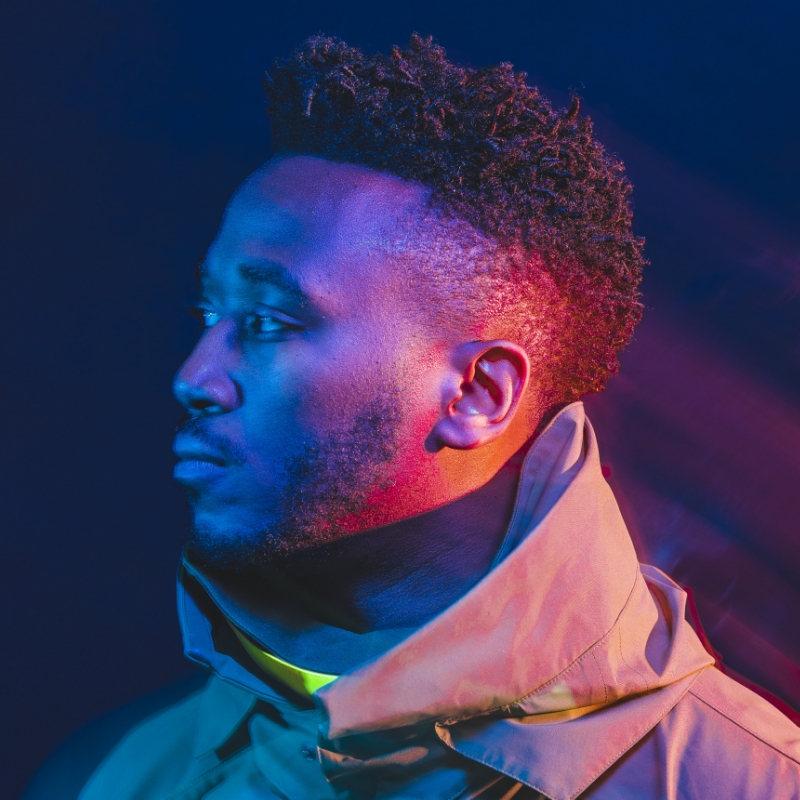
[Music] [Tobi Shinobi] For those that don't know me, I go by Tobi Shinobi. I'm a multi-hyphenate creative and fine artist. I'm excited to share some cool techniques with you today that will elevate your visual storytelling using Adobe Lightroom and Premiere Pro. We'll kick things off in Lightroom where I'll show you how to use its color grading tools to create stunning cinematic video vignettes. Essentially, moving postcards that convey a mood or a story. Then we're going to take these video vignettes into Premiere Pro's create dynamic triptychs, an engaging format that's perfect for telling stories on social media. By the end of this session, you'll have a solid understanding of how to integrate these editing techniques into your video workflow and produce compelling visual content. Quick thing, just before we get started 'cause I can hear the questions already, why would you edit in Lightroom when you have Premiere? Well, in addition to the fact that some folks don't have access to it and the fact that some don't know that this feature is available, you can get really great results from Lightroom. Let's get started by exploring Lightroom's color grading tools, such as the light panel, curves, and color panels. These will allow you to fine-tune the tone, mood, and atmosphere of your video vignettes. A cinematic video vignette is usually a shortcut from a longer video that conveys a story or piece of the bigger picture. Here, when we say vignette, we're talking about a short cinematic clip. The light panel allows for all your regular adjustments. Now I don't like to do anything too drastic when it comes to editing, but feel free to dial in what feels best to you. Curves allow for precise adjustments in brightness and darkness helping create that cinematic look that we're aiming for. Now let's see how we can use these tools to craft a cinematic video vignette. So there are your basic controls. You can trim and adjust the playhead as needed.

I can see that. I'm going to play it through so you can kind of get an idea for the scene. This is the MCA that I have in my book Equilibrium if you're interested.

We can jump forward 10 seconds, jump back 10 seconds, and we can even trim this, right? So let's take this to a good point. Go here. And Trim. Just bring that in.

Bring it into place.

And boom.

Cool. So that's now a 30-second clip.

Let's bring it to start it from here.

We'll trim again.

That's about 5 seconds, just when it's about to turn, so start from there.

Trim. So now when we play, it starts turning immediately.

That's just better. So now we don't have access to some of the panels in Lightroom that we would have if we were doing stills, but there's still a fair amount that we do get access to, so there's no Point Color, which is reserved for stills. The effects, in terms of texture clarity, dehaze, don't have those either. Sharpening, we don't have those, but for most part, we can do a lot of cool things. So let's get started with the Light panel. So let's start off by just doing a little bit of just not too much, so we'll just lighten that a little bit. We'll add a touch of contrast. I don't want to go too heavy with this because I like to do a lot of that with the...

Curves adjustment panel. So I'll bring Highlights down a touch. I also like to do things in fives. You don't have to do it the way I do it, but just in terms of having a mental preset, I like to do things in fives. It allows me to remember things a little bit more easily. So let's boost the Shadows a little bit.

Scroll that.

Whites. [INAUDIBLE].

So that and then blacks.

Okay.

Cool. So that's decent. I'll do before, after, before, after. So we're getting there. Now we'll move to the Curve panel. And with the Curves panel, what I like to do is, while clicking on the curve or not, it can get a bit wayward if you just click anywhere, so we don't want to do that. So let's...

Reset that back.

So if I hit Option down and then click on Reset Curves, it goes back. But then whilst you're on that curve itself, if you hold Option, it allows you to make very precise placements. So I split this curves adjustment into one, two, three, four sections with three point placements. And then I will do another break in the bottom half so there's the darker shadowy section and then one in the light section. So then I'm going to take the edge off of the highlights and take the edge off of the shadows. I'll then start to polish out a little bit to create a [INAUDIBLE] bottom like you see...

The contrast that is put into the image. So before, after, before, after.

So I'm liking the way that it looks. We can just do it at the wall. That's what it looks like to start with. That's what we have now. So I think just going back to the Light panel, I'll take the highlights down a little bit more.

Just bring back some of the depth there, and then...

We can get some more contrast by taking these out.

There. There. And then we can lift the black point by lifting this.

And then let's see...

20, and let's lift the shadows a little bit.

So a good mix between the curves adjustment layer and the Light panel will get you to a really good spot. This feels a little bit washed out, so let me take Whites down a bit...

And then we'll do overall before and after.

Maintain the highlights [INAUDIBLE].

Cool. I think this is getting there.

So next, let's look at Color. So with color, I'd like to say to everyone that, when it comes to Temperature and Tint, these are two which have a great deal of power similarly to the curves adjustment layer, with the different red, green, and blue curve adjustment layers, especially in video. I'd potentially avoid these just because you don't have the same level of range as you would do in a raw photo. So I attempt to do more of my color in the panels themselves. Here, we have adjustments. So I'm just going to do slight adjustments here. Literally, I'm going to take it...

Just a little bit over, and you can see it already. The minus 3 has made a big change to the tone.

I like to do things quite subtly, so it may not feel like it's that big of a difference, but going through across, just as slight blue tint to the gray areas and neutral areas. And then I'm going to mess around with the tint just to get this balance so that it feels like there's a bit of pink in the neutral tone areas. Go minus 3 there so that feels it feels about right. And then Vibrance takes the areas which have less saturation and adds saturation to them. Saturation affects all of the pixels in the image overall. So let's start off by boosting the Saturation just a touch. So we'll go to 25. These ones, you could be a lot more liberal with and then overall vibrance. Let's take this up a touch so we can go maybe-- I think that's good. Yeah, that's good. We'll stop there, and then we'll start messing around with the Color Mixer.

So let's look at the colors. So Luminance, we've got the green here and yellow here. I want to bring these up a touch. So what I'm going to do is take the green...

Bring them up to about 35, and yeah, let's go a bit further. Let's go 45, and then we'll match this with the yellows here.

And...

we'll bring the aqua.

See if we bring it down a touch. See how it affects the buildings.

There. Double tap to reset.

Think I'm going to leave that there, but I am going to mess with the hue of the green. And then take the green to be a bit more yellowy, make it feel a little bit more natural. Got our minus 25.

And then I'm going to take the yellow in the image and go a bit more green with that just to bring things a bit more alive.

So plus 25 on the yellow and-- Yeah, that's looking good. So before, after, before, after. That feels closer to where I want it to be.

And then we have the Color Grading panel. So what I like to do with this is use the Shift and Command modifier buttons to make things a little bit easier because if you see similar to what I was saying to you with the tint and temperature, you can get some massive results just by not doing much. So double-tap to reset. By holding Shift, it locks the color slider or the color grading slider on an axis. So you see that it's picked a particular hue and it allows me to unlock this to that hue and I can just get more and more crazy with it. So what I'm going to do is double-tap to reset. And then what I want to do is go to-- I want to lock it at about-- Saturation. I want to take the saturation to 10. I don't want it to be too much more than that. And then if I hold Command whilst I'm locked at 10, I can now choose the hue I want. And I think I want it somewhere around 225 to add a blue hue to the shadows. You see before, after, before, after, just to give it a little bit more of a cinematic feel. And then we're going to do the same thing with highlights. So first of all, you go Shift and then you take it to 10 or however you feel. If you want to add more emphasis to the highlights, you can do that. And then I'm going to take Command and I'm going to take this. And let's do some red...

37, let's do 40.

Cool. So highlights without highlights with gold. So there's like just gold highlight there. And, again, you can mess around with this. And then with mid tones sometimes I add color, sometimes I don't. One of the things you can do with this is just add a little boost to the mid tones in terms of luminous values and just take that and just go up and you can just-- You can see you can open up the middle of the image, and you can bring it down if you want.

So let's double-tap again to reset. I'm just going to go up a little bit. I've got by 5. And yeah, overall Color Grading is a slight touch but just gives you a little bit more of a cinematic feel to it. As I said before, when it comes to Effects, you're not going to have to use texture, clarity, and dehaze. But what you can do is add some vignette. So let's take this down a touch. We don't need much to have a really strong effect.

Let's go minus 5. You can see it's already pretty dark.

You can mess with Feather. Obviously, I don't know who would want to do that, but you can do it if that's what your choice is. I tend to put it on the other side. So let's see, if we do 75, make that feather pretty strong, and you can see you can move the midpoint. That makes it very centered, and this brings it out a bit. So let's match the 75 with the 75, and you can see...

So it just brings the MCA out a little bit more, and then I tend to have my highlights...

On high. So it just means they highlight priority these areas here, these areas here, highlights should not be affected as much by the vignette. So again, overall, without the vignette, with the vignette, just gives it a little bit extra and then that takes us to all of the tools that you have in light with color grading. And again, I'm going to show you the before, very flat. Afterwards, a lot more saturated. Let's give this some playback.

Jump forward. Jump forward.

So some other thing with this, we can scrub through.

I think I'll move that section there.

Let's pause that. Let's trim. Take the playhead back to there, just as it stops.

Playhead back to the side.

See where it stops rising up.

Just right there.

Just very short.

Hit Spacebar to play.

Nice.

Go back to this image.

We can copy the edit settings and go back to where we were before and use this as a starting point so we can Paste Edit Settings. You see, it gives us a feel. We can do that again. Paste Edit Settings.

And use it as a starting point for the image. It's looking a bit much right now, but this is a starting point to keep things in a good place. So let's take the contrast down. It doesn't need to be that high.

Okay. Okay. Just this.

Just not as intense.

And then...

Take the Saturation down a little bit.

Take the Vibrance down.

Yeah. I think it might increase the exposure a little bit.

Before, after. Before, after. So let's see what can we do with this? Let's move the playhead.

These greens might be a little bit too intense, so let's...

Go to Luminance. See what we've got going on here. So it's come up a bit. Let's check the saturation. We've got the saturation. Then hue. Let's reset. No. Doesn't make a difference.

Alright. Reset. Boom.

Yeah. So that's where it is. So just doing less on the tint can make a big difference. Let's see. Before, after. Before, after.

Yeah. Seems pretty cool. So then let's start at the beginning. Let's play.

So let's go back to here. Let's trim it.

That's when the motion starts. So here.

Nice pan.

Position.

Maybe we can cut it about there.

So this one is closer to where it needs to be. So you can copy the edit settings...

And then...

Paste the edit settings, and it just automatically looks significantly better.

Similar to this, right click, and we can paste these edit settings. It looks significantly better. So you can see how just having a good basis from one picture, one motion clip can be helped in Lightroom as well. Just another way of using Lightroom to kind of get you into a good place if you're more familiar with this or you're in a pinch. So, let's look at this one. And I know one thing that's happening with this is that we have the vignette. So let's turn the vignette off.

It looks better. Yeah. We don't need the vignette here.

So let's just zero out the vignette...

And it must be on these ones as well. Zero out the vignette.

Yeah. Looks better.

And there, voila. You have it. A cinematic vignette that's ready to be used as part of a larger project or shared as a standalone moving postcard. With our cinematic video vignettes prepared, we'll transition to Adobe Premiere Pro. Premiere Pro is a versatile tool that elevates our video editing especially when crafting intricate format like triptychs. And at this point it's worth me saying you can obviously use Premiere Pro for color grading, but now you know how to do it in Lightroom as well. So for those who aren't familiar, triptychs are an art form that tell a story or theme across three panels. In the context of video editing, this form has become highly engaging, particularly on social media, where capturing and maintaining attention is key. By placing our video vignettes into a triptych layout, we can create a visually compelling narrative that implies viewers to explore the story in a more dynamic way, especially if you shot 16x9 by my good buddy Nelson who absolutely nails his format. Go check him out. Let's start by importing the vignette we created in Lightroom into Premiere Pro. So let's import media.

Shift click.

Import all of them. Next, we'll set up the sequence for vertical video. So we'll go to sequence.

Social up here.

This is my 1080x1920.

We'll set that up.

Adjust this a little bit.

And then I already know that I definitely want this.

We'll keep existing settings.

Double-clicking...

Brings up Effect Controls. Click here.

And then we can right-click here and then Scale to Frame Size.

That's nice and centered already...

But let's make sure we're doing this in a more mathematical way. So go to-- So now we've clicked into this monitor here. We're going to click View. We're going to do...

Show Rulers.

View again. Show Guides. So we need to create a guide at 6x40. So we go up here. Let me drag down.

We're going to go to 6x40, which is-- Let me see, if we zoom in...

Get it more precise.

Cool. And then let's just zoom back out again. We're going to grab another guide and go to 1280 pixels this time.

Twelve to nine, we'll zoom back in.

Grab the guide.

There we go. 1280. Alright. And then click here. We'll do a fit. And at any time when you're in the monitor by hitting the tilde button, you can fill the screen there so you can get an idea of what it's going to look like. I'm going to take this clip here and then put it...

On top. And I'm going to take-- Let's see. I want this one.

Why do I want this one? Interesting. Let's have a look. Let's see.

By hitting backslash-- Okay. That's zoom out...

And then right click.

Come down to Scale to Frame Size.

Do the same on this one.

Let's go to frame size. Now the reason why it looks like they disappeared is because they're both underneath this middle one.

Oh, there we go. So now let's change the position.

I'll make this easier to see.

Increase the scale of this one.

Make sure it fits.

And this clip, double-click that one. Click on Effect Controls. We're going to increase the scale of this one. So it needs about...

108.

I'm going to switch the order of these just so it's easy to remember that.

So now we're working with the clip on the bottom just for ease and convenience to remember where I think it's placed and I'm going to...

Move this one down...

Into position here...

And increase this by...

8.

So then this being the shorter version, if I click on it and then forward slash, it will do an in and out for that period, then I like to click on this loop playback button. Sometimes you may not have it. Come over to here. You have a list of different things you can use. Some very helpful tools. Cancel for now. And I'm going to click loop playback, so then when I play-- And there you have the vignettes.

So what I might do with this is hit pause...

And pick the most relevant sections from this. So what I want to do with this middle clip is shift to a point when there's more action happening. So I think from here...

And maybe about here...

I think that's where the most action is taking place.

So let's go here.

Just going to click the edge of that and drag it to there. Bring it into place. Take this into this. Take it down there. And let's have a look at that now.

So just looks a little bit more compelling.

Hit Spacebar to pause that.

Got some nice action there.

And then I'll just look at this top version.

Let's see. Let's go.

Going to take the end of this, take that there, take this there. And then we will hit Sequence. Render In to Out. Let's pause that for a second.

We'll click into this monitor here.

We'll get rid of the guides.

We'll hit tilde.

And there you have it. Always remember to save, tilde to come out.

File, Export, Media. And then I'll show you the video settings I like to use. So I'm going to Match Source, get rid of the excess black on the other sides. Got more. And Render Maximum Depth. Use Maximum Render Quality, and then scroll down. I like to make sure I'm doing 2, and then we can get this about 100 megabytes. Why not? Yeah. So we do-- Yeah. That'll work. It's a very short clip and then we can export that.

There you have it. Add some music. Nice little social media posts showing a range of different angles. Another way to tell a great story. Thank you for joining me today. If you have any questions or want to share your work, please don't hesitate to reach out via Instagram DM. I really look forward to seeing the incredible projects that you can create. Until next time.

[Music]

Online Session

Enhancing Your Work Through Cinematic Color Grading - OS805

Sign in
ON DEMAND

Closed captions in English can be accessed in the video player.

Share this page

Speakers

Featured Products

Session Resources

No resources available for this session

About the Session

Join Tobi Shinobi, multi-hyphenate creative, as he explores the capabilities of Photoshop Lightroom and Adobe Premiere Pro from color grading tools to practical applications, including creating triptychs in Premiere Pro to expand your skills into more video-focused work.

You’ll learn how to:

  • Integrate photo editing techniques into video: Apply your photography skills to video by using familiar tools and techniques in new ways, ensuring a seamless transition between media.
  • Enhance visual storytelling: Master the use of color wheels, curves, and sliders.
  • Create cinematic vignettes: Learn step-by-step how to transform ordinary video footage into cinematic vignettes using the comprehensive suite of editing tools in Lightroom.
  • Design triptychs for social media: Craft visually compelling triptychs that tell a story and engage viewers — perfect for sharing on social media.

Technical Level: General Audience

Category: Inspiration

Track: Photography

Audience: Art/Creative Director, Photographer, Social Media Content Creator

This content is copyrighted by Adobe Inc. Any recording and posting of this content is strictly prohibited.


By accessing resources linked on this page ("Session Resources"), you agree that 1. Resources are Sample Files per our Terms of Use and 2. you will use Session Resources solely as directed by the applicable speaker.

Not sure which apps are best for you?

Take a minute. We’ll help you figure it out.