Designing a Book Cover: Inspiration and Design Tricks

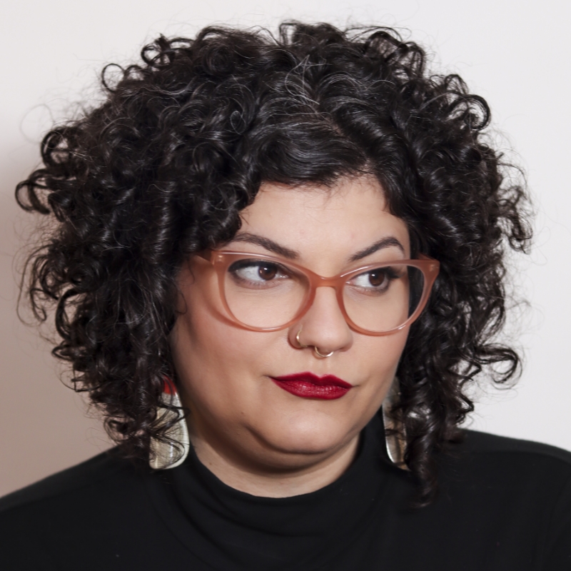
[Music] [Faride Mereb] Hi, I'm really excited to be here sharing with you today, but specially to be talking about books. My name is Faride Mereb. I am a designer, an art director and a researcher.

When I was a kid, when I was growing up, I had a typewriter similar to this.

I think it was almost exactly like this one. And I used to type on it and then cut the little papers and make little magazines, van scenes.

And I think it all started in the '90s when I was given this book about magazine making. Imagine this same image, but without the pixels.

And I think it actually changed the way I saw the world. It opened new possibilities for me, which led me to this hot take that I have that I'm pretty sure evolved from back then. And that is that books are alive.

Besides the material aspect of the book, their finishings, inks, formats, books are also meant to create experiences. And being a designer, I do know how important materiality is. But at the end of the day, making books is about something else. It's always about people.

That can mean the story being told in the book, what it denounces, or even technical aspects in the book, like this font size... The size or format of the book, because it's meant for an audience that it's intended to serve.

Growing up in Venezuela taught me a lot about inventive and doing the best of what I had at hand, being very resourceful with materials.

But it also taught me a lot about myself and how my brain works. I am a neurodiverse person. This is my first passport, by the way...

And this was my official first computer, it was one of those tiny ones that you plug into a projector. Well, my brother back then hacked it and we installed Illustrator on it.

I think it's still an upgrade from the typewriter, I would say. And this was the same computer that I used to publish my first book. This book I made in 2014... With the help of printer Javier Espurua in Caracas on Eclair Express.

In college, I was taught a lot about Illustrator, but never too much about InDesign, because most of the teachings were focused on branding, on commercial work, on logos, on illustration. But I didn't think, I didn't get enough...

Of what I wanted to learn about micro and macro typography. So InDesign was my never go-to software. It was always Illustrator.

And with Illustrator, I managed to make this experimental book, "Es una buena máquina" by author Miyó Vestrini. And if you see, the structure is very complex, so imagine doing that in Illustrator. And the book was French folded, so if you see the forehead of the book, the outer margin is also printed and the signatures are also printed inside. So this meant that the way the book was made was kind of backwards of how we're used to producing a book.

And with this same structure. I published Al Filo by the same author, but this time talking about literary interviews.

And this was in 2016, 2015, 2016. And this book won the Latin American Design awards in the editorial category.

But just imagine how complex it was for me to try to lay out a book with such structure, with the limitations of Illustrator not knowing InDesign. Here, a little graphic.

This is how a representation of how the file kind of looked. And looking back, I'm just trying to remember how I even foliated that book. The page numbers must have been a total nightmare for me.

But then I started using InDesign, and to me it was life-changing, especially while being euro-spicy. I think us, as designers and creatives, we should always do what's best for our processes and our needs, because a lot of what we do at the end of the day gets permeated by who we are. And I know that my brain works a little bit different.

So one thing I would say is that learning InDesign allowed me to streamline a lot of processes. And after I learned it, it allowed me not only to delegate more stuff, but to build community and stronger bonds to grow like with my project, Letra Muerta Inc.

We started in 2014 in Venezuela but as a publishing house, and we opened two years ago in 2022 as a design studio in Williamsburg, New York, which is where I currently reside. We curate collections for institutions focused on Latin American and Caribbean art. For example, this beautiful wood carving by John Vasquez Mejias about Puerto Rico. We also built bridges with similar projects in other parts of the world, like, Imprenta Recate in Argentina, for example. And we also digitize and catalog works by other designers from the 20th century, like Victor Viano, which is a project that we developed here in the studio. A cool thing is we always get to experiment with the materials we have, like making chat books. We also display the work that we do in different media. If we do research, we can do tote bags like this one, design covers, get to work with photo books...

Design and layout multilingual publications, and those can later become collections.

This is a book by Lynne Shapiro.

We had a lot of fun with this one, with the typesetting and especially with the photo shoot. You can see here, we even incorporated honey in the book. And all of this was done in InDesign. Here are other pages from another book we co-designed with photographer Tim Soter. It's about DFA records. It compiles the work of the label until 2007, and this we made with a monospaced font to evoke that kind of first wave of Internet vibe.

Working across platforms, we usually create content like these videos for social media, and we incorporate not only the works we have made in InDesign, but software like Premiere...

Photoshop, Illustrator. And we incorporate different media to kind of let people know more about these subjects, these authors, and the work that we do.

And today I want to share with you three portfolio examples or three projects that I have made in InDesign. The first is about Karmele Leizaola. She was the first woman to work as a graphic designer in Venezuela, and this project ended up becoming a three-volume publication in the shape of a newspaper or a zine, displaying not only her growth as a person but her professional career. Here you can see a lot of facsimile from her work in actual size, which was pretty cool to make. And we work with three different formats, mini, tabloid, and broadsheet.

This was the result of a grant that I received from 10x10 photo books doing research specifically on women, the work about women. And this was also a bilingual publication, so the content was not only created in English but also in Spanish.

We recently were also featured in the Women Designers You Should Know podcast. I invite you to check that one out.

And one of the publication highlights was this timeline that we made.

And we were able to make this not only by interviewing people from her family but also by checking the credits on each publication.

And you have no idea how much work was not credited. Not surprised. Here in this example, you can see the darker magenta has professional highlights. The black is everything that was regarding her personal life, and all the green in the bottom is political context, so kind of to shape what was surrounding her life in that moment. These are some images from a show we hosted in Shoshana Gallery in Manhattan with the work.

And this work also led me into publishing more research, like the one about Victor Viano with Katherine Small Gallery. But that's a whole other lecture.

The second project that I want to share is a cover for the science of departures.

And this cover, the main inspiration was a photography by Eileen Hohmuth-Lemonick, which at the time was my student at Center for Book Arts. And we licensed her amazing work because it not only captured the essence of life and death, in my opinion, but it also intercepted with subjects like nature, flight, sound and even migration. The process of discover involved a lot of variations, but the goal was very clear. The font implemented is based on the work of Wim Crouwel, which meant that the typesetting was going to be very modernist, and the image is very organic in nature. So this typesetting was made thanks to the work of Mirko Velimirovic, type font engineer, which I have the honor of working with in other projects for Google Fonts. And this on the right is the result.

If you see here, you can see that we made a separate layer only for the cicada on the cover, it shines. So that's varnish, and that the cover wraps around, so it was very immersive.

And the last project I want to share with you is Crania. Crania is a book by writer Adalber Salas Hernández.

This is a project that I am particularly proud of, because right now we are in the finalist for the editorial category in the Latin American Design Awards for this year.

The first section of the book includes images with some of the literary and historical reference mentioned in the book. They're only printed in varnish. You can only see these images at a certain angle, or depending on how the light hits the paper. And this varnish was also applied in the outer margins of the book. And it not only helped to emphasize how books age and oxidize...

But it also gives it a warm sheen. And these different textures with the type of paper and shades, evoked bone-like textures that we wanted to represent, because the title of the book is Crania, after all.

The runners of the text are also represented in the binding details, the color of the thread, the sewing, the exposed spine, and even details like the printing in the signatures.

The font used for this book was mainly Labrada by Omnibus-Type, a foundry in Argentina and Public Sans.

One might think that there's a fixed relationship between the styles in this book, but the truth is, as the book evolves and the reading progresses, the lines often blur. It's hard to tell which language has predominance. And that was part of the play that we wanted to portray in the studio for this particular book. Formally, the book is meant to be perceived as an encyclopedia or sort of medical guide. If you see the binding of the book allows it to lay flat. It's very precise, the type of binding.

But anyway, now what? Well, now we jump into InDesign.

But there is more to bookmaking and typographic work than just software. First we have to think, and that's why I wanted to quote this that was published by Clube do Livro Design in Brazil.

And today I'm going to be teaching you three tricks for book covers or making covers. And those will be using the three portfolio examples I just shared with you. One is doing covers as spreads. The second one is doing covers as a single sheet with margins and columns. And the third one is doing different size work areas within one same document. So let's get to it. Okay, so now we jump into InDesign. We're going to work on our first example, a cover as a spread. We're going to go into New file. We're going to go into Print in this tab right here. If you see, the first thing we're going to do is we're going to name our file "cover as spread". Now, if you notice here we have something called the Units. So as I come from Latin America, I'm very used to working in centimeters, millimeters and meters. It's a very different measuring system than inches. So I'm going to work in inches because I'm going to print this here. But something cool I want you to notice is that if I even write this in centimeters, it will immediately convert it into the units that I have selected on this side. So let's say 11.

Now we can say, let's see, 25.

And if we have preview selected, we can see what's going on in the back. So this is the actual size I'm going to be working with. Make sure the orientation is correct.

Amount of pages. So the amount of pages is going to be based on multiples of four, because the way this is going to be bound is subtle. So this means that each page will be folded in half, resulting into four different composition spaces. I'm going to put 16...

Start at page one. I'm going to leave this as is, the margins at default. Something really cool about the margins is that if you unselect this, you also get the option of make changes on each individual side, like top, bottom, inside or outside. In this case, I'm going to leave it as is. And then I'm going to go into Bleed and Slug. In the case of the Bleed, if you see right now, we only have our work area. If you go here...

As I increase this size here, you're going to see this red line going farther and farther away from my composition. So this means this is a part of the file that would actually print, but then we'll get trimmed when in production. Something to keep in mind for a case like this is that for the inside, we don't want to have any Bleed, because we're going to be working with a type of binding that doesn't require any trimming on that end of the publication. So I'm going to unselect this, go zero. And then one little thing that we're not going to be using today, but I want to show you, is the Slug. So if I were to click this...

You see this blue line here? So this is an area where I can leave comments, notes, or even distinctions for production, like folding or scoring for the printer. In this case, I don't need any of that. So I'm going to go zero...

And yeah, Create. So you might be wondering why, if we're working with a cover, we have 16 pages. In this case, is because our cover is going to be the exact same material as the inside of the publication. Meaning that we can take advantage of the back of the cover which is number one, and the back, or inside, or endpaper, however you want to call it, of that back cover, which is page 16. Now to wrap up this example, I'm going to show you something really simple. I'm going to get the Rectangle Tool, use my same grid as a reference. I'm going to go into the swatches and pick a color similar to the one of the example from Carmele that I showed you just randomly this. And now I'm going to import my image, already silhouetted, that I did in Photoshop. So I guess I can drag it or place it. In this case, I'm going to place it.

And a really cool feature that really helped me while working on this publication was being able to make changes live. So if you see, I have my publication here, and if there's anything that I don't like, let's say, I don't know, I want to silhouette this again or remove this little hairs, I would just very simple, go into Photoshop...

Open my file, and then I can make changes here. Let's say I'm going to change, make this darker and this lighter. And then I'm going to, you know, modify.

I'm going to sharpen her eyes a little bit more. So when I finish that, it's going to immediately warn me that there's a new update on the image. So if you see it's right there and that's done. I could also go into my Links panel...

Right here by window, and I can go and check what's the status of my imported file from Photoshop. So that's it for the first example. Second example, I'm going to be showing you how to work with one single sheet to create an entire cover and back cover. So a cover and it's spine as a page. So I'm going to name this Cover example 2.

Always go into Print. I guess I'm used to doing that. Again, Inches. Something I want you to consider is that in this case, since the cover and the back cover will only be one page, we want to add up this number. So instead of 8.5 inches, we're going to have 17 inches. The height will be exactly the same. We can hit Preview as well, so we can see what we're doing. Now, Pages. I'm going to hit 10. Cool trick here. I'm going to delete the Facing Pages option, so I have individual pages here as you can see. Start at page one. Yeah. Now I'm going to be using the columns as my little hack. So instead of one, I'm going to hit two. What we see here is we're going to have the cover and the back cover in one single page. This works wonders for when we're working with continuous designs or very simple mechanicals. And now what I want to do is put the width of my spine in the Gutter.

I'll just hypothetically say, you know, 1 inch or 0.5. Now what I want to do is since I'm taking 0.5 from my total width, I want to add that into the total width of my work area. And that's something that I can do very simply in InDesign by adding it up. So I put +0.5...

Voila...

17.5. Now I go here, I have my margins. Bleed, I'm going to put a quarter. That's great.

We need it all across. Perfect. I'm going to add Slug on this one because I'm going to be using varnish for this cover.

A lot of Slugs, so I can leave notes. Now I'm going to hit Create. Now what we have here is the actual cover. Some things that I recommend for cases like this. Since this will be a pocketbook, a soft cover, usually there's a hinge that it exists for when you open the book. I usually like to add a little guide. Depending on the printer, it can be one centimeter or half an inch or even less than an inch. So I usually, depending on the type of printer I'm working with, I do that guide, or I can also leave a note up here. And then what this will allow me is to have different iterations. I'm going to show you the messy source file from which I designed this cover, so you can take a peek.

So if you see, this is my file from which I designed the cover.

I have my guides...

And what I have on my Pages panel is a bunch of iterations. So when you're inspired, you're working fast, you just want to like throw options and iterations. This is a great way to do so. So for example, if I have this and I want to make a change, I'll just duplicate this spread, and then on this spread I can make a slight variation. I can either change this color or I can move the letters or change the positioning of the photography. And that gives me a lot of different options. So this is a cover as a spread.

What we have here is what will be later put in varnish. You can either have it in a separate sheet which you can export on a separate PDF, or you can also have it on a different layer in your Layers panel here.

Now for my last example, I'm going to show you how to create different size documents within one same file. First of all, I'm going to name this just example three. I'm trying not to pay too much attention to what's happening here because I'm going to modify it later on.

I'm going to be using my little hack of putting inches and then converting what I'm writing here, 13 centimeters, then 17.5, in this case centimeters. In this case, I have front and back matter, which is a folded sheet will serve not only as pages, but as cover and back cover, and we have an exposed spine. So if you see here we have eight pages. All of this we can figure out later on. For now, I'm just going to hit Create. Now that we have our pages on the Page panel, the actual trick is going to be within this panel. I'm going to be going into my hamburger menu on Pages. If you can't see your Page panel, just go to Windows and select this. Make sure you have the little check mark. I'm going to go into my hamburger and I'm going to click where it says Allow Document Pages to Shuffle and I click that, want to make sure it's unselected like you see here. And then I'm going to select, since this is cover and this is technically back cover, I'm going to select page number five and drag and drop it here. If you see, there's a difference between the bracket when I come close to the spread, and the little line when I come close to the edge of the panel. So I drop it there and now I have two separate sections. It helps me visually organize better and understand what is it that's going to be an even or an odd page.

It's just better to work. It's cleaner. So I have two pages and then whatever goes here, I know it won't be this.

So now the next little trick, very simple. I'm going to go into my Page panel. I'm going to hit "+", which is a new page. I have it here, number nine. And I'm going to be drafting my layout for my spine within the same file, not a separate file. So what I'll do is I'll select the page, you see because I have it in blue, like a little shadow on top, and then I'm going to go here where it says Edit page size.

Out of all the options, I'm going to hit Custom. Then when I go into Custom, I'm going to name it, for the sake of this project, SPINE. And in this case, I'm just changing the width. For now, I'll just put two inches. Something really important to consider is that the width that you put here can never be less than the margins and columns you have put previously, because it's physically impossible. I'm going to put two and I'm going to hit OK. So if you see, now I have my little page, my little spine right there, and something extra I could do is select, if I can, I can leave it there, but I could also go into my hamburger panel again, make sure it can shuffle and then drag...

And drop. So I'll do is see how it gave me that little cue, that little line drop. So I go into page nine and I have the spine within the same file. Another little trick that's very useful is for when working dust jackets within one same file, you can incorporate the spine...

In between the pages. This is also very useful for modifying spine widths depending on how you're working.

Each process to one's own, depends on what you like.

Now I'm going to show you how my messy file looks, so you see.

In this case, ignore all the margins. I just want you to see that in my layers I have an extra one called silo, where I added what the printer should emboss. So I can turn that off or on. I have them locked. And then here I have everything that I just showed you how to make. And this is an example of how I wanted each printing signature to look. What this allows me to do is by having a little measurement of an estimate of the signature I can place however I wish to place the title of the book or either whatever text I want to place there. So, yeah, that's it. Well, thank you for coming to my presentation. I'm really thankful for everyone who signed up for this. Thank you, Adobe, for inviting me.

Most of the images from this presentation are from public domain, and this font, particularly, that I love for the thank you slide is by Nadine Chahine. Thank you.

[Music]

Playlist

Graphic Design and Illustration

Online Session

Designing a Book Cover: Inspiration and Design Tricks - OS310

Sign in
ON DEMAND

Closed captions in English can be accessed in the video player.

Share this page

Speakers

  • Faride Mereb

    Faride Mereb

    Book Designer, Art Director, and Researcher, Letra Muerta Inc.

Featured Products

Session Resources

No resources available for this session

About the Session

Books are alive! Join Faride Mereb, founder of publishing house Ediciones Letra Muerta, to hear her discuss some book covers and experimental projects she has worked on recently. She’ll teach you about processes and how to focus your ideas. As an added bonus, Faride will share tricks for bringing elements into InDesign and using layers to help boost your skills.

Between the pages, you’ll find:

  • How to convey visual meaning in your design
  • Hands-on tricks for hybrid dust jackets, spines, and production
  • Managing imported files from other Adobe apps
  • A free cover template

Technical Level: Beginner, Intermediate

Category: Inspiration

Track: Graphic Design and Illustration

Audience: Graphic Designer, Print Designer

This content is copyrighted by Adobe Inc. Any recording and posting of this content is strictly prohibited.


By accessing resources linked on this page ("Session Resources"), you agree that 1. Resources are Sample Files per our Terms of Use and 2. you will use Session Resources solely as directed by the applicable speaker.

Not sure which apps are best for you?

Take a minute. We’ll help you figure it out.