What Makes Good Type?

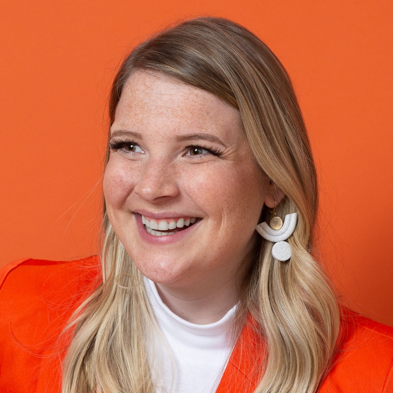
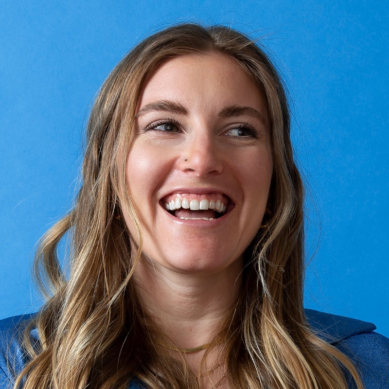
[Music] [Ilana Griffo] So we're so excited to be here, and we are bribing you a little bit. I know it's been a very long day, and we've taken in a lot of information. You guys are probably tired, so we gave you guys a little sweet treat. And we really want to bribe you to stay till the end if you can 60 minutes. And we have some surprises sprinkled throughout, so bear with us while we talk about what makes Good type. [Katie Johnson] Yeah! Whoop, whoop. That's us. We're the two Co-Owners of Good type. That's me on the left, the one in the orange. And my name is my name is Katie Johnson. I am a lettering artist. I live in Austin, Texas. Anybody? - Yeah. - Yeah. All right. Oh, sorry. That might have been very loud. Tell me go, if I'm too loud, and I'll shut up. I'm a cat and dog mom. I've got the cutest little Aussiedoodle. I'm an ex-roller skater, which is weirdly going to come up in this talk about typography. Yeah. Yeah. And I'm a DIY enthusiast. So if you feel like talking about tiling your bathroom, find me after. - She's your girl. - Yep. I'm the other one in orange. It's hard to tell us apart. And we have the same hair. Same hair. And I'm from Upstate New York. I'm Ilana. Did I say that? Just the other one. I'm Ilana. I'm from Upstate New York.

Woah! Wegmans. Yes. Thank you. Oh, my gosh, that makes me so happy. Okay, I am a BMX mom. Very proud.

When I was eight, went to the Junior Olympics, hit my prime. - Very important for this class. - I'm downhill since then. Downhill since then. Used to be a snowboard instructor. None of that's really relevant today. Swimming will come up, though. - So-- Yeah. - Soon. So we've enticed you enough, I think, for you to stick around.

So how, why are we here on this-- - I don't know. - Stage? Well, we had really weirdly similar stories before ever meeting each other. We both went to school for design and graduated with degrees in design, and then went and worked as art directors at advertising agencies. And while those were our dream jobs on paper, in reality, it was, not as dreamy as we'd imagined. Yeah. There were dreamy parts, but overall, we were like, there's something missing. And so we each independently went out on our own. We started selling products of our own things like art prints and greeting cards. And while we were in that space, we discovered art licensing. Anybody? Art licensing? - Yeah. - Art licensing ladies. I love that. And for those of you who aren't familiar, art licensing is basically like you make the art, you rent it to companies for them to put on products, you get money in return, and it's a great situation. And we didn't know that it existed. And when we discovered that, we were like, "This is so cool. Why aren't more people talking about this in the type lettering space?" And so I went into my Instagram stories, and I was like, "I think I'm going to do a course on this subject. Would anybody be interested?" And the scowl, Ilana Griffo, slid into my DMs and she was like, "Wow, you're doing a course. I was thinking of doing a course on licensing too." And at first I was like, "Well, my whole plan is foiled." It's already been thought of. So I can never do it. And then I went, "Hey, you know what, that's not what I think I should stand for." I should be like community over competition. Like I say, I am. So I reached out to her and asked if she wanted to collaborate. She said, "Yes." The rest is history, but I'm going to tell you about it anyway.

The rest was basically we made more classes together. We became pretty much inseparable even though we live across the country from each other. And eventually we came to co-own Good type. So all of this to say that you're only one DM away from something life-changing. And that DM might be waiting in your inbox right now and you might have just overlooked it. So go into MAX with open eyes and an open heart because you never know what can happen. - Open inbox. - When you say yes. Also, if you see someone who is sitting alone or just like by themself during the event, go up to them and just say hi. You have no idea what their story is, and they would probably feel really seen if you did that. So this is the promo image for our first course together, Art Licensing for Letterers. And you can see from this really awkward image of the two of us, we had never met in-person, and didn't meet for three years after we started working together. We also didn't know how to do remove background apparently because we just pushed our faces together. But if you haven't noticed by now, we spelled the name of our course wrong, and this was the only promo image we had. - Yeah. - Nailed it. So we felt like big old fools. But it actually, this is an actual photo of us realizing. Oh. So we felt really silly. We made this huge mistake, and then we were like, "You know what? It's actually not that big of a deal." Kind of set the tone for us as people who maybe have some perfectionism tendencies that it's not that deep. It's not a big deal. The course actually went on to do really well and set us up for the trajectory of our career. It's just a little mistake. Also, two people double the mistakes, not less mistakes because there's two of us, more mistakes. So then in conversation on Zoom as we spend most of our time there. Katie, very casually, even though in her head had a 90-page business plan already drafted up. I was like, "So I guess we're starting a business together?" And I was just like, "LOL. Okay." And that is how you get an MBA and start a business. So thanks for coming to our doc. No. I'm just kidding. So this is Good type. We have over a million artists nation across the world who are part of our community, and we have a good time at Good type. We say that Good type is a place for type lovers to connect, nerd out, and level up. So we have two core beliefs that we're going to talk about, and these are just like really true to everything we do at Good type. The first one is that good design is for everyone. Good design should be accessible. Good design is for everyone. It doesn't matter where you are, where you start. It's for everyone. The other thing we believe is that you deserve to love your job, and we offer a lot of education for people who want to monetize their art, and that's a big part of what we do.

So we have four pillars to our business. Craft, which is all about skill building. And community, that's literally what Good type is, is a community. Inspiration, we really want to amplify voices that we feel deserve the spotlight that maybe people haven't heard of before. Inspiration. Yep. I said that. Okay. And business, I just mentioned we want to help people make business feel a little less scary and a little more doable, and so we offer a lot of education.

So if you're wondering, is Good type a bunch of guys with beards or who works there? We literally had somebody in our inbox being like, "Oh, I thought y'all were dudes with beards." - No we're women with no beards. - With beards. Yeah. Yeah. We had beards, but we removed them.

So we had headshots done recently, to show off our new bobs. And as we were editing them, we asked Adobe Firefly to help us like, "Edit the background." And in popped this guy, that we did not ask for. So we have named him Keith...

And he is like very cozy with his co-worker, Ilana. And he is fully prepared for a day of work at Good type, as you can tell by the swim cap and swim goggles. - We swam together back in the day. - Yeah. And his like UV shirt that like children wear at the beach.

So that's according to Firefly, but the team according to us looks like this. It's Ilana and I, and then our dearest Emily, she's right over here. - She-- Yes. - Yay! That's so great. She is our marketing manager and guru, and she helps us not go in too deep of a spiral. - And she keeps us sane-ish. - Looking for it. Ish. Okay. So we only have one rule. That's me.

And there's a little bit of a background to this one. So when I was about seven, I started roller skating competitively, and I [CURSING] really bad in the beginning, as you do at the beginning of things. Yeah. And then I got better and I got pretty fast. And we would have these free skates at our skating rink, and then all the kids that were five and six and on skates for the first time, they would clump up and get in the line and get ready to race. And I would come up there like a 10, 11-year-old and I was like, "Oh." And instead of looking at them and saying, "Look at their bright shining faces, they're going to fall in love with roller skating." I was like, "Move aside [CURSING], you're going to eat my dust." And I proceeded to smoke them and I enjoyed it.

But the whole point of this being-- What I was trying to do was get over my own insecurities and by showing off, show myself how much I had grown, that I was fast and I was doing it, but what I really did was discourage a bunch of little children and look like a dick. Yeah.

So the rule is don't be a red light green light menace like I was.

So the equivalent in the design world to Katie as a red light green light menace is what we're calling a design snob. And a design snob is someone who goes around policing other people thinking that they know the only right answer for design. And we don't really like it that much. We felt this a lot. We felt the big overwhelming design snobbery when we were in design school. Raise your hand if you have been subject to critiques in design school. Yeah, so every classmate who had been a graphic designer for four minutes came up and turned into a vulture in front of your eyes and just tore your work apart. And so it really made us feel a lot of feelings about putting our work out there and sharing our work. And we see this a lot online now with people showing up in comments, doing some troll work, and-- Troll work. I love it. We figured we should put a face to this. Maybe it's our classmates from college. Maybe it's somebody else. So we asked Firefly, what does a design snob look like? We want to introduce you to our foe. - This is Derek. - Yeah. We'll be referring to Derek throughout. Please raise your hand if you have been personally victimized by Derek. Yeah. Literally everyone. So Derek is a pretty good designer, but he's hella annoying, and he's a total dick. And yeah, it's not great. We don't love it.

Yeah, the thing is, we know that because of Katie's experience, we know that the reason he's going around policing people and thinking he knows the only way is really coming from a place of fear.

And so we made this list to help you figure out if maybe you are a design snob or how to identify a design snob. So the thing is, this is a lot of black and white. Yeah, we're calling you out. This is a lot of black and white thinking, and really thinking that there is only one way to be a designer. So the first thing, and I'm hoping this works with your headphones, but try it with me. If you have this binary view of good versus bad, you might be a-- - [All] Design snob! - Yes. That's awesome. Oh, my God, we practice this so many times. It's so nice to hear real people. It is so glad not to be a-- I've been the one that was like design snob. It's like design snob. Okay, so it's great if you hold yourself to whatever standards that you feel are right for you, but if you're holding other people, especially people who you don't even know to these unrealistic standards, you might be a-- Good snob! - Okay. - Yeah. This is so great. I love it. If you are literally inserting yourself as an unwelcome authority in people's comments like a freaking troll, you might be a-- Design snob! Love it so much. Okay, if you go to a restaurant and you have pointed out every type, every font, and then all of a sudden everyone goes, "I'm not hungry anymore. I'm going to go home." You're [CURSING] the fun out of the room. You might be a-- - Design snob. - Okay. And if you're dying because we left a widow. Yeah. Yeah. Just the little if that's hanging there, you're definitely a design snob. We've all been there. It's okay. We'll let that one slide.

So when people become design snobs, it's usually because they think that clinging onto these ideas of rules or like perfectionism as a goal will keep them safe. But we love this book called How to Be an Imperfectionist. I'm a recovering perfectionist myself, and I absolutely love this book by Stephen Guise. And he says, "Holding on to this idea that if you're careful you won't make mistakes gives a false sense of security. The only real security is knowing and accepting who you are right now," which I got to break it to you folks. It's an imperfect person. We all are. And we're better off when we embrace it. So Derek, with all of his rule following and his rigid thinking, he might be a good designer. He might very well be good at what he does. But he's not going to be able to push beyond that and become someone who's great. So let's give him his very own She's All That moment with the help of our friend, Adobe Firefly. Oh, yikes.

He's got the makeover he deserves. All he needed to do was take off his glasses and reveal these creepy cartoon blue peepers-- - Yep. - That stare into your soul. Yeah, not quite what we expected, but thank you, Firefly. It's endless fun.

So he has his internal makeover, or he has his external makeover. Now let's try and give him his internal makeover...

And see what it takes for Derek to become great. So he could be great if he just replaced his binary black and white good and bad thinking with curiosity. And he came to problems with, what if I do this? What might happen instead of thinking he has the solution all the time to every problem. If he started collaborating with people, inviting other people to add to his ideas, and make something new, instead of just correcting them for when they say GIF or GIF, whichever he thinks is the wrong one. Yeah, literally who cares? Derek could be great if he started focusing on the process instead of focusing on the results. And here we are again with my friend Stephen Guise explaining that, "Perfectionists use their desire--" "Perfectionists and Derek's--" Yeah. "Use their desire for positive results to motivate them to go through the process." So it's all about that one final moment to them, and everything else is just a slog. Slog, slog. And imperfectionists which I am arguing that we should all strive to be, focus on the process and let the results take care of themselves. So in other words imperfectionists have more fun. Yeah. Blondes move over. Get out of here. That was Katie's joke. I stole it from her.

It's not that good of a one which is why I left it out.

I thought you just forgot. No, I didn't forget. I just decided not to say it. I thought it was funny.

If you're too busy trying to control the results, trying to decide if I'm going to say the joke or not, you're never going to get past good. Great designs happen when you make room for something unexpected to come into the mix.

So this is your reminder that everyone is welcome here. There's no pretense for loving design. There's also no certificate or like test you have to pass that says you're a graphic designer. I don't know what's happening. - Don't try to control the process. - Yeah. It's okay. We're imperfect. And so everyone is welcome here, and we really try and instill that in our community, but also to everyone in the room, you're all welcome here regardless of where you are, beginner, expert. It doesn't matter.

And, again, regardless of where you are, everyone has the power to do something really, really wonderful with Good type. So what is Good type? And why does it even matter? Why does Good type actually matter? So typography can really make or break the message that you are trying to communicate. So we called on our friend, I guess, Uncle Sam, and this recruiting US Army poster. And right now it says, "I want you for the US Army." Means business. It's very serious. The tone is set. But what happens if we just change the type here? So we changed it to something like a little script-ish, a little retro, and now it's reading, "I want you for the US Army." And you're like, "Oh, that's kind of sexy." What if we took it even further and matched the image to the text? Again, thanks to Firefly. Oh, my gosh. Firefly, go off. Sign me up for the army. I typed in make him sexier.

So you can see where the message, it is unhinged. This is not what we were going for, and it's because that typography and the imagery completely makes or breaks your message. This is not what we were going for. It'll attract a whole different clientele. A totally different clientele. Wow. You guys got that so quick.

So if this was Good type, what is bad type? And to us, bad type is when it's not communicating the message. Okay? It's not about the kerning. It's not about anything else. It's about primarily, making sure you're aligning the message. And so most of you have seen it. If you didn't get the joke, the handle is a C. Okay? - This is Katie's alma mater-- - So proud. UNT. Yeah. And it's not working. It's not doing its job. There's no proud parent going to the bookstore to buy this unless they're putting wine in it and drinking it at 7:00 in the morning. So this is our example of what bad type is.

The thing is, Good type can do so many powerful things. It can even save lives. I know it sounds dramatic, but it's true. This is an incredible project called You Are Not Alone Murals from our friend, Annica. She is the co-founder, and there are over 100 murals across the world that say this exact phrase from artists all over. Now it's not about just saying you are not alone, it's about pairing the type and the messaging to leave so much impact. This is such an incredible project, and if you want to be a part of it, you just need to find a wall.

Good type can support accessibility. This is a project from my dear friend, Remy Glock, and she is deaf. And so during COVID, she had a very, very hard time. She works at an agency. She was on Zoom all day, really feeling secluded from the rest of her community. And so one day, she sat down super frustrated, and she took out some embroidery thread and put these three simple words, "I Read Lips," on her mask. She went to the coffee shop in her neighborhood, and she simply walked up to the counter, gave them her order, and the lovely Barista just very quickly to be very cautious of everyone in the room, and as to not get anyone sick and just be aware, she pulled down her mask quickly, asked a question, pulled her mask back up, and all of a sudden, with the power of type, Remy was able to have a normal experience.

Good type can plant seeds, and we love this idea, especially when it comes to our children. I have a four and a six-year-old. And I love reading this book by Jessica Hische, Tomorrow I'll Be Brave. And we get to talk about all of these different amazing qualities, but they also get to see all of these beautiful letters together. And it's such a beautiful book.

Good type can catch your attention. How many of you have bought a book for the cover? Yeah, especially covers by our friend Casey in the back. Casey. I don't know. I've been looking at these slides for four weeks. I don't even know what flavors these are. I'm going to buy them anyway. Okay, something with citrus, I don't care. They're so cute. I'm just going to buy them. This is from our friends BRETHREN DESIGN CO. out of Tulsa, Oklahoma, and their bottles are just they're beautiful. I'm going to buy them just for that. Good type can completely change and revitalize the space. This is a mural from Lisa Quine, and you can see this parking lot or alley. I don't know. Whatever it is. Now I want to go there. I don't know what store it's in front of, but now I want to go and take a picture, create a social moment. It completely changes how I feel about this random parking lot.

Good type can also get you off the computer, which we love. This is a project from Sophie Elinor. And not only does this get her off the computer, the artist, it also gets all of us off the computer to interact with this beautiful piece and hopefully gets us inspired to create our own. And it can even be interactive. This is an amazing project that was a Kickstarter. You can actually download for free the files if you have a 3D printer to use them yourself, by Will Mower, and this is called BlockFace. And what it is, is little bits and pieces of letters, little shapes that you can put together in infinite different solutions to make your own art projects, to make your own alphabet, to make your own pieces of art. And we love that this also can get kids involved. It can help people who are learning the alphabet or learning how to spell for the first time too.

So Ilana walked us through a lot of the amazing impacts that type can have, and it can do so much, but how do we wield that power? Well, we think a really good place to start is understanding some basics and laying some groundwork of the basics of typography. And Robert Bringhurst from The Elements of Typographic Style, which anybody should read if you're interested in typer design. He says, "Originality is everywhere, but much originality is blocked if the way back to earlier discoveries is cut or overgrown." So what he's saying here is that typography has such a rich history, and there are so many people who have gone through trials and errors, and tried to figure out what works and what doesn't with type. And they've discovered some universal basic truths. And so when we tell you we want to start with the basics, we're not trying to box you into a room with Derek in the corner staring at you. Over your shoulder. So creepy. We simply encourage you to take the gift that people who have come before you are giving you of starting in the middle of the race instead of at the beginning. So we like to look at these things as a springboard from which we can spring, if you can imagine that. And then we sprinkle our own creative something something, and add our own whatever it is on top. So what are some of the things we want to know? Well, Derek is making an appearance here because this is a very controversial area for a lot of people. They get very passionate about the difference between typeface and font. But if you are finding your inner Derek coming out right now, just shove him down, get them out of here. Uppercut. Give him an uppercut and let's have a civil conversation about this. So typeface, when we say the words typeface, we are talking about think about a carton of eggs. The typeface is the carton that holds the eggs. It's the design of the letters. It's the overall vibe and design...

Of all the little fonts that are the little eggs inside the carton. So a font is like a specific size, weight, and style. So this is how we like to think of it.

But it's not too deep and we are just telling you this so that we can speak the same language, so that we can communicate to each other and collaborate with each other. But remember, you're never going to bridge the gap between good design and bad design simply because you know when to say font versus typeface. And especially not if you are correcting people about it all the time. We've done it. But we have-- - Don't do it, but we-- - We've done it but we've changed. Yeah. And time and time again, Ilana and I have learned this lesson starting from the moment that we spelled our course name wrong. It was a very humbling moment, but we've learned this lesson that it's not that deep and it applies across all of design for us. There are no design emergencies. This is not life or death stuff. So we like to learn the rules, but hold them lightly.

But it's fun to nerd out. I mean, when you really like something, it's fun to nerd out. And a lot of the-- So let's-- Yeah, let's do that a little bit. A lot of the vocabulary that we use to describe type now comes from the way that type was physically created and physically used. And so there's these type cabinets, and you can imagine that a whole typeface of physical type that had to be set into a printer and pressed against paper, they all lived in this type cabinet. And then you pull out an individual drawer and that's like an individual font, 36 pt. Bold. So that's how we like to remember it. And fun factoid also, uppercase and lowercase, that came from this thing too. Uppercase would be stored higher, lowercase would be stored lower because they used it more often. The more you know, right? And this here is, a look inside Adobe Fonts at the typeface that we are using throughout this presentation, which is, obviously by OH no Type Co. And you can see how robust this type family is, right? There are so many opportunities for us to solve different problems with different amounts of extension, or there's narrow and condensed options, and there's heavy and there's light. So we really love to look for typefaces that have lots of options and solve lots of problems. So it's important that we just really, really quickly distinguish between these three beautiful art forms. Calligraphy is all about handwriting. Okay, it is beautiful handwriting. That's all we need to cover. Okay, lettering. It's really about illustrating the letters. Each one is like a little painting all by itself. And then type design is what we were just talking about where we're creating a whole egg carton basically of fonts, and it's really painstaking. There's a lot of math involved, so if you don't like math, it might not be for you. And it's the foundation of what we all use as fonts today. But it's important to know that it's actually about optical adjustments, and it's not just about the math. We really want to go for what looks and feels right. It's not just about the number of pixels or things like that. It is really about what looks and feels right. And you learned this the hard way. I did. I had a lot of lessons in college, which is probably good. I paid for them.

And one of our first things that we had to do in typography class, which I thought was topography class about maps, which is so weird. The first assignment was they gave us a printed out little version of a font, and then we had to blow it up with our pica rulers. Anybody? Pica rulers. Yeah. We had to blow it up using our pica rulers by hand and like measure everything out. And then when it came time for me to space between the letters, I was like, "How do I go about doing this?" Well, I've been measuring everything. So I assume I just put the same amount of-- Math. - Yeah. - Girl math. Yeah. I'll just add the same amount of space in between. I turned it in, got it back from my professor, and he had drawn aircraft carriers in between all of my letters. And it just stuck with me that...

It just looked really weird when I did it mathematically and so that helped me remember, "Okay, it's about optics. I get it. I learned the lesson, got my money's worth. Thank you, UNT." Despite your mugs, you are a good school. So we want to talk about how we actually choose type, so that we can incorporate Good type into our projects. And I know we want to think it's all about aesthetics. And I'm so sorry if you guys didn't have headphones on, you'd hear the gasp. It's not about aesthetics. I know, I know it's so tragic. But just because it's pretty doesn't mean it's communicating your message. So it might be bad type in that context, and context is really important.

The thing is you can't polish a turd. Okay? So you'll never bridge the gap between good design and bad design by moving something two pixels to the left. And that's really-- How many of you work at 700%? Most of you? Anyone? Yeah. Yeah. I see everyone's ashamed. They're like-- Yeah, we got to zoom out a little bit because we have to think about the context and how our design is actually going to be out in the world, like the mug. I mean, that was pretty bad. So we like to break it down by spending about 90% of our effort, not our time, our effort, into making sure that first and foremost, our type is supporting the message. And then we come in with the aesthetics, and the personality, and all of the really beautiful things that nobody except a designer notices and finesse the details.

If you find your inner voice saying, "Babe or that you need to only make it look good at 700%." You're probably Derek. Tell him to shut up.

The thing is Good type, there's no measure of the best. There's the best solution for a problem, but it doesn't have to be the best type in order to be the best solution, right? There's no measurement for that.

In Good type, we want these two things to be cozying up style and substance just like these spicy little co-workers. Yeah. I truly don't know what this stock video ever could have been used for except for this one moment. It's for the HR video of what would be inappropriate in the corporate office. So substance, style, we want them both to work together. Yeah. Okay. We want them to be collaborating. And then when you don't have that, you forget style and substance. You get this which is the side dish that appears at my husband's family's Christmas dinner. It's Derek's afternoon snack. Yeah. He's like, "Oh, so good." And he just likes to munch on this. But I guess some relative of theirs, didn't have a lot of food for Christmas and was just putting together what she had. And so she had green jello and mayonnaise and green onions. The olives are just Ilana added those for flare, but they're not in the-- - Actually, Firefly. - Firefly. Firefly added them. I didn't know if they were in your prompt or not. So this is the disgusting thing that happens when you forget both that style and substance. I did assume there's got to be something redeemable. It must taste really good. Nope. - No. Yeah. - It's disgusting. - So avoid the green-- - Yeah. Mayonnaise jello, please.

Okay, so let's talk about how do you go about picking type styles. So this is our process. The first thing that we think about since message is so important, we've harped on that enough. Yeah. What am I trying to communicate? So I'm going to pick out some adjectives that align with the vibe or message that I want my type to support. So maybe that's friendly, approachable, quirky. Those are really helpful adjectives. Or maybe I want to go in the other direction. Maybe I want to do formal and reserved. Or maybe it's spooky month, so I'm feeling spooky and mysterious. So I grab those adjectives. And then on top of that I want to ask myself, "Am I trying to communicate something about time, place, or culture? Do I want to add a layer on top?" And we talked about the type has such a rich history and it can transport you back to these moments in time. So if you want to tap into that, put that on your list too. Do you want it to feel like 1900s Paris? Awesome. Go look at some ephemera. Go grab some examples and references. Do you want 1920s Wanted poster? What wood type were they using? Russian Folk Art. So we add that layer and we have that information.

And then we ask ourselves, what are the parameters? What am I working with here? Where is my type going to live? Is it going to be printed? Is it going to be digital? If it's going to be printed, is it Risograph? Is it letterpress? So what limitations or factors am I going to need to account for? And I'm going to make a very different decision about the type that I choose if I'm doing body copy for a book and I need it to be legible at a small size versus if I'm doing a billboard blowing it up to 800% just like our buddy Derek likes.

And then I'm going to turn all that into a wish list of visual qualities...

And ask myself how can I physically represent these adjectives and these things that I've decided that I need? And Ilana is going to talk you through what your options are when it comes to that. So I think most of you probably know these, but we'll really quickly talk about the three type styles or classifications for your type. We have serifs, which have the cute little feet on the bottoms or on the edges. And we've got sans serifs, which is a little bit more modern. Every font that we're using in this presentation is available on Adobe Fonts. And we've also got script which there's-- So many styles within all of these, but they're all going to give off such a different vibe. But we first start by narrowing down what style are we looking for, what classification. Then from there we look at weight. And you can see if you put these two on a scale, obviously, the one on the bottom is going to be way heavier and the one on the top very thin and light.

Then we look at contrast which is really different from weight. You can see in the top where it says low the whole letter, all of the letters feel really heavy and the ones on-- So it has low contrast. And the one on the bottom the stems are heavy, but the crossbar is light and so it creates contrast within each letter.

Then we've got a condensed type which would be on the top, it's very narrow. There's not a lot of breathing room. They're getting real intimate just like those co-workers versus if we have on the bottom, the width is a lot more wide. We have a lot of breathing room, not enough for a jet to go through or anything like that, but we've got just enough for them to feel comfortable, they could stretch their legs out. And then we have display versus text. So I like to think of a display font as something for headlines. It's main character energy. It's like Michael Scott, you can only take so much at once and it's definitely not going to be body copy. So if you want something for body copy you definitely want something that's really text friendly, heavy text, way more legible, way less of those beautiful main character details because you're going to read a lot of it together.

And if you are trying to set display for body copy, you get something that looks like this, which is my husband driving a smart car around Italy. It's just not meant to be crammed in that little space. Not right. It's just something's wrong. - It's just not right there. - Not going to work.

So we've got three more terms to share with you. The first one is kerning, and here's something you really need to know about kerning. Quality type designers spend painstaking amounts of time kerning the letters before you get the font. So they have gone through every combination and made sure that the letters work together for that specific pairing because it's not math. It's not the same for every single letter. So if you have a quality font, you should be doing minimal kerning unless it's for a logo where you're literally building something new from that. And if you have maybe a font that's not that quality, that's okay, you can do your own kerning. Tracking is, what Katie was talking about where there's all the space between the letters and another-- I think people confuse all of these terms but the other term we want to share with you is leading. And going back to that beautiful type drawer that Katie was showing, it's literally a piece of lead like a little space bar and there would be multiple pieces of lead stacked up and that is your leading in between every line of text. So if you have trouble remembering that, it's literally a piece of lead. Derek's shown his stupid little face again here because this is an area where design snobs really-- Yeah, they'll come for you. Look at you. They'll come for you. But I did when I was in school again, learning all the lessons. I tracked out lowercase type and-- Oh, it's a big no-no, which I quickly learned, but because it makes things really hard to read. - Yeah. - It's like a legibility issue. So my professor called me into his office and he told me this famous quote from Frederick Goudy. Well, famous for type nerds. "A man who would letterspace lower case would steal sheep." And I didn't want to be a sheep thief so I was like, "Okay, I guess I won't do that." And so I remembered, forevermore. But when I went to look for this quote to put it in this presentation, I learned that there's a deeper lore behind this quote, and there's a lot of questions, around what he actually said, and they think it was something much spicier. So let you go ahead and fill in that blank and think about that tonight.

And look at that poor sheep. The poor sheep. So what we love so much about Adobe Fonts, perfect segue to Adobe Fonts, is that when we are browsing for what font we want to use, what typeface, we can narrow it down using the exact characteristics that we just laid out for you. We can say we want it sans serif. We want it a middle of the road width. We want a lot of contrast or a little contrast. And then all of a sudden, we're not dealing with trying to choose from scrolling through every single typeface that exists, but we have a really curated grouping of-- You're better than just looking through eight billion options. Yeah. Totally. It's super helpful. And then if you walk away with anything at all, other than Derek, I hope you walk away with the memory of Derek grilled into your brain.

But remember this, observation is your greatest superpower. We love to search for great type and then reverse engineer it, find the things that we love, find the things that are working and communicating to us, and use those in our own work. And I think people are often afraid when they step into the world of type to look at other people's work and look at real type and use it as reference, but we very much encourage it. Typography is an art that just continues to build on itself, and we love starting with that springboard from what people who have come before us have learned and then adding our own creative sprinkle on top.

So we have a friend named Matthijs, he's a wonderful type designer and he's completely self-taught. So we asked him, "How did you do it?" Okay? Your type is so beautiful. We've hired him for our podcast art. He's really incredible and his work has so much depth to it. And so we said to him, "How did you do this as a self-taught designer?" And he said really simple answer. "I looked at an absolute ton of letters." He looked at what people before had done and used that as a springboard to say, "This is the qualities I like about it. This is what I want to incorporate to my own work." And then he went to work.

So if you want to find places to look for inspiration, just a few places we recommend antique shops, online or offline archives. You can even look for public domain to use in your work. And books, of course. We will share some of our favorites in just a few seconds. Signage is incredible. Ghost signs, anytime you can see those, it's really exciting. Future fonts is amazing. That's where we got one of our brand fonts, Margo. And type designers can upload their work-in progress and you can purchase it and get updates when they work on it, which really helps to support them. Adobe Fonts and Behance are also great.

And these are three of our favorite books. The House Industries Lettering Manual from Ken Barber and then our design mom, is Ellen Lupton. She's great, Thinking with Type. This is the book that I used for my type 101 class when I was an adjunct professor. And yeah, still have it on my desk, still open it. I think I opened it three times last week. And then The Anatomy of Type from Stephen Coles. These are all really wonderful books to start with. We just want to remind you, don't become Derek. This guy, he's going to hypnotize you with his creepy eyes and his blue light glasses and he's going to [CURSING] the fun right out of all the beautiful things you can do with type. Say no to Dereks.

So instead of worrying about being the best and being a design snob, let's try being curious with our work. Let's try being more approachable as designers. Let's try being a little bit more open-minded, maybe breaking the grid once or twice. Be a little more flexible, be experimental, and most importantly, be authentic to you. Do what you think looks good and feels good for you.

So this was all about what makes Good type. We talked a lot about Derek, but what is Good type? What did we learn? Good type first and foremost supports your message. So we're looking for legibility or intentional ambiguity. So if type is your image and you're just playing and it doesn't need to be read, that's beautiful too. That's a whole other art form. We love that. Having that sense of time and place, like Katie mentioned, is really important.

Are the vibes vibing? We want to be on the right vibe, of course. And we don't want any inadvertently distracting elements. We want things that add to the message just like we saw with, Uncle Sam. So we asked our friend, Matthijs, who we brought up earlier, if he felt like this list, him being an awesome type designer that we really admire, if he felt like this list really encapsulated what Good type meant to him. And he said, "Yes." And if you want to take your type from good to great, here's what you need to do. "Everything from the previous slide, plus a combination of luck, skill, the universe smiling down upon you, inspiration, and daring to push boundaries." And that's a lot of stuff. - Yeah. - Right? And we are not telling you that because we want to deter you from reaching for greatness and striving for making great design. We say that to remind you that greatness is great because it's rare. Just like diamonds and gold, greatness gets its value because it is scarce, and it can't be found everywhere. And when we start to expect greatness from ourselves as designers and as human beings all of the time, that's when we start to run into major problems.

Your goal simply cannot be perfection. That's impossible and it's going to cause several things. It might cause you to freeze in your tracks and decide to not do anything because you can't be perfect, so you can't do anything at all. It might cause you to become performative and do things because you wanted make other people impressed. Red light green light menace here. Okay? I know this very well.

And the worst thing of all, it might end up making you lose touch with the joy of the process. And that's the reason that we are all here today. That's probably the reason that you're sitting in this room today. And we don't want to lose that. We want to hold on to that. That should be at the center of everything that we do as artists, and designers, and creative people. So instead of asking yourself, "How can I make it great?" Instead of saying, "How can I make it the best every single time, which we know isn't going to happen?" We want to take that question and change it to, what if it was fun? So you can ask yourself things like, "What if I posted it?" Oh, my God, what would happen? What if I shared my wild idea? What if I designed for just 20 minutes? What would I make? What if you designed to not show anybody? What if you broke the grid? Oh, my goodness. What if you make this just for yourself? What if you make new rules? What if you don't zoom in? What would happen? What if it was fun? So if you're wondering, "Okay, where do I start with type? Or I want to reinvigorate my type practice, what should I do?" We highly suggest joining a challenge or creating one of your own. This is a very vulnerable share from me because I was very nervous and hadn't shown my type before on Instagram. And I joined into one of Lauren Hom's HOMwork challenges, and it ended up leading me on this path to be on this very stage right at this moment. So it's really cool when you say yes to things, and you don't wait until you're ready, and you get uncomfortable. So all of you freaking go out there and get uncomfortable here. - It's so good. - At MAX. - It's really good. - Isn't it? - Yeah. - I was so nervous to post it. I thought it was terrible. So we created a channel...

In our Slack channel called Share Your Work, and it's an opportunity for everyone to just share their work and ask for feedback or just share what you're working on. And like I said, we really want to build community and keep a welcoming community. So feel free to share your work there or message us, email us, and we'll help you, with the feedback and we'd love to see your work. We also are on Instagram and three times a week we share artists from our community that are just inspiring us. And so we'd love to see you on there. And then we also host a conference and we talked about wanting to amplify voices that maybe we haven't heard from before. And so if you look at our lineup, every year we pick people that were like, "Why have I never heard them speak before?" And we hope that you feel the same way when you look at the lineup and you say, "Oh, I'd love to hear them speak." And so we created a coupon code for you guys if you want to join us to The Kernference. And we also-- I don't know if this is going to work, but we did hide two golden tickets, under some seats. They're like taped up in there. I don't know if the seats are full. So yeah, go at it. It looks like everybody's picking a wedgie. Yeah.

If you find one, you will come find us later. It might be in an empty seat, so I'm pretty it's definitely in an empty seat.

Yes. One! Yay! We got you. We're going to The Kernference. Yeah. Okay, let's go to the next one. Oh, we also put like little cards on some of the seats too with some of this information. Yeah, but this code's better so you want this one. Wait, we give two different ones. It was like six months ago we were there. - Don't control the process. - Okay. And then we created some pins for you guys which are on a chair in the back, and-- They're in the middle right here in this center aisle, and you can go choose which one you want as you leave. Yep. - So-- - Please just grab one. Yeah. Thank you. So you can be a member of the anti-design snob club or ask me what font this is because I don't know why we gatekeep, we got to support the type designers, get them those royalties so-- And if you're wondering because people are going to ask you, that's obviously and swear from OH no Type Co. Yeah. So grab your pins on the way out.

We're so thankful that you all came here and don't be a design snob. Be curious. [Music]

In-Person On-Demand Session

What Makes Good Type? - S6370

Sign in
ON DEMAND

Closed captions in English can be accessed in the video player.

Share this page

Speakers

Featured Products

Session Resources

Sign in to download session resources

About the Session

Join Katie Johnson and Ilana Griffo from Goodtype as they explore the attributes that make type look good and, more importantly, feel good. From the technical aspects to the humanity behind the glyphs, they’ll show how typography unlocks new forms of expression and helps you make important messages much more impactful.

In addition to warming your design enthusiast heart, this session will cover:

  • Choosing the right type styles to make your message hit home
  • How to elevate your type from passenger princess to driver
  • Balancing aesthetics with functionality
  • Designers who are using type in exciting ways (and how you can join them)

Technical Level: General Audience

Category: Inspiration

Track: Graphic Design and Illustration

Audience: Art/Creative Director, Graphic Designer, Print Designer, Web Designer

This content is copyrighted by Adobe Inc. Any recording and posting of this content is strictly prohibited.


By accessing resources linked on this page ("Session Resources"), you agree that 1. Resources are Sample Files per our Terms of Use and 2. you will use Session Resources solely as directed by the applicable speaker.

Not sure which apps are best for you?

Take a minute. We’ll help you figure it out.