



Content as a Service v3 - Thursday, October 1, 2026 at 09:43
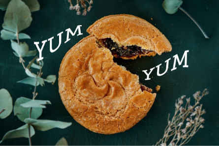
What is the Warp Text tool?
The Warp Text tool in Photoshop Elements lets you distort a line of text into a range of preset shapes — arcs, arches, bulges, waves, flags, and more. Rather than text sitting flat on the page, it bends and curves to give it energy and visual interest. It’s useful for titles, event announcements, greeting cards, or any project where you want text that feels designed rather than just typed. The sliders give you precise control over how much the text bends, so you can go subtle or dramatic depending on what you need.
Time required: About 5 minutes. Skill level: Beginner-friendly.
Before you begin, make sure you have:
- Photoshop Elements installed and open on your computer. Don’t have it yet? Start a free 7-day trial.
- A photo you’d like to add text to.
- A short phrase or title in mind. Warp Text works best on a single line or short phrase.
Step 1: Add your text with the Type tool
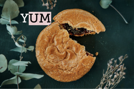
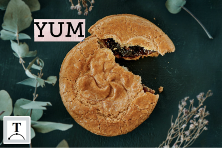
Open your photo in Advanced mode. In the toolbar on the left, click the Type tool — it looks like the letter T. Click on your photo where you want the text to appear and type your text.
Tip: Warp Text works best on a single line or short phrase. Long sentences or multiple lines can warp in ways that are hard to read. Keep it brief for the clearest results.
Step 2: Select the Warp Text tool
With your text layer still selected, in the top menu select Layer > Type > Warp Text.
Step 3: Choose a warp style
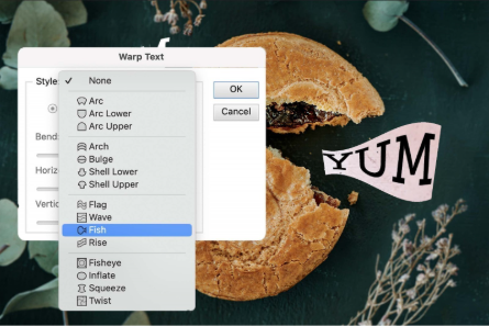
A Style dropdown menu will appear with a range of preset warp options — Arc, Arch, Bulge, Wave, Flag, Fish, and more. Click through the options to preview how each one looks on your text, then select the one that fits what you have in mind.
Tip: Arc and Arch are the most versatile starting points — they give text a gentle upward or downward curve that works well for most photos. Wave and Flag are more dramatic and work well for titles or fun, informal designs.
Step 4: Fine-tune the warp with the sliders
Use the Bend slider to control how much the text curves — move it to the right for more bend, to the left for less. The Horizontal Distortion and Vertical Distortion sliders let you stretch the effect in either direction for a more exaggerated or subtle look.
Tip: The sliders update in real time, so you can see the effect as you drag.
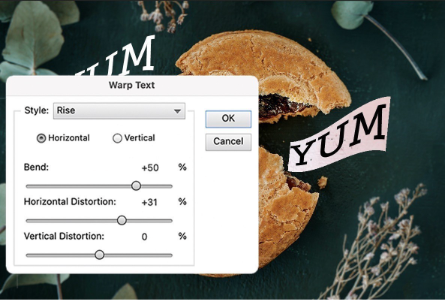
Step 5: Save your result
When you’re happy with the warp, click OK to apply it. Your photo will return to the main editor window where you can continue making changes or go straight to saving. Go to File > Save As and give your edited version a new name to keep your original photo safe and untouched.
Helpful hints for better results
Start with a subtle bend
A small amount of warp often looks more intentional and polished than a heavy distortion. Try setting the Bend slider to around 20–30% first and increase from there if you want something more dramatic.
Use a bold font for warped text
Thin or delicate fonts can look spindly when warped, especially at higher bend values. A bold or medium-weight font holds its shape better and stays readable as it curves.
Warp works well with Text Styles
Once you’ve warped your text, you can apply a preset style from the Effects panel — a drop shadow, glow, or bevel — to enhance it further. The two techniques complement each other well.
You can always undo
Press Ctrl+Z on a PC or Command+Z on a Mac to undo any step. You can also reopen the Warp Text dialog at any time by selecting your text layer and clicking the Warp icon again.
Common questions
Yes. As long as you haven’t flattened the image, the text layer remains editable. Select the Type tool, click on your text, and then click the Warp icon again to reopen the settings and make changes.
The Warp icon only appears in the Tool Options bar when a text layer is selected and the Type tool is active. Make sure you’ve clicked on your text layer in the Layers panel and that the Type tool is selected in the left toolbar.
Text on a Shape and Warp Text are two separate tools and work differently. Text on a Shape flows text along a custom path. Warp Text distorts the shape of the letters themselves. You can use them on separate text layers in the same photo, but they can’t be applied to the same text layer simultaneously.
Not unless you save over it. Use File > Save As to save your edited version with a new name, and your original will stay exactly as it was.
Yes. Warp Text works with any font installed on your computer. Any font you add through your operating system will appear in Photoshop Elements the next time you open the application.
You may also like
Photoshop Elements 2027
Photoshop Elements &
Premiere Elements 2027
Best value
Create
- Insert an object into a photo
- Warp text into curves and shapes
- Extend a photo background
- Remove objects and people from photos
- Remove or replace your background
- Add text styles like shadows and glows
- Touch up portraits
- Create a custom pattern brush
- Move, scale, or duplicate an object
- Combine multiple photos into one
- Add text to a shape
Connect





CardTitle
Warp text into curves and shapes.
CardImage
CardImageAltText
Image of a pie with the words YUM in warped text inside and around the pie.
PrimaryTag
caas:content-type/how-to
Tags
caas:content-type/how-to, caas:products/photoshop-elements
BadgeText
How-to
