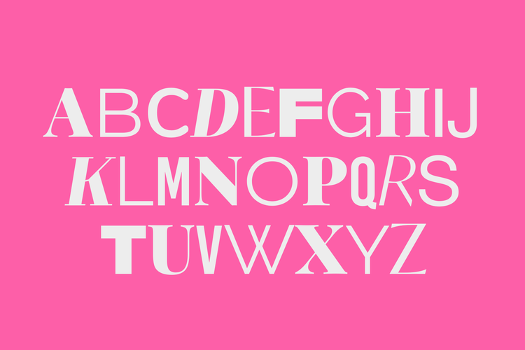
As with many professions, there’s a lot of jargon in graphic design. Knowing the basic lingo inside and out is key to understanding your briefs, as well as communicating about your projects. To help you get off on the right foot, we’ve compiled a list of 50 basic terms that all designers should know across design, typography, color, and branding.
Design
51 Key words all designers should know
A comprehensive introduction to the language of design.
Adobe Express
June 26, 2025

Design key words
1. Alignment
Alignment is about the position of the text or graphic on the page — whether they're to the left, right, centered, or full justified.
2. Asymmetry
When design elements aren’t equal on both sides of a central line, the design would be considered asymmetrical.
3. Bleed
The bleed is when a design is deliberately extended past the intended size of the image so that once printed, there's no risk of white edges when it's trimmed.
Further reading: Designing for print versus for screen
4. Contrast
Contrast is achieved by using elements within your design that look different from one another such as contrasting colors, shapes, textures, sizes, or typeface.
5. Crop
An image that's been cropped has been cut to remove parts of the image, improve framing, or alter the aspect ratio.
6. Hierarchy
Hierarchy refers to how various elements within a design are arranged to guide the viewer's eye to the most important elements first.
7. Illustration
Illustration is the process of creating images, often hand-drawn or digitally generated, to explain or enhance a message.
8. Orphans
Similar to widows, orphans are when a word or line is alone at the bottom of a page or column, separated from the paragraph before.
9. Raster image
Raster images are pixel-based graphics. These cover file formats such as JPG, GIF, PNG, TIFF, RAW, and PSD.
10. Resolution
Resolution is a measurement of the quality of the image based on the number of pixels. The higher the resolution of an image, the clearer and more detailed it will be.
11. Scale
Scale is the size of an element in relation to another element.
12 Symmetry
Symmetry is achieved when all design elements are equal on both sides of a central line.
13. Trim
The trim size is the final size of a printed design after it's been trimmed from the page.
14. Vector images
Vector images are curve-based graphics. These cover file formats such as PDF, EPS, and AI.
15. White space
Also known as negative space, white space is an area in a design that's clear of any imagery or text.
16. Widows
Similar to orphans, widows are when a word or line appears alone at the top of a new page or column, separate from the rest of the paragraph.
Typography key words
1. Ascender
An ascender is the part of a lower-case letter that rises above the main body of the text. Letters such as “b” or “h” have ascenders.
2. Baseline
The baseline is the line that all font characters sit on. If you were writing in a lined notebook, the line on the page would be the baseline.
3. Descender
A descender is the part of a lower-case letter that falls below the main body of the text. Letters such as “y” or “g” have descenders.
4. Font
A font refers to a specific style of text.
5. Font spacing
Font spacing refers to how the vertical or horizontal lines of a font can be altered to change the overall appearance of the font.
6. Kerning
Kerning refers to the space between pairs of letters in the same word. Altering the kerning between letters can mean adding or subtracting space to make a word look more visually appealing or readable.
7. Leading
Leading is the space between two lines of text.
8. Lorem ipsum
Lorem ipsum is dummy text that's used as a placeholder in a design until the final text can be added.
9. Medium
Also known as the x-height, the medium is where lower-case letters should reach their maximum height (with ascenders rising above the medium). The medium is set from the height of the x in a font.
10. Sans Serif / Slab Serif
A sans serif typeface covers fonts that do not have serifs on the letters, while a slab serif typeface covers fonts that have thick and blocky serifs on the letters.
11. Script
Script is a typeface, recognizable by its similarity to handwriting with flowing cursive-like letters. Fonts of this type have connected letters and decorative flourishes and are typically used for headlines rather than body copy.
12. Serif
Serifs are the small lines or strokes that are attached to the ends of the main strokes of letters that make up the serif typeface. Serifs add decoration, but they also improve readability.
13. Tracking
Tracking is the adjustment of spacing for groups of letters and blocks of text. Similar to how kerning affects the spacing between two letters, tracking affects every character in the text.
14. Typography
Typography refers to the art and technique of arranging type to make your text more readable and visually appealing.
Further reading: 10 font pairings for maximum impact
Color key words
1. Analogous
Analogous colors are adjacent to one another on the color wheel.
2. Complementary
When two colors are referred to as complementary it means that they are opposite to one another on the color wheel.
3. Gradient
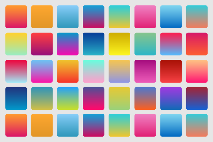
A color gradient is when two colors blend smoothly from one to another, regardless of color family. Gradients typically involve a transition from one color to another, while an ombre typically involves the transition between two shades within the same color family.
4. Grayscale
Grayscale is when a monochromatic image is created using only shades of gray.
5. Hue
The hue of a color is the underlying base color of the mixture that you’re looking at — aka yellow, orange, red, violet, blue, or green (the primary and secondary colors).
6. Monochrome
Monochrome is when an image or design contains only black and white, or only shades of one color.
7. Ombre
Ombre is when one color smoothly blends into another color within the same color family. Gradients typically involve a transition from one color to another, while an ombre typically involves the transition between two shades within the same color family.
8. Opacity
Opacity is when something lacks transparency. The less transparent an image is, the more opaque it is
9. Palette
A palette is a collection of colors that have been selected for use in a specific design. Color palettes are very important in branding to ensure consistency across designs.
10. Saturation
Saturation refers to the intensity of a color. For example, the pure hue of a color will have greater saturation than a tone, shade, or tint of the original hue.
11. Shade
A shade is when black is mixed with a pure color, creating a darker version of the original hue.

11. Tint
A tint is when white is mixed with an existing pure color to make it lighter and paler — often resulting in a pastel version of the original hue.
12. Tone
A tone is when gray is mixed with a pure color, creating a less vibrant and more toned-down version of the original hue.
Further reading: The difference between hues, tints, tones, and shades
13. Triadic
Triadic colors are three colors that are evenly spaced on the color wheel. When used together in a design, one color dominates, another supports, and the third color is used for accents.
Further reading: 101 brilliant color combinations
Branding/logo design key words
1. Abstract mark
An abstract mark is a logo that uses the emotive qualities of color and form. Abstract marks are less recognizable as specific objects but use shape to represent your business.
2. Branding
Branding through design is about creating brand consistency across all elements to create a memorable visual identity for a brand that conveys the desired sentiment. Branding for design encompasses elements such as the logo, colors, fonts, and overall aesthetic.
3. Emblem
An emblem is a type of logo and uses frames and shapes to enclose the company name. Badges, seals, and crests are examples of emblems.
4. Lettermark
Lettermark logos feature one or more stylized letters to identify the brand (such as the company’s initials). A great example of this is the HBO logo.
5. Mascot
Mascot logos feature a character used to represent the business, such as Mr. Peanut.
6. Pictorial mark
Pictorial marks are visual icons that represent your service or company name. For example, the Apple logo.
7. Wordmark
A wordmark logo features custom typographic treatment of text (usually of the company name). A great example of this is the Coca Cola logo.
Feeling more in the know? Put your newfound knowledge to the test and begin your newest design project with Adobe Express.


