


Complex information becomes easier to understand when it's presented visually. Infographics combine data, ideas, and storytelling into clear, engaging designs that help audiences absorb key messages quickly. Create professional infographics with Adobe Express and turn information into visuals that inform, engage, and inspire.

12 incredible infographic ideas.
Ignite your imagination with this collection of brilliant infographic designs to help you get started on building your very own.

Easy all-in-one editor

One-click edits from any device

Fast creation with generative AI

Thousands of professionally designed templates
Summary
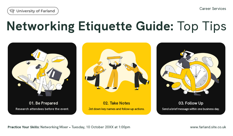
1. Demonstrate a process.
We’re starting our list with a great example of an infographic. Here we have many common essentials that make an infographic easy to read and understand – that being images, minimal yet direct text, and arrows or directions breaking down an idea for the reader. Media here literally walks the reader through their process step-by-step, which is helpful both if you’re a new hire at the company or a potential client looking to learn more. Infographics can serve as a guide when you need to teach or share a process.

2. Breakdown small parts of a bigger whole with graphics.
A good way to think about infographics is to show rather than to tell. Use imagery as a key player here when you’re breaking down a concept. Offering visuals along with words offers two points of reference for someone to remember. And it helps your reader understand all the smaller components that make up a final product.
3. Illustrate step-by-step instructions.
There’s no doubt that a design like this would be great as a poster in a classroom or as a Pinterest pin for explaining a recipe. Why is that? Breaking down each part of the cooking process makes each step digestible for the reader. If someone is learning how to cook the best omelet, looking at a recipe like this feels welcoming, approachable, and reassuring. Each step is clear, and providing visuals ensures the reader knows what’s going on.
4. Feature a map with your infographic.
Infographics aren’t just about visualizing processes or data. You can also showcase maps, including but not limited to maps of a town, country, or continent; a map of the body or its systems; a star chart; weather patterns; or even palm lines. When working with maps, they can provide the imagery to pair with any text you want to feature, offering insight about your information. You can also get as creative as you’d like with your maps – no need to be perfectly accurate, as infographics are more about a clean, playful presentation than precise, intricate details.
5. Use infographics to depict timelines.
Sometimes dates, names, and facts can be challenging for people to remember all at once. Help them out with a bit of data visualization. Deconstruct timelines and historical dates with an infographic to give a visual perspective of time, distance, and/or relationships. History is important, so finding a way to communicate historical facts enticingly will provide your reader with knowledge of context and importance.
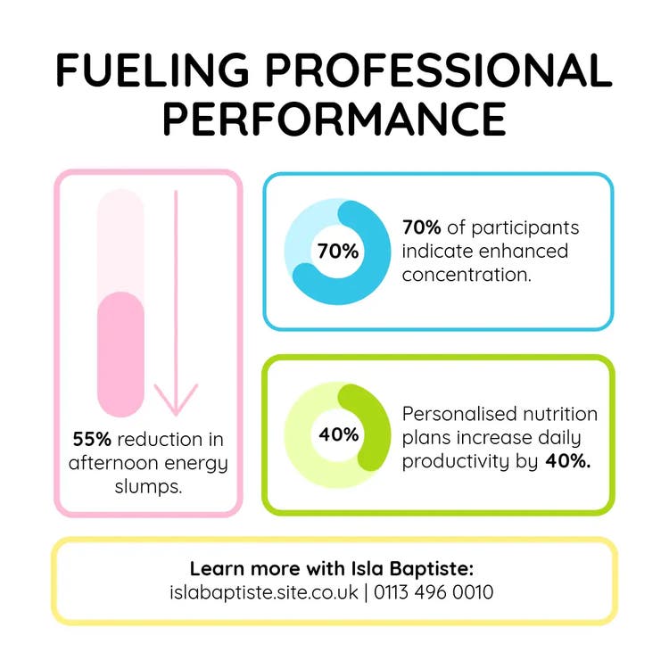
6. Visualize percentages.
Charts, such as pie charts or bar charts, are standard methods for depicting percentages. While they are no doubt helpful, how can you convey your data more creatively? In the example here, we see percentages paired with the majority they describe to provide additional context and a clear idea of who the subject is we’re learning about. Explore with shapes, icons, or imagery when communicating a percentage on your next infographic.
7. Compare data with visuals.
There are so many different terms for the endless types of coffee out there. This infographic is read from top to bottom and from side to side when we get to a comparing content panel. Visuals are the leading component, and keeping consistency with the visuals allows the reader to understand the differences that are being compared. This makes the characteristics of each cup stand out. Think about how you can keep consistency as a tool when making comparisons in your graphic.
8. Use color to show comparisons.
There are countless ways to organize and divide information; one method is to use color. Using color to your advantage is a great tool as it is eye-catching, can communicate a specific mood, and doesn’t take up space in your composition – instead, it often adds dimension to it. See how color creates a clear division between the two columns to indicate the two categories and allows us to compare the differences in this example.
9. Create distinct divisions with color.
In these examples we see color creating stark distinctions between each section. This keeps the information separate, and the checkerboard pattern takes our eye on a journey around the page to read it all. Using just two tones here, the grey and the red or the blue and the white keeps the design simple, so it’s easy to enjoy while still absorbing the information without any distractions.
10. Shift colors gradually when providing information.
Color, as it’s working here, is not just creating divisions in the data. It’s also subtly communicating information with the gradual shift in hues of blue. The change in the gradients from light blue to dark blue indicates a process from beginning to end and carries our eye through the composition in a way that subconsciously makes sense. Use colors that support your messaging and serve a purpose in your design.
11. Feature icons as the primary indicators.
Icons, as we’ve talked about, are an excellent tool when it comes to graphics. Imagery, in general, provides information that a reader might process before even realizing they’re reading a graphic. Let imagery, icons especially, tell your story as much as possible. This approach works great when dealing with an audience who may not read well, such as young kids or those who speak a different language. Icons can also be customizable to match the mood and color scheme of your graphics.
12. Feature infographics on your resumé.
Now that we know that infographics serve to make bulk information easier to understand, don’t you think that would be a helpful tool on your resume? Give recruiters a chance to understand who you are quickly and your important details by highlighting those points using text, color, and imagery. Here we see examples that feature a timeline, a chart, and a fact cloud, highlighting key takeaways for the reader.
How to make an infographic with Adobe Express.
1. Start with inspiration.
We hook you up with thousands of professionally designed templates, so you’re never starting from a blank canvas. Search by platform, task, aesthetic, mood, or color to have fresh inspiration at your fingertips. Once you find a graphic to start from, just tap or click to open the document in the editor.2. Remix to make it your own.
There are lots of ways to personalize the templates. Change up the copy and font. Sub out the imagery with your snapshots or short video clips. Or browse from thousands of free images right in Adobe Express. Spend as little or as much time as you want to make the graphic your own. With a premium plan, you can even auto-apply your brand logo, colors, and fonts, so you’re always #onbrand.3. Amp up the flair.
It’s easy to add extra flair and personality to your projects with our exclusive design assets. Add animated stickers from GIPHY or apply a text animation for short-form graphic videos in one tap. We’ve taken care of all the boring technical stuff so you can focus on your message and style.4. Resize to make your content go further.
Gone are the days of having to memorize image dimensions for every single platform. Once you’ve landed on a design you like, you can easily modify it for any social network by using our handy resize feature. Duplicate the project, hit resize, select the platform you want to adapt it for, and we take care of the rest.5. Save and share your custom infographic.
Once your design is complete, hit that publish button and share your design with others. Adobe Express saves your designs, so you can always revisit your project if you need to update it in the future.


