Tips for designing a digital poster.
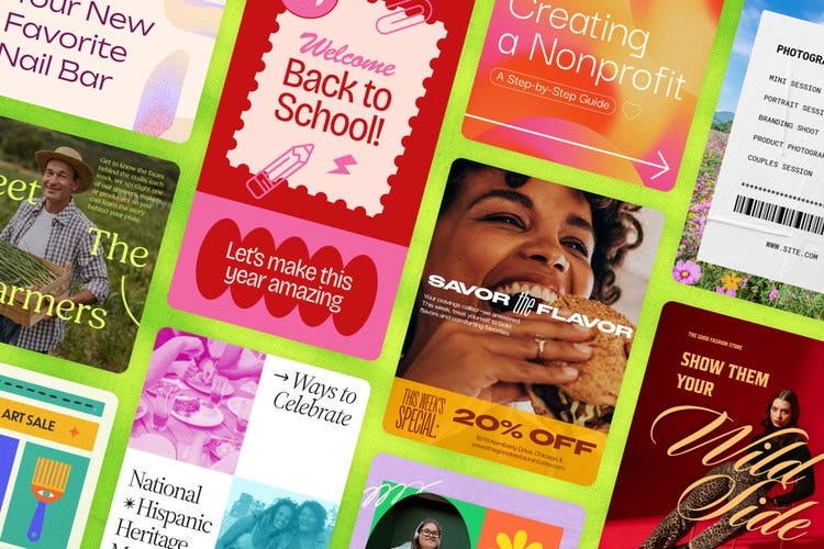
If you’re designing a digital poster, you want it to be as visually appealing and engaging as possible to help you grab and keep your audience’s attention. Adobe Express can help you do this, not only through our innovative tools but also with a few top tips to help you make the best design decisions.
Here are our top tips for designing a digital poster:
Define your main goal.
What’s the goal of creating this poster? What key message are you trying to communicate? Whether it’s to market a product, promote an event or simply raise awareness on an important topic, identify these key factors and let the answers influence every decision you make for your digital poster design.
Choose your target audience.
Another key factor that should drive every decision you make for your poster is the target audience. Spend some time thinking about who you want your content to attract or inform, then tailor your design features to this specific audience.
Think about placement.
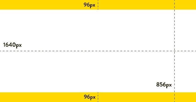
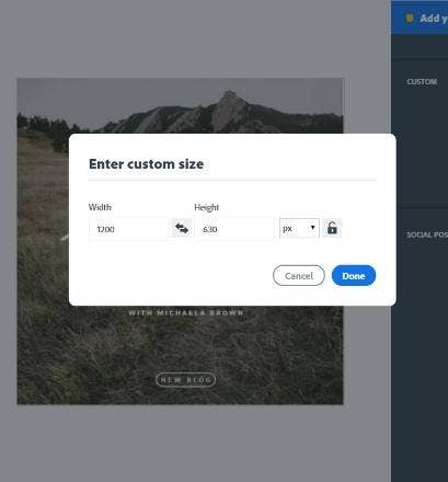
Decide the best place for your poster to be displayed online. Will it be on a website, digital billboard or social media? Or all of the above? You don’t have to go with just one option. Often, promoting your content on a range of platforms works well as part of a broader multimedia strategy. Just remember, the different mediums you choose may require varying poster dimensions.
Prioritise readability.
This involves looking at aspects such as font choice, size and contrast with background colours. Go for clear, legible fonts, suitable text sizes, and ensure the contrast is strong enough to make the text stand out. All this works together to help you create a poster that’s easy for your audience to read across different formats and viewpoints.
Use high-quality imagery/graphics.
It’s important to use high-quality images with high-resolution to avoid pixelation that can affect the visual appeal of your poster. The last thing you want is to upload digital content of poor quality, as it won’t show your brand in the best light. You should also ensure that you include images and graphics that are relevant to your target audience and purpose to help boost engagement.
Choose an effective colour palette.
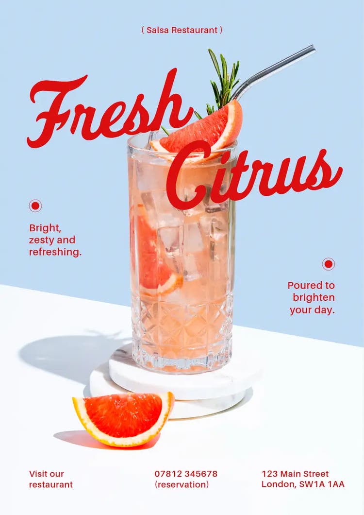
Opt for colours that align with your brand and the mood you’re trying to create, or the message you’re trying to communicate. For example, greens can convey nature and relaxation, while red can suggest caution and call for attention. To reduce visual clutter, it’s best to limit your colour palette to two to four primary colours and consider accessibility to ensure your colour poster is legible to those with vision deficiencies.
Keep it concise.
Posters are mainly created for visual engagement, but it’s still a good idea to include some text. Aim to keep written context clear and concise, so that you can communicate with audiences quickly and effectively. Use punchy headlines, short phrases, keywords and bullets that are easy to scan and digest.
Test on different screens.
Last, but not least, always check how your poster looks on different devices, including desktops, tablets, and mobile phones, as well as different screen sizes and resolutions. This way, you can ensure your design remains clear and visually appealing in all formats.