
toc-title
Table of contents:
toc-aria-label
table of contents links
content-1

Hyper Industrial, explained

content-1-short
content-2

Why the clarity of Hyper Industrial matters right now

content-2-short
content-3

How to build a Hyper Industrial design

content-3-short
content-4

Hyper Industrial in action

content-4-short

Imagine yourself in a big city walking amongst massive skyscrapers. Suddenly your path is divided into grids, which instantly gives you an instinctual sense of a world that dives into structure and its systemic components.

That world could be called Hyper Industrial, an Adobe 2026 design trend. This trend is inspired by architecture and engineering, it uses structure, restraint, and thoughtful organization to make complicated ideas feel approachable. Instead of shouting for attention, it draws people in through surprisingly — and often, delightfully — understated design.

Whether you’re creating a social post, presentation, flyer, or report, Hyper Industrial can help you communicate complex ideas with the power and precision they deserve.

Hyper Industrial, explained

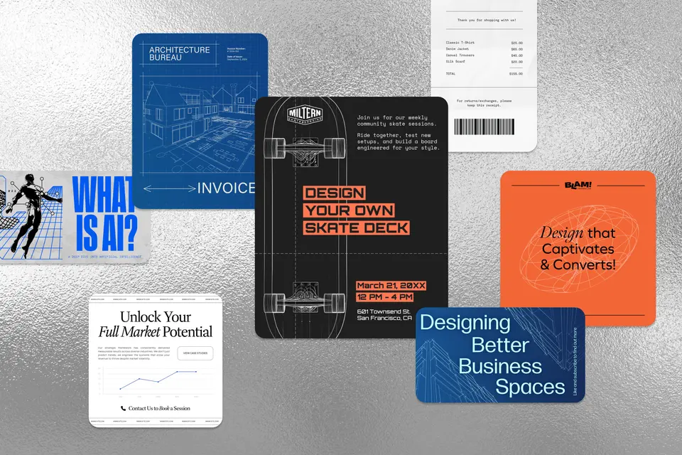
Some design styles rely on bold photography or illustrations to grab attention. Others use striking typography and other larger-than-life visual elements. Hyper Industrial takes a different approach. It borrows from blueprints, floor plans, technical drawings, and architectural sketches, arranging those elements into layouts that feel organized and intentional.

Grids and geometric features play a major role in Hyper Industrial designs. They create rhythm across the page, establish a clear hierarchy, and help even information-heavy designs feel approachable. Supporting elements like measurement marks, arrows, labels, and fine-line work reinforce the feeling that every piece of the design has a purpose.

recipe

collection=default&templateIds=urn:aaid:sc:VA6C2:431ee3a9-da9b-50ca-b17e-5f3f3c337b87

recipe

collection=default&templateIds=urn:aaid:sc:VA6C2:700a5eb2-3397-51ea-8813-b5c8369e95e6

Typography tends to be modern and restrained, allowing complex or technical elements to stand out without overwhelming the viewer. Bold sans serif headlines can capture attention, while smaller supporting text echoes the annotations found in architectural drawings and documents.

Color palettes are equally intentional. Cooler tones like navy, charcoal, forest green, gray, and white work well, occasionally paired with a brighter accent color to emphasize key information. As with most design languages, Hyper Industrial calls for balance — a splash of purple could pop against a black background, for example, or an orange highlight could draw the eye toward a can’t-miss event date.

recipe

collection=default&templateIds=urn:aaid:sc:VA6C2:9d4a5a3f-02de-507e-bf70-607836870617

recipe

collection=default&templateIds=urn:aaid:sc:VA6C2:d09f1c5e-8c7a-5959-b5db-b5ba1cd19579

Hyper Industrial is effective for virtually every type of brand visual, not just posters or other pieces of marketing campaigns. The same design principles work just as well for everyday business materials like invoices, receipts, reports, and presentations. Thoughtful layouts help even the most practical documents feel purposeful, ensuring every audience interaction with your brand builds trust and goodwill.

recipe

collection=default&templateIds=urn:aaid:sc:VA6C2:3b383b50-1442-505e-81e5-511f6abe974e

recipe

collection=default&templateIds=urn:aaid:sc:VA6C2:0a5b8d42-4f50-5d56-b072-2c9079273243

One of this trend’s biggest strengths is its flexibility. While it naturally complements architecture and engineering, the same design language translates to technology, education, finance, consulting, and countless other sectors. Any brand that wants to communicate competence can put these design principles to work.

Why the clarity of Hyper Industrial matters right now

These days, many brands embrace vibrant colors, oversized typography, or eye-catching illustrations — hallmarks of Adobe’s 2025 design trend Maximal Realm. Hyper Industrial takes a quieter approach.

Rather than asking viewers to stop and admire the design, Hyper Industrial uses structure to guide them naturally through the information. In doing so, it demonstrates that thoughtful systems can be just as impactful as bold visual statements.

recipe

collection=default&templateIds=urn:aaid:sc:VA6C2:55904340-431c-5795-ac78-26d05861eb83

recipe

collection=default&templateIds=urn:aaid:sc:VA6C2:d32a67f1-822b-543a-af43-87eb12ff8a5c

This approach also builds trust. Structured layouts and technical details suggest careful planning, reinforcing the idea that every element has a purpose.

If you get stuck while creating this style, remember to think like an engineer, not a designer. Don’t add elements just to fill space. Every line, annotation, and graphic should solve a communication problem. When each element has a clear role, the entire design works together powerfully.

recipe

collection=default&templateIds=urn:aaid:sc:VA6C2:0419add5-f390-53dd-89ad-2e8d94db6a9f

recipe

collection=default&templateIds=urn:aaid:sc:VA6C2:a1c95034-1e96-53e7-ae4e-63c5c54ec458

How to build a Hyper Industrial design

Hyper Industrial is built from the inside out. Before you choose fonts, colors, or graphics, think about the information you’re trying to communicate. What’s the main takeaway? Which details support it? Once you’ve answered those questions, you can begin organizing the page around them.

Start with a strong visual hierarchy. Whether you’re leading with a headline, a product image, or an illustration, your audience should immediately know where to look first. From there, use elements like modular sections and supporting graphics to guide viewers through the rest of the design.

recipe

collection=default&templateIds=urn:aaid:sc:VA6C2:52ba6dcf-4fda-5013-af27-bcc40801f84e?

recipe

collection=default&templateIds=urn:aaid:sc:VA6C2:41dc938c-28a9-5423-9147-03f23d692ffd

While Hyper Industrial is a utilitarian style, that doesn’t mean it has to be boring. A local band could reimagine a vintage typewriter as a technical illustration on an album cover, while a skate store could promote a custom deck workshop with graphics that celebrate the craft behind every board.

recipe

collection=default&templateIds=urn:aaid:sc:VA6C2:0c247188-4091-549d-a590-f9f671c20df1

recipe

collection=default&templateIds=urn:aaid:sc:VA6C2:af4a69f2-0347-58c2-9ef4-74357300ef87

The best Hyper Industrial designs never feel overloaded, even when they’re packed with information. Every line, label, and layout decision contributes to a cohesive whole.

A good rule of thumb: When your audience instinctively knows where to look first, where to look next, and what action to take, you’ve built a design that does exactly what it was meant to do.

Hyper Industrial in action

Hyper Industrial shines whenever information needs to be understood quickly. Whether you’re explaining a process, presenting data, introducing a product, or showcasing a portfolio, its structured approach helps complex ideas come through clearly.

What makes this trend so versatile is that it isn’t tied to a specific industry. Instead, it draws from timeless design principles — strong hierarchy, modular layouts, restrained typography, and purposeful visual details — that help almost any message feel easy to navigate.

Remember, you don’t need to pack your designs full of drawings, icons, images, and measurement lines. Borrow the elements that fit your brand, let structure do the heavy lifting, and you’ll build designs that are as functional as they are beautiful. Piece by piece, Hyper Industrial helps you assemble a visual identity that reflects the thought and care behind your creativity — and your brand.

Try Adobe Express for free now