Fonts do more than look nice. The right font choices make reading easier, reduce eye strain, and help learners focus on meaning instead of decoding letters. The wrong choices (thin strokes, cramped spacing, low contrast) can slow comprehension, especially on screens and for diverse readers. This guide explains research-backed font picks and practical formatting habits you can use across print handouts, slides, worksheets, and digital materials.
Key takeaways
- Prioritize legibility over style: Clear letter shapes, strong contrast, and comfortable spacing matter more than serif versus sans serif debates, as outlined in the APA accessibility typography guidance.
- Use a short, safe list of classroom-friendly fonts (and stick to them) to build consistency across materials.
- For diverse learners, pair font choice with size, spacing, and layout. These often drive readability improvements more than the typeface alone, a theme explored in readability and formatting research hosted on ERIC.
- Consider a low-vision option like Atkinson Hyperlegible when you want maximum character distinction.
What makes a font “good” for classroom instruction?
A classroom-friendly font supports fast, accurate reading in real conditions: small screens, projectors, photocopies, and tired eyes. In practice, that means:
- Distinct characters (I/l/1, O/0)
- Even spacing and clean shapes
- Good performance on screens (modern sans fonts often shine here)
- Consistency across your materials so students don’t re-adjust every time
Why do font choices matter for readability and comprehension?
Reading is a cognitive task. When text is visually hard to process (low contrast, tight spacing, decorative forms), students spend more effort on decoding and less on understanding. Typography and spacing can influence reading speed and comprehension, especially on screens and for developing readers.
Also important: It’s a misconception that serif fonts are automatically “bad” or sans serif fonts are automatically “best.” What matters most is overall readability: clear shapes, adequate size, and strong contrast.
What are the core components of readable, accessible classroom typography?
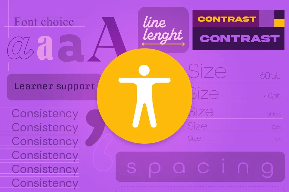
Think in terms of a system of core components, not a single font:
- Font choice: Clear letterforms, good screen rendering, familiar shapes
- Size: Big enough for the room and the device
- Spacing: Line spacing and character spacing that prevent crowding
- Line length: Not too wide (wide lines increase fatigue)
- Contrast: Text/background combination that’s easy to read
- Learner support: Options for dyslexia/low vision and multilingual content
What are the best fonts for educators?
Here are 7 essential steps
Step 1: Choose a safe list of reliable classroom fonts
If you want simple, widely available choices that read well in both print and digital, start here:
Strong all-purpose (for screen and print):
- Arial / Verdana / Tahoma / Trebuchet (common, readable, widely installed), which align with recommendations in the British Dyslexia Association style guide.
- Calibri (designed for screen readability; common in documents), with readability context discussed in research on screen typography.
Excellent modern options (available via Google Fonts):
- Roboto / Open Sans / Source Sans 3 (clean, flexible, highly legible), similar to modern institutional guidance like Stanford’s typography system.
Low-vision friendly option:
- Atkinson Hyperlegible is built specifically to increase legibility for readers with low vision.
You don’t need dozens of fonts. Pick one body font and one heading font (often the same family in different weights).
Step 2: Match font choice to the medium
- Slides and projectors: Use fonts with thicker strokes and high clarity at large sizes (Roboto, Arial, Verdana, Source Sans 3).
- Handouts: Either serif or sans serif can work; opt for what prints cleanly on your copier and stays readable at smaller sizes.
- Digital reading: Fonts designed for screens (Calibri, Roboto, Open Sans, Source Sans 3) often feel smoother for long passages.
Step 3: Set sizes that reduce strain
A practical baseline:
- Slides: Treat size as “room-based,” meaning that if the back row squints, increase it and shorten the text.
- Handouts: Many accessibility guides recommend 12–14 pt as a starting range.
- On-screen reading: Aim for at least 16 px equivalent body text; go larger for long reading passages, consistent with Section 508 typography guidance.
- Step 4: Use spacing to fight “crowding”
Spacing can do as much work as the font itself:
- Increase line spacing (1.2–1.5 is a solid range for most materials).
- Avoid overly tight tracking; consider slightly increased spacing for dense paragraphs or younger readers. Spacing can influence readability and comprehension.
If your materials feel “busy,” try adding whitespace before changing fonts.
Step 5: Design for diverse learners (without singling anyone out)
A few evidence-aligned, widely used practices:
- Prefer plain, evenly spaced fonts for many readers who experience visual crowding; common guidance includes Arial, Verdana, Tahoma, Trebuchet, Century Gothic, and similar options.
- Be cautious with “special dyslexia fonts.” Research on OpenDyslexic shows mixed results; it may not reliably improve reading speed compared with familiar fonts, as described in a peer-reviewed study on PubMed Central.
- Offer flexibility when possible: Provide digital copies where learners can zoom, adjust line spacing, or switch to a preferred font.
Step 6: Keep contrast and simplicity high
Even the best font fails with low contrast.
- Use Dark text on a light background as the default.
- Apply minimal background textures behind text.
- Try bold for emphasis instead of light-gray text.
For slides and posters, start from a clean template where spacing and contrast are already sensible, then adjust content rather than rebuilding layouts from scratch. This is where tools like Adobe Express can quietly help: Templates, consistent text styles, and quick resizing for different formats reduce accidental readability mistakes.
Step 7: Standardize your “classroom typography rules”
Write 5–7 rules and reuse them everywhere. Example:
- Heading font: same family, bold
- Handout body: 12–14 pt, 1.3 line spacing
- Slides: short lines, large type, high contrast
- Never use thin fonts or all-caps paragraphs
- Keep line length moderate and add whitespace
Consistency supports comprehension because students spend less energy adapting to new visual patterns.
Font best practices for educators
- Pick familiar, legible fonts and use them repeatedly.
- Use weight and spacing to create hierarchy instead of adding more fonts.
- Avoid “novelty fonts” for instructions, assessments, and long reading.
- Build for screens first when your materials will be viewed digitally.
- When in doubt, choose clarity: larger size, more spacing, higher contrast.
Quick classroom typography checklist
✅ Choose one body font and one heading font (or one family with multiple weights).
✅ Set readable sizes for print and digital (scale up for the room).
✅ Use comfortable line spacing (aim 1.2–1.5) and avoid cramped paragraphs.
✅ Keep contrast strong; avoid textured backgrounds behind text.
✅ Ensure characters are distinguishable (I/l/1, O/0).
✅ Test on the device/print method students will actually use.
✅ Save your rules as a reusable template for future materials (easy to maintain in tools that support templates and style presets).
The best fonts for education don’t need to be complicated. Choose a small set of reliable fonts, give text room to breathe, keep contrast strong, and stay consistent across materials. When your typography fades into the background, students can focus on what you’re teaching—which is the whole point.