



Understanding how color relationships work together makes a big difference in everything from branding and digital design to painting and interior design. If you’ve ever wondered how creators, artists, and designers find the perfect color combinations, it’s because they understand color theory.
Color theory is the study of how colors work together to influence mood, and the color wheel is the main tool that visualizes hue relationships. The principles of color theory help us organize colors, understand how colors interact, and create harmonious color combinations. From there, the color wheel maps the primary, secondary, and tertiary colors to help us visually understand things like complementary, analogous, and triadic color schemes.
Here, we’ll explain the core components of color theory, give a brief history of the color wheel, and show how using the color wheel in design with primary, secondary, and tertiary colors supports successful design decisions.
Key takeaways
- Color theory explains how colors work together to create harmony, contrast, and emotional impact.
- The color wheel is the primary tool used by designers, artists, and creators to visualize these relationships. It organizes colors into primary, secondary, and tertiary hues, making it easier to understand relationships such as complementary and analogous.
- Different color models serve different mediums. RYB is used in traditional art and painting, RGB is used for digital screens, and CMYK is used in print production.
- Shades, tints, and tones modify a single hue by adding black, white, or gray. This lets designers control depth, softness, and saturation while maintaining visual cohesion.
- Designers use the color wheel to guide aesthetics and mood. Warm colors are good for energy and approachability, and cool colors for calm, professionalism, and balance.
What is the color wheel?
You’ve probably seen a color wheel at some point — it’s a circular diagram that groups colors based on their chromatic relationships to visually map out primary colors (red, yellow, green), secondary colors (created by mixing primary colors), and tertiary colors. Think of it as a foundational tool in art, design, and color theory.
In the late 17th century, Isaac Newton created the first color wheel, which is mapped into a circle, connecting red back to violet, and became the basis for modern color theory. Then Johann Wolfgang von Goethe proposed a color wheel based on human perception and psychological effects — think warm versus cool colors and emotional associations. Johannes Itten standardized the 12-hue artist’s color wheel that most of us know today.
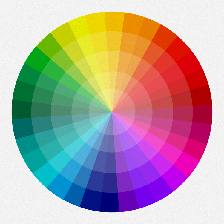
The wheel shape makes it easy to visualize opposites — placed across from each other as complementary colors that create high-contrast, strong visual energy. It shows the difference between warm (reds, oranges, yellows) and cool (greens, blues, purples) colors.
Color harmony — evenly spaced hues form balanced schemes; analogous colors are neighboring hues on the wheel, so they’re harmonious and naturally pleasing. Split-complementary relationships, known as triadic colors, are evenly spaced colors forming a triangle as a main color plus two adjacent to its complement.
There are two types of color wheels. The RYB — the red, yellow, blue — color wheel is used by artists, particularly for combining paint colors. And the RGB — the red, green, blue — color wheel is used digitally on computer or TV screens.
Why primary, secondary, and tertiary colors matter
The color wheel consists of 12 main colors, and can be divided into primary, secondary, and tertiary colors. Primary colors in RYB color model are opposite each other in the color wheel and can’t be mixed from other colors. These are red, yellow, and blue. In RGB color wheel, they’re the colors that, mixed together, create pure white light. These are red, green, and blue. They’re the source colors in their respective systems. Understanding primary colors helps you choose vibrant combinations.
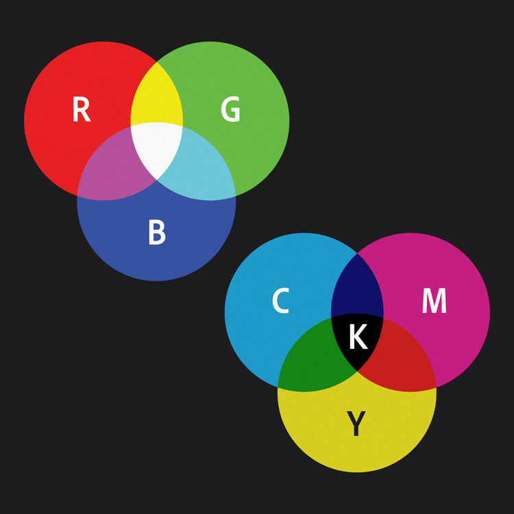
- RYB color model (common in art and painting): red, yellow, blue
- RGB model (common in screens): red, green, blue
- CMYK (common in print): cyan, magenta, yellow, black
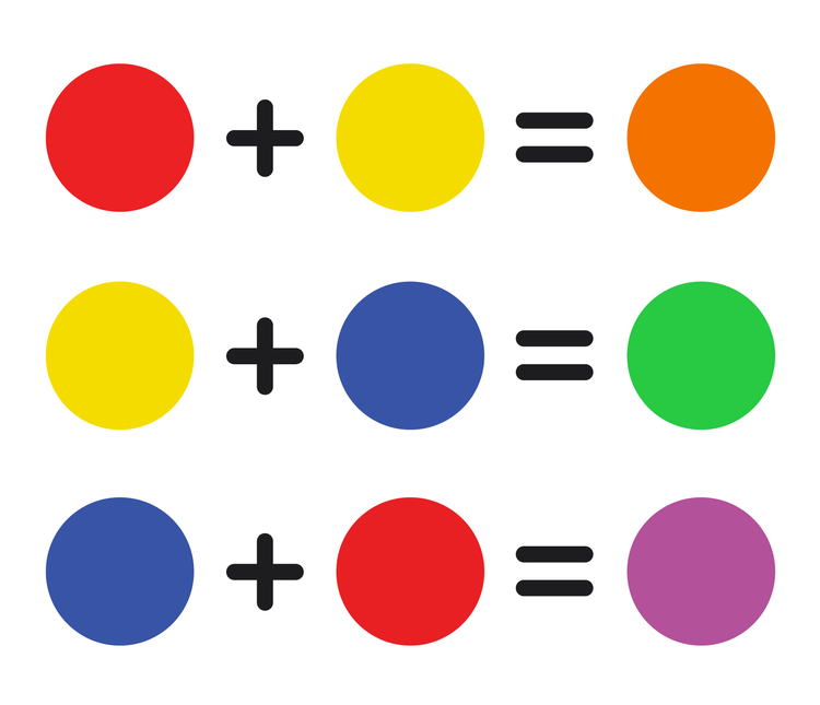
- Red + yellow = orange
- Yellow + blue = green
- Blue + red = purple
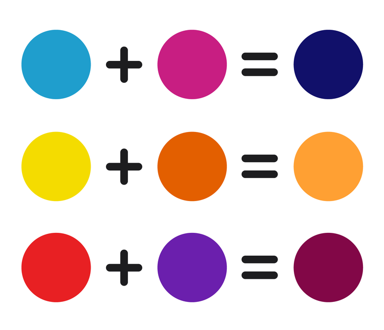
- Red + orange
- Yellow + orange
- Yellow + green
- Blue + green
- Blue + purple
- Red + purple
Primary, secondary, and tertiary colors make up the full range of hues on a traditional color wheel.
Read more: A comprehensive guide to using color in branding
Variations on hue
Shades, tints, and tones are all variations of a single hue that help designers create depth, hierarchy, and cohesion. They show how a color changes when you adjust its lightness or darkness.
A shade is created by adding black, which makes the color darker and deeper and increases its visual weight. Shades tend to feel more dramatic and grounded. Tints are made by adding white to make the color lighter and softer. Pink is a tint when white is added to red, for example. Tints are often used to create an airy or gentle feel. Finally, when you add gray to a hue, that changes intensity or saturation, also known as the tone. In other words, tones adjust mutedness.
How designers use the color wheel
For designers, the color wheel is both a decision-making tool and a reference chart. Designers can use the color wheel to build color schemes that ensure colors work well together. Diana Walker, visual content designer for Adobe Express, believes that color should create feeling, structure, and connection. “I use it to establish mood and identity, but also to support hierarchy, clarity, and cohesion across a design system.”
Analogous schemes are colors that sit next to each other on the wheel and create calm, cohesive visuals when used together. Complementary colors sit opposite each other and introduce contrast and visual energy.
The color wheel also helps designers consider mood and perception. For example, warm colors feel inviting while cool colors are more professional.
In addition to the color wheel, color pickers and digital palettes are also useful to designers. Discover popular color palettes with Adobe Color.


