


Social Media
YouTube thumbnails and titles: Which rules are true for your channel

Adobe Express
11/05/2026
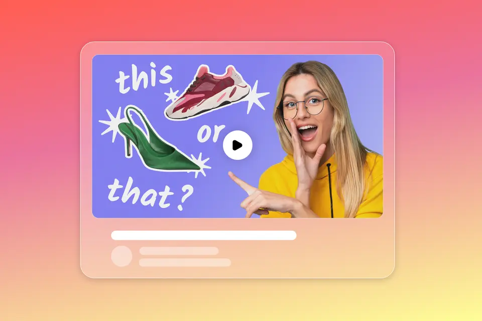
YouTube’s thumbnail guidance recommends 3840 × 2160 px for video thumbnails and allows desktop uploads up to 50 MB. Getting the file right is only the starting point. Faces, colors, and short headlines are design hypotheses, not guarantees. Test which title and image explain your video well enough to attract viewers who keep watching.
Key takeaways
- YouTube’s title-testing announcement confirms you can compare up to three titles and thumbnails per video, rather than testing images alone.
- A/B testing requires desktop YouTube Studio and advanced-feature access, which is different from basic phone verification.
- YouTube selects the winner by watch time, not click-through rate. A click isn’t the whole outcome.
What size should a YouTube thumbnail be?
Use 3840 × 2160 px at 16:9 for video thumbnails and 2160 × 3840 px at 9:16 for Shorts. YouTube’s current custom-thumbnail guidance distinguishes the formats and upload methods below. Keep recommendations separate from minimum dimensions and check the exported file rather than assuming a template’s default canvas matches the platform’s latest advice. Choosing the correct dimensions doesn’t determine whether the image communicates anything useful.
| Specification | Video thumbnails | Shorts thumbnails |
|---|---|---|
| Recommended resolution | 3840 × 2160 px | 2160 × 3840 px |
| Aspect ratio | 16:9 | 9:16 |
| Minimum dimension | 640 px wide | 640 px high |
| Recommended image formats | JPG or PNG | JPG or PNG |
| Desktop upload limit | 50 MB | 50 MB |
| Mobile upload | 2 MB limit | Custom uploads through desktop Studio only |
Specifications checked October 16, 2026. Custom uploads require a verified account. Podcast-playlist thumbnails use 1:1; their mobile limit is 10 MB. A channel banner is a different asset, covered in the YouTube banner design guide.
Keep text, imagery, and graphic elements editable while you compose the thumbnail. Check the canvas dimensions, replace any sample wording, and separate text from busy photography with a plain shape or contrasting background. These are readability choices, not a promise of higher views. Judge the lettering in a small preview rather than only at full editing size. Save the full-resolution file separately from any review copy.
How do thumbnails and titles affect audience retention?
Thumbnails and titles set the expectation that the opening of the video must meet. YouTube’s title guidance warns that inaccurate wording can make people stop watching. Think of the pair as complementary: The image shows something worth examining, while the title supplies the question or context. Repeating an identical sentence in both places wastes an opportunity to tell viewers more about what they'll learn.
For example, a bread-making lesson could show two cut loaves beside the title: “Why your sourdough stays dense.” The image offers evidence; the title identifies the problem. Check the pair in three views:
- Hide the title. Does the image communicate a recognizable subject or outcome?
- Hide the image. Does the title make an accurate, specific promise?
- View them together. Do they complement each other without repeating the same information?
Then check whether the opening delivers. YouTube’s audience-retention report measures how many viewers remain after the first 30 seconds and connects strong introductions with fulfilled expectations. For the bread lesson, show the crumb and identify the problem early. The YouTube video-success guide covers content planning and presentation; a different thumbnail can't fix a video that never answers its own title.
Use Adobe Express’s Duplicate & Resize, available on Premium plans, to create a smaller inspection copy while preserving the full-resolution design. Check the lettering, then inspect the actual platform preview. The copy is a readability check, not a simulation of YouTube’s interface. Keep it separate from the file you upload.
How do you test and compare thumbnails and titles?
Use YouTube Studio’s A/B Testing controls to compare alternatives for one video. Under Title or Thumbnail, choose a test type, add your options, and select Done. Start with an older video, as YouTube recommends, and choose the comparison that answers your question:
- Title only compares different wording while keeping the image unchanged.
- Thumbnail only compares images while keeping the title unchanged.
- Title and thumbnail compares complete pairs, not the effect of each element separately.
For the bread lesson, keep the title fixed and compare a finished loaf, a crumb close-up, and a before-and-after image. These are different ways to explain the same subject. Changing both the title and image tests the complete presentation but doesn’t isolate which change caused the difference. Keep dimensions and elements outside the experiment consistent, so the comparison answers the question you intended.
Adobe Express’s multi-page controls let you duplicate a design and manage the alternatives in one file, avoiding repeated setup. Name each version after its idea and record what you expect it to communicate.
Check these conditions before starting:
- Eligible videos include Live Archives and Premieres converted to long-form videos. Shorts, Scheduled Lives, Premieres that haven’t ended, and private, made-for-kids, or mature-audience videos are ineligible.
- Tests take a few days to two weeks. Overly similar alternatives can make a test run longer.
- Editing the title or thumbnail during the experiment stops the test automatically.
Use previews to assess legibility, not audience response. YouTube presents the alternatives concurrently and selects a winner by watch time. A manual before-and-after swap isn’t the same experiment, and a higher click-through rate doesn’t by itself establish success.
When no clear winner emerges, YouTube uses the first option uploaded; that doesn’t prove it was better. In a 2025 YouTube interview, Ebi Atawodi explained the aim: “We're just trying to give you enough data to be confident that there's a meaningful difference between the two.” Save the outcome, including an inconclusive one, rather than treating the default as a winning design.
Use click-through rate and retention as diagnostics. If clicks rise but viewers leave early, compare the opening with the promise before blaming the thumbnail.
How do you choose a TikTok video cover, and why is it a different job?
Choose a TikTok cover that makes the topic identifiable in a profile or search result; don't assume its job matches a YouTube thumbnail’s. TikTok’s cover-selection instructions say to choose Select cover before posting, select a video frame, and save it. On the For You feed, people encounter a stream of videos rather than first choosing among a YouTube-style grid of static previews.
For the bread lesson, a recognizable loaf and a brief topic label may help someone find the right post on your profile. The first moving image and spoken explanation still need to earn attention during playback. Treat that as a different design problem, not proof that TikTok covers do not matter. The TikTok thumbnail article provides platform-specific creative context; its examples do not establish rules for your YouTube audience.
Keep other surfaces separate, too. Facebook video thumbnails introduce individual videos. Instagram Story Highlight covers help organize saved collections. Use the corresponding guides for those jobs instead of transferring every layout unchanged. A coherent brand doesn’t require identical text, crops, or proportions everywhere. Preserve the subject and tone, then adapt the image to how someone encounters and uses it.
Create your next thumbnail test
Choose one existing video and start with a YouTube thumbnail template in Adobe Express. Use its editable text, imagery, and graphic elements to build alternatives without recreating every layout. Give each version a distinct idea but keep every image faithful to the video. Check the full-resolution exports and record the title paired with each image, along with your test question. When the designs are ready, upload them to YouTube Studio for a test rather than choosing on appearance alone. Save the editable versions so you can return to the ideas that deserve another comparison.


