.

Design

Typeface vs font: What’s the difference and why it matters

A practical guide to using typeface and font in real design work.

Adobe Express logo

Adobe Express

07/08/2026

Summary

Why typeface vs font still confuses people

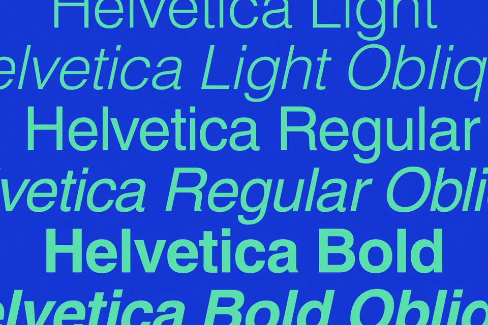
“Typeface” and “font” get used interchangeably so much that sometimes even experienced designers stop correcting it. In daily work, most tools label everything as a font even when the broader idea is the typeface. Typeface is the design style (e.g., Helvetica), whereas font is a specific style, weight, and size of a typeface (e.g. Helvetica bold 12pt). This makes the distinction easy to miss until you need to talk clearly about style, hierarchy, or consistency in a design. This guide explains the difference between typeface and font when you’re designing.

Typeface in typography means the overall design of a set of letters

A typeface is the full visual design behind a set of letters. Helvetica is a typeface, Times New Roman is a typeface, too. Even if you change the regular letter into bold, italic, or light, the text still has the same underlying design.

Typefaces start shaping the design before you change the layout or add styling. A custom card can tell you early whether the message is polished, relaxed, or more personal. This makes it easier to decide how much more decoration you can add. In an online presentation, the typeface helps with organization: Headings separate more cleanly from body text. The slides read faster, and you are less likely to patch weak hierarchy with oversized text.

More than changing the look of the letters, a typeface can:

  • Give a steadier hierarchy. If a typeface includes multiple weights and styles, you can separate headings, subheads, and body copy without making them look unrelated. That’s important in a design that has layers of information, including slides, flyers, and social graphics.
  • Push the tone in a direction right away. A narrow serif with sharp contrast can make a custom design feel formal. A plain sans serif can make the same layout feel cleaner and more current. That early decision affects what kind of spacing, alignment, and decoration will still make sense later.
  • Change how far you can go with text effects. Some typefaces can handle outlines, shadows, or curved text without looking crowded. If the letterforms already have a lot going on, extra styling often makes the text harder to read instead of more expressive.
  • Cuts down on correction work. People often try to rescue weak typography with larger sizes, more bolding, tighter spacing, or extra effects. Starting with a typeface that fits the job saves time because fewer fixes are needed later.
  • Makes pairing less random. Once the main typeface is doing its job, it gets easier to spot whether a second one adds contrast or muddies the page. That’s useful when you want variation without making the design feel patched together.

A primary benefit of knowing typefaces is that it helps you make earlier decisions with less trial and error. You can narrow the tone sooner, confidently choose supporting styles, and spot faster when a text treatment is working against the layout.

A font is the specific version of a typeface you put to work in a design

A font is one version of a typeface. It changes by weight, style, or emphasis. That means regular, bold, italic, light, and condensed are all fonts. For instance, if you chose Helvetica Bold for a headline or switch body text to italic, you’re not changing the whole typeface. You are choosing a specific font within it.

This is usually the part people deal with directly in design tools. You’re not picking a broad typography concept. You’re choosing the exact version of the text that has to work in the layout.

Where that starts to matter:

  • Headings and body text stop fighting each other. A heavier font can carry a title without overworking the size. A lighter or regular one can keep supporting text readable without drawing too much attention upward.
  • Text has a better chance of holding up over images. In a photo collage, thin fonts often look fine at first, but they disappear once they sit atop busy photos. A sturdier font gives you more room before there’s a need to add outlines, shadows, or a background shape to make the words readable.
  • Curved text gets harder or easier based on the font. In a curved text generator, simpler letterforms usually follow the path more cleanly. Fonts with sharp contrast, delicate strokes, or decorative details can appear uneven when the text bends.
  • 3D styling can either work or fall apart. In a 3D text generator, a clear font gives the effect of something solid to build on. If the font already has too much going on, the added depth makes the word feel heavier and harder to scan.

A lot of design friction starts with picking a font that looks good on its own but doesn't work once the layout fills out. Then come the rescue moves: larger sizes, extra bolding, tighter spacing, more effects. Sometimes the easier fix is to change the font earlier.

That’s why the term 'font' is the one most people end up using in practice. It is the part you click on, test, replace, and judge inside the design.

Typeface vs font: Key differences

People use “font” to refer to almost everything, so the line between the two terms gets blurred fast. That usually doesn’t matter until the text in a design starts feeling off and you need to figure out what to change. If you want to define typeface vs font in a way that actually helps during the work, the easiest way is to look at the decision level.

AspectTypefaceFont
What it refers toThe overall design family of the lettersOne specific version within that family
What kind of choice it isA broader style decisionA working adjustment inside the layout
Where you usually notice itWhen choosing a look from the get-goWhen editing headings, body text, captions, or callouts
When to change itWhen the whole design feels mismatchedWhen the design works, but the text needs better hierarchy or clarity

That last difference is the one people usually need. If a design feels too formal, too stiff, or just wrong for the message, changing the font weight won’t solve the problem. The problem is probably the typeface choice. If the overall style already fits, but the heading looks weak, or the body text is hard to scan, the typeface may be fine; the font is where the fix starts.

That’s where the distinction between typeface and font becomes useful in practice. Knowing the difference means you can stop guessing at random text changes and make a cleaner call earlier.

Why the difference between typeface and font matters in design work

The distinction between typeface and font becomes important when a design stops responding to small tweaks. Knowing whether you’re dealing with the overall typeface or a specific font helps you make the right adjustment sooner, rather than stacking changes that don’t hold.

Branding consistency

The problem: A brand can stick with one typeface and still look uneven across its own materials. This often shows up in batches of social posts. One uses a heavy headline, and the next switches to a lighter one. Sometimes, words lean on italic for emphasis. Each post works on its own, but side by side, the set loses its rhythm.

The solution: Build a simple text rule before the next round of designs. Pick one font weight for headlines and another for supporting copy. Decide once how emphasis will appear, whether that means bold, italic, or a small size change. That kind of restraint keeps each post from developing its own typography habits, which is often where the inconsistency begins.

Readability

The problem: Readability issues often come from font choices that look fine in isolation. A restaurant menu is a good example. A narrow or decorative font can work for section headers and carry over into dish descriptions and prices. This is where the type slows people down and makes information harder to scan.

The solution: Keeping the same typeface while switching to a more stable body text font usually fixes this problem. With it, you don’t have to rework the layout. The structure remains intact, but the text becomes easier to navigate.

Tone and message alignment

The problem: Text sets expectations that don’t align after the message is fully read. A wedding invitation might use an elegant serif typeface for the couple's names, then undercut that mood with a heavier or more playful font for names, dates, or venue details. A journaling page meant to feel calm can feel harsh if the font is too formal for the prompts' tone.

The solution: Choose fonts that reinforce the intended tone from beginning to end. Keep decorative and supporting fonts consistent with the mood you want to create, and review the design as a whole to ensure every text element communicates the same emotional message.

Hierarchy and flow

The problem: A slide or social post can have all the right pieces and still feel hard to follow. Titles, subheads, and body text may be too close in weight or style, so nothing stands out clearly. The usual response is to push size, add bold, or introduce color to force contrast. But that tends to make the layout louder without making it clearer.

The solution: A better font choice creates separation earlier, so the structure reads without those extra fixes.

Better decisions across formats

The problem: Text behaves differently depending on where it sits. A font that works well in a square social post may feel cramped on a narrow dinner menu or too light on a presentation slide with more content. This becomes obvious when you reuse the same setup across formats.

The solution: Understanding the difference between typeface and font makes it easier to adjust the text while designing. The overall look can stay, while the font changes to fit the space.

Less trial and error during editing

The problem: A lot of time is wasted on adjustments that never address the real problem. A headline feels weak, so the font size increases. Then the spacing changes. Then bold gets added. Then a text effect goes on top. The design gets heavier, but not much clearer.

The solution: Sometimes the issue is the font. Other times, it starts higher up with the typeface itself. Knowing the difference helps you stop patching symptoms and change the part that is actually throwing the design off.


 Tips on choosing the right typeface and font for your project

Picking type gets easier once you stop asking, “What looks good?” and start asking, “What is this text doing here?” The answer should shape your design choices.

  • Start with the most prominent line. Identify the text people need to notice first. On a poster, that may be the event name. On a banner, it may be the offer. On an Instagram graphic, it may be the quote or hook. Pick a typeface that gives that line the right presence without forcing you to over-style it later.
  • Choose from a real sample, not the font name list. A font can look promising in the picker and then feel wrong once your actual words are in place. Test it using the real headline, real names, real prices, or real caption. Certain type choices disintegrate once they have to handle awkward word lengths, punctuation, or all caps.
  • Watch what happens to repeated letters and tight combinations. This catches more problems than people expect. In banners and posters, pairs like “rn,” “ll,” “tt,” or “oo” can start looking cramped or awkward depending on the font. If the letterforms start bunching or creating odd gaps, edit them.
  • Keep pairing practical. If you use two fonts, give them clearly different roles. One can carry the focal line, and the other can handle supporting information. The pairing usually works better when the contrast feels intentional rather than decorative. If both fonts are calling attention to themselves, the layout starts sounding crowded.
  • Check the font against the background it will sit on. This is where many decent choices fail. A font that reads well on white can thin out over photography, textured color, or layered graphics. Test the type in its intended environment, not on a blank canvas.
  • Look into how much room you have. Some fonts need space around them. Others can survive tighter layouts. If the text has to be squeezed, wrapped awkwardly, or tracked too hard to fit, that choice is costing you.
  • Make one decision that you don’t keep revisiting. Once you pick the main typeface, stop browsing unless the design gives you a reason to change it. A lot of messy typography comes from second-guessing halfway through, especially when the layout is almost done, and every new font starts to look tempting for five seconds.

A good typeface and font choice usually proves itself quickly. The text settles into place, the layout stops fighting back, and you spend more time refining the design than rescuing the words.

How to use typefaces and fonts in Adobe Express

In Adobe Express, most typography decisions are tied to what’s happening in the layout. The easiest way to stay in control is to treat the typeface as the steady element, and the font as what you can change or adjust.

  • Don’t swap fonts the moment you open a template.

Try editing the actual text first. Replace the placeholder copy with your headline or caption and see how the existing typeface holds up. A lot of templates look “off” only because the sample text doesn’t match your content yet.

  • Watch what happens when your text length changes.

This comes up a lot on social media layouts. A short sample line might look balanced, but then your caption runs longer and starts wrapping in awkward places. Instead of jumping to a new font, adjust line breaks or font weight first. Some fonts handle longer lines better without losing shape.

  • Use the same typeface across pieces, then adjust fonts per format.

If you’re building a set of digital banners and Facebook posts, keep the typeface consistent so everything still feels connected. Then tweak the font depending on space. A bolder font usually works better on heavier layouts, while a lighter one can sit more comfortably on a smaller layout.

  • Pay attention to how fonts behave over images, not just color blocks.

In posters especially, text often sits on top of photos. Some fonts that look clean on a plain background start to break once there’s texture underneath. Before adding overlays or shadows, try switching to a sturdier font within the same typeface.

  • Use brand kits when you’re repeating work, not just for logos.

If you’ve already settled on a typeface and a couple of working font styles, save them. This will be valuable when you’re producing multiple assets. It keeps you from drifting into slightly different font choices each time.

  • Be cautious with quick style toggles.

It’s easy to click bold, italic, or effects just to see what happens. Do that a few times, and the text starts carrying too many signals at once. If something feels off, undo a few steps and check whether the font choice itself needs changing instead.

Working this way keeps the process from turning into constant switching. The typeface gives you a stable base across templates, and the font choices stay flexible enough to handle real content, different formats, and whatever the layout throws at you.

Create better designs with typeface vs font using Adobe Express

You don’t need to know much typography to create well-designed material. Once you can tell the difference between the overall look of the lettering and the specific version you’re editing, it gets easier to make cleaner choices without overworking the text.

Adobe Express gives you a steadier place to start, especially with templates that already have much of the structure for you. That means less guessing, less backtracking, and more consistency across materials like posts, banners, and other quick-turn designs.

Try Adobe Express today

word word word word word word word word word word word word word word word word word word word word word word word word word word word word word word word word word word word word word word word word word word word word word word word word word word word word word word word word word word word word word word word word word word word word word word word word word word word word word word word word word word word word word word word word word word word word word word word word word word word word word word word word word word word word word word word word word word word word word word word word word word word word word word word word word word word word word word word word word word word word word word word word word word word word word word word word word word word word word word word word word word word word word word word word word word word word word word word word word word word word word word word word word word word word word word word word word word word word word word word word

mmMwWLliI0fiflO&1
mmMwWLliI0fiflO&1
mmMwWLliI0fiflO&1
mmMwWLliI0fiflO&1
mmMwWLliI0fiflO&1
mmMwWLliI0fiflO&1
mmMwWLliI0fiflO&1