



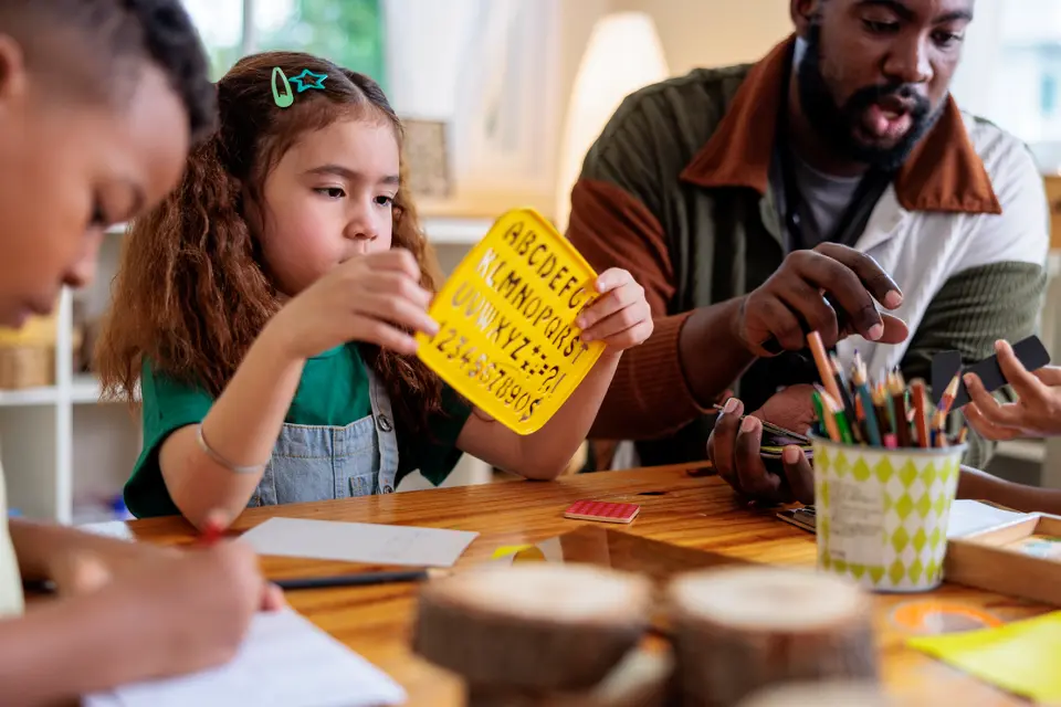
Typography affects both learning and readability. It influences pace, confidence, comprehension, and stamina. A strong type system can help students scan directions faster, follow assignment structure, and stay with reading tasks longer. A weak one can make even strong content feel harder than it is. When considering fonts for teachers, typography is not just a visual choice. It is part of how information is taught.
Good classroom typography does not need to be elaborate. It needs to help students process content clearly and efficiently. The best fonts for education support reading, organization, and attention across grade levels. When teachers use typography intentionally, materials often become easier to understand, easier to navigate, and more effective for learning.
Key takeaways
- Typography affects how easily students read, process, and stay engaged with classroom materials.
- Strong typography can improve readability, support comprehension, and reduce the mental effort required to move through text.
- Weak typography can make directions, readings, and assignments feel more confusing or more demanding than they really are.
- In classrooms, typography influences not only reading comfort, but also pacing, focus, and how clearly information is organized.
- Adobe Express for Education can help teachers build classroom materials with more consistent typography across worksheets, posters, slides, flashcards, and digital resources.


