.

Design

A beginner's guide to how to design a poster: everything you need to know

Adobe Express logo

Adobe Express

07/23/2026

Summary

Poster design is the process of arranging text, images, and visual elements on a single surface, so the message is immediately clear and visually compelling. It matters for events, businesses, causes, and creative projects because a poster has to do its job fast — often at a glance, from a distance, or while someone is moving past it. This guide explains how to design a poster well using a simple, repeatable process that works whether you're designing for print or digital use.

Key takeaways

  • Start with one clear message. A poster that tries to say everything usually communicates nothing.
  • Hierarchy does most of the work. The viewer's eye needs a clear path: What to read first, second, and third.
  • Design for the distance and context where the poster will be seen, not just how it looks on your screen.
  • Restraint in color, fonts, and detail produces stronger posters than trying to make every element stand out.

What is poster design?

Poster design is the process of organizing visual and written elements (headline, imagery, color, typography, and supporting information) on a flat surface so that a viewer can quickly understand what the poster is about and what they're supposed to do or feel. A poster is one of the most compressed communication formats available: It has to attract attention, deliver a message, and prompt a response, often in a matter of seconds.

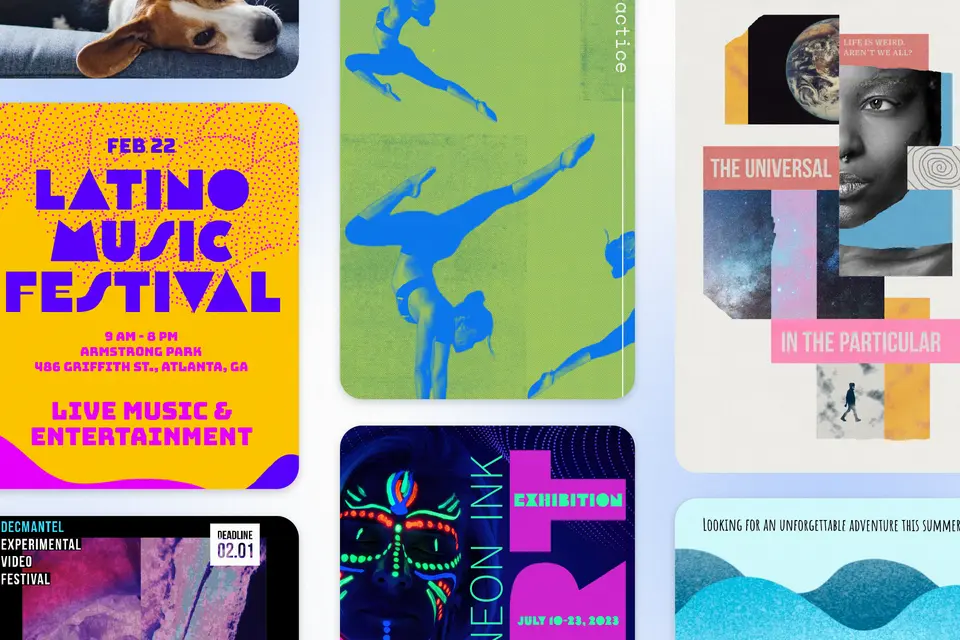
Examples of poster types include:

What all of these have in common is the same core challenge: Too much to say, too little time to say it, and a viewer who isn't obligated to stop and read.

Why does poster design matter?

A well-designed poster removes friction between your message and your audience. When the hierarchy is clear, the typography is readable, and the visual elements support the message rather than compete with it, people can absorb the key information almost without trying.

Here's how good poster design helps in practical terms:

  • an event poster communicates the what, when, and where before a viewer even consciously decides to read it
  • a business promotion poster directs attention to the offer and makes the next step obvious
  • a cause or campaign poster creates an emotional impression that sticks even after the viewer walks away
  • a social media poster graphic reads clearly as a thumbnail before anyone taps to enlarge it

Good poster design decisions don't just feel right. They're backed by research on how people process visual information and respond to print and digital materials. Here are five data points worth knowing.

  • Print ads achieve a 78% recall rate, compared to 46% for digital ads. That gap matters for poster designers because it tells you something important about the medium: Physical posters leave a stronger impression than their digital equivalents, which is a reason to treat the craft seriously even for what seems like a simple event flyer or promotion.
  • Digital posters now hold a 47.6% share of the poster design market, reflecting how much of poster design has shifted to social media graphics, digital displays, and online promotion. That split means most poster designers today need to work across both formats and understand that the design logic for each is different. A poster built for print needs to survive real-world viewing distance. A poster built for digital needs to communicate at thumbnail size on a phone screen.
  • The brain processes images in as little as 13 milliseconds, which is why the imagery and visual choices in a poster do so much work before a viewer consciously decides to read anything. A strong focal image, a clear color palette, and a readable headline all register in that initial flash, making the first impression of a poster almost entirely visual.
  • 98% of consumers agree that authentic images and videos are pivotal in establishing trust, according to Getty Images' 2024 research. For poster designers, this is a strong argument for choosing imagery that feels real and contextually appropriate over generic or overly staged visuals. A poster promoting a local event, a small business, or a community cause earns more trust when the imagery reflects the actual people, places, and spirit behind it.
  • 96% of people have watched an explainer video to learn about a product or service, and 85% say a video convinced them to buy, according to Wyzowl's 2026 video marketing report. The underlying principle applies directly to poster design: When a visual communicates clearly and removes uncertainty about what's being offered, it reduces hesitation and moves people toward action. A well-designed poster that immediately answers who, what, and why functions the same way, because it lowers the friction between seeing and responding.

The other advantage of strong poster design is that it reflects on the thing it's promoting. A polished, well-organized poster signals that the event, business, or cause behind it is worth taking seriously. A cluttered or hard-to-read one sends the opposite message, even if the content is excellent.

What are the core components of an effective poster?

Think of a poster as a system with a few essential parts, each with a specific job:

  • Message: The single most important thing the viewer should take away. Everything else in the poster supports this.
  • Hierarchy: The visual order in which elements are seen and read. Usually: primary headline, supporting information, call to action or details.
  • Imagery: A photo, illustration, or graphic that attracts attention and reinforces the message emotionally or contextually.
  • Typography: The fonts used for the headline, subheads, and body text. Type choices communicate personality and tone before anyone reads the words.
  • Color: The palette that creates mood, guides attention, and keeps the design visually unified.
  • White space: The empty areas that give the design room to breathe, make it easier to read, and prevent it from feeling cluttered.
  • Call to action or key detail: The one thing you want the viewer to do or remember — a date, a website, a ticket link, a phone number.

How do you design a poster?

Here are 7 essential steps

Step 1: Define the message and the goal

Before opening any design tool, answer two questions in plain language:

"What is this poster about?" and "What should someone do or feel after seeing it?"

The answer to the first question becomes your headline. The answer to the second shapes every other design decision, including the imagery, the color, and the tone of the typography. A poster for a summer music festival should feel energetic and inviting. A poster for a community fundraiser should feel warm and trustworthy. A sale poster should feel urgent and clear.

If you can't write a one-sentence version of the poster's message before designing, the design will reflect that uncertainty. Clarity at this stage produces cleaner, more effective work at every stage that follows.

Step 2: Choose the right size and format

Poster dimensions aren’t interchangeable, and designing in the wrong format creates problems that are difficult to fix later. The size and proportion of your poster should match where and how it will be used.

Common poster formats to know:

  • Standard print poster: 11×17 inches (tabloid), 18×24 inches, or 24×36 inches
  • Small flyer/handout poster: 8.5×11 inches (letter size)
  • Social media poster: 1080×1080px (square), 1080×1350px (portrait feed), 1080×1920px (Stories)
  • Digital display or presentation poster: varies by screen, but 1920×1080px (landscape) is common
  • Event banner: typically much wider than tall; dimensions vary

Start with the correct size before designing. A poster laid out for a large print format won’t simply scale down cleanly for social media; the hierarchy, type sizes, and detail levels usually need to be rethought for the smaller surface. Adobe Express includes preset poster and flyer sizes for common formats, which removes the guesswork and keeps proportions correct from the start.

Step 3: Build your visual hierarchy first

Hierarchy is the most important structural decision in poster design, and it should be established before imagery, color, or fine typography are finalized. Hierarchy answers the question: In what order does the viewer read this poster?

A simple three-level hierarchy works for most posters:

Level 1 — The hook: The single largest, most visually dominant element. Usually the headline, event name, or a bold image. This is what stops the viewer.

Level 2 — The context: The supporting information that explains the hook. For an event poster, this is usually the date, time, location, and a brief description. This is what the viewer reads once they've stopped.

Level 3 — The detail: Smaller supporting information — a website, a ticket price, a sponsor logo, a social handle. This is what engaged viewers look for after they've read levels 1 and 2.

A common beginner mistake is giving too many elements equal visual weight, so nothing leads. If everything is large, bold, and colorful, nothing is the headline. The hierarchy must be clear enough that a viewer knows immediately where to look first.

Step 4: Choose and place your imagery

A strong image can do more work in a poster than any other single element. It attracts the eye, sets the emotional tone, and communicates context before a word is read. A weak image, or no image where one is needed, leaves the typography to do all of that work alone, which rarely produces the same result.

A few guiding principles for poster imagery:

  • Use one dominant image rather than several competing ones. A single strong visual focal point almost always outperforms a collage or a busy background.
  • Choose images where the subject is clear and reads quickly at a distance. Fine detail, complex scenes, and subtle compositions tend to disappear in poster contexts.
  • Make sure the image and the message are congruent. An image that doesn't obviously connect to the poster's subject creates confusion rather than interest.
  • Leave room in the image or in the composition around it for the headline to sit without competing visually with the photo.

Step 5: Apply color with intention

Color in poster design does three jobs simultaneously: It creates mood, guides attention, and holds the composition together visually. A color palette chosen without intention tends to produce a poster that feels either flat or chaotic, both of which undermine the message.

For beginners, a few practical principles keep color decisions manageable:

  • Start with two or three colors. A background color, a primary color for headlines and key elements, and a neutral or accent color for supporting text is often all a poster needs. Adding more colors increases complexity without necessarily improving the design.
  • Use contrast to reinforce hierarchy. The highest-contrast element in the poster should be the most important one. If your headline is in a color that barely separates from the background, the hierarchy breaks down.
  • Make sure the color fits the message. Bright, saturated colors suggest energy and excitement. Deeper, more muted tones suggest sophistication or seriousness. Warm palettes feel inviting. Cool palettes feel calm or authoritative. None of these is right or wrong, but the color should be reinforcing the same mood the headline and imagery are already creating.
  • Test readability, not just appearance. A color combination that looks attractive can still be difficult to read, especially at smaller sizes or in lower-contrast printing conditions. Always check that text is legible against its background before finalizing.

Step 6: Refine typography and spacing

Once hierarchy, imagery, and color are in place, the typographic refinement begins. For most posters, this means two typefaces at most, one for the headline and one for supporting text, applied consistently across the hierarchy levels.

Typography choices that tend to work well in poster contexts:

  • Bold, high-weight display fonts work well for headlines because they read quickly at a distance and create strong visual weight at the top of the hierarchy.
  • Clean sans serifs work well for supporting text and details because they remain readable at smaller sizes and across varied print and screen conditions.
  • Script or decorative fonts can add character to a poster when used sparingly, typically for the headline only, and only when the style fits the message.

Spacing is where many beginner poster designs fall apart. Insufficient spacing between elements creates a crowded, hard-to-read composition even when the individual elements are well chosen. A few habits that help:

  • Add more white space than feels necessary. Beginners almost always under-space.
  • Keep margins consistent and generous. Elements pushed to the very edge of a poster tend to feel unanchored.
  • Let breathing room work for you. A headline with space around it feels more commanding than one squeezed between other elements.

Step 7: Check the poster in real-world conditions

Before finalizing any poster, check it in the conditions where it will actually be seen. A poster that looks strong on a large monitor can reveal significant problems when viewed differently.

For print posters:

  • Print a test copy at actual size before ordering a larger print run. Colors, type sizes, and detail levels often look different on paper than on screen.
  • View the test print from the distance someone would typically see it. Step across a room, position at the end of a hallway, or view from a few feet away at a bulletin board.
  • Check that the most important information is still readable from that distance. If the headline is hard to read, it needs to be larger or bolder.

For digital and social posters:

  • Check the poster on a phone screen, not just on a computer. Most people will encounter social poster graphics on mobile, where small text and fine detail disappear.
  • Look at it as a thumbnail. On social platforms, the first impression is often a small preview image. Is the key message still obvious at that size?
  • Preview it in the actual layout or platform where it will appear. A poster graphic that looks right on a blank background may feel different once it's surrounded by other feed content.

Logo design best practices

Design for function, not admiration. The test of a logo isn't whether people think it's beautiful. It's whether they remember it and associate it correctly with your brand.

Earn complexity later. Simple logos are easier to remember, easier to reproduce across surfaces, and more versatile than complex ones. Start minimal and add only what's necessary.

Separate your personal taste from your brand's needs. The colors and styles you prefer personally may have nothing to do with what will work for your audience. Create a brief, then design for the brief.

Own one thing. The most memorable logos commit to one distinctive element (a color, a shape, a typographic treatment) and make it unmistakably theirs. Trying to be visually distinctive in multiple directions at once produces clutter, not character.

Design in vector format from the start. Vector files (SVG, AI, EPS) scale to any size without losing quality. Raster files (JPEG, PNG) don't. A logo that only exists as a JPEG isn't finished.

Be patient with the process.It takes an average of 5-7 exposures before people remember a brand. No logo builds recognition overnight. Consistent use over time does the work.

Treat the logo as a system, not an object. The logo itself is one piece of an identity system that includes color, typography, and visual style. Design it with that system in mind from the beginning.

Quick poster design checklist

✅ Write the one-sentence message before starting.
✅ Choose the correct size and format for how the poster will be used.
✅ Establish a three-level visual hierarchy before adding color or imagery.
✅ Select one dominant image with a clear focal point.
✅ Apply a limited color palette — two to three colors to start.
✅ Use two typefaces at most, sized to reinforce the hierarchy.
✅ Add white space and check margins.
✅ Test text contrast and readability.
✅ Check the final poster at the distance and size where it will actually be seen.

Poster design gets easier when you stop trying to fit everything in and start asking what can be taken out. Define the message, establish the hierarchy, support it with imagery and color that reinforce the same mood, and then check the result in the conditions where real viewers will see it. A poster that communicates one thing clearly and quickly will always outperform one that tries to say everything at once.

Try Adobe Express today