


Design
What should you know about sizes, safe areas, and best practices for website hero images and web banners?

Adobe Express
11/13/2026
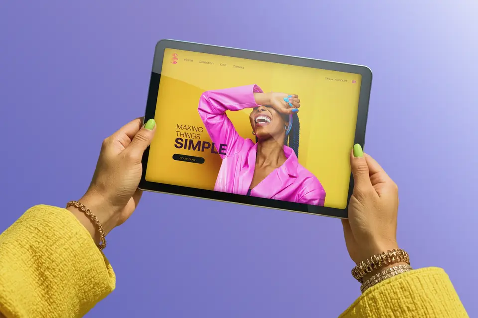
Your website banner should help visitors understand what you offer. A clear photograph, catchy headline, and useful next step can introduce a product collection, announce an event, or explain a service. The page section determines the shape of the image visitors see, so preparing a banner starts with understanding that layout.
Whether you're planning asmall business website or updating an existing page, check how its images appear on different screens. This guide explains sizes, cropping, and export requirements, then shows how to adapt the same design for a website and display ad.
Key takeaways
- Choose website hero dimensions for the page section and its layout; uploading a bigger file alone won;t solve cropping.
- Keep important subjects away from vulnerable edges and review the composition on both wide and narrow screens.
- Add website headlines and buttons aslive page content so they remain readable as the layout changes.
- Check the accepted dimensions and file-size limit for each placement; website images and advertising creatives have different requirements.
- Check pixel dimensions and file size separately. Changing a print-resolution setting doesn’t add image detail.
- Review animation requirements as well as dimensions, including how long the exported file plays and whether it loops.
- Use Adobe Express Premium’sDuplicate & Resize to preserve your original while creating layouts for additional placements.
What size should web banners be?
Start with the image section in your chosen website layout. A hero image is the prominent visual near the top of a page, often accompanied by a headline and button. Its displayed shape depends on the space the layout provides and how the image fits that space, so there isn’t a single upload size that works for every website hero.
Before preparing the artwork, confirm these details:
- Display area: Find the recommended image dimensions for the selected section, then check how its height and width change on smaller screens. A shallow header and a tall introductory section need different compositions.
- Proportions: Aspect ratio describes the relationship between width and height. A 3:1 image is three times as wide as it is tall; uploading more pixels at that same ratio does not change its shape.
- Source dimensions: Check the photograph’s actual pixel width and height. Adobe’s guide to image size and resolution explains why changing a print-resolution setting without resampling leaves those pixels unchanged.
- Mobile treatment: Check whether the site supports a separate mobile image. A different crop for a smaller screen can keep the subject understandable when shrinking the entire desktop composition would make it too small.
- File requirements: Confirm accepted formats and the upload limit. Adobe’sJPEG and PNG comparison explains the trade-offs: JPEG suits photographs that benefit from smaller files, while PNG supports transparency and lossless compression.
For example, imagine an image area measuring 1200 × 400 CSS pixels, the units used by the page layout. A 2400 × 800 source has the same 3:1 proportions and provides twice as many image pixels along each axis, which can help accommodate a higher-density display. These figures illustrate the relationship; they aren’t a recommended size for every hero image.
Adobe Express’simage resizer lets you enter custom pixel dimensions for an individual photo. Keep the original, follow the selected section’s guidance, and inspect the result in the page. For a finished JPG or PNG that needs a smaller file size, theimage compressor lets you adjust compression and compare the preview before downloading.
Why does your hero image keep getting cropped?
A website may fill its image area by resizing a photograph to cover the space, then clipping whatever extends beyond the edges. The World Wide Web Consortium's explanation of background image sizing distinguishes this approach from fitting the entire image inside the area, which may leave empty space. Think of the section as a window: Changing the window’s proportions changes how much of the photograph you can see.
Look for these common causes:
- Side cropping: A wide photograph filling a tall area loses content from one or both sides, depending on its alignment.
- Vertical cropping: A tall photograph filling a wide area loses content from the top, bottom, or both.
- Image position: If the site provides alignment or focal-point controls, adjust them and check the whole subject, including faces, handles, and other important details.
- Text placement: A headline or button may overlap the photograph differently on a phone, even when the subject remains within the visible crop.
Imagine a pottery shop showing three mugs spread across a table. A narrow crop might leave only the middle mug visible. Grouping the mugs closer together, changing the section’s height, or preparing a separate mobile image could make the collection easier to understand.
The safe area is the portion of your composition that survives the layouts you test. Starting near the center can help, but no fixed percentage guarantees that every website will preserve the same region. Use thecrop image quick action to explore different proportions, then check the actual page.
Adobe’sbanner design tips can help you refine the message and visual hierarchy once the composition works in its intended space.
What are the standard web banner sizes for display ads?
Display ads use dimensions specified for their advertising placements. TheIAB’s fixed-size recommendations include these examples, listed as width × height in pixels:
- Medium rectangle: 300 × 250.
- Skyscraper: 160 × 600.
- Leaderboard: 728 × 90.
- Billboard: 970 × 250.
- Smartphone banner: 300 × 50 or 320 × 50.
These are advertising formats, separate from website hero dimensions. TheIAB New Ad Portfolio also includes flexible formats defined by aspect ratio and size range, so confirm whether the placement needs a fixed image or another type of creative.
Check the publisher’s accepted dimensions, file format, and upload limit before designing. IAB’slightweight ad guidance distinguishes the initial load from additional assets loaded later; do’t combine those allowances into a single-image file budget. A specification for an advertising package may cover more than the picture you export.
For animation, theIAB ad experience guidelines limit playback to 15 seconds, including loops. Treat this as industry guidance and confirm the receiving publisher’s rules, since acceptance depends on that placement. Check the downloaded file’s behavior before submission, and keep a static version available when animation is unsuitable.
How do you resize one banner for a website header and an ad slot?
Here are 7 essential steps
Create a separate version of the editable design for each placement, then review its layout and export against that destination’s requirements. If you already made an animated banner, start with its editable original so you can adjust individual elements.
Step 1: Start from the largest placement you need.
List the website section and ad slots you'll use, then gather original photographs with enough detail for the largest required version.Web banner design ideas and inspiration can help you choose a visual direction, whileanimated banner templates offer editable starting layouts. Build from a sharp original and make smaller versions from it, checking each new shape instead of enlarging a small finished export to fill a larger space.
Step 2: Keep the subject in the center safe area.
Place the essential subject where it remains visible in your tested desktop and mobile crops, leaving flexible space around it. Use Adobe Expressrulers and guides to mark that working area while arranging your design, then compare it with the website preview. Keep decorative details outside it when needed, but remember that these guides help you compose the artwork; the website doesn’t read or enforce them.
Step 3: Keep the text on the page, not in the image.
Add the website headline, supporting copy, and button as separate webpage elements, followingguidance on using actual text so visitors can enlarge it independently of the photograph. Separate copy also makes translation and language changes easier to manage, including headlines that take more space in another language. Uploaded image ads need their message within the creative, so build that text into the ad version and keep the website photograph available separately.
Step 4: Resize to each placement rather than cropping one file.
In Adobe Express Premium, open Resize, choose pixels, enter the required width and height, and select Duplicate & Resize to preserve the original. Leave Expand image unchecked when you want to avoid generative expansion, then reposition elements for the new shape. Adobe’sanimation resizing tutorial confirms that animation settings are retained, but play the entire resized version to check moving elements, transitions, and text placement.
Step 5: Check every size on a phone.
Review the actual page on a phone and a larger screen, then narrow the browser window to see where the layout changes. Check the subject, headline, button, and text contrast together, and enlarge the text to catch overlapping or hidden content. If the website banner moves automatically, check that visitors can pause or stop it when required by W3C’s guidance on motion controls.
Step 6: Export at the right weight for the slot.
Export each static ad at its required dimensions, compare JPG and PNG results, and inspect the downloaded file’s actual size against the upload limit. Adobe Express’s GIF download options provide Low, Medium, and High quality, but selecting one doesn’t establish the exported animation’s frame rate or total looping time. Verify those properties before submitting an animated ad, or use a compliant static version if you can't confirm them.
Step 7: Keep a master file you can re-cut.
Save the editable original, source photographs, and approved exports with clear names identifying the destination, dimensions, and revision. Keep a short note of the theme’s crop settings and the ad specifications you used so the next update starts from a known layout. Store separatelogo sizes with the other brand assets, and preserve editable text and animation elements so a new offer can be adapted without reconstructing the entire design.
Web banner best practices
- Give the image one job. Choose a subject that supports the page’s main message.
- Leave room for cropping. Keep expendable background around essential details.
- Review the whole composition. Check the image with the actual headline and button.
- Use motion deliberately. Keep the message understandable in a static version too.
- Label each export clearly. Include its destination and dimensions in the filename.
- Reuse approved assets. Adobe Express Premium’sbrand kits keep colors, fonts, and logos available for related layouts.
Quick hero image and banner checklist
✅ Confirm the largest placement and prepare a source image with enough pixels for that version before creating smaller exports.
✅ Check that the main subject stays visible within the tested crops, including narrow screens and any selected image-position setting.
✅ Add website headlines and buttons as page content, then verify that they remain readable when text is enlarged.
✅ Export each uploaded ad at its accepted dimensions and keep its finished creative separate from the website’s image-only version.
✅ Check every downloaded file’s format and weight against its destination’s requirements, including animation speed and stopping behavior when relevant.
✅ Review the actual page on a phone and larger screen, checking the crop, contrast, button, and any motion controls.
✅ Write usefulalt text for informative images, or mark an image decorative when it adds no information beyond nearby content.
✅ Save the editable master, source images, approved versions, and placement notes together so future updates start from the correct files.
A useful banner keeps its subject and message clear wherever it appears. Start with the website section or advertising slot, choose a photograph that works in that space, and adapt the layout for each destination. Keep website text editable on the page, review narrow-screen crops, and check the exported files before uploading. Once the versions work, save the master design alongside the placement details and approved exports. That gives your next product launch, event, or seasonal update a practical starting point, with fewer design decisions to repeat.


