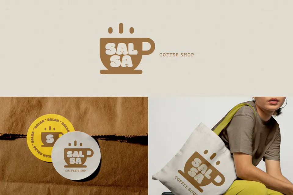
A logo for a small business has a lot of responsibility. A good logo doesn't need to be complicated, clever, or deeply symbolic to be effective. It needs to be clear, recognizable, flexible, and usable across the places a small business shows up: social profiles, websites, packaging, invoices, signs, and more. Most logos don't fail because small business owner lacks creativity. They fail because they're designed as artwork instead of as a working business asset. This guide breaks down how to design a business logo that works in practice, how to make better decisions early, and how to build confidence with best practices, a checklist, and FAQs.
Key takeaways
- A good logo is less about decoration and more about clarity, recognition, and usability.
- The best beginner logos are usually simple, readable, and easy to use in different sizes and formats.
- Don't start by asking how to make the logo look impressive; start by asking where the logo needs to work.
- Templates, font pairings, and quick resizing tools can make the process easier for beginners who want something clean and practical.
What is a logo, really?
A logo isn't your entire brand. It is one visual identifier inside your brand system. Its job is to help people recognize and remember your business quickly and consistently.
For a small business, that means a logo should work across real-world touchpoints such as:
- social media profile images
- website headers
- business cards
- flyers
- product packaging
- email signatures
- promotional graphics
A logo doesn't need to explain everything about your business. It needs to identify it clearly and reliably.
Why do small businesses need to think differently about logo design?
Because a logo for a small business has to work harder than a logo made for a large, established brand. A small business usually needs one mark to do many jobs across many formats, often with limited time, limited budget, and no full design team behind it.
Beginners also tend to focus on what the logo means before they think about how the logo functions. That often leads to logos that are too detailed, too literal, or too hard to use in small spaces.
A better beginner approach is to think in this order:
- where the logo will appear
- what the business needs it to communicate
- how simple it can be while still feeling distinct
- whether it stays clear at small sizes
That’s why the strongest beginner logos are usually the ones that solve practical problems first.
What are the core components of a successful logo?
If you understand these, you’ll make stronger logo decisions right away:
- Clarity: Is it easy to recognize quickly?
- Simplicity: Can it work without too many details?
- Readability: If it includes text, is the name easy to read?
- Distinctiveness: Does it feel identifiable without becoming overly complicated?
- Flexibility: Does it work in different sizes, shapes, and placements?
- Consistency: Can you use it the same way across your business materials?
- Relevance: Does it feel appropriate for your audience and type of business?
How do you design a small business logo that actually works?
Here are 7 essential steps
Step 1: Start with use cases, not symbolism
Before you choose fonts, icons, or colors, list the first places the logo will need to appear. For most small businesses, that often includes:
- a profile picture
- a website header
- printed materials
- social graphics
That changes the design process immediately. A logo that looks good only on a wide banner but fails in a tiny circle isn't doing its job well. For beginners, it helps to design around practical use first and deeper meaning second. A logo can still be thoughtful, but it should work before it tries to say too much.
Step 2: Keep the concept simple enough to recognize fast
A logo is usually seen quickly, not studied carefully. That’s why simple logos often perform better than detailed ones. A beginner logo doesn't need multiple symbols, intricate line work, or a complex hidden message.
A useful test is this: If someone saw the logo for two seconds on a mobile device, what would they remember? A strong shape, clean name treatment, or simple mark will do more for recognition than extra detail ever will.
Step 3: Make the business name easy to read
Many small businesses need recognition more than abstraction. That means the business name often matters more than an elaborate icon.
If you’re using a wordmark or text-based logo, prioritize readability. Choose a type style that fits the business but doesn't make the name harder to read. Whether it’s elegant, playful, bold, or minimal, it can work, but only if the words are clear.
This is one reason beginners often do better with cleaner font choices and restrained styling. Adobe Express helps by offering easy starting points with editable text, font combinations, and simple layouts that are easier to refine than building everything from scratch.
Step 4: Design for small sizes first
If a logo only works when it’s large, it won’t be useful. Many of the most important logo placements are small, including:
Shrink the design down early. If details disappear, letters blur together, or the icon becomes confusing, simplify it. A beginner logo gets stronger when it survives reduction. Thin lines, tiny details, and crowded arrangements usually create problems later.
Step 5: Build one clean version before creating variations
Beginners sometimes make too many versions before the core logo is even solved. Start with one strong primary version. Then think about useful variations, such as:
- a full logo
- a simplified icon or initials version
- a version for dark backgrounds
- a version that fits square or circular spaces
Other common logo versions include:
- one version with a slogan
- one with an icon
- one stacked
- one horizontal
- one with extra decoration
Adobe Express can help with this practical side by making it easier to resize, duplicate, and adapt a logo for different business materials once the main design is set.
Step 6: Use color carefully, but make sure the logo can work without it
Color can help a logo feel warmer, more premium, more energetic, or more calm. But the structure of the logo should still work when color is removed. That matters for things like:
- invoices
- stamps
- one-color printing
- embroidery
- other everyday business uses
For beginners, that means it’s smart to test the logo in black and white before treating color as the solution. If the logo only works because of a gradient, effect, or color contrast, the underlying design may still need work.
Step 7: Think of the logo as part of a small brand system
A logo works better when it isn't carrying the whole brand alone. Small businesses often get more mileage by pairing a simple logo with a few supporting rules, such as:
- 1–2 brand fonts
- a small color palette
- consistent social post styling
- repeatable layouts for promotions or announcements
That takes pressure off the logo to do everything by itself. Adobe Express can help beginners and small business owners move from logo work into matching social posts, flyers, profile graphics, and branded content without having to rebuild the visual system from zero each time.
Logo design best practices
- Design for real use, not just presentation. A logo should work on everyday business materials, not only on a mockup.
- Keep it simple enough to recognize quickly. Clarity usually beats cleverness.
- Make sure the text is readable. If the name is hard to read, the logo is doing less for the business.
- Test a small version of your logo design. Many logo problems show up when the size is reduced.
- Build one strong primary version first. Variations should come after the core identity works.
- Make sure it works in black and white. A strong logo should not depend entirely on color.
- Support it with a basic visual system. Fonts, colors, and templates help the logo feel more consistent in use.
Quick checklist for designing a better logo
✅ List the places the logo needs to appear first.
✅ Keep the concept simple and easy to recognize.
✅ Make the business name readable.
✅ Test the logo at small sizes early.
✅ Create one strong primary version before adding variations.
✅ Check that it still works in black and white.
✅ Build a few supporting brand rules so the logo isn't working alone.
Good logo design isn't about adding as much meaning or detail as possible. It’s about making something your business can use, repeat, and grow with. When beginners focus on clarity, readability, flexibility, and real-world use, they end up with logos that feel stronger, look more professional, and work much better over time.