


Design
How do you design an email newsletter with the right layout, width, and images?

Adobe Express
11/17/2026
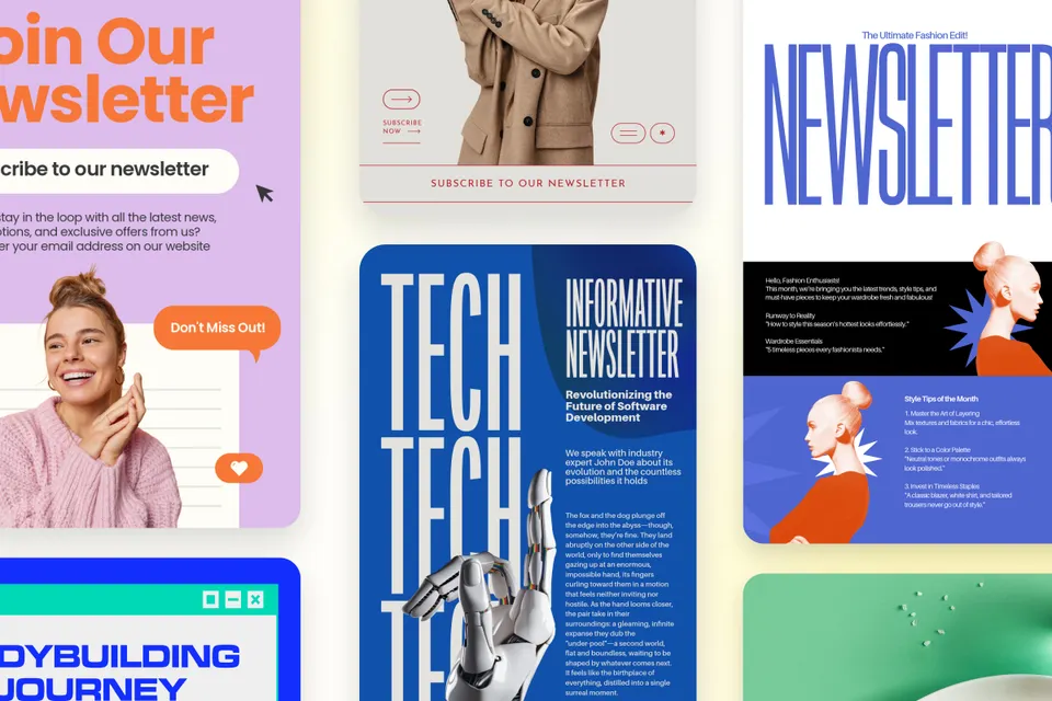
An email newsletter gives your business a regular place to share news, useful ideas, and updates with people who want to hear from you. Good design helps readers find what interests them. From the opening headline to the final link, each element should make the message easier to follow.
This email newsletter design guide covers the decisions behind that experience: layout, width, header and banner sizes, images, and signatures. It builds on our look at newsletter design and branding with practical steps for creating a newsletter, preparing its graphics, and checking what readers will see.
Key takeaways
- Adobe's email-design guidance recommends template widths between 600–800 pixels. Follow your chosen template and test its mobile layout.
- Header and banner dimensions depend on the image block, including its columns and padding.
- Keep essential information in live text so readers can understand the message when images are blocked.
- Animated GIFs can play in Outlook for Windows, but the recipient's animation settings affect playback.
- Adobe Express GIF exports don’t support audio or transparent backgrounds; keep each exported file under 60 seconds.
What is an email newsletter?
An email newsletter is a recurring message that brings selected news, advice, offers, or updates to subscribers. Its design organizes those items into a recognizable sequence, usually a branded header, a lead story, supporting sections, a clear next action, and a footer.
Each element needs a job. A bakery might lead with weekend preorders, show one product photograph, and provide a pickup link. A community organization might lead with an event, explain who it serves, and make registration easy to find. Choose the content before choosing decorative elements.
Why should small businesses care about email newsletter design?
- Respect readers' attention. In Adobe's survey of 1,007 U.S. consumers, 46% found wordy marketing emails less appealing. Use descriptive headings and short introductions to help readers find relevant information.
- Keep the message accessible. Live text, logical reading order, and meaningful links help people navigate your content. Keep essential information outside images so readers can follow the message when graphics are unavailable.
- Make the next issue easier. A reusable layout gives recurring features a consistent place. Update the story, offer, and artwork while keeping the structure familiar.
How wide should an email newsletter be?
Use the width specified by your email platform's template, then test how it adapts to smaller screens. Adobe's email-design guidance for Journey Optimizer recommends template widths between 600-800 pixels. That's a recommendation within that workflow, not a universal email-client requirement.
A narrower layout can suit a desktop preview pane, but the phone version still needs checking. Look for readable line lengths, images that fit their blocks, and buttons that remain easy to distinguish as the layout changes.
Start with a single column when the message follows one reading order. If you use columns for products or short updates, confirm that they stack logically on mobile. Check the actual template before choosing artwork dimensions or trying to force a wider layout.
What size should a newsletter header or banner image be?
A newsletter header or banner image should fit the specific image block in your template. The newsletter's overall width is only part of the calculation: columns, margins, and padding reduce the space available to individual images.
Check the template's body and component settings before exporting. For illustration, a section measuring 600 pixels overall, including 20 pixels of padding on each side, leaves 560 pixels for its contents. Your template may use different spacing. Follow its image-upload guidance and keep the source image's pixel dimensions separate from its displayed width.
In Adobe Express, use the banner maker to prepare a branded header with your images, colors, and type, then download the graphic for your email template. Keep the main headline and offer in the email's text blocks. Choose a header height that leaves room for the opening message on a phone.
Where do you find email newsletter templates?
Find the sending layout in your email platform and use visual templates to develop its look. Look for editable text, image blocks, and buttons that adapt to different screens. Adobe's email-authoring documentation explains the options for starting from a template, importing HTML, or building an email from scratch.
The newsletter templates collection provides visual and document layouts, including newsletters downloaded as PDFs. Use those layouts for design direction, then adapt the content into your sending platform's live text, image blocks, and buttons. A document export doesn’t automatically become an HTML email.
Publishing directly on a social platform uses a different workflow. Follow the guide to creating a LinkedIn newsletter for that format rather than applying an email builder's dimensions to it.
How do you keep newsletter images from slowing the email down?
Crop images to the content you need, resize them for their intended display, and reduce file weight before uploading. Check the result at its actual reading size ,so smaller files still show useful detail.
Choose a format your sending platform supports. Adobe's JPEG and PNG comparison explains why JPEG works well for photographs and PNG supports graphics with transparent backgrounds. Compress the exported image without losing useful detail, follow your platform's documented file limits, and keep animations short.
Adobe's guidance on email images recommends balancing images with text because images may be blocked. Judge the image-to-text ratio by whether the message remains understandable with images turned off. Put dates, prices, descriptions, and the next action in live text, and add useful text alternatives that communicate each informative image's purpose.
Do animated GIFs work in email signatures?
Animated GIFs can work in email signatures, but playback depends on the receiving application and its settings. Microsoft's Outlook animation guidance says animated graphics normally play in message bodies and identifies disabled animation as a reason only the first frame appears.
For Outlook for Office 365 before version 2008, Microsoft points to File > Options > Advanced, then Play animated GIFs in the Display section. From version 2008 onward, its instructions use Windows animation controls: Show animations in Windows on Windows 10, or Settings > Accessibility > Visual effects > Animation effects on Windows 11. This guidance concerns Outlook for Windows; it doesn’t establish behavior in new Outlook, Outlook on the web, Gmail, Apple Mail, or mobile apps.
Adobe Express lets you download videos and animations as GIFs through Download > GIF, with Low-, Medium-, or High-quality options. Keep each exported file under 60 seconds and choose a much shorter loop for a signature.
This export workflow doesn’t support audio or transparent backgrounds. An opaque background can appear as a box when it differs from the email background. Test the result in light and dark appearances and keep essential meaning in the first frame and nearby live text.
How do you make a branded email signature with your logo?
Prepare the logo at the size your signature layout needs, then assemble the image, contact text, and links in your email client's signature editor. Adobe Express's Resize image Quick action lets you choose Custom dimensions and enter the required width and height before downloading. Preserve the logo's proportions.
The email signature generator offers another way to develop the signature graphic. Keep your name, role, phone number, and website as editable text and links in the email client. Microsoft's Outlook signature instructions explain how to combine text, links, and images.
Send a new message and a reply to check spacing and logo size. A personal signature and a newsletter's campaign footer serve different purposes, so retain the sending platform's subscription controls when adding a personal sign-off.
How do you create an email newsletter?
Here are 7 essential steps
Build the message in the same environment that will send it. Use this sequence to turn the specifications above into a repeatable workflow.
Step 1: Choose one main purpose
Decide what the reader should learn or do after opening this issue. For a seasonal promotion, connect the newsletter to your wider holiday campaign plan. Keep secondary stories from competing with the main action.
Step 2: Select the sending template
Choose a newsletter layout with the sections you need, then inspect its desktop and mobile settings. Note the widths of the header, full-width images, and any columns. Those spaces determine the assets you prepare next.
Step 3: Arrange the reading order
If your builder lets you drag and drop content blocks, place the lead story first, followed by supporting details and the next action. Use the builder's heading controls to establish a logical heading structure. Keep one idea in each short section so readers can scan without losing the thread.
Step 4: Prepare and place the images
Crop and export the header and supporting graphics for their actual blocks. Check file weight, add alt text, and preview each image after insertion. Confirm that any text inside a graphic remains readable at phone size.
Step 5: Write descriptive links and buttons
Use labels such as “Reserve a workshop place” or “View the weekend menu.” Make the destination match the promise. Keep the primary action easy to find, with enough surrounding space to distinguish it from nearby links.
Step 6: Add the sign-off and fallback
Add a compact signature if it suits the message. If you use animation, inspect its first frame and check that contact details remain available as text. Review the plain-text version as well as the designed email.
Step 7: Send a test and save the template
Send a test message or proof to check the content in actual inboxes and on a phone. If a link is inactive in a proof, use your platform's documented method for checking it. Retest after changes, then save the corrected layout for the next issue.
Email newsletter design best practices
- Keep typography consistent. Use a small set of heading and body styles across issues.
- Check text contrast. Choose foreground and background colors with sufficient contrast for readability.
- Use images with a purpose. Include graphics that explain a product, demonstrate an idea, or establish context.
- Make space for the message. Balance imagery with clear headings and concise live text.
- Preserve useful defaults. Keep the template's working mobile behavior and footer controls as you customize it.
What to test before you send
✅ Check the subject line, preview text, sender name, and reply address.
✅ Read the newsletter in desktop and mobile inboxes.
✅ Check image crops, file weight, and readable text size.
✅ Turn images off and confirm the message still makes sense.
✅ Inspect text, logos, and backgrounds in dark mode.
✅ Check the first frame of every animated GIF.
✅ Verify every link destination, including buttons and footer controls.
✅ Review personalization and the plain-text version.
A tested newsletter becomes a useful starting point for the next issue. Keep a short record of the template, image dimensions, and checks that worked, then update the content with each send. Build a small collection of reusable graphics alongside it.


